VB6: how avoid these memory leak on API timer?

Featured Imgs 23

heres my timer class with a module(on a group project for create a DLL):

'Module:
Option Explicit

Private Declare Function SetTimer Lib "user32" (ByVal hWnd As Long, ByVal nIDEvent As Long, ByVal uElapse As Long, ByVal lpTimerFunc As Long) As Long
Private Declare Function KillTimer Lib "user32" (ByVal hWnd As Long, ByVal nIDEvent As Long) As Long
Private Declare Sub CopyMemory Lib "kernel32" Alias "RtlMoveMemory" (pDst As Any, pSrc As Any, ByVal ByteLen As Long)

Private mcolItems   As Collection

Public Sub AddTimer(ByRef pobjTimer As APITimer, ByVal plngInterval As Long)
    If mcolItems Is Nothing Then
        Set mcolItems = New Collection
    End If
    pobjTimer.ID = SetTimer(0, 0, plngInterval, AddressOf Timer_CBK)
    mcolItems.Add ObjPtr(pobjTimer), pobjTimer.ID & "K"
End Sub

Public Sub RemoveTimer(ByRef pobjTimer As APITimer)
On Error GoTo ErrHandler
    mcolItems.Remove pobjTimer.ID & "K"
    KillTimer 0, pobjTimer.ID
    pobjTimer.ID = 0
    If mcolItems.Count = 0 Then
        Set mcolItems = Nothing
    End If
    Exit Sub
ErrHandler:

End Sub

Public Sub Timer_CBK(ByVal hWnd As Long, ByVal uMsg As Long, ByVal idEvent As Long, ByVal SysTime As Long)
Dim lngPointer  As Long
Dim objTimer    As APITimer
On Error GoTo ErrHandler
    lngPointer = mcolItems.Item(idEvent & "K")
    Set objTimer = PtrObj(lngPointer)
    objTimer.RaiseTimerEvent
    Set objTimer = Nothing
    Exit Sub
ErrHandler:

End Sub

Private Function PtrObj(ByVal Pointer As Long) As Object
Dim objObject   As Object
    CopyMemory objObject, Pointer, 4&
    Set PtrObj = objObject
    CopyMemory objObject, 0&, 4&
End Function

'class:
Option Explicit

Private Const CLASS_NAME As String = "APITimer"


Public Event Refresh()

Private mlngTimerID      As Long

Friend Property Let ID(ByVal plngValue As Long)
    mlngTimerID = plngValue
End Property

Friend Property Get ID() As Long
    ID = mlngTimerID
End Property

Public Sub StartTimer(ByVal Interval As Long)
    If mlngTimerID = 0 Then
        AddTimer Me, Interval
    End If
End Sub

Public Sub StopTimer()
    If mlngTimerID > 0 Then
        RemoveTimer Me
    End If
End Sub

Private Sub Class_Terminate()
    StopTimer
End Sub

Friend Sub RaiseTimerEvent()
    RaiseEvent Refresh
End Sub

after create a DLL, i'm using it on my project:

Dim GameBitmap As New vbAPITimerTools.clsImage
Dim WithEvents tmr As vbAPITimerTools.APITimer
Private Sub Form_KeyDown(KeyCode As Integer, Shift As Integer)
    If (KeyCode = vbKeyEscape) Then
        FreeResources
    End If
End Sub


Private Sub Form_Load()
    Set tmr = New vbAPITimerTools.APITimer

    blnGameLoop = True
    Me.Show
    PreencherMatriz Level1, _
            ColorConstants.vbBlack, ColorConstants.vbBlack, ColorConstants.vbBlack, ColorConstants.vbBlack, ColorConstants.vbBlack, ColorConstants.vbBlack, ColorConstants.vbBlack, ColorConstants.vbBlack, ColorConstants.vbBlack, ColorConstants.vbBlack, _
            ColorConstants.vbBlack, ColorConstants.vbWhite, ColorConstants.vbWhite, ColorConstants.vbWhite, ColorConstants.vbWhite, ColorConstants.vbWhite, ColorConstants.vbWhite, ColorConstants.vbWhite, ColorConstants.vbWhite, ColorConstants.vbBlack, _
            ColorConstants.vbBlack, ColorConstants.vbWhite, ColorConstants.vbWhite, ColorConstants.vbWhite, ColorConstants.vbWhite, ColorConstants.vbBlack, ColorConstants.vbWhite, ColorConstants.vbBlack, ColorConstants.vbWhite, ColorConstants.vbBlack, _
            ColorConstants.vbBlack, ColorConstants.vbWhite, ColorConstants.vbBlack, ColorConstants.vbWhite, ColorConstants.vbWhite, ColorConstants.vbBlack, ColorConstants.vbWhite, ColorConstants.vbBlack, ColorConstants.vbWhite, ColorConstants.vbBlack, _
            ColorConstants.vbBlack, ColorConstants.vbWhite, ColorConstants.vbWhite, ColorConstants.vbWhite, ColorConstants.vbWhite, ColorConstants.vbBlack, ColorConstants.vbWhite, ColorConstants.vbBlack, ColorConstants.vbWhite, ColorConstants.vbBlack, _
            ColorConstants.vbBlack, ColorConstants.vbWhite, ColorConstants.vbBlack, ColorConstants.vbWhite, ColorConstants.vbWhite, ColorConstants.vbBlack, ColorConstants.vbBlack, ColorConstants.vbBlack, ColorConstants.vbWhite, ColorConstants.vbBlack, _
            ColorConstants.vbBlack, ColorConstants.vbWhite, ColorConstants.vbWhite, ColorConstants.vbWhite, ColorConstants.vbWhite, ColorConstants.vbWhite, ColorConstants.vbWhite, ColorConstants.vbWhite, ColorConstants.vbWhite, ColorConstants.vbBlack, _
            ColorConstants.vbBlack, ColorConstants.vbBlack, ColorConstants.vbBlack, ColorConstants.vbBlack, ColorConstants.vbBlack, ColorConstants.vbBlack, ColorConstants.vbBlack, ColorConstants.vbBlack, ColorConstants.vbBlack, ColorConstants.vbBlack
    FPS = 0
    FramesCount = 0


    Set GameBitmap = New vbAPITimerTools.clsImage
    GameBitmap.NewImage 32 * 10, 32 * 10
    FillWall1 = GameBitmap.CreateBrush(vbBlack)
    FillEmpty = GameBitmap.CreateBrush(vbWhite)
    DrawMap GameBitmap.MemoryHDC, Level1


    tmr.StartTimer 1000
    While (blnGameLoop)
        GameBitmap.Draw Me.hdc
        FramesCount = FramesCount + 1
        DoEvents
    Wend
End Sub

Private Sub tmr_Refresh()
    On Error Resume Next
    FPS = FramesCount
    Me.Caption = "FPS: " & CStr(FPS)
    FramesCount = 0
End Sub

Private Sub Form_Terminate()
    'FreeResources
End Sub

Private Sub Form_Unload(Cancel As Integer)
    'FreeResources

End Sub

Private Sub FreeResources()
    blnGameLoop = False

    GameBitmap.DestroyPenBrush FillWall1
    GameBitmap.DestroyPenBrush FillEmpty

    tmr.StopTimer
    Set GameBitmap = Nothing
    Set tmr = Nothing
    End
End Sub

when i press Escape key, the program terminate... but the project too.. seems that i have a memory leak and i don't know why :(
on Group project i test the timer without problems... what i miss?
PS: i tested without the timer instance and no problems...

Embracing Introversion In UX

Featured Imgs 23

I place myself firmly in the category of being an introvert when it comes to my role as a UX researcher. I love the process of planning and executing research. I have never felt a need to be the loudest or most talkative person in a meeting. I contribute after I have developed something worth saying (or have a really bad joke worked up).

I also love interviews and usability testing, where I interact with users and engage in meaningful conversation. And then I am exhausted. I love speaking about the findings of research and sharing the spotlight with my colleagues during a presentation, and then I want to go to bed underneath the conference room table. I facilitate workshops with ease but have trouble mustering up the energy required to attend what often feels like mandatory post-workshop socializing.

In truth, I have sometimes felt introverted tendencies set me back at work, particularly as a consultant who needs to build relationships to keep the work flowing (in theory). An example would be getting called out by a manager in my junior days for not engaging in as many networking activities as I could have been with some of our clients. My defense of feeling overstimulated, overwhelmed, and uninterested in socializing fell on deaf ears.

I think we have grown in our understanding of introverts and what they need to be high performers, particularly since Susan Cain’s 2013 best-selling book Quiet: The Power of Introverts in a World That Can’t Stop Talking was released.

This article aims to celebrate the power of introversion in UX research and design. We’ll debunk common misconceptions, explore the unique strengths introverted researchers and designers bring to the table, and offer practical tips for thriving in a field that sometimes seems tailored for extroverts. My goal is to build on some of the work on UX and introversion that already exists. I’ve cited other articles where appropriate and shared the resources I’ve found on UX and introversion at the end of this article.

Introversion is not the same thing as being shy, just as extroversion isn’t the same thing as being brash. For simplicity and the sake of this article, I am going to use the following definitions provided by de Jongh & de la Croix:

“Extroverts get energy from interaction with others and like to share ideas with others to help develop their thinking, whereas introverts need to recharge on their own after much social contact and prefer to share ideas only when they are fully formed.”

There are many potential reasons one could have introvert or extrovert tendencies (McCulloch 2020), and these come on a scale where one might lean or introvert or extrovert depending on the occasion. Those who straddle the middle ground of introversion and extroversion are considered ambiverts.

As Jonathan Walter notes in a series of articles on introverts and UX, many UX professionals find themselves drawn to the field because of their introverted nature. Introversion, often misunderstood as shyness or social awkwardness, is simply a preference for internal reflection and processing. It’s about drawing energy from solitude and finding fulfillment in deep thought and meaningful connections.

As UX is clearly a space where introverts are drawn, there is already a decent amount of literature aimed at introverted UX practitioners. In writing this article, I wanted to differentiate from what is already out there, as well as extend.

I wanted to include some personal stories of introverts who aren’t myself and work in UX. To do this, I went to LinkedIn and asked people to send me personal anecdotes. My post, at least by my standards, was well received, with over 100 reactions and a dozen people sending me direct messages sharing anecdotes. I was even introduced to Tim Yeo, who has recently released a book on introverts in the workplace. I’ll be sharing some of the stories people shared with me over LinkedIn, where appropriate (and with their permission), throughout this article to help draw the connections to real life.

First, let’s talk a little about what we know about measuring if you (or others) are introverted, extroverted, or in between.

Measuring Introversion & Extroversion: Self-Assessment Tools

Understanding where you and your team members fall on the introversion-extroversion spectrum can be invaluable for tailoring your approach to work, collaboration, and personal development. Reinoud de Jongh and Anne de la Croix, two medical school professors, write that medical educators should know where they fall on the introversion — extroversion spectrum to deliver great teaching experiences. I’d extend this to UX practitioners, including UX managers, UX researchers, and designers. If we collaborate with others, we will benefit from knowing where we fall on this scale.

While there’s no single definitive test, here are a few simple and accessible tools that can offer insights:

  1. Online Quizzes: Numerous online quizzes and assessments are available, often based on established personality frameworks like the Myers-Briggs Type Indicator (MBTI) or the Big Five personality traits. These quizzes can provide a general sense of your tendencies and preferences. Popular options include:
    • 16Personalities: Offers a free, comprehensive assessment based on the MBTI.
    • Truity: Provides a variety of personality tests, including the Big Five and Enneagram.
    • Verywell Mind: Offers a quiz specifically focused on introversion and extroversion.
  2. Reflection and Journaling: Take some time to reflect on your daily experiences and interactions. Ask yourself the following questions:
    • What activities energize me vs. drain me?
    • Do I prefer to work alone or in groups?
    • How do I recharge after a long day?
    • Do I prefer deep conversations with a few people or socializing with a larger group?
  3. Observation: Pay attention to your behavior and reactions in different social settings. Notice what triggers your stress response and what environments make you feel most comfortable and productive.
  4. Professional Assessment: If you’re seeking a more in-depth analysis, consider consulting a career coach or psychologist who specializes in personality assessment. They can administer standardized tests and provide personalized feedback and guidance.
    • Multidimensional Introversion-Extroversion Scales (MIES): This scale specifically focuses on the multifaceted nature of introversion and extroversion. It measures several sub-traits associated with each dimension, such as social engagement, assertiveness, enjoyment of social interaction, and preference for solitude. Professional psychologists often reference this test, which can be accessed freely here, but might be best done with the guidance of a professional.

There’s no right or wrong answer when it comes to introversion or extroversion. You might even find some folks are ambiverts who display different personalities in different settings. You can’t force your teammates to take these types of tests. But if you are able to get buy-in, it can be a fun activity to see who considers themselves more introverted or more extroverted. The goal is to understand your own preferences and tendencies and those of your colleagues so you can create a work environment that supports your well-being and maximizes your potential.

Introverts’ Super Powers

The idea that UX is an extrovert’s game couldn’t be further from the truth. As Jeremy Bird notes in his article on the strengths of introverts in design, it’s a field that demands a wide range of skills, including deep listening, empathy, observation, analysis, and creativity — all of which introverts excel at. With so much information already available from articles on UX and introversion noted in the biography below, I’m going to briefly highlight the commonly accepted strengths of introverts.

Deep Listening

Introverts are often exceptional listeners. In user interviews, they give participants the space to fully express their thoughts and feelings, picking up on subtle cues and nuances that others might miss. This active listening leads to a deeper understanding of user needs and motivations, which is crucial for both research and design.

One practitioner shared their experience on LinkedIn:

“In a nutshell, being introverted gives a natural advantage in giving the user space to tell their story. I’m more likely to embrace pauses that others may feel are awkward, but this allows users to either double down on their point or think of another point to add (“lightbulb” moment).”

— Dominique S. Microsoft User Research via LinkedIn

Empathy

Many introverts possess a high degree of empathy. They can easily put themselves in users’ shoes, feeling their frustrations and celebrating their successes. This empathy fuels user-centered design, ensuring that products and services are not only functional but also emotionally resonant.

Observational Skills

Introverts are naturally observant. They notice details in user behavior, interface interactions, and environmental context that others might overlook.

Thoughtful Analysis

Introverts often prefer to process information internally, engaging in deep, solitary reflection before sharing their insights. This leads to well-considered and insightful findings and well-crafted data-informed design.

Independent Work

Introverts tend to thrive in independent work environments. As Heather McCulloch notes, teachers should allow introverted students to work independently or in pairs. This way, they can focus deeply on research tasks, design problems, or data analysis without the distractions that come with constant collaboration.

Now that we’ve covered the commonly recognized strengths introverts bring to the table, let’s cover some common hurdles and explore effective strategies for overcoming them that empower introverts to thrive.

Potential Challenges (And How To Overcome Them)

Being introverted can bring up some challenges when it comes to doing things that require a lot of social energy. However, many introverts in UX find ways to push beyond their natural tendencies to meet the demands of their profession. One UX practitioner shared their experience on LinkedIn:

“I’ve been extremely introverted all my life, but have always been able to proceed beyond my introverted boundaries because of a commitment to (perceived) duty. My passion for synergizing user needs, business needs, and the assorted bevy of constraints that arise helps me downplay and overlook any challenges arising from my tendency to be withdrawn.”

— Darren H. MS UXD via LinkedIn

Networking

Introverts might initially feel overwhelmed in networking situations or workshops due to the continual social interaction and the need to navigate unfamiliar environments and interact with new people, which can be particularly daunting for those who prefer solitude or small-group conversations.

  • Researchers & Designers: Building professional relationships can be challenging for introverts. Large conferences or networking events can feel overwhelming. Small talk can feel forced and inauthentic.
    • Solutions for researchers and designers:
      • Focus on quality over quantity: Instead of trying to meet as many people as possible, focus on building a few meaningful connections.
      • Utilize online communities: Connect with other UX professionals on platforms like LinkedIn or Twitter. Engage in discussions, share your insights, and build relationships virtually before meeting in person.
      • Attend smaller events: Look for niche conferences or meetups focused on specific areas of interest. These tend to be more intimate and less overwhelming than large-scale events.
      • Leverage existing relationships: Don’t be afraid to ask a colleague or mentor to introduce you to someone new.

Presenting Work and Public Speaking

Introverts may initially avoid presenting because they tend to prefer avoiding the spotlight. They may also worry about being judged or scrutinized by others.

  • Researchers: May feel anxious about presenting research findings to stakeholders, especially if they have to do so in front of a large audience.
  • Designers: Can struggle with pitching design concepts or justifying their decisions to clients or colleagues, fearing criticism or pushback.

For the introvert, you might not like this, but you need to get comfortable presenting, and the sooner you do, the better.

Solutions for researchers and designers:

  • Practice, practice, practice
    The more you rehearse your presentation or pitch, the more comfortable you’ll feel. Practice in front of a mirror, record yourself or ask a trusted friend for feedback.
  • Use visual aids
    Slides, mockups, or prototypes can help you illustrate your points and keep your audience engaged.
  • Focus on clear communication
    Structure your presentation logically, use simple language, and avoid jargon. Speak slowly and confidently, and make eye contact with your audience.
  • Build confidence over time
    Start with small presentations or informal feedback sessions. As you gain experience and positive feedback, your confidence will naturally increase.

I’ve personally found presenting in front of a large anonymous crowd to be less intimidating than smaller, intimate meetings where you might know a few people mixed in with a few strangers. In the end, I always remind myself I am supposed to be the expert on what I’ve been asked to present or that my job is to clearly state the outcome of our research to stakeholders hungry to see the relevance of their work. The audience wants to support you and see you succeed. I take confidence in that. I’m also exhausted after giving a presentation where I’ve left it all on the floor.

Now, let’s move on to topics beyond what I’ve found covered in existing articles on UX and introversion and cover workshop facilitation and managing group dynamics.

Managing Group Dynamics

Introverts may find group dynamics challenging, as they often prefer solitary activities and may feel overwhelmed or drained by social interactions. In group settings, introverts may have difficulty asserting themselves, sharing their ideas, or actively participating in discussions. They may also feel uncomfortable being the center of attention or having to make decisions on the spot.

Additionally, introverts may struggle to build relationships with their peers in a group setting, as they may be hesitant to initiate conversations or join in on group activities. These challenges can make it difficult for introverts to fully engage and contribute in group settings, leading to feelings of isolation and exclusion.

One UX designer responding over LinkedIn eloquently shared their experience with communication challenges:

“Introversion can sometimes create challenges in communication, as my thoughtful nature can be misinterpreted as shyness or disinterest. To step out of my shell, I need to build trust with those around me before I can feel truly comfortable. However, I don’t see this as the worst thing in the world. Instead, I view it as an opportunity to identify areas where I need to improve and learn to advocate for myself more effectively in the future. In embracing both the strengths and challenges of being an introvert, I’ve found that my introverted nature not only enhances my work as a designer but also drives continuous personal and professional growth, ultimately leading to better outcomes for both myself and my team.”

— Arafa A. via LinkedIn
  • Challenge: Large groups can be overwhelming, and introverted facilitators might find it difficult to assert control or manage dominant personalities who may derail the discussion.
  • Solutions:
    • Clear Ground Rules: Establish explicit ground rules at the beginning of the workshop to ensure respectful communication and equal participation.
    • Assertive Communication: Practice techniques like “broken record” or “fogging” to politely but firmly redirect the conversation when necessary.
    • Partner with a Co-Facilitator: Collaborate with an extroverted colleague who can complement your strengths. They can take the lead in managing group dynamics and energizing participants.

Managing group dynamics covers a broad number of situations UX professionals face on a daily basis. Let’s get a little more specific and focus on how introverted UXers can thrive as workshop facilitators.

Facilitating Workshops

If you’re an introverted UX professional who shies away from leading workshops, it’s time to reconsider. Here are some of the reasons introverts can be perfect workshop facilitators:

  1. Preparation:
    • Introverts tend to be meticulous planners. We thrive on preparation and often go above and beyond to ensure a workshop is well-structured, organized, and aligned with learning objectives. This thoroughness translates to a smooth, well-paced session that instills confidence in participants.
  2. Thoughtful Facilitation:
    • Introverts are known for their active listening skills. We genuinely want to hear what others have to say and create a safe space for diverse perspectives to emerge. We ask thoughtful questions, encourage reflection, and facilitate meaningful discussions that lead to deeper understanding.
  3. Empathy & Connection: We’ve already discussed in the section on superpowers how introverts excel at empathy and connection.
  4. Observation Skills: We’ve already discussed in the section on superpowers how introverts excel at observational skills.
  5. Comfort with Silence:
    • Introverts understand the power of silence. We’re not afraid to pause and allow reflection after asking a question or during a brainstorming session. This creates space for deeper thinking and prevents premature conclusions or groupthink.

We’ve reviewed many of the challenges introverts might face in their daily work life. Let’s turn our attention to a more recent phenomenon, at least in terms of its widespread availability as an option for many UX professionals: remote work.

Working Remotely

Increased telecommuting offers a unique opportunity for some introverts. Introverts, who often find comfort in solitude and derive energy from spending time alone, sometimes find the constant socialization and bustle of open-plan offices overwhelming and draining.

Remote work provides introverts with an opportunity to control their surroundings and create a workspace that promotes focus, productivity, and creativity. Remote work allows introverts to communicate and collaborate on their own terms. Introverts often prefer one-on-one interactions over large group meetings, and remote work makes it easier for them to engage in meaningful conversations with colleagues and clients.

Potential Challenges For Introverts Working Remotely

While remote work has been a game-changer for many introverts, it is important to acknowledge that it is not without its challenges. Introverts may miss the camaraderie and social connections of an in-person workplace, and they may need to make a conscious effort to stay connected with colleagues and maintain a healthy work-life balance.

Introverts working remotely may need to develop strategies for self-advocacy and communication to ensure that their voices are heard and their contributions are valued in a virtual work environment.

  • Isolation and Disconnect: The lack of face-to-face interaction can lead to feelings of isolation and detachment from the team.
  • Communication Barriers: Virtual communication can be less nuanced, making it harder to convey complex ideas or build rapport with colleagues.
  • Meeting Overload: Excessive video calls can be exhausting for introverts, leading to burnout and decreased productivity.
  • Limited Non-Verbal Cues: Virtual interactions lack the subtle body language and facial expressions that introverts rely on to understand others’ perspectives.

Overcoming Challenges: Strategies For Introverts Working Remotely

Introverted remote employees can implement some of these strategies and tactics to enhance their productivity, reduce burnout, and maintain a positive work environment:

  • Proactive Communication: Initiate regular check-ins with colleagues and managers, both for work-related updates and casual conversations.
  • Schedule Breaks: During long virtual meetings, take short breaks to recharge and refocus.
  • Advocate for Your Needs: If you’re feeling overwhelmed by meetings or social interactions, don’t hesitate to speak up and suggest alternatives, such as asynchronous communication or smaller group discussions.
  • Build Virtual Relationships: Participate in virtual social events, share personal anecdotes in team channels, and find opportunities to connect with colleagues on a personal level.
  • Embrace Video Calls (Strategically): While video calls can be tiring, they can also be valuable for building rapport and understanding non-verbal cues. Use them strategically for important discussions or when you need to connect with a colleague on a deeper level.

Implementing what we’ve covered in this section will help to reduce the likelihood of frustration from both remote working introverts and their colleagues.

Tips For Introverted UX Researchers And Designers

We’ve covered a lot of ideas in this article. If you find yourself nodding along as an introvert or perhaps coming to the realization you or someone on your team is more introverted, this section and the next will end this article on a high note, introducing some actionable tips for introverted researchers and designers, and their managers and teammates, to create a more comfortable and successful working environment for introverts to thrive alongside their extroverted colleagues.

Self-Care

Everyone needs to engage in an appropriate amount of self-care to feel their best. For an introvert, this is often done in solitude, particularly after engaging in a day or week full of social interaction. Some tips that could apply to anyone but are of particular relevance to introverts include the following:

  • Schedule downtime: Block out time in your calendar for quiet reflection and recharging after meetings or social interactions. This could be a walk in nature, reading a book, or simply sitting in silence.
  • Honor your energy levels: Pay attention to when you’re feeling drained. Don’t be afraid to decline invitations or reschedule meetings if you need time to recharge.
  • Create a calming workspace: Surround yourself with things that promote relaxation and focus, such as plants, calming music, or inspiring artwork.

Play To Your Strengths

Introverts know themselves best and have spent a lifetime reflecting on who they are and what makes them wake up happy to go to work. As such, introverts may have a high awareness of their strengths. This allows an introvert to do the following:

  • Identify your unique talents: Are you a meticulous researcher, a creative problem-solver, or a passionate user advocate? Focus on tasks and projects that align with your strengths.
  • Communicate your preferences: Let your manager or team know what type of work you thrive in. Perhaps you prefer to work independently on research tasks or focus on the visual aspects of design.
  • Build on your skills: Seek opportunities to develop your existing skills and acquire new ones. This could involve taking online courses, attending workshops, or seeking mentorship from experienced researchers and designers.

Communication

Introverts might hesitate to speak up when the room is crowded with unknown future friends. However, anyone, introverted or not, needs to be their own best advocate when it comes to making colleagues and management aware of how to create the best workplace environment to thrive in:

  • Advocate for your needs: Don’t be afraid to speak up and ask for what you need to succeed. This could involve requesting a quiet workspace, suggesting alternative meeting formats, or simply letting your team know when you need some time to yourself.
  • Develop your communication skills: Even though you may prefer written communication or one-on-one conversations, it’s important to be able to communicate effectively in various settings. Practice public speaking, participate in team discussions, and learn to articulate your ideas clearly and confidently.

It’s essential for introverts to advocate for their needs and communicate their preferred work styles to their colleagues and managers. One UX professional shared their experience on LinkedIn:

“I do my best work when I have time to think and prepare vs. on-demand thinking, speaking, & decision making. So, I ask for agendas, context, and pre-reads to help me make the most impact in meetings. When I shared this fact, it really helped my outgoing teammates, who never thought that others might operate differently than they do. I got feedback that this was a learning experience for them, and so I have continued to share this fact with new teammates to set expectations and advocate for myself since I find it to be an extrovert-centered business world.”

— Anonymous UXer on LinkedIn

Another LinkedIn UXer provided additional tactics for how they navigate communication styles and expectations, particularly in a fast-paced or extrovert-dominated environment.

“The longer I work with people in a creative capacity, the more I recognize the power of delay. Plenty of introverts are also high-achieving people pleasers (raises hand 🙋🏻). This has caused stress over the years when working with extroverts or verbal processors because there can be a perceived sense of urgency to every thought or ask.
[slowing things down] can look like using certain phrases to help slow down the implied urgency to allow me to more thoughtfully process the ask:
  • “Ah, interesting! Could you say more about that?”
  • “Can you clarify the ‘why’ behind this for me? I want to make sure I’ve got it right.”
  • “How does this support our goals for < x project / user >?”
And if the ask comes through asynchronously via email or Slack, I ask myself the following:
  1. Was this sent during working hours?
  2. Am I the only one who can answer this question / address this issue?
  3. Can I provide a short response that lets the person know their message was seen and that it’s on my radar?”
— Kait L. UXer via LinkedIn

Group Dynamics

Introverts may not initially thrive when it comes to group dynamics. They might wish to observe the group before deeply engaging. They can find it difficult to assert themselves in a group setting and may feel overwhelmed by the constant need for social interaction.

Additionally, introverts may find it harder to contribute to discussions or be slower to form meaningful connections with others in a group. The extroverted nature of group dynamics can be draining for introverts, and they may require more time to recharge after being in a group setting.

  • Prepare in advance: Gather your thoughts, jot down key points, or even practice your delivery. This can help you feel more confident and articulate in group settings.
  • Take breaks: If a meeting is dragging on, step out for a few minutes to recharge. A quick walk or a moment of solitude can do wonders for your energy levels.
  • Seek one-on-one interactions: If you’re struggling to be heard in a group, try scheduling separate meetings with key stakeholders to share your insights or design concepts in a more intimate setting.
  • Utilize virtual collaboration tools: If in-person meetings are particularly draining, suggest using tools like Slack, Miro, or Figma for asynchronous collaboration and feedback.

Introverts often find creative ways to navigate the challenges of large group settings. One UX researcher shared their experience on LinkedIn:

“I have a monthly meeting with many employees (50+) to go over survey results. I realized it was super awkward for me just to wait as people joined the meeting. I tried to make small talk about upcoming weekend plans or what people had done over the weekend, but engagement was still pretty low, and I was not equipped enough to carry on conversations. I decided to fill the time with memes. I would search for user research memes and tie them into why user research is important. More people started coming to my meetings just to see the meme! As time went on, I became known as the meme person. While I can’t necessarily say if that’s a good thing — brand awareness is powerful! At least people know user research exists and that we’re fun — even if it all started from being awkward and introverted.”

— Anonymous LinkedIn UXer

Guidance For Moving Up As An Introverted Researcher Or Designer

I turned to Tim Yeo to provide some insight into how introverts can best prepare for moving up the career ladder. Tim provided some tactical advice focusing on teamwork and people skills:

“Practice your people skills. If you, as an individual, could do it all on your own, you would’ve probably done it already. If you can’t, then you need to work with people to bring your creation to life. It takes a team.”

Tim also shared the strategic reason behind the importance of leaders having excellent people skills:

“We also like to believe that higher management is always more sure, more right, and has all the answers. In my experience, the reality is almost the opposite. Problems get fuzzier, messier, and more complex the higher up the organization you go. Making decisions with incomplete, imperfect information is the norm. To operate successfully in this environment requires steering people to your worldview, and that takes people skills.”

You can find some additional information on ways for introverts (and extroverts) to gain people skills in some of the references listed at the end of this article.

Let’s move on and wrap up with some tips for those who are working alongside introverts.

Tips For Managers And Colleagues of Introverts

If you are a manager of a team consisting of more than yourself, you likely have an introvert among your team. Tim Yeo states, “Research from Susan Cain’s book, Quiet, shows that 1/3 to 1/2 of our population identify as quiet or introverted.”

Therefore,

“If you work in a diverse team, it follows that 1/3 to 1/2 of your team are quiet. So if you don’t create a space for quiet ones to be heard, that means you are missing out on 1/3 to 1/2 of ideas.”

UX managers of teams, including introverts and extroverts, should engage in some of the following suggested practices to create an inclusive work environment where everyone feels valued, heard, and able to contribute effectively to the team’s success. UX managers can use these tips to foster a diverse and productive team dynamic that drives innovation and creativity.

  • Flexibility
    • Offer communication options: Not everyone thrives in the same communication environment. Provide alternatives to large meetings, such as email updates, one-on-one check-ins, or asynchronous communication tools like Slack.
    • Embrace different work styles: Recognize that not everyone is most productive in a bustling office environment. Allow for flexible work arrangements, such as remote work or flexible hours, to accommodate different needs and preferences.
  • Value Diversity
    • Recognize the strengths of introverts: Introverts bring a unique perspective and valuable skills to the table. Encourage their contributions, celebrate their successes, and create an environment where they feel comfortable sharing their ideas.
    • Foster inclusivity: Make sure everyone on the team feels heard and valued, regardless of their personality type. Encourage open communication, active listening, and mutual respect.
  • Create Safe Spaces
    • Provide quiet spaces: Designate areas in the office where people can go to work independently or simply decompress.
    • Encourage breaks: Remind your team to take regular breaks throughout the day to recharge. This could involve stepping outside for fresh air, taking a short walk, or simply closing their eyes for a few minutes of meditation.
  • Professional Development
    • Offer tailored training: Provide opportunities for introverted researchers and designers to develop their communication and presentation skills in a supportive environment. This could involve workshops, coaching, or mentorship programs.

As a bonus, if you’re an introverted UX Manager and you are managing a team composed of introverts and extroverts, remember to encourage a variety of communication channels for your team members. You might default to your preferred style of communication but recognize that different team members may prefer different communication channels.

Some extroverted team members might enjoy brainstorming in large meetings, and introverted team members might prefer to contribute their ideas through written channels such as email, chat, or discussion boards.

Encouraging a variety of communication channels ensures that all team members feel comfortable sharing their thoughts and ideas.

Tim Yeo provided this list of tactics for encouraging and engaging introverts in participating in discussion:

  • Sharing the agenda before the meeting (so your quiet teammates, who are amazing preppers, by the way, can prepare and be ready to contribute).
  • Using a mix of silent and think-out-loud activities in meetings (so people who process information differently can all perform).
  • Give a heads-up before you call on a quiet colleague to speak.
  • Offer to be a thinking partner (when your quiet colleague appears to be stuck on a piece of work).

Now, let’s move on to focus on some tips for managing remote workers.

Recommendations For Managers And Teams Working Remotely

Managers and colleagues play a crucial role in creating a supportive and inclusive environment for introverted researchers and designers on dispersed teams. Here are some strategies to consider:

  1. Intentional Communication
    • Asynchronous First: Prioritize asynchronous communication methods (email, project management tools, shared documents) for brainstorming, feedback, and routine updates. This gives introverts time to process information and craft thoughtful responses.
    • One-on-One Check-Ins: Schedule regular one-on-one meetings with introverted team members to build rapport, discuss their concerns, and offer individualized support.
    • Mindful Meeting Management: Be mindful of meeting frequency and duration. Consider alternatives to video calls when possible, such as shared documents or asynchronous communication channels. When video calls are necessary, ensure they have a clear agenda and purpose.
  2. Creating Virtual Water Cooler Moments
    • Casual Communication Channels: Set up dedicated IM channels or virtual spaces for non-work-related conversations, allowing for informal social interaction and team bonding.
    • Virtual Social Events: Organize virtual coffee chats, game nights, or team-building activities to foster camaraderie and connection outside of work-related tasks.
    • Collaborative Tools: Utilize virtual whiteboards or shared documents for brainstorming sessions, encouraging participation and idea generation from all team members.
  3. Cultivating Empathy and Understanding
    • Education and Awareness: Share articles or resources about introversion with the team to foster understanding and appreciation for different personality types.
    • Open Dialogue: Encourage open conversations about communication styles and preferences, creating a safe space for everyone to express their needs.
    • Celebrate Strengths: Highlight the unique contributions that introverted team members bring to the table, such as their deep listening skills, thoughtful analysis, and ability to advocate for users.
  4. Leadership Support
    • Model Inclusive Behavior: Managers should lead by example, demonstrating respect for different communication styles and creating opportunities for all team members to contribute.
    • Provide Resources: Offer training or workshops on effective virtual communication and collaboration, tailoring them to the needs of introverted team members.
    • Check-In Regularly: Regularly touch base with introverted team members to gauge their well-being, address any concerns, and offer support.

Managers and teams can implement these strategies to create a work environment that values and empowers introverted researchers and designers, enabling them to thrive and make significant contributions to the team’s success.

Conclusion

We create a more inclusive and productive environment when we understand and appreciate the unique needs and preferences of introverts. Whether you’re an introverted UXer navigating the challenges of remote work or a manager looking to foster a diverse and engaged team, the strategies and insights shared in this article can help you unlock the full potential of introverted talent.

“The superpower of introspection that comes with introversion has enabled me to reflect on my behaviours and engineer myself to become more of an omnivert — able to adapt to different situations.

Being self-aware and working hard to ladder up through increasingly more challenging experiences has taken me from an introvert who was too concerned to tweet to an active leader in the community, delivering seminars, speaking at an international conference and now running a mentorship program for hundreds of UX professionals across the globe.”

— Chris C. UX Master Certified, via LinkedIn

Introversion is not a weakness to be overcome but a valuable asset to be embraced. We build stronger teams, foster innovation, and ultimately deliver more meaningful and impactful user experiences when we create a culture that celebrates both introverted and extroverted strengths. The best solutions often emerge from a blend of diverse perspectives, including the quiet voices that deserve to be heard.

In closing, I’d like to use the words of Tim Yeo, who provides us with some inspiration and positive reinforcement of who we are as introverts:

“You are enough. The world may continue to favour the extrovert ideal, but pretending to be someone you are not will never feel right. Know that there is a different path to have impact at work where you don’t have to pretend to be someone you are not. That path comes from tiny habits, done well, accumulated over time.”

[You can learn more about tiny habits in Tim’s book The Quiet Achiever]

Biography And Additional Resources


Gain $200 in a week
from Articles on Smashing Magazine — For Web Designers And Developers https://ift.tt/98A3ICK

How to flush network buffers in Apple / Python

Featured Imgs 23

I have posted this question elsewhere and gotten zero helpful responses.

Specifically on an Apple, with Python 3.9.10, I am using the socket sendall method to send a data buffer on a network connection that has successfully opened to a server. The data that I am sending does not reach the server until I use the socket's close method when I give up on waiting for data to be returned.

The intent is for the Python script to act as a network client to contact a server and do some minimal data transactions. The server is running as a service on a Linux machine. The client-side script spawns a thread to do the network communication with

import threading, sys

t = threading.Thread(target=social_init, daemon=True)
t.start()

The client-side spawned code in question (in part) is:

import socket               # Import socket module and JSON parser module
import json
def social_init():
    global social1_resps, social2_resps, social3_resps
    host = "test.mydomain.com"  # Get server name
    port = 6942                 # this is where the server is listening
    with socket.socket(socket.AF_INET, socket.SOCK_STREAM) as s:
        s.settimeout(30.0)    # note: 30 second timeout
        s.connect((host, port))
        sbuf = json.dumps({"rmv":"1","gameID":9,"function":1})
        bbuf = sbuf.encode('utf-8')
        nbytes = len(bbuf)
        s.sendall(nbytes.to_bytes(4, 'little'))
        s.sendall(bbuf)

        nnbuf = s.recv(4)
        nbytes = int.from_bytes(nnbuf, 'little')
        bbuf = s.recv(nbytes)
        sbuf = str(bbuf, 'utf-8')
        obj = json.loads(sbuf)
        while (obj != None):
            # actual processing of returned data elided

        s.close()                   # Close the socket when done

This code works as expected on Windows and Linux hosts, but on an Apple host the server sees the connection happen, but no data. When the client times out the receive, or when the script terminates (which forces the connection closed), we see the data being sent - I've checked timing by running Wireshark on the server.

I'm aware of the existence of the flush() function, but because we're using sockets rather than the file handle abstraction, flush apparently does not apply. I have tried the file handle abstraction (socket.makefile) with no better success - in that case flush apparently flushes the file object buffers to the network subsystem, but it still does not hit the wire. Is there an equivalent method that can be used on a socket to force flushing of the network buffer?

Re-Working the CSS Almanac

Featured Imgs 23

Getting right to it: the CSS-Tricks Almanac got a big refresh this week!

I’m guessing you’re already familiar with this giant ol’ section of CSS-Tricks called the Almanac. This is where we publish references for CSS selectors and properties. That’s actually all we’ve published in there since the beginning of time… or at least since 2009 when most of the original work on it took place. That might as well be the beginning of time in web years. We might even call it Year 1 BR, or one year before responsive.

You don’t need me telling you how different writing CSS is today in the Year 14 AR. Quite simply, the Almanac hasn’t kept pace with CSS which is much, much more than properties and selectors. The truth is that we never really wanted to touch the Almanac because of how it’s configured in the back end and I’m pretty sure I spotted a ghost or two in there when I poked at it.

Visiting the Alamanc now, you’ll find a wider range of CSS information, including dedicated sections for pseudo class selectors, functions, and at-rules in addition to the existing properties and selectors sections. We’ve still got plenty of work to do filling those in (you should help!) but the architecture is there and there’s room to scale things up a little more if needed.

The work was non-trivial and as scary as I thought it would be. Let me walk you around some of what I did.

The situation

We’re proudly running WordPress and have since day one. There’s a lot of benefit to that, especially as templating goes. It may not be everyone’s favorite jam, but I’m more than cool with it and jumped in — damn the torpedoes!

If you’re familiar with WordPress, then you know that content is largely sliced up into two types: pages and posts. The difference between the two is fairly minimal — and nearly indistinguishable as they both employ the same editing interface. There are nuances, of course, but pages are largely different in that they are hierarchal, meaning they’re best for establishing parent-child page relationships for a nicely structured sitemap. Posts, meanwhile, are more meta-driven in the sense that we get to organize things by slapping tags on them or dropping them into a category group or whatever custom taxonomy we might have in reach.

The Almanac is built on pages, not posts. Pages are boss at hierarchy, and the Alamanc is a highly structured area that has a typical sitemap-like flow, and it just so happens to follow alphabetical order. For example, an entry for a CSS property, let’s say aspect-ratio, goes: Almanac → Properties → A → Aspect Ratio.

That doesn’t sound like a bad thing, right? It’s not, but pages are tougher to query in a template than posts, which have a lot more meta we can use for filtering and whatnot. Pages, on the other hand, not so much. (Well, not obviously so much.) They’re usually returned as structured objects because, you know, hierarchy. But it also means we have to manually create all of those pages, unlike tags and categories that automatically generqte archives. It feels so dang silly creating an empty page for the letter “A” that’s a child of the “Properties” page — which is a child of the Almanac itself — just so there’s a logical place to insert properties that begin with the letter A. And that has to happen for both properties and selectors.

The real problem is that the Almanac simply tapped out. We want to publish other CSS-y things in there, like functions and at-rules, but the Almanac was only ever built to show two groups. That’s why we never published anything else. It’s also why general selectors and pseudo-selectors were in the same bucket.

Expanding the place to hold more content was the scope I worked with, knowing that I’d have some chances to style things along the way.

One template to rule them all

That’s how things were done. The original deal was a single template used for the Almanac index and the alphabetical pages that list selectors and properties. It was neat, really. The page first checked if the current page is the Almamac page that sits atop the page hierarchy. If it is that page, then the template spits out the results for selectors and properties on the same page, in two different columns.

Previous version of the Almanac showing a large Almanac heading, a sub navigation with jump links to alphabetical letters, and the selector and properties lists.

The query for that is quite impressive.

<?php
function letterOutput($letter, $selectorID, $propertyID) {
  $selector_query = new WP_Query(array(
    'post_type' => 'page',
    'post_status' => 'publish',
    'post_parent' => $selectorID,
    'posts_per_page' => -1,
    'orderby' => 'title',
    'order' => "ASC"
  ));

  $html = '<div class="almanac-group">';
  $html .= '<div class="group-letter"><a id="letter-' . $letter . '">' . $letter . '</a></div>';
  $html .= '<div class="group-list">';

  while ($selector_query->have_posts()) : $selector_query->the_post();

    $html .= '<details id="post-' . get_the_id() . '" class="link-item"><summary>';
    $html .= '<h2><code>';
    $html .= get_the_title();
    $html .= '</code></h2>';
    $html .= '</summary>';
    $html .= get_the_excerpt();
    $html .= '<pre rel="CSS" class="almanac-example"><code class="language-css">';
    $html .= get_post_meta(get_the_id(), 'almanac_example_code', true);
    $html .= '</code></pre>';
    $html .= '<a class="button" href="' . get_the_permalink() . '">Continue Reading</a>';
    $html .= '</details>';
endwhile;
  
  $html .= "</div>";
  $html .= "</div>";

  return $html;
}

That’s actually half the snippet. Notice it’s only marked up for a $selector_query. It loops through this thing again for a $property_query.

From there, the function needs to be called 26 times: one for each letter of the alphabet. It takes three parameters, namely the letter (e.g. A) and the page IDs for the “A” pages (e.g. 14146, 13712) that are children of the selectors and properties.

<?php 
  echo letterOutput("A", 14146, 13712);
  // B, C, D, E F, G, etc.
?>

And if we’re not currently on the index page? The template spits out just the alphabetical list of child pages for that particular section, e.g. properties. One template is enough for all that.

Querying child pages

I could have altered the letterOutput() function to take more page IDs to show the letter pages for other sections. But honestly, I just didn’t want to go there. I chose instead to reduce the function to one page ID argument instead of two, then split the template up: one for the main index and one for the “sub-sections” if you will. Yes, that means I wound up with more templates in my WordPress theme directory, but this is mostly for me and I don’t mind. I can check which sub-page I’m on (whether it’s a property index, selector index, at-rules index, etc.) and get just the child pages for those individually.

The other trouble with the function? All the generated markup is sandwiched inside a while()statement. Even if I wanted to parse the query by section to preserve a single template architecture, it’s not like I can drop an if() statement anywhere I want in there without causing a PHP fatal error or notice. Again, I had no interest in re-jiggering the function wholesale.

Letter archives

Publishing all those empty subpages for the letters of each section and then attaching them to the correct parent page is a lot of manual work. I know because I did it. There’s certainly a better, even programmatic, way but converting things from pages to posts and working from that angle didn’t appeal to me and I was working on the clock. We don’t always get to figure out an “ideal” way of doing things.

It’s a misnomer calling any of these letter pages “archives” according to WordPress parlance, but that’s how I’m looking at the child pages for the different sections — and that’s how it would have been if things were structured as posts instead of pages. If I have a section for Pseudo-Selectors, then I’m going to need individual pages for letters A through Z that, in turn, act as the parent pages for the individual pseudos. Three new sections with 26 letters each means I made 78 new pages. Yay.

You get to a letter page either through the breadcrumbs of an Almanac page (like this one for the aspect-ratio property) or by clicking the large letter in any of the sections (like this one for properties).

We’ve never taken those pages seriously. They’re there for structure, but it’s not like many folks ever land on them. They’re essentially placeholders. Helpful, yes, but placeholders nonetheless. We have been so unserious about these pages that we never formally styled them. It’s a model of CSS inheritance, tell you what.

Page for the letter A in the Almanac's properties section. The first four alphabetical properties are displayed as large links.
Yup, you can stop gushing now. 😍

This is where I took an opportunity to touch things up visually. I’ve been working with big, beefy things in the design since coming back to this job a few months ago. Things like the oversized headings and thick-as-heck shadows you see.

Updated design for the letter A.

It’s not my natural aesthetic, but I think it works well with CSS-Tricks… and maybe, just maybe, there’s a tear of joy running down Chris Coyier’s face because of it. Maybe.

Another enhancement was added to the navigation displayed on the main index page. I replaced the alphabetical navigation at the top with a nav that takes you to each section and now we can edit the page directly in WordPress without having to dev around.

The old version of the almanac header above the new version.
Before (top) and after (bottom)

The only thing that bothers me is that I hardcoded the dang thing instead of making it a proper WordPress menu that I can manage from the admin. [Adds a TODO to his list.]

Since I freed up the Alamanc index from displaying the selector and property lists in full, I could truly use it as an index for the larger number of sections we’re adding.

There may be a time when we’ll want to make the main page content less redundant with the navigation but I’ll take this as a good start that we can build up from. Plus, it’s now more consistent with the rest of the “top-level” pages linked up in the site’s main menu as far as headers go and that can’t be bad.

Oh yeah, and while we’re talking about navigating around, the new sections have been added to the existing left sidebar on individual Almanac pages to help jump to other entries in any section without having to return to the index.

Yes, that’s really how little content we have in there right now!

Quickly reference things

The last enhancement I’ll call out is minor but I think it makes a positive difference. If you head over to any subpage of the index — i.e., Selectors, Properties, Pseudos, Functions, At-Rules — a snippet and high-level definition is available for each item at the ready without having to jump to the full page.

We’ve always been big on “get to the examples quickly” and I think this helps that cause quite a bit.

“You could’ve also done [x]…”

Yeah, lots more opportunities to tighten things up. The only goal I had in mind was to change things up just enough for the Almanac to cover more than selectors and properties, and maybe take some styling liberties here and there. There’s plenty more I wanna do and maybe we’ll get there, albeit incrementally.

What sort of things? Well, that hardcoded index navigation for one. But more than that, I’d like to keep pushing on the main page. It was serving a great purpose before and I pretty much wiped that out. It’d be good to find a way to list all of the entries — for all sections — the way we did when it was only twe sections. That’s something I plan to poke at.

And, yes, we want to cover even more CSS-y items in there, like general terminology, media and user preference queries, possibly specifications… you get the idea. The Almanac is a resource for us here on the team as much as it is for you, and we refer to it on the daily. We want it flush with useful information.

That’s all.

You can stop reading now and just head on over to the Almanac for a virtual stroll.


Re-Working the CSS Almanac originally published on CSS-Tricks, which is part of the DigitalOcean family. You should get the newsletter.

25+ Best Fall Fonts (Autumn + Fall Color Fonts)

Featured Imgs 23

Fall is an enchanting season full of cozy vibes. It’s a time for weddings, festivals, and new fashion trends. It’s also a time to refresh your fall font collection. And we’ve got the perfect picks just for you.

With the autumn season approaching, you will be seeing an increase in demand for wedding invitation designs, poster designs for fall festivals, and ad campaigns for new seasonal offerings from fashion brands.

To help you prepare for these upcoming design projects, we handpicked a collection of beautiful fall-themed fonts. There are many different styles of fall fonts in this collection with script, serif, and sans designs.

Have a look and be sure to download the free fonts as well.

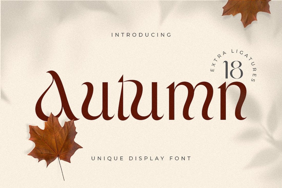
Autumn – Unique Fall Font

Autumn - Unique Fall Font

This is one of the most unique and elegant fonts on our list. It also features a classy letter design with an autumn-themed vibe that creates a beautiful look for your logos, branding, and various other typography designs. The font comes with lots of alternate characters to help you craft more original-looking text and logos.

Croffle – Playful Serif Fall-Themed Font

Croffle – Playful Serif Fall-Themed Font

Croffle is a serif font that features a retro-style letter design inspired by vintage typography. The font has a playful fall-themed design that allows you to evoke a cozy and nostalgic feel through different types of designs. It’s perfect for packaging designs, labels, posters, and much more.

Autumn Romans – Modern Fall Font

Autumn Romans - Modern Fall Font

This font comes with a simple and clean look that gives you the freedom to create many different types of typography designs. It has a flexible and versatile letter design with uneven strokes that will fit right in with everything from greeting cards to logo designs, poster titles, and even social media posts.

November – Fall-Themed Signature Script Font

November - Fall-Themed Signature Script Font

November is a cursive script font that comes with beautiful curves and a natural flowing design. It will make your seasonal marketing campaigns much prettier and more attractive. The font is also ideal for designing wedding invitations as well as quotes for social media and t-shirts.

Autumn Field – Handwriting Fall Font

Autumn Field - Handwriting Fall Font

The stylish signature-style handwriting letter design gives this font a very professional and classy feel. It also uses autumn as its theme to create that same cozy and warm vibe. It has uppercase and lowercase letters with lots of alternates and stylistic characters, making it a total of over 350 glyphs.

Cotta – Free Elegant Fall Font

Cotta - Free Elegant Fall Font

Cotta isn’t exactly a fall font but it has all the elements to be the perfect fall-themed font. It has elegant curves, stylish serif letters, and a classy look to make your titles look much more attractive. The font is free for personal and commercial use.

Roses Bolero – Free Fall Font

Roses Bolero - Free Fall Font

This font is also free to download. It has an elegant letter design with unique strokes and lines. The font is ideal for bold titles and headings. The font is free to use with commercial projects.

Falling Dried – Modern Autumn Font

Falling Dried - Modern Autumn Font

Falling Dried is not just another autumn font. It actually has a clean and minimalist design that makes the font much more suitable for modern branding and graphic design projects such as event invitations, logos, and magazine covers. The tall and narrow lettering is what gives this font its own identity.

Savo Bawdy – Cursive Fall-Themed Font

Savo Bawdy - Cursive Fall-Themed Font

Savo Bawdy is a cursive script font featuring a handcrafted letter design. It has a unique and playful look with a mix of the fall season vibes across all of its characters. The font is ideal for wedding invitations, greeting cards, packaging designs, and other graphic design projects.

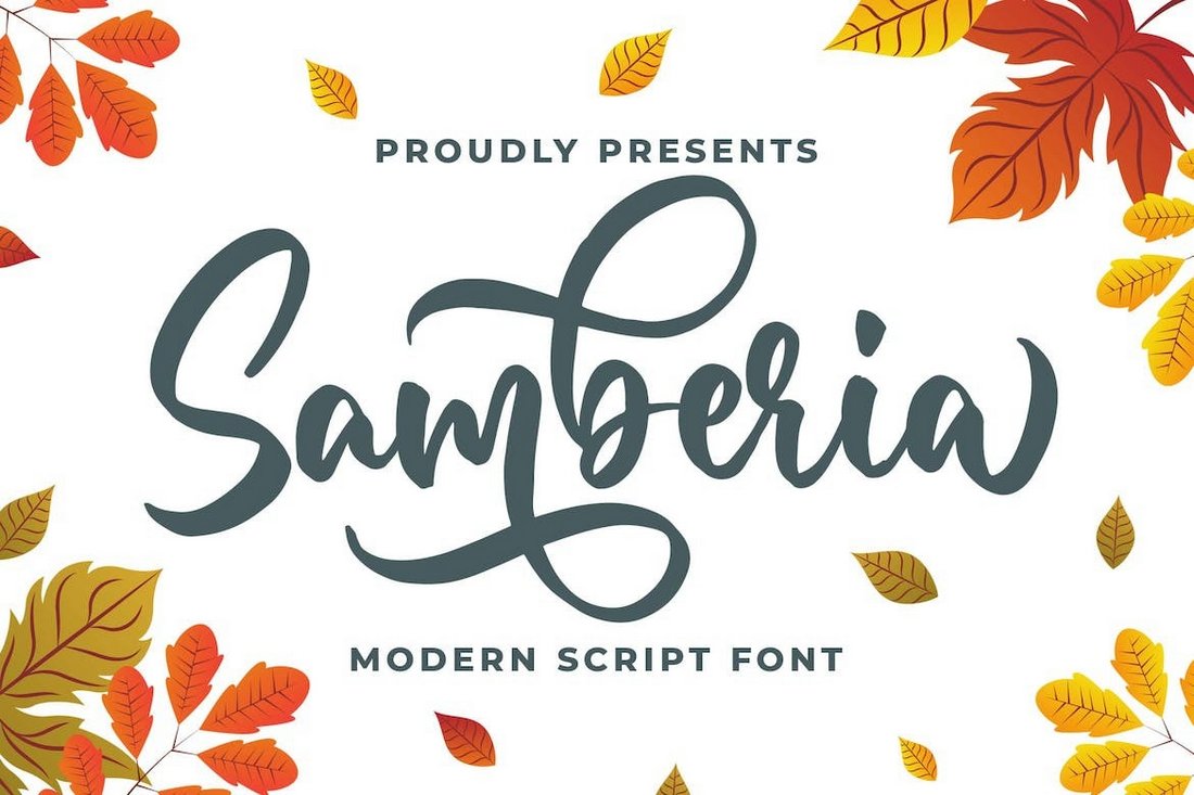
Samberia – Modern Script Fall Font

Samberia - Modern Script Fall Font

If you’re looking for a modern script font for a fall-themed design, this font is perfect for your project. It features a modern calligraphy-style letter design that is ideal for all sorts of fall season designs, especially for fall fashion and clothing brands, invitations, flyers, and more.

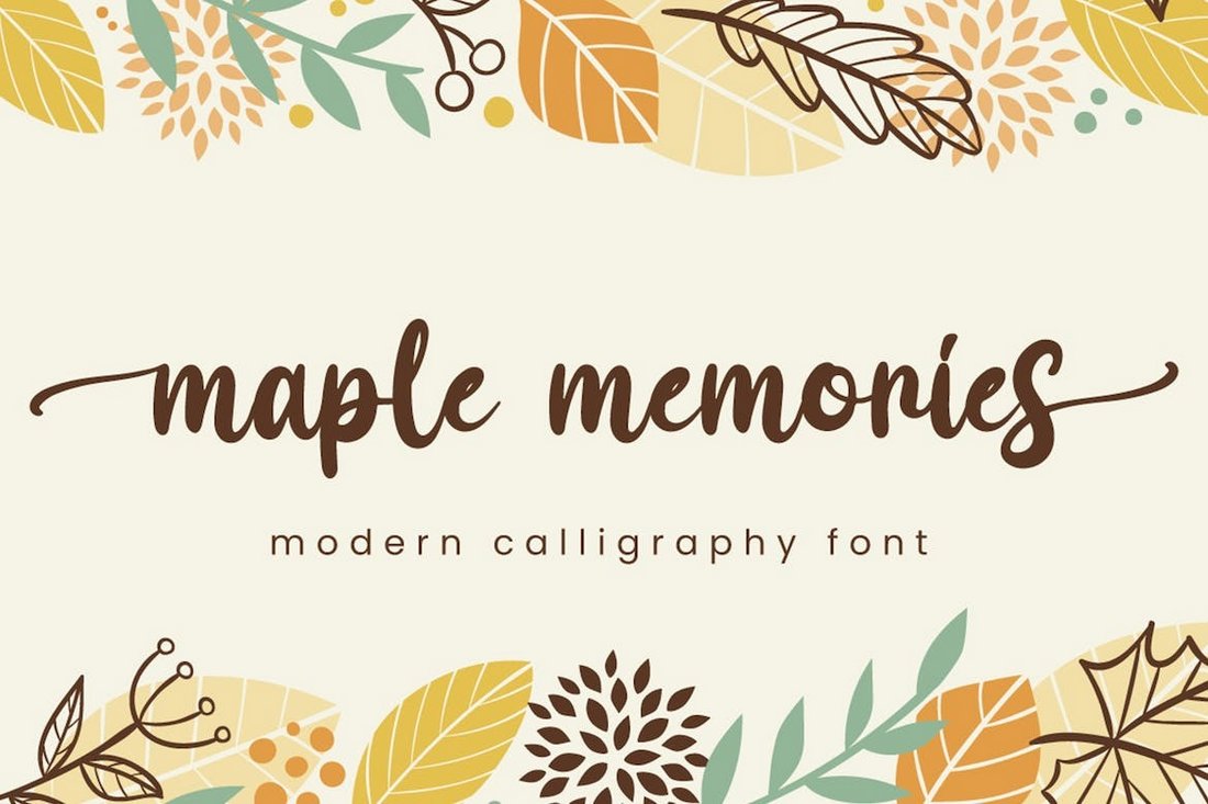
Maple Memories – Autumn-Themed Script Font

Maple Memories - Autumn-Themed Script Font

Maple Memories features the perfect look for designing beautiful and romantic greeting cards and wedding invitations. The font features smooth calligraphy handwritten letters that will give a personalized look to your typography designs. The font includes swashes and extensive multilingual support as well.

Fall Season – Handwritten Autumn Font

Fall Season – Handwritten Autumn Font

A simple, clean, and minimal fall font with tall and narrow letters. This handwritten font will make sure your autumn-themed designs look more playful as well as elegant. It includes both uppercase and lowercase letters with ligatures and alternate characters.

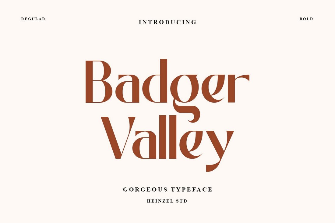
Badger Valley – Free Autumn Font

Badger Valley - Free Autumn Font

Badger Valley is a free autumn-themed font you can use to add a gorgeous look to your title designs. The font is great for promotional campaigns, posters, and advertisements too. It’s free for personal use only.

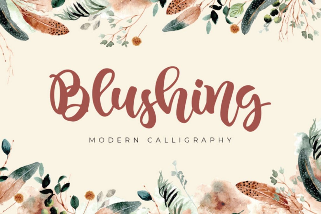
Blushing – Free Autumn Font

Blushing - Free Autumn Font

This free font has a cute and trendy letter design that has a modern look and feel. It’s ideal for calligraphy-style typography designs. The font is free to use with personal projects.

Billy Holiday – Handwritten Autumn Font

Billy Holiday - Handwritten Autumn Font

Billy Holiday is an autumn-themed handwritten font that you can also use as a signature font for crafting beautiful logos, business cards, and product labels. It’s especially perfect for fall fashion designs, seasonal promos, and packaging designs too.

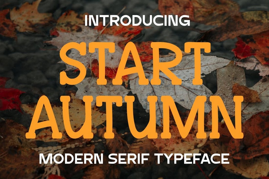
Start Autumn – Playful Fall Font

Start Autumn - Playful Fall Font

This font comes with a very fun and playful letter design that accurately represents the theme of the fall season. It has serif letters with thick strokes that are made for crafting big titles and headings. The font is ideal for poster titles, festival banners, flyers, and everything in between.

Zaida Autumn – Beauty Autumn Font

Zaida Autumn - Beauty Autumn Font

The classy and elegant look of this font makes it easily stand out from the crowd. It has very unique strokes with smooth curves. You can use it to design all sorts of fall-themed typography, especially for fashion and beauty brands.

Thankful Sunday – Fall-Themed Font Duo

Thankful Sunday - Fall Themed Font Duo

Thankful Sunday is a pair of fall-themed fonts. It includes a casual sans serif font and a playful script font. As a bonus, it comes with lots of doodles featuring all sorts of fall-themed illustrations. You can combine them together with the font duo to create unique designs.

Cute Maple – Adorable Fall Font

Cute Maple - Adorable Fall Font

This is arguably the cutest font on our list. It has a fun and adorable letter design that is especially suitable for kids-themed design projects. You can use it for greeting cards, school posters, festivals, and more.

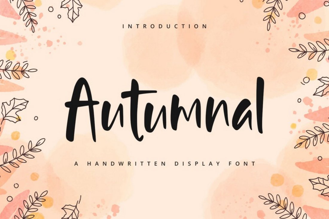
Autumnal – Free Fall Font

Autumnal - Free Fall Font

Autumnal is a free fall-themed font with a fun handwritten letter design. It has uneven strokes with a true hand-crafted look. The font is perfect for custom t-shirts, labels, posters, and packaging designs. It’s free for personal use.

Better Autumn – Free Fall Font

Better Autumn - Free Fall Font

You can download this for free to craft playful titles and cute headings for your autumn-themed designs. The font has unique characters with fun shapes as well. You can use it freely with your personal projects.

Savor Fall – Creative Autumn Font

Savor Fall - Creative Autumn Font

Savor Fall is a creative autumn-style font with thick letters. This font is most suitable for crafting big and bold titles, especially for banners and posters. It’s ideal for promoting fall festivals and events too.

Pear Leaves – Autumn-Themed Font

Pear Leaves - Autumn Themed Font

A lovely script font with an autumn-themed letter design. This font has a hand-crafted look that will give a more personalized look to your text and titles. You can use it to design greeting cards and invitations with a more human touch.

Warm Autumn – Cute Fall Font

Warm Autumn - Cute Fall Font

This fall font captures the true fun and warm feeling of the season through its cute and friendly character design. This is a handwritten font that comes with a versatile look that will fit in with everything from logo designs to fall catalogs and more.

My Autumn – Fall-Themed Handwriting Font

My Autumn - Fall-Themed Handwriting Font

Even though it’s not exactly a fall-themed font, we love the handwriting design of its letters. This font is perfect for crafting business cards, logos, and various other branding designs. It includes swashes and multilingual support.

Turning Leaf – Fall Title Font

Turning Leaf - Fall Title Font

Turning Leaf is a bold title font that comes with block letters. It’s great for crafting big titles for posters and banners, especially for fall-themed events and festivals. The font includes a set of all-caps letters.

Autumn Wind – Signature Script Fall Font

Autumn Wind - Signature Script Fall Font

A beautiful signature-style script font for professional typography designs. While it has the right look for branding designs you can also use it to promote your fall fashion trends, new clothing lineups, and seasonal offers too.

For more great fonts, check out our best luxury and elegant fonts collection.

How to Use AI Personalization Tactics to Scale Marketing Growth

Featured Imgs 23

AI is better at guessing at scale than humans but how do you integrate it into your growth marketing plan while maintaining a personal touch?

As businesses grow, marketing teams often find themselves caught in a balancing act: scaling their efforts to reach more customers, while still trying to maintain the campaign personalization strategies that drove customer engagement and interest in the first place.

Download Now: The Annual State of Artificial Intelligence in 2024 [Free Report]

As Kieran and I discuss in a recent episode of Marketing Against the Grain, however, the larger the audience, the harder it becomes to consistently deliver targeted interactions. This often results in generic messaging, missed market opportunities, and diminishing conversions.

So what can companies do to ensure their marketing strategy stays relevant and impactful as they scale?

We believe the solution lies in AI personalization tactics, which enable businesses to analyze and interpret vast amounts of customer interactions across large datasets. AI personalization can lead to higher user engagement, smarter segmentation, and increased campaign efficiency.

How to Use AI Personalization Tactics to Scale Marketing Growth

Here are our top three recommendations about how to use AI personalization to scale marketing growth — plus tips and resources for getting started today.

1. Build Detailed Ideal Customer Profiles

A key way AI personalization tools help marketers scale is by creating incredibly detailed Ideal Customer Profiles (ICPs).

For example, tools like Scout AI and Humantic AI combine internal data, like customer behaviors and preferences, with external data sources like Google search, LinkedIn contacts, and paid ad performance — and then use those insights to generate a detailed ICP tailored to your business needs.

From there, you can build your own proprietary contact database filled with leads that align with this profile.

Once your ICP and contact database are in place, these personalization tools take things a step further by crafting targeted outreach strategies, including dynamic content suggestions, paid ads, and email campaigns that align directly with your ideal customers.

As a result, marketing and sales teams can concentrate on the most relevant, high-value prospects, making demand generation more efficient and scalable.

2. Tailor Content and Messaging With Real-Time Data

A second way AI personalization tools support marketing scalability is by processing real-time user data — browsing behavior, previous purchases, location — and adjusting marketing content and messaging based on these insights for individual customers.

“AI has elevated us from segment personalization to one-to-one personalization,” Kieran explains.

For example, tools like ChatSpot AI, 6Sense, and Clay integrate with CRM platforms like HubSpot, allowing marketing teams to analyze real-time customer data and then refine the angle of their campaign pitch, email messages, or creative assets. This dynamic approach ensures that every interaction is timely and relevant to the customer’s current needs.

As Kieran puts it, “We are transitioning from the traffic acquisition era to the attention acquisition era.” This shift makes tailored content and messaging all the more critical for quickly capturing customer loyalty — and differentiating your business from the competition.

3. Accelerate and Amplify Creative Content

A third way that AI supercharges marketing growth is by identifying what creative content works well, automating its creation and templatization, and accelerating iterations and testing.

For example, AI tools can ingest keyword data and analyze the content that currently ranks for those keywords. It then breaks down why that content is performing well and offers recommendations on how to replicate and improve upon it.

From there, artificial intelligence allows marketing teams to rapidly test these creative templates at scale, with AI re-ingesting both internal and external data to continuously refine its recommendations.

Many AI tools also have built-in analytics. This helps you identify what’s performing best over time and find fresh ideas to ensure your creative strategy is in sync with what resonates with your audience.

To watch the full episode about how to use AI to scale your marketing efforts, check out the full episode of Marketing Against the Grain below:

This blog series is in partnership with Marketing Against the Grain, the video podcast. It digs deeper into ideas shared by marketing leaders Kipp Bodnar (HubSpot’s CMO) and Kieran Flanagan (SVP, Marketing at HubSpot) as they unpack growth strategies and learn from standout founders and peers.

The Ultimate Guide to RFPs — All The Tips I Learned From Experts

Featured Imgs 23

This is the guide for you if you’re creating a request for a proposal (RFP) for the first time or if you want to improve your RFP process.

Download Now: Free RFP Templates

In this article, I’m diving into the specifics of what an RFP is, why you might need one, when to issue an RFP, and how to create your very first RFP today.

I’ve reached out to senior sales professionals, marketing leaders, and CEOs who are already using the RFP process. Want to learn from the best? Take note of their top tips for getting the most out of RFPs.

What exactly is an RFP?

Keep in mind that an RFP shouldn’t be confused with an RFQ. The RFP may also be used differently depending on the department.

Let’s first dig into the definition of an RFP.

When your company has a new (often large) project or one that’s more complex and requires a bit of outsourcing, an RFP can help you get the job done right the first time.

The RFP doc allows you to quickly uncover potential vendors' strengths and weaknesses in relation to your project without having to spend too much time hunting for them yourself.

RFPs can also give you a sneak peek into different strategies you may not have considered since each vendor will include their own unique action plan along with their bid.

And you’ll have this information before you ever have to commit to the vendor.

RFP vs. RFQ

An RFQ is a Request for Quotation, which differs slightly from an RFP.

The RFQ is just the quote. Companies solicit multiple price quotes from various vendors to compare services based on price alone. An RFQ does not detail anything other than price.

RFP includes a price quote along with several other specifics. While you’re still receiving a quote in an RFP, you’re also getting information on the timeline of completion, deliverable schedule, and the list of services provided as well.

You can go straight to the RFP phase if you want to, but some companies will submit the RFQ and then the RFP.

Maurice Harary is CEO and co-founder of The Bid Lab, a company that responds to RFP and grant responses for businesses and non-profit organizations. Harary recommends that companies are better off sending an RFQ before the RFP.

Harary says, “Never skip out on issuing an RFQ before you issue an RFP. Learn what makes a vendor qualified for the job before you issue that industry cattle call.”

Once you've issued, reviewed, and assessed responses from an RFQ, Harary says that teams should have a realistic idea of the requirements necessary to implement the desired solution. You can then tweak your RFP according to industry feedback before you post the official version of your request.

“When you do finally publish your RFP, you will have learned exactly which elements of the solution you need to stress to potential respondents up front —and, conversely, you‘ll know to be clear about what won’t work for your organization,” Harary notes.

From there, the resulting responses will be more relevant and tailored according to the guidelines you established in the RFP and RFQ. And, Harary says, “Since you issued that RFQ, you'll probably also have a better rate of responses to boot.”

What is an RFP in marketing?

In Marketing, an RFP is often used to outsource marketing activities.

If you work at a small startup, you might create an RFP to find a full-service communications and marketing firm to create an integrated marketing plan for your business. A successful marketing RFP would outline that you're looking for a firm to help you “increase SEO presence” or “attract social media followers,” etc.

What is an RFP in sales?

In sales, an RFP is often created when a business is looking to purchase a product or service to suit its needs. For instance, if an enterprise company is looking for new CRM software, the business might release an RFP that outlines what it's looking for and what it hopes to achieve with the new CRM software.

RFPs can play a critical role in the enterprise sales cycle. Enterprise companies that issue RFPs often look for businesses that can provide them with IT support, security, onboarding and training, and other services.

Why issue a request for proposal?

Let’s briefly compare these two scenarios:

  • Option #1: Spend time finding the perfect vendor on your own.
  • Option #2: Use an RFP to get potential vendors to come to you.

If you choose the first route, you’ll probably use your coworkers, friends, and networking groups to solicit possible job referrals.

Or, you might search Google to check out the top vendors in your area.

After you review the website of a possible candidate for the job, you’ll craft the perfect message to reach out and learn if they can even help.

Then, you’ll have to explain the specifics of your project, and you may or may not ask them to submit a proposal before choosing them for your project.

It’s not a complicated process, but you’d have to repeat it for every promising referral or vendor you come across.

Imagine how long that’s going to take!

Now, what if these potential contractors already knew your project details and they came back with their best plan of action and a formal bid for you to review?

Instead of having to explain your needs each time, you would simply outline it once and send it out to the masses.

And to save you even more time, it would be up to potential contractors — not you — to reach out.

RFP Benefits

While creating an RFP will require time up front, it’s certainly worth doing the legwork. Benefits of creating an RFP include:

  • Saving you time. As explained in the scenarios above, an RFP saves you tons of time when doing vendor outreach. Instead, you can create one RFP document, publish it, and have the vendors come to you.
  • Expanding your network. When doing the outreach yourself, you’re most likely to stay within your own network, relying on referrals. While referrals are great, publishing an RFP online allows you to reach a much larger swath of vendors.
  • Offering vetted solutions. The RFP route also gives you a sneak peek into each vendor’s real plan of action, not the one they talk you into over the phone or in person. Since potential candidates have to submit a formal bid, they’ll need to spend time outlining the solution and really working through the problem at hand.

With RFPs you have an easy way to weed out vendors and cut through the stack of options fairly quickly.

But, to get to this point, you have to avoid one major pitfall: timing.

When to Issue an RFP

You will issue an RFP when your company needs a product or service from an external vendor.

It’s ideal for you to issue the RFP in good time before you’re desperate to complete the work. While the RFP process is simple, you must take your time in the early phases (research and scope) to get the best out of it — more on this in the section below.

Outside of your research, account for respondent time and onboarding your new service provider or product.

For respondent time, according to Loopio, the majority of respondents will reply within ten days, but 29% of respondents will take eleven days or more. If you want to catch the majority of respondents, you might want to wait for two weeks before making your shortlist.
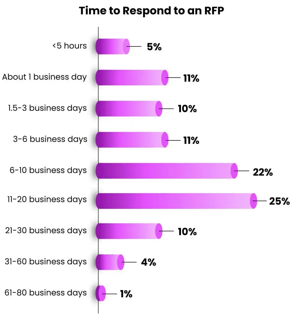
Loopio’s graph shows how long respondents take to reply to an rfp by percentage.

Image Source

RFP Use Cases

If you’re still unsure if the RFP process is right for you, let’s look at some use cases of when you might submit an RFP.

Technology Procurement

You might be ready to expand your tech stack; perhaps you want one piece of technology to solve multiple problems.

However, researching the technology available is going to be incredibly time-consuming, and you might be left unsure about whether or not the tech you’re researching does what you want it to.

An RFP will bring technology providers to you, and they’ll respond only when their tech can help you.

Marketing and Advertising Services

Marketing and advertising services are often sourced through the RFP process. There are endless agencies that can support you. The RFP gathers information that allows you to compare them against a range of suppliers quickly and easily.

You can request proposals for a range of services, including but not limited to branding, advertising campaigns, social media strategy, or web design services.

Event Management

If you’re hosting a large conference, trade shows, or corporate events, you might prefer to outsource the management to a vendor. It’s not uncommon for companies to issue RFPs to event management firms or venues.

Truly, you can use the RFP process for anything! Now, I’ll explain how the process works.

The RFP Process Explained

Before potential bidders can submit their proposals, the company must draft an RFP requesting the work. The RFP gives potential contractors everything your company is looking for so they can respond.

Once your RFP is sent out, contractors or vendors will find it. Vendors interested in pitching for work via RFPs are always on the lookout for the right opportunities.

The process is generally quite competitive, and companies wishing to close larger accounts via RFP must have a team prepared for the response process. It’s a sophisticated process that requires efficiency.

In your RFP, you can ask for anything you like, but generally, you’d at least ask for

  • An action plan to solve your issue
  • A timeline of what you can expect
  • Any necessary background information
  • How much entire project will cost

Next, I’ll break down the process of creating the perfect RFP.

5 RFP Stages to Get the Best Bids

1. Assess what you need.

Before you draft an RFP, you’ll need to do a bit of preparation to figure out what you need and what you’d like to accomplish. You will likely need to speak with your internal team about expectations.

You may also want to conduct competitor and industry research to evaluate your position. This research may help you see things differently and expand on your RFP requirements.

Ultimately, you want to treat the RFP as the most comprehensive brief. Any upfront research will help you.

This process will help you define your goals and project scope. You may also discover potential roadblocks you can resolve before your new service provider is onboarded.

Top tip: Be very detailed about what you want. Remember the differences between the RFQ and RFP. The RFP is more thorough and asks a lot from vendors. According to Loopio, it takes the majority of respondents 30 hours to complete an RFP. Let this give you a gauge of how much you can ask for.

2. List any technical specifications.

Including technical specifications up front in your RFP allows vendors to determine whether or not they can provide what you need.

This also protects your business because if a vendor agrees that they can meet your specifications initially but fails to deliver once they’ve taken on the project, you can hold them accountable to the specifications listed in the RFP.

3. Distribute the RFP.

Once the RFP is written, it’s time to send it out. There are many ways to distribute an RFP.

You can:

  • Publish it on your website and create a specific landing page.
  • Leverage any industry-related professional groups you’re a member of and advertise it there.
  • Utilize your local chamber of commerce, which is also an excellent place to advertise your RFP if you’d prefer to work with a local vendor.
  • Use online RFP portals.

Early in the RFP process, bidders may request adjustments based on their industry experience. At this point, you can either review their feedback and create a new RFP to accommodate the changes, or you can leave the original as is and consider it while considering the other submitted bids.

It’s worth noting that aforementioned expert Maurice Harary warns, “If you‘re receiving a deluge of questions from vendors, or you’re seeing huge differences in cost estimates from vendor to vendor, then your RFP wasn't well-understood.”

4. Evaluate your offers.

Once you receive all the proposals, it will be almost effortless to compare each and determine which vendor best fits your company.

Out of the stack of bidders, you’ll want to narrow this down to a handful of your top three, five, or 10 favorites to consider, depending on how many you receive or are interested in. From here, you’ll want to spend time vetting potential vendors further to determine who’s really the ideal fit for the job.

Top Tip: Don’t rush to choose a vendor. Respondents will reply in their own time, with some taking more time than others. Though the early respondents may not be the best, it’s fair to say an early reply may be an indicator of efficiency, which might be important to you.

5. Select the best vendor for the job.

Some companies may request one more best and final offer from their top vendors after they’ve started this negotiation process to ensure they’re getting the right person or company for the job and at the right price.

While this may sound like an extra step, it could save you money, time, and headaches down the road.

But this also leads us to a big question: Is all of this really necessary?

How to Write an RFP

Here’s the basic structure of an RFP and what to include in yours:

1. Project Overview

Before you go into the company specifics, you should give a brief introduction to the project itself so vendors know right away if it’s something worth bidding on.

Don’t get too carried away in the overview. There are dedicated places for elaboration, such as the ‘goals’ or ‘project scope’ section. For now, your overview should be concise.

Max DesMarais, Director of Strategy at Vital Design, receives dozens of RFPs each month. He recommends "an overview section with bulleted or key-listed information about timelines, budgets, response format, and scope.”

2. Company Background

This shouldn’t be a long history of your company. Rather, it should give contractors context.

You want to focus on the most relevant details. For example, the sector your company operates in, the company's core values, the types of clients or customers you serve.

3. Project Goals

Ideally, you will be able to clearly identify what you want to accomplish with this project and what a successful project looks like for you.

This information will help vendors understand your needs exactly and help them determine if they’re a good fit to work with you. Clearly identifying your needs will also help vendors with costs.

Sometimes, those writing the RFP don’t know the solution in its entirety. Perhaps it’s a technical solution. You should exhaust your company's internal knowledge first; speak to your peers and see what you can pull together.

In circumstances where there are gaps, Alex Wilson, marketing director at pixelframe Design, has a great tip.

“If you don't know the specific solution required, describe the problem that needs solving,” Wilson says.

According to Wilson, a frequent challenge in responding to RFPs is having to determine what the client really needs versus what they're asking for.

“If you skip the research phase of crafting your RFP, you may be asking for services that don‘t properly solve your issue, and if you haven’t properly outlined the problem, the agency won't be able to help guide you,” says Wilson.

This is excellent advice from Wilson because it allows you to be descriptive of what you want without the need to lay it out exactly.

4. Project Scope

The details of the project are essential in an RFP. Spend time detailing your project scope so there are no surprises later on. Remember, you’re looking to provide an RFP that will take ten hours to complete. It needs to be detailed.

The project scope wants to be as detailed as it needs to be but concise.

Dan Christensen, owner, CEO, and founder at DJC Law, has some great advice when it comes to streamlining the RFP process without sacrificing detail.

He says, “Be as clear and detailed as possible in the requirements while also keeping it focused. Outline exactly what you need, why you need it, and the criteria that will be used to evaluate responses.”

According to Christensen, RFPs are often vague, leaving respondents to make assumptions and requiring lengthy and unfocused responses.

“A tightly defined and well-structured RFP allows respondents to provide the right information efficiently. I recommend dividing requirements into must-haves versus nice-to-haves, being very specific on timelines, deliverables, performance metrics, and providing respondents with any templates or formats you want responses in,” Christensen says.

5. Target Deliverable Schedule

Even if your deadlines aren’t super tight, you should still have a target deliverable schedule in mind. This needs to be included in your RFP so potential vendors can properly gauge if they have the resources and bandwidth to complete the job on time.

When you set your deliverable schedule, you must consider the RFP process.

Jakub Kozlowski, Sales Manager at People for Pools, says, “Establishing a clear timeline, allowing for questions and clarifications, and providing structured evaluation criteria can streamline the process and ensure a more efficient review of the proposals.”

I like how Kozlowski has specified “allowing for questions and clarifications.” In my experience, there is always a problem to solve, and Kozlowski reminds us to consider the things that we might not expect or account for.

6. Possible Roadblocks

Don’t hide your existing or potential issues under the proverbial rug if you want them to disappear.

A successful RFP is explicitly clear about any technical issues or possible roadblocks, such as: Are you dealing with custom coding or an outdated platform? Does your team have limited resources?

By explaining this upfront, potential vendors will know exactly what they’re getting into.

You’ll also naturally weed out contractors who can’t handle the task due to those constraints.

But you’ll also connect with companies that know how to work around these common issues with skill and finesse.

Remember, it’s far better to find this out now than after you’ve accepted the bid and started work.

7. Budget Constraints

It’s important to be upfront with your budget. This looks better for potential vendors because they know they’re not wasting time responding.

Alex Wilson of pixelframe Design warns that not including a budget could result in your RFP being skipped altogether. Wilson says, “Include a budget. A range is fine, but not including a price at all makes your RFP much more likely to be skipped.”

It’s not just about setting the budget but being upfront with the scope in the steps above so the respondents can see what’s involved and how to price. A thorough RFP will help with budgeting and prevent surprises later.

Reyansh Mestry, Head of Marketing at TopSource Worldwide, says, “By prioritizing deliverables and outcomes in our project proposals, we've ensured that vendors concentrate on what really matters — achieving our desired results. This focus has helped us avoid unnecessary complexity and kept the project aligned with our strategic goals.

Vendors who understand the importance of outcomes are more likely to propose solutions that are tailored to our specific needs, leading to greater efficiency and effectiveness in project execution. The clarity provided by this approach has also reduced misunderstandings and scope creep, allowing us to stay within budget and timeline constraints.”

The more information upfront, the more likely your vendor can provide you with a price that a) meets your budget and b) meets the price with the full scope.

8. What You’re Looking For in Potential Vendors

Another way to reduce or eliminate surprises is to explain exactly what you’re looking for in potential contractors.

All you have to do is outline what matters most to your project (i.e., time, solution, budget, etc.) and show how you’ll evaluate their proposals.

Brett Ungashick, CEO and CHRO of OutSail, has some advice on crafting your questions to vendors in a way that allows them space to demonstrate their USPs.

Ungashick uses RFP for software selection as an example. He says, “We avoid generic feature-based queries because most platforms have similar capabilities, which can result in nearly identical responses.”

“Instead, we ask about areas where there can be meaningful variation, such as cost structures, service models, innovation cycles, and product architecture. This approach not only streamlines the evaluation process by cutting down on redundant information but also draws out richer, more revealing responses that showcase each vendor's unique strengths and approaches.”

Sample Responses to RFPs

If you‘ve issued an RFP and are collecting responses, you might be wondering what you should look for in effective RFP responses. Here, let’s look at a few examples of impressive RFP sample responses.

Example One: General RFP Response for Web Design Services

Dear [author of RFP]:

Regarding your request for proposal (RFP), [our company] is thrilled about the opportunity to provide you web design services. Having worked with [brief list of past clients], we believe a partnership with [company you're writing to] would have a tremendous impact on your customer satisfaction and bottom line.

As one of [client‘s industry] leading providers of [client’s main service], you know just how critical this time of year can be for your customers. On average, the cost to deliver is $[xxxx.xx], and [client name] is committed to “[client's mission statement].”

As these challenges become more common, it is increasingly important to provide customers with a powerful, SEO-optimized website to attract new leads. With this in mind, [our company] intends to help [client's name]:

  • Create a sleek, impressive website that is clean, user-friendly and mobile responsive to work on all devices, so web viewers have a strong first impression of your brand regardless of the device they use to find you.
  • Help you strengthen brand identity through a new logo and a new, cohesive color palette.
  • Ensure each of your web pages are SEO-optimized to rank quickly, which will attract new customers to your website and demonstrate your leadership in the industry.

As stated in the executive summary, [our company] intends to help [client‘s name] [brief allusion to client benefits outlined in executive summary]. To do this, our team has outlined a proposed set of deliverables, an order of operations, division of labor, and expected dates of completion to ensure the partnership between [your company] and [client’s name] is successful.

[Your company] can‘t wait to work with you to help [client’s name] in addressing [client's challenges described in Executive Summary]. To recap, please see below a brief overview of the services included in this partnership.

This sample response clearly and succinctly explains how the vendor‘s service will solve the buyer’s critical pain points when it comes to creating a strong website.

By outlining the key benefits, you‘re showing the client how you’ll put them first and focus on their needs to get the job done.

Free and Editable RFP Template
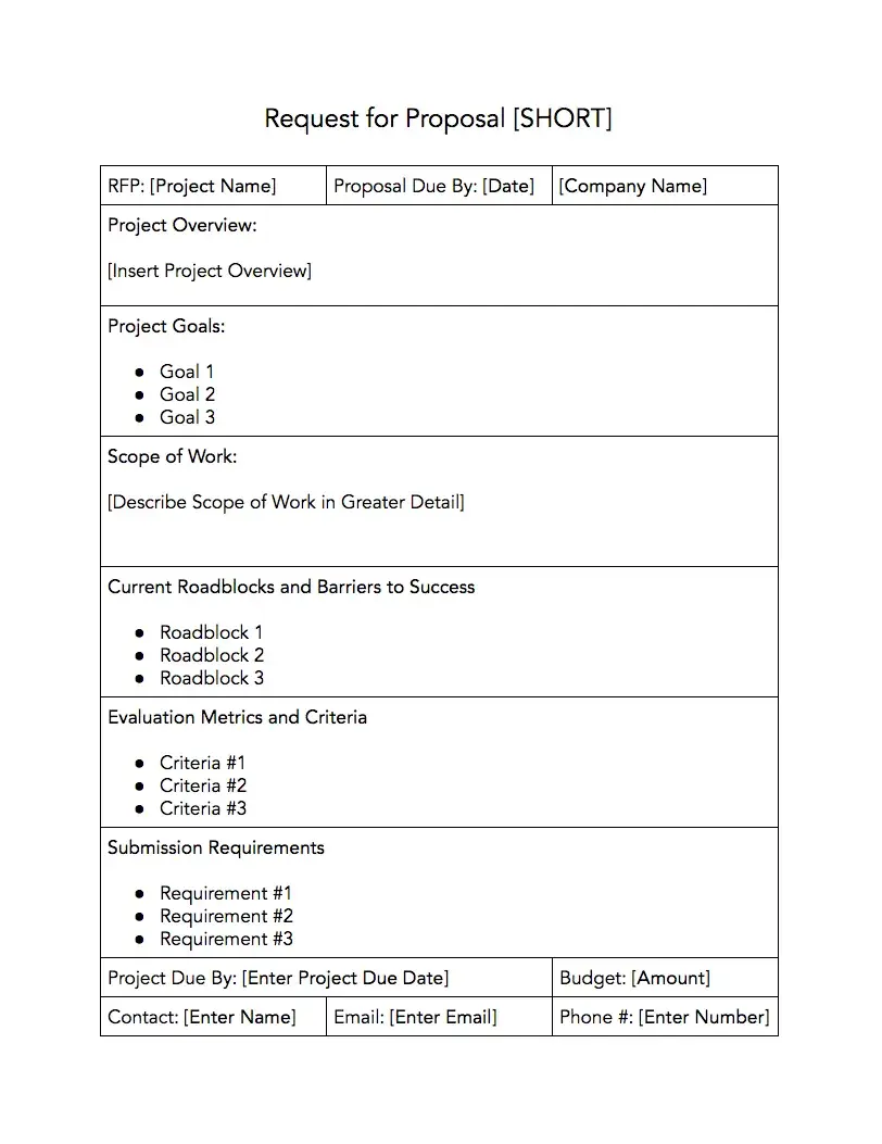
hubspot rfp template

Download a free, editable RFP template.

To use this template, simply download it here or fill out the form below.

You can remove sections or pieces of information that don’t pertain to your project and add whatever else you need for your RFPs.

You can also use this tried-and-tested proposal formula to ensure your RFP is professional and polished, too.

Proposal Software Tools to Help You Manage RFPs

For those responding to RFPs, there are amazing tools that help you manage and create professional-looking proposals in less time.

Below are five tools to improve your RFP response.
1. Responsive

screenshot from responsive’s homepage.

Image Source

Responsive solves the problem of responding to RFPs, from project management to collaboration to integrating with other software.

Their solution includes reporting dashboards, auto-response features, and automated generation of proactive proposals from within your CRM.

Responsive also includes an intelligent answer library that turns previous RFP responses into on-demand intelligence that empowers revenue teams with enterprise content at their fingertips wherever they work.

And what's better? Responsive has an integration with HubSpot that will automatically sync your RFP with your portal, making it easy to share information with your team.
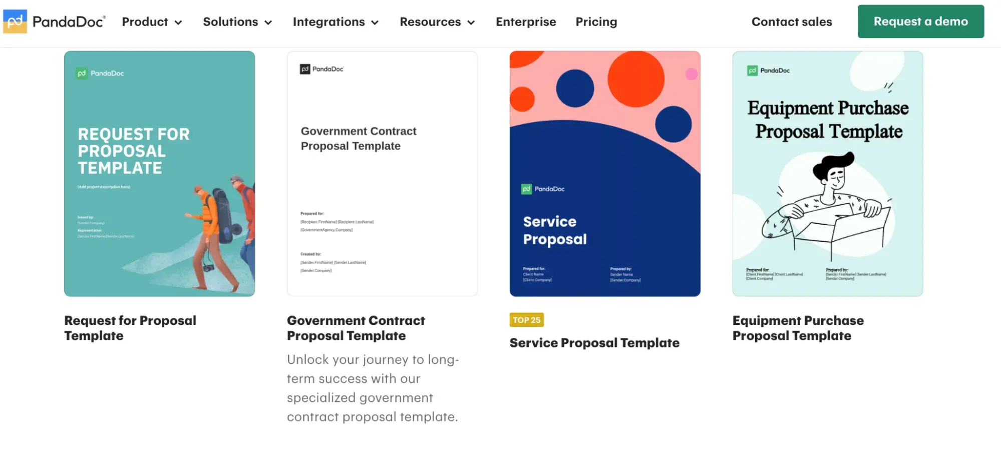
2. PandaDoc

screenshot from PandaDoc’s website.

Image Source

To create customized RFPs with your own branding, consider using the proposal software PandaDoc.

Here, you can set up your first RFP within minutes and even collaborate with team members using real-time updates in the document itself.
3. Nusii

screenshot from Nusii’s homepage.

Image Source

Similar to other proposal software on the market, Nusii uses a drag-and-drop editor that makes building RFPs a breeze — especially for beginners.

Thanks to its clean, modern, simple design, it’s also really easy to figure out.

One of Nusii's most helpful features is its ability to rework existing RFPs, which can save you time. You can copy the content from an RFP you like and edit the information to fit your new request.
4. Loopio

screenshot from Loopio’s homepage.

Image Source

How do you plan on organizing all the responses to your RFPs?

One standout feature withLoopiois its RFP response library, which gives you instant access to all your answers from previous RFPs. This saves you the hassle of digging around to find what you need in a crowded inbox.

Their magic feature will even help you auto-populate a response if it appears similar to one you've already done.

Plus, you can manage your entire RFP process — including sending automated responses — and collaborate with your team all in one place with their intuitive dashboard.

And if proposal tools are out of the budget right now, or if you’d like to try your hand at creating your own first, use one of these templates as a starting point.
5. Proposify

screenshot from Proposify’s homepage.

Image Source

Proposify makes creating proposals effortless. You can create proposal templates to reuse content and pages for future proposals; a great feature for pages and content that won’t change is your company overview, for example.

Proposify will alert you when your proposal has been viewed and allow recipients to sign digitally. It also offers analytics so you can see which pages are viewed and for how long. This data can be used to optimize your proposal template for maximum engagement.

Create an RFP With Ease

Now that you have a better idea of what an RFP is and how to create your first one, you’re ready to get started.

I recommend first sitting down with your team to narrow down your project’s specifics, goals, and scope of work. Then, determine when the project needs to be completed and your budget before moving on to the drafting phase.

With this intel, you’ll be ready to plug everything into our template.

Follow these steps, and you’ll have an RFP template you can quickly update. Your next project will be a success that much faster.

Editor's note: This post was originally published in August, 2018 and has been updated for comprehensiveness.

Why You Shouldn’t Buy Instagram Followers (& What Experts Say to Do Instead)

Featured Imgs 23

You might know your Instagram content is good, but imagine how much better it will seem if it looks like 10,000 people agree.

Whether you’re trying to become a social media celebrity or simply looking to spread brand awareness on Instagram, it can be tempting to take shortcuts wherever you can in order to expand your audience, including 'buying' Instagram followers.

New Data: Instagram Engagement Report [Free Download]

Here, I’m covering all the questions you have about buying Instagram followers.

I’ve also explored the pros and cons, so you can decide for yourself if it’s a good move for your brand.

Table of Contents

1,000 followers seems like a good deal for the price of a small Starbucks latte. But of course, if it really was that cheap and easy, everyone would be doing it.

So what’s the catch? Is buying Instagram followers legal and safe for your business? Is it a worthwhile investment? And how much do these fake followers cost anyway?

How much do Instagram followers cost?

The price you pay for Instagram followers can range from a few dollars to thousands, depending on how many you buy and how often you buy them.

I’ve seen a few websites offer different types of followers to purchase (like active profiles vs. bots), and the price differs for each. 

Remember that buying followers violates Instagram’s Community Guidelines, so the price you pay could be more than monetary.

Buying followers could cost you your Instagram account, at worst, and at a minimum, decrease in engagement and reach.

How to Buy Instagram Followers

The vast majority of purchasable followers are either bots or inactive accounts. Here's how it works:

The Fake Follower Vendors

Instagram has cracked down on accounts that violate its terms of service, but it’s still relatively easy to buy Instagram followers nowadays. 

You simply conduct a search, choose a vendor whose price range you like, and wait for it to deliver the bots—sorry, I mean followers—to your account.

I won’t link to any here because I don’t think you should buy Instagram followers, but if your final decision is to buy them, then a simple Google search will get you what you need. 

But what happens once you’ve paid for your followers?

Sellers roll out your followers over time to not alert Instagram that something fishy is going on (which is a red flag).

Assuming the vendor is legitimate (as legitimate as can be for this type of service) you’ll wait anywhere from a few minutes to a few days for your followers to trickle in. Some sellers let you pick a delivery schedule for your followers to arrive.

Once you have your brand new automated followers, I wouldn’t expect much. Engagement is not guaranteed (or even likely), and you’re mostly paying for a number despite having purchased them.

Instagram Bots

Instagram bots are everywhere, and some companies have automated the process of creating bots so well that they can sell them as followers. Bots might even assume the identity of a real person, using stolen images and names.

Some services might offer organic dummy accounts, running on automation to share and like content. Some might even produce content.

But, because they’re not really people, the follow-to-follower ratio will not look organic, and the engagement they produce will have little impact. 

Without real followers who engage, your posts are essentially hidden from everyone except your inauthentic audience.

Plus, your bot followers won’t discuss your brand with their friends or family because they don’t exist in real life (no offense, bots).

Inactive Accounts

Some companies sell followers in the form of genuine accounts managed by real people. Typically, their only goal is to get followed in return, so while they might engage initially, they’ll ultimately become dormant once they get a follow-back or simply go inactive. 

After all, if their account was created for the sole purpose of fulfilling sponsorship requests, the real person behind the account has little reason to dwell on the newsfeed, interact with content, or purchase the goods and services being advertised.

You’re left with inflated follower counts but none of the value that true organic followers will bring. 

Demographic Accounts

In addition to buying followers directly, you can also pay services to strategically follow other accounts on your behalf based on your preferences (location, hashtag usage, account type, and gender).

Ideally, those followed accounts will then follow you back.

With this option, your followers are more likely to be real people, but engagement is still unlikely. Since you can't even guarantee these accounts will follow you back, it’s a risky investment.

Most accounts won’t follow you back, and even if they do, they probably aren’t going to be long-term, loyal, or active followers.

Here’s how I can put it simply: any engagement you get from buying followers will taper off over time. 

Purchased Instagram followers also provide no long-term value to your profile's content or your Instagram marketing strategy.

You might get views, likes, and comments early on, but attention does nothing in terms of helping you understand and report on your Instagram performance. 

Engagement is also a key factor in how Instagram’s algorithm displays posts to users. Without likes or comments, real people probably won’t see your posts in their feed, especially not on Explore Pages. 

Below I’ll go over a few more reasons why I wouldn’t recommend buying Instagram followers.

1. You wont know if your content sucks. 

I know this sounds harsh, but it’s true: the worst thing about buying followers is that you won’t know if your content sucks.

Likes from fake followers don’t mean someone likes your content, and comments might not even be related to what you’ve posted. 

If a majority of your followers are bought, there’s a pretty good chance that the content you continue to share won’t meet the needs of or be interesting to your real human followers because fake accounts overshadow their engagement.

You might actually turn your real followers away if they get tired of seeing posts that aren’t relatable. 

With real followers, you can build an effective Instagram strategy that actually helps you meet your goals. You share content, see how followers interact with it and adjust to better meet their needs. The feedback you get from real people on Instagram is what helps you succeed on the app.

2. Fake followers could hurt your credibility.

A high follower count might convince users to follow you organically, but it’s not guaranteed. 

I tend to follow accounts if I like their content, not based on their number of followers. I wouldn’t be convinced to follow an account if I hated its posts but saw it had 1M followers. I’d decide it wasn’t for me and move along. 

Think of it this way: would you keep following an account if you saw that most of its “loyal audience” was made up of inactive accounts or bots? I’m guessing not. 

One of the biggest benefits to Instagram is being able to build trust, community, and relationships with your audience.

If people realize you have fake followers, you can damage that trust. You might lose real followers and risk people wondering if they should be skeptical of anything related to your brand/business overall.

3. Purchased Instagram followers can distort your performance metrics.

Tracking analytics is the only way to understand your success on Instagram, but with fake followers, you won’t get accurate measurements of your performance on Instagram.

Any ratios you have will inevitably be skewed if a high percentage of your audience isn’t real. 

And, when you don’t have accurate metrics, it’s harder to run effective social media campaigns that actually draw in users and convert followers. And isn’t that the point?

4. Instagram identifies and purges fake followers.

If you’re buying followers, you’re violating Instagram’s community guidelines, which read: “Help us stay spam-free by not artificially collecting likes, followers, or shares, posting repetitive comments or content, or repeatedly contacting people for commercial purposes without their consent…”

If you violate Community Guidelines, Instagram has the right to take action against your account, which can be anything from actually losing your account to getting suspended. 

While it doesn’t really take that long to buy Instagram followers, the time, energy, and money you’d spend on buying them is much better spent focusing on creating an Instagram marketing strategy that helps you interact and build genuine relationships with a real audience.

If your content is good, your loyal followers will engage with you, no bribes necessary.

Alternatives to Buying Instagram Followers

Looking for an alternative to buying Instagram Followers? Look no further than, well, creating an Instagram marketing strategy, and using good Instagram marketing practices. 

By doing both, you can better reach the nearly 2 billion monthly active users and build an authentic audience that gives authentic engagement. 

Here are some alternatives I suggest.

1. Make your account public.

First, make your account public so that users can see your profile and content. This way, you can grow your audience organically when your content pops up on users' explore pages, attracting and delighting your target viewership.

You can easily make your account public by unchecking the Private Account Box in your Privacy and Security settings.

How to make your account private on instagram

2. Engage with other Instagram users. 

Results from the Instagram Engagement Survey I ran found that, overall, marketers say the most effective strategy for growing your following. Interacting with your audience is also the most popular Instagram marketing strategy.

gain-instagram-followers-1

Image Source

Whether you like, comment, save, or share their posts, every interaction counts for you and them.

Instagram’s algorithm favors engagement, which means the more you interact (and the more people interact with you), the more likely it will be that your content appears on more news feeds.

That means more visibility and growth for your page.

It also pays off: marketers told me that interacting with your audience brings in the second-highest ROI of all strategies. 

strategies-ROI-1

Image Source

Engagement in Action

GoSimplified does a great job of responding to comments on its posts. This example shows that the comments don't have to be detailed or long, but a simple acknowledgment goes a long way for engagement.

Alternatives to Buying Instagram Followers: Engaging with comments featuring GoSimplified

Image Source

Pro tip: Before you go overboard, remember that Instagram does have a limit to this “rule.” There have been cases where the social media platform blocked users from engaging with content if they liked and commented on more than a few hundred posts in an hour.

3. Give users a reason to follow you by publishing quality content.

You really won’t gain followers unless you’re sharing high-quality content.

When it comes to the type of content to post, results from that same survey show that Instagram marketers most often share content that showcases a brand's products/services, funny content, and relatable/authentic content.

The top three remain the same regarding ROI (which includes engagement). 

Whatever type of content you choose to share, you can do it in the form of images, GIFs, Reels, videos, Boomerangs, quizzes on your story, how-tos, user-generated content (UGC), and so much more.

content-with-high-performance-2

Image Source

Depending on your brand personality, it can help to be funny or witty in your content, especially since consumers say funny content is the most memorable type of content brands can post on social media. 

Whatever kind of content you share, aim to build trust and excitement among your followers by using high-quality photos, writing catchy captions, posting consistently, and keeping up a unique style to differentiate yourself from other accounts. 

Overall, being aware of how your brand is perceived and the trends on Instagram will help you choose content to post and interact with your Instagram community.

Quality Content in Action

HeytonyTV became an overnight viral sensation during the pandemic when he released skits where he plays the role of a school administrator.

In a short period of time, he amassed hundreds of thousands of followers who couldn't get enough of his creativity and wholesome, nostalgic humor.

Alternatives to Buying Instagram Followers: Creating Quality Content Featuring HeyTonyTV

Image Source

You don't have to be a comedian to gain followers, though. Being relatable and providing value to your audience is the number one goal. When looking at the top Instagram posts of all time, the content is engaging and relatable, rallying followers to like, comment, and share these posts.

My pro tip: Most marketers use organic content over paid content and say that organic content is best for growing your following. Why not leverage their advice?

4. Set a regular posting schedule. 

In my survey, I also asked Instagram marketers for their top recommendation for gaining the first 1K followers on Instagram, and the number one result was setting a regular posting schedule.

This makes sense to me: the more content you share, the more visible you are, and the more visible you are, the more engagement you get, and so on. 

gain-first-1k-instagram-1

Image Source

To drive home the importance of posting consistently, those same marketers said that not posing enough is the #1 reason they’ve lost followers. 

lose-instagram-followers-1

Image Source

I understand that reaching the first 1K followers on Instagram can be challenging. It requires patience, as it most often takes 4 to 6 months for a brand to go from zero to 1K followers on Instagram.

It’s not a huge amount of time, but it is enough that I get why the alternative of buying followers is more appealing. But, as I mentioned, those fake followers bring in fake engagement, which doesn’t help you meet your goals.

5. Try Instagram Reels.

In terms of key engagement metrics, marketers told us that Reels shine in terms of getting reach/views and impressions.

This makes sense because Reels are known for increasing the reach of a post beyond the audience that already follows you. 

So, Reels are a great opportunity for your content to attract people who don’t follow you but already engage with similar posts. 

A bonus is that consumers care more that the content they see is authentic and relatable vs. having a high production value, so you don’t need an expensive camera and editing set up to start posting Reels. 

To get started, I recommend recording a simple video, adding a few relevant hashtags, and choosing a trending sound. Even if you don’t see an immediate bump in followers, consistency and monitoring view counts let you know how many people are watching and what people enjoy the most.

Reels in Action

Hickory Lane Home uses Reels to show her followers more relatable content that draws the viewer in. As a result, the comments are flooded with relatable responses and amusement that you just can't get from purchased followers.

Alternatives to Buying Instagram Followers: Using Instagram Reels featuring Hickory Lane Home

Image Source

6. Use Instagram stories.

The audience for Instagram stories is simply waiting and watching for the next viral video or meme to slide across their screens. What makes stories arguably even better for growth than the traditional Instagram feed is the ability for users to interact with the content in a story.

Polls, quizzes, and questions on Stories are engagement magnets — the more people interact with those elements, the more people Instagram will share your story with. Marketers who leverage Stories say they share them multiple times per week (33%) — 14% post multiple times per day.

Leverage their advice to get the most out of engagement when sharing Stories on your profile. 

Stories in Action

RMW.Home uses a series of stories to gauge her audience's taste in home decor. Not only does this help her understand her audience better, but the polls are also helping expand the reach of her story and her profile to potential followers.

Alternatives to Buying Instagram Followers: Using Instagram Stories featuring RMW.Home


7. Use Hashtags.

But don’t start adding random hashtags to all your content. You’ll need a hashtag strategy to target the right people.

Do research on which hashtags generate a lot of buzz and which are aligned with your brand. The key for hashtags is to be intentional.

Ideally, I recommend using a mix of broad and niche hashtags to reach your entire potential audience.

For example, a broad hashtag like #recipe can help you gain exposure, and one like #tacorecipe can help you meet a more specific audience. 

The maximum amount of hashtags you can use is 30, and the sweet spot for Instagram hashtags is between 6 and 11.

That might seem like a lot, but if you have a strategy for using them, you’ll likely find more than 30 that will work for you, and you can switch up the ones you use post-by-post. 

hashtags-used-1

Image Source

Hashtags in Action

Take a look at the hashtag #dogsofinstagram for example. With over a quarter of a million posts, this hashtag has the potential to reach a wide audience.Alternatives to Buying Instagram Followers: Using HashtagsHowever, it's a great idea to pair that hashtag with a smaller, niche one like #ridgebackpuppy to reach people who love your particular breed of dog.

Alternatives to Buying Instagram Followers: Using Niche Hashtags


8. Conduct market research.

Each of the alternatives we mentioned above is native to the Instagram app.

However, a solid Instagram strategy begins with comprehensive market research, and there's no shortcut to hearing directly from your audience about what content they want to see.

We also conduct our own market research to dive deep into Instagram and how it’s used. Here are some high-quality pieces I recommend reading: 

Market Research in Action

Stephanie Morgan, Founder and CEO at Social Lock stands by market research as an alternative to buying followers and says, "The alternative to buying followers is doing market research on what your ideal customer will resonate with, then posting that content in order to naturally accumulate [a] large following."

Check out her methods for conducting market research on Instagram in the image below.

Alternatives to Buying Instagram Followers: Market Research by Stephanie from Social Lock

Image Source

Can you buy Instagram followers? (& Other FAQs)

Can you buy Instagram followers?

You can buy followers on Instagram. 

But I wouldn’t recommend it. The followers you can buy are typically bots or inactive accounts, and 99% of the time, they don’t engage with the content you share. 

Is it illegal to buy Instagram followers?

It’s not illegal to buy Instagram followers, but it violates the community guidelines you agree to when signing up for an account.

A section of its guidelines says, “Help us stay spam-free by not artificially collecting likes, followers, or shares, posting repetitive comments or content, or repeatedly contacting people for commercial purposes without their consent.” 

Instagram monitors for community guidelines violations and says overstepping them can result in deleted content, your account being disabled, or other possible restrictions. Multiple violations can lead to account deletion. 

Will Instagram ban you for buying followers? 

Your Instagram account can be disabled (banned) for buying followers. Instagram wants to be spam-free, and it considers buying followers spammy behavior.

Violating guidelines leads to account restrictions (like losing access to features) or your account being disabled. 

Why would someone want to buy Instagram followers?

Someone trying to succeed on Instagram might turn to buy followers because a high follower count can lend credibility, and brands/accounts/influencers who are seen as trustworthy are more likely to gain followers.

The more followers you have (if they’re real), the more engagement you’ll have, and higher engagement is favored by the algorithm and brings even more visibility. 

How much do you pay for Instagram followers?

How much you pay for Instagram followers depends on where you buy them.

When I search ‘buy Instagram followers’ on Google, prices listed on the top result are $2.25 for 50 ‘real’ followers, or $1.50 for 50 ‘high quality’ followers.

Which I find funny because I would hope that, if I’m buying followers, they would be both real and high-quality. 

Can people tell if you buy Instagram followers?

I think it’s easy to tell if someone has bought Instagram followers because the ratios are off. They’ll have a high follower count, but the engagement (likes and comments) doesn’t match up.

For example, if an account has 10K followers but averages less than 200 likes per picture, it could be a sign that something is up.

There’s a Better Way to Grow on Instagram

Instagram has been one of the fastest-growing social media platforms for several years and shows no signs of slowing down anytime soon. 

I understand the pressure and temptation you might feel to keep up with growth by buying followers, but if you’ve made it to the conclusion, you can probably tell I don’t recommend buying Instagram followers. 

The repercussions are too great (you can lose your account entirely), and these fake followers don’t help you reach your desired engagement benchmarks.

The alternatives I mentioned above will help you navigate a path toward organic follower growth that's more valuable than 10,000 fake followers could ever be.

Editor's note: This post was originally published in March 2020 and has been updated for comprehensiveness.

Designing for Mental Health Week: Templates, Graphics & More

Featured Imgs 23

Mental Health Week is about encouraging open conversations and reducing stigma, and thoughtful design plays a key role in delivering that message effectively.

In this post, we bring you a collection of graphics and templates for designing more attractive posters, flyers, and banners related to World Mental Health Day. In addition to templates for flyers and posters, you’ll also find social media graphics and visual aids that can help spread awareness across different platforms.

From calming color schemes to approachable fonts, the templates featured in this collection are designed to capture attention while maintaining a compassionate tone.

Whether you’re aiming for something bold and eye-catching or subtle and soothing, these templates offer a variety of styles to suit your event’s needs.

Mental Health Day Flyer Template

Mental Health Day Flyer Template

This is a professionally prepared digital asset designed for crafting flyers to spread awareness for World Mental Health Day. It comes neatly arranged with easy-to-edit layouts, making it ideal for projects around mental health. This A4-sized template includes multiple files in AI and EPS formats and comes with Instagram post and story options, although images are not included.

Creative Mental Health Day Flyer

Creative Mental Health Day Flyer

Another creative flyer template designed for efficiently creating eye-catching mental health-related materials. With options for print and digital use, this package comes with customizable Adobe Illustrator, Photoshop, and EPS files. The flyer displays your information clearly and connects with your audience on Instagram.

Mental Health Week Flyer Template

Mental Health Week Flyer Template

This template allows you to easily promote your event with its clear and efficient design. It’s fully customizable, featuring easy text and image replacement. It comes with Instagram posts and story variations for effective social media outreach. Along with the template, you get Adobe Illustrator, Adobe Photoshop, and EPS files for advanced users.

Mental Health Event Poster Template

Mental Health Event Poster Template

This is a fully customizable template compatible with Adobe Photoshop and Illustrator. It transforms flyers into cool, enjoyable visuals. The template features layered Photoshop and Ai CC Files, smart object photos, a 3mm bleed setting, A4 print size, 300 DPI, and CMYK color mode. It also offers a free font.

Mental Health Day Flyer Ai & EPS Template

Mental Health Day Flyer Ai & EPS Template

An elegantly organized and easy-to-customize flyer perfect for conveying crucial information to your audience. This versatile design is available in international A3 and A4 sizes, 300 DPI CMYK with included bleed, and comes in Ai and EPS formats with alternate colors.

World Mental Health Day Poster Template

World Mental Health Day Poster Template

This is a versatile template for creating compelling mental health week flyers. Ideal for use with Adobe Photoshop or Illustrator, it’s customizable and straightforward to use, featuring smart object photos, a 3mm bleed setting, and a free font link. Designed in A4 print size with 300 DPI and CMYK color mode, this template makes creating appealing mental health awareness materials a breeze.

Modern Mental Health Day Flyer

Modern Mental Health Day Flyer

A convenient solution for conveying information to an audience. It includes a neatly laid out, easily editable flyer template that is compatible with both Ai and EPS formats, available in A3 and A4 sizes with alternative colors. Features such as well-organized layers, customizable design, free fonts, and more.

Simple Mental Health Day Flyer

Simple Mental Health Day Flyer

This is a versatile and user-friendly flyer template, perfect for your World Mental Health Day campaign. Compatible with Adobe Illustrator and Photoshop, it features a fully editable, 100% vector illustration and supports .EPS 10 and CC files. Provided in A4 size with CMYK color at 300 DPI, it’s print-ready and comes with documentation.

Retro World Mental Health Flyer Template

Retro World Mental Health Flyer Template

A professionally designed, easy-to-customize flyer template emphasizing mental health awareness. With its vintage vibe, the template provides AI & PSD files, 300 dpi CMYK resolution for print quality, editable fonts, and effortless color changeability. The layers are well-organized and the used fonts are noted for user convenience.

Mental Healthy Flyer & Instagram Post

Mental Healthy Flyer & Instagram Post

This is an editable, multipurpose flyer template suitable for various mediums such as social media posts, event covers, posters, or health seminars. Cleverly designed for the World Mental Health Day Event, it’s presented in a clean, minimalist style that’s easy to customize. It offers seamless resizing, inclusive of A4 and 1080x1080px Instagram Post sizes, and is print-ready with its CMYK 300 DPI setting.

World Mental Health Day Flyer Set

World Mental Health Day Flyer Set

This is a suite of customizable templates perfect for enhancing mental health awareness campaigns. Able to be edited using Adobe Illustrator or Photoshop, these designs offer separate layers for texts, pictures, and graphics, and support high resolutions of 300 DPI. Please note, fonts, photography and mockups are not included. Sizes include flyer (8,27×11,69 in) and Instagram-friendly dimensions.

Mental Health Counseling Template

Mental Health Counseling Template

This is a versatile template ideal for promoting equality and mental health awareness. It includes an A3 high-resolution single-sided flyer and Instagram-compatible files, all customizable in vector formats. Provided in .ai and .eps files, this package is a comprehensive solution for vibrant, compelling event promotions and communications.
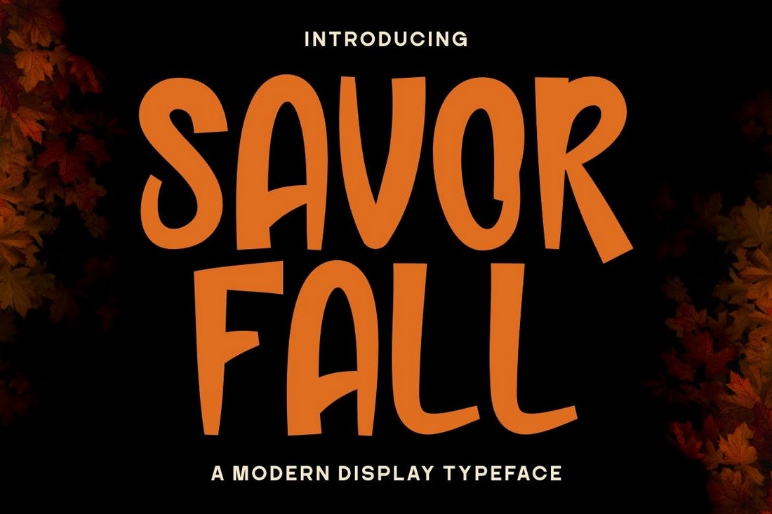
Mental Health Anxiety Infographic Template

Mental Health Anxiety Infographic Template

This a high-quality vector illustration perfect for designing infographics related to mental health. This 100% customizable illustration showcases a variety of images including a pink brain, a game stick controller, and an anxious character. The colors and text are also fully editable.

Mental Health PowerPoint Templates

BriveMind – Mental Health PowerPoint Template

BriveMind - Mental Health PowerPoint Template

BriveMind offers a mental health PowerPoint Template with a modern and functional design. It comes packed with unique layouts, infographics, graphs, and icons that can enhance your presentations. It’s suitable for diverse business needs including market reviews, funding requests, product reviews, and educational training.

Mental Health PowerPoint Illustrations

Mental Health PowerPoint Illustrations

This is a dynamic, multipurpose PowerPoint Template designed specifically for mental health presentations. Its modern, animated slides and included illustrations are completely customizable to suit your specific needs. The template is versatile, providing an ample number of slides for a comprehensive presentation and supports a 16:9 HD display. Included in the ZIP file are PPT, PPTX, and PDF versions.

Mindfulnes – Mental Health PowerPoint Template

Mindfulnes - Mental Health PowerPoint Template

The Mindfulness is an easily adaptable mental health PowerPoint Template perfect for various projects. It comes with impressive features like resizable and editable graphics, master slides, wide screen ratio, and a picture placeholder.

Wellness Mental Health PowerPoint Template

Wellness Mental Health PowerPoint Template

A creative and illustratively engaging PowerPoint template for conveying important mental health discussions. With 25 unique, fully editable slides and a clean light background, it’s perfect for business events, community projects, and more. While it features easy drag-and-drop image customization.

Mental Health PowerPoint Presentation Template

Mental Health PowerPoint Presentation Template

A user-friendly PowerPoint template that allows you to create an engaging and informative presentation with ease. It features over 50 unique slides, compatible with Microsoft PowerPoint, and boasts Full HD resolution. The design aesthetics are eye-catching, and all slides are fully customizable.

Warm Mental Health PowerPoint Template

Warm Mental Health PowerPoint Template

This is a versatile PowerPoint template crafted with care and professionalism. Its 20 unique slides are designed with a strong emphasis on readability and usability, simplifying presentation creation. The template’s modern, multi-purpose design accommodates various presentation needs and features editable graphics, free web fonts, and easy drag and drop functionality.

Mental Health Awareness PowerPoint Template

Mental Health Awareness PowerPoint Template

This is a stylish and modern PowerPoint template, ideal for mental health-related presentations. The template includes over 30 unique, widescreen slides that feature graphic components that are both resizable and easy to edit. Drag-and-drop picture placeholders also come as part of the package, including main files, a help guide, and an icon pack.

Free Mental Health Week Templates

Free Mental Health Day Flyer

Free Mental Health Day Flyer

This is a free flyer template you can use to design an attractive promo flyer to spread the word about Mental Health Day events. The template comes in PSD format and it’s free to use in your personal projects.

Free World Mental Health Day Flyer

Free World Mental Health Day Flyer

This free mental health flyer also comes with a beautiful design featuring a creative illustration. The template is fully customizable and you can even change the text, colors, and fonts using Photoshop.

Free Mental Health Week Poster Template

Free Mental Health Week Poster Template

Another free poster template for mental health-related events. This poster template also comes in PSD format and includes an easily editable design. It’s available in A4 size.

Free World Mental Health Graphic

Free World Mental Health Day Template

You can use this free graphic to create unique posters, flyers, and brochures of your own to promote Mental Health Week and various other events. The template is available in EPS vector format.

Free Mental Health Day Graphic

Free Mental Health Day Graphic

This free graphic template is also free to download and it includes a fully editable design for creating various posters, flyers, and designs related to mental health awareness. The template comes in EPS format.

Python Libraries for Data Engineers Guide

Featured Imgs 23

Data, data, and some more data. As businesses are swimming in the ocean of information, data engineers have become the lifeguards with their trusty flotation device — Python.

Python is a versatile language that quickly becomes the go-to tool for data wizards everywhere. Why?

It’s simple enough for beginners yet powerful enough to tackle the most complex data challenges. But Python’s real superpower lies in its vast ecosystem of libraries.

If you’re a data engineer, developer, or anyone looking to optimize their data engineering processes using Python, let us introduce you to the key Python libraries that will make your life a whole lot easier.

Pandas

Want a personal assistant who can organize, clean, and analyze your data in the blink of an eye? That’s Pandas for you.

This library is a powerhouse of data manipulation and analysis in Python. It will turn your messy datasets into well-behaved tables faster than you can say “spreadsheet.”

Key features:

  • DataFrame and Series data structures for efficient data handling
  • Powerful data alignment and integrated indexing
  • Tools for reading and writing data between in-memory data structures and various file formats
  • Intelligent data alignment and missing data handling

Real-world applications:

  • Cleaning and preprocessing large datasets
  • Time series analysis and financial data modeling
  • Creating data pipelines for ETL (Extract, Transform, Load) processes
  • Ad-hoc data analysis and exploration

NumPy

NumPy is fundamental for scientific computing in Python. It provides support for large, multi-dimensional arrays and matrices, along with a collection of mathematical functions to operate on these arrays.

Key features:

  • Efficient multi-dimensional array object
  • Broadcasting functions for performing operations on arrays
  • Tools for integrating C/C++ and Fortran code
  • Linear algebra, Fourier transform, and random number capabilities

Real-world applications

  • Implementing machine learning algorithms
  • Signal and image processing
  • Financial modeling and risk analysis
  • Scientific simulations and computations

PySpark

When your data gets too big, PySpark steps in, it’s the Python API for Apache Spark that enables big data processing and distributed computing at scale.

Key features:

  • Distributed data processing with Resilient Distributed Datasets (RDDs)
  • SQL and DataFrames for structured data processing
  • MLib for distributed machine learning
  • GraphX for graph computation

Real-world applications:

  • Processing and analyzing large-scale log files
  • Real-time data streaming and analysis
  • Building and deploying machine learning pipelines on big data
  • Graph processing for social network analysis

Dask

Dask brings the power of multicore and distributed parallel execution for analytics to enable performance at scale for large datasets and computations.

Key features:

  • Parallel computing through task scheduling
  • Scaled pandas DataFrames
  • Integrations with existing Python libraries
  • Dynamix task graphs for complex workflows

Real-world applications:

  • Scaling existing pandas, NumPy, and scikit-learn workflow
  • Processing datasets larger than memory
  • Parallel and distributed machine learning
  • Interactive data analysis on large datasets

SQLAlchemy

SQLAlchemy is a SQL toolkit and Object-Relational Mapping (ORM) library that provides a full suite of well-known enterprise level persistence patterns.

Key features:

  • Efficient and high-performing database access
  • Database schema creation, manipulation, and querying
  • ORM for translating Python classes to database tables
  • MSupport for multiple database systems

Real-world applications:

  • Building database-backed applications
  • Creating and managing complex database schemas
  • Implementing data warehousing solutions
  • Automating database migrations and versioning

Lxml

At a glance, XML looks like alphabet soup, but Lxml knows how to make sense of it all. It’s fast, it’s powerful, and it makes XML processing a breeze.

Key features:

  • Fast XML parsing and generation
  • Support for XPath and XSLT
  • Pythonic API for tree traversal and manipulation
  • Validation against DTDs and XML schema

Real-world applications:

  • Parsing and processing XML-based data feeds
  • Web scraping and HTML parsing
  • Generating XML reports and documents
  • Integrating with XML-based APIs and services

For more detailed information on XML processing with Python, you can refer to this post on XML conversion using Python from Sonra.

Why is Python ideal for data engineering?

So, why has Python become the darling of data engineers everywhere? It’s not just because of its cool name (though that doesn’t hurt).

The real reason is its versatility, which allows engineers to tackle diverse tasks within a single ecosystem, from data extraction and transformation to analysis and visualization.

Python has a straightforward syntax and is a very readable language. It reduces the learning curve for a beginner.

Despite being easy to use, Python offers a powerful and compelling ecosystem of libraries. For data engineers, it’s like having a toolbox where every tool is your favorite. Need to crunch numbers? There’s a library for that. Want to automate workflows? Done.

And let’s not forget about Python’s amazing community. It’s huge and helpful. If you’re facing a problem, chances are someone in the Python community has already solved it and shared the solution.

Automating data engineering tasks with Python

In the past decade, the use of Python has significantly increased due to its capability to automate boring stuff. Python is well able to streamline complex data workflows and increase productivity.

Data engineers use libraries like Apache Airflow and Perfect to approach task scheduling and pipeline management. These tools allow for the creation of dynamic, scalable, and maintainable data pipelines using Python code.

With Airflow, you can create data workflows that look like flowcharts (called Directed Acyclic Graphs or DAG). It is used for complex ETL processes. Prefect takes things up a notch, offering even more flexibility and observability.

Want to learn more?

Hungry for more Python goodness? Check out these articles:

Conclusion

The Python libraries we discussed in the article form the backbone of modern data engineering practices. It offers powerful tools to tackle complex data challenges efficiently. 

Data engineers can use these libraries to streamline workflows, improve data processing capabilities, and build strong and scalable data pipelines. 

If you’re a data engineer, we’ll encourage you to be more interested in Python libraries. Play around, experiment, and see how they can transform your data engineering projects. 

Remember, Python is not a language of the past; it’s a language of the future. The more you fall in love with this, the more you’ll be able to conquer those complex and large datasets that are yet to come.

Pandas Visualization

Pandas visualization

Source

Code snippet: Importing Pandas for plotting

import pandas as pd
import matplotlib.pyplot as plt

df = pd.read_csv('data.csv')

df.plot(kind = 'scatter', x = 'Duration', y = 'Maxpulse')

plt.show() 

Source

PySpark Visualization

PySpark Visualization

Source

Code snippet: # How many passengers tipped by various amounts

# Look at a histogram of tips by count by using Matplotlib

ax1 = sampled_taxi_pd_df['tipAmount'].plot(kind='hist', bins=25, facecolor='lightblue')
ax1.set_title('Tip amount distribution')
ax1.set_xlabel('Tip Amount ($)')
ax1.set_ylabel('Counts')
plt.suptitle('')
plt.show()

Source

The post Python Libraries for Data Engineers Guide appeared first on CSS Author.