Sticky Headers And Full-Height Elements: A Tricky Combination

Category Image 080

I was recently asked by a student to help with a seemingly simple problem. She’d been working on a website for a coffee shop that sports a sticky header, and she wanted the hero section right underneath that header to span the rest of the available vertical space in the viewport.

Here’s a visual demo of the desired effect for clarity.

Looks like it should be easy enough, right? I was sure (read: overconfident) that the problem would only take a couple of minutes to solve, only to find it was a much deeper well than I’d assumed.

Before we dive in, let’s take a quick look at the initial markup and CSS to see what we’re working with:

<body>
<header class=”header”>Header Content</header>
<section class=”hero”>Hero Content</section>
<main class=”main”>Main Content</main>
</body>

.header {
position: sticky;
top: 0; /* Offset, otherwise it won’t stick! */
}

/* etc. */

With those declarations, the .header will stick to the top of the page. And yet the .hero element below it remains intrinsically sized. This is what we want to change.

The Low-Hanging Fruit

The first impulse you might have, as I did, is to enclose the header and hero in some sort of parent container and give that container 100vh to make it span the viewport. After that, we could use Flexbox to distribute the children and make the hero grow to fill the remaining space.

<body>
<div class=”container”>
<header class=”header”>Header Content</header>
<section class=”hero”>Hero Content</section>
</div>
<main class=”main”>Main Content</main>
</body>

.container {
height: 100vh;
display: flex;
flex-direction: column;
}

.hero {
flex-grow: 1;
}

/* etc. */

This looks correct at first glance, but watch what happens when scrolling past the hero.

See the Pen Attempt #1: Container + Flexbox [forked] by Philip.

The sticky header gets trapped in its parent container! But.. why?

If you’re anything like me, this behavior is unintuitive, at least initially. You may have heard that sticky is a combination of relative and fixed positioning, meaning it participates in the normal flow of the document but only until it hits the edges of its scrolling container, at which point it becomes fixed. While viewing sticky as a combination of other values can be a useful mnemonic, it fails to capture one important difference between sticky and fixed elements:

A position: fixed element doesn’t care about the parent it’s nested in or any of its ancestors. It will break out of the normal flow of the document and place itself directly offset from the viewport, as though glued in place a certain distance from the edge of the screen.

Conversely, a position: sticky element will be pushed along with the edges of the viewport (or next closest scrolling container), but it will never escape the boundaries of its direct parent. Well, at least if you don’t count visually transform-ing it. So a better way to think about it might be, to steal from Chris Coyier, that “position: sticky is, in a sense, a locally scoped position: fixed.” This is an intentional design decision, one that allows for section-specific sticky headers like the ones made famous by alphabetical lists in mobile interfaces.

See the Pen Sticky Section Headers [forked] by Philip.

Okay, so this approach is a no-go for our predicament. We need to find a solution that doesn’t involve a container around the header.

Fixed, But Not Solved

Maybe we can make our lives a bit simpler. Instead of a container, what if we gave the .header element a fixed height of, say, 150px? Then, all we have to do is define the .hero element’s height as height: calc(100vh – 150px).

See the Pen Attempt #2: Fixed Height + Calc() [forked] by Philip.

This approach kinda works, but the downsides are more insidious than our last attempt because they may not be immediately apparent. You probably noticed that the header is too tall, and we’d wanna do some math to decide on a better height.

Thinking ahead a bit,

What if the .header’s children need to wrap or rearrange themselves at different screen sizes or grow to maintain legibility on mobile?
What if JavaScript is manipulating the contents?

All of these things could subtly change the .header’s ideal size, and chasing the right height values for each scenario has the potential to spiral into a maintenance nightmare of unmanageable breakpoints and magic numbers — especially if we consider this needs to be done not only for the .header but also the .hero element that depends on it.

I would argue that this workaround also just feels wrong. Fixed heights break one of the main affordances of CSS layout — the way elements automatically grow and shrink to adapt to their contents — and not relying on this usually makes our lives harder, not simpler.

So, we’re left with…

A Novel Approach

Now that we’ve figured out the constraints we’re working with, another way to phrase the problem is that we want the .header and .hero to collectively span 100vh without sizing the elements explicitly or wrapping them in a container. Ideally, we’d find something that already is 100vh and align them to that. This is where it dawned on me that display: grid may provide just what we need!

Let’s try this: We declare display: grid on the body element and add another element before the .header that we’ll call .above-the-fold-spacer. This new element gets a height of 100vh and spans the grid’s entire width. Next, we’ll tell our spacer that it should take up two grid rows and we’ll anchor it to the top of the page.

This element must be entirely empty because we don’t ever want it to be visible or to register to screen readers. We’re merely using it as a crutch to tell the grid how to behave.

<body>
<!– This spacer provides the height we want –>
<div class=”above-the-fold-spacer”></div>

<!– These two elements will place themselves on top of the spacer –>
<header class=”header”>Header Content</header>
<section class=”hero”>Hero Content</section>

<!– The rest of the page stays unaffected –>
<main class=”main”>Main Content</main>
</body>

body {
display: grid;
}

.above-the-fold-spacer {
height: 100vh;
/* Span from the first to the last grid column line */
/* (Negative numbers count from the end of the grid) */
grid-column: 1 / -1;
/* Start at the first grid row line, and take up 2 rows */
grid-row: 1 / span 2;
}

/* etc. */

This is the magic ingredient.

By adding the spacer, we’ve created two grid rows that together take up exactly 100vh. Now, all that’s left to do, in essence, is to tell the .header and .hero elements to align themselves to those existing rows. We do have to tell them to start at the same grid column line as the .above-the-fold-spacer element so that they won’t try to sit next to it. But with that done… ta-da!

See the Pen The Solution: Grid Alignment [forked] by Philip.

The reason this works is that a grid container can have multiple children occupying the same cell overlaid on top of each other. In a situation like that, the tallest child element defines the grid row’s overall height — or, in this case, the combined height of the two rows (100vh).

To control how exactly the two visible elements divvy up the available space between themselves, we can use the grid-template-rows property. I made it so that the first row uses min-content rather than 1fr. This is necessary so that the .header doesn’t take up the same amount of space as the .hero but instead only takes what it needs and lets the hero have the rest.

Here’s our full solution:

body {
display: grid;
grid-template-rows: min-content 1fr;
}

.above-the-fold-spacer {
height: 100vh;
grid-column: 1 / -1;
grid-row: 1 / span 2;
}

.header {
position: sticky;
top: 0;
grid-column-start: 1;
grid-row-start: 1;
}

.hero {
grid-column-start: 1;
grid-row-start: 2;
}

And voila: A sticky header of arbitrary size above a hero that grows to fill the remaining visible space!

Caveats and Final Thoughts

It’s worth noting that the HTML order of the elements matters here. If we define .above-the-fold-spacer after our .hero section, it will overlay and block access to the elements underneath. We can work around this by declaring either order: -1, z-index: -1, or visibility: hidden.

Keep in mind that this is a simple example. If you were to add a sidebar to the left of your page, for example, you’d need to adjust at which column the elements start. Still, in the majority of cases, using a CSS Grid approach is likely to be less troublesome than the Sisyphean task of manually managing and coordinating the height values of multiple elements.

Another upside of this approach is that it’s adaptable. If you decide you want a group of three elements to take up the screen’s height rather than two, then you’d make the invisible spacer span three rows and assign the visible elements to the appropriate one. Even if the hero element’s content causes its height to exceed 100vh, the grid adapts without breaking anything. It’s even well-supported in all modern browsers.

The more I think about this technique, the more I’m persuaded that it’s actually quite clean. Then again, you know how lawyers can talk themselves into their own arguments? If you can think of an even simpler solution I’ve overlooked, feel free to reach out and let me know!

27 Case Study Examples Every Marketer Should See

Featured Imgs 23

Putting together a compelling case study is one of the most powerful strategies for showcasing your product and attracting future customers. But it's not easy to create case studies that your audience can’t wait to read.

Download Now: 3 Free Case Study Templates

In this post, I’ll go over the definition of a case study and the best examples to inspire you.

Table of Contents

A case study proves how your product has helped other companies by demonstrating real-life results. Not only that, but marketing case studies with solutions typically contain quotes from the customer.

This means that they’re not just ads where you praise your own product. Rather, other companies are praising your company — and there’s no stronger marketing material than a verbal recommendation or testimonial.

A great case study also has research and stats to back up points made about a project's results.

There are several ways to use case studies in your marketing strategy.

From featuring them on your website to including them in a sales presentation, a case study is a strong, persuasive tool that shows customers why they should work with you — straight from another customer.

Writing one from scratch is hard, though, which is why we’ve created a collection of case study templates for you to get started.

There’s no better way to generate more leads than by writing case studies. However, without case study examples from which to draw inspiration, it can be difficult to write impactful studies that convince visitors to submit a form.

Marketing Case Study Examples

To help you create an attractive and high-converting case study, we've put together a list of some of our favorites. This list includes famous case studies in marketing, technology, and business.

These studies can show you how to frame your company's offers in a way that is useful to your audience. So, look, and let these examples inspire your next brilliant case study design.

These marketing case studies with solutions show the value proposition of each product. They also show how each company benefited in both the short and long term using quantitative data.

In other words, you don’t get just nice statements, like “this company helped us a lot.” You see actual change within the firm through numbers and figures.

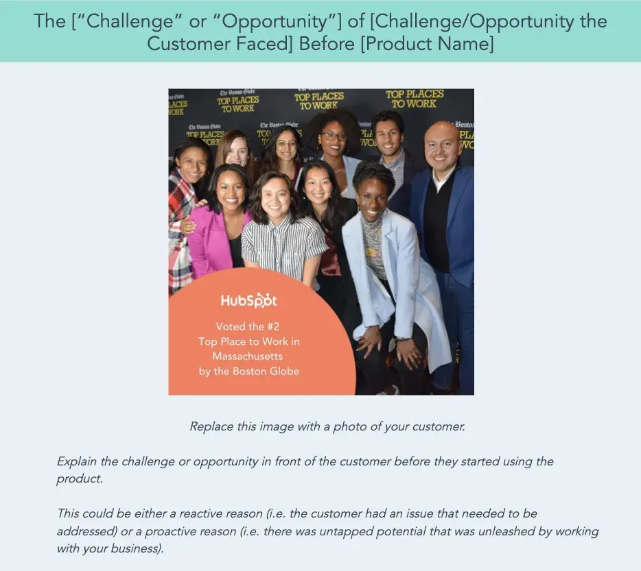
You can put your learnings into action with HubSpot's Free Case Study Templates. Available as custom designs and text-based documents, you can upload these templates to your CMS or send them to prospects as you see fit.

digital marketing case study, template

Download These Free Case Study Templates

1. "How Handled Scaled from Zero to 121 Locations with the Help of HubSpot," by HubSpot

digital marketing case study, hubspot

What's interesting about this case study is the way it leads with the customer.

That reflects a major HubSpot cornerstone, which is to always solve for the customer first. The copy leads with a brief description of why the CEO of Handled founded the company and why he thought they could benefit from a CRM.

I like that the case study also opens up with one key data point about Handled’s success using HubSpot, namely that it grew to 121 locations.

Notice that this case study uses mixed media. Yes, there is a short video, but it’s elaborated upon in the other text on the page.

So, while your case studies can use one or the other, don’t be afraid to combine written copy with visuals to emphasize the project’s success.

Key Learnings from the HubSpot Case Study Example

  • Give the case study a personal touch by focusing on the CEO rather than the company itself.
  • Use multimedia to engage website visitors as they read the case study.

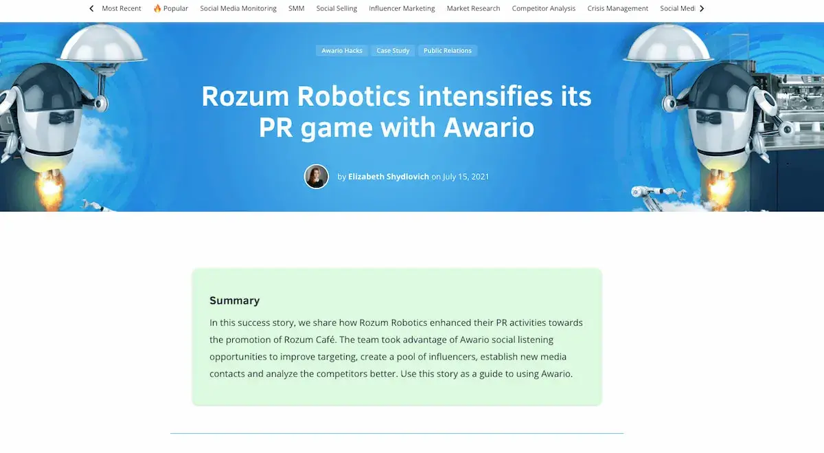
2. "Rozum Robotics intensifies its PR game with Awario," by Awario

digital marketing case study example from Rozum Robotics

In this case study, Awario greets the user with a summary straight away — so if you’re feeling up to reading the entire case study, you can scan the snapshot and understand how the company serves its customers.

The case study then includes jump links to several sections, such as “Company Profile,” “Rozum Robotics' Pains,” “Challenge,” “Solution,” and “Results and Improvements.”

The sparse copy and prominent headings show you don’t need a lot of elaborate information to show the value of your products and services.

Like the other case study examples on this list, it includes visuals and quotes to show the effectiveness of the company’s efforts. The case study ends with a bulleted list that shows the results.

Key Learnings from the Awario Robotics Case Study Example

  • Create a table of contents to make your case study easier to navigate.
  • Include a bulleted list of the results you achieved for your client.

3. "Chevrolet DTU," by Carol H. Williams

digital marketing case study example from carolhwilliams

If you’ve worked with a well-known company, use only the name in the title — like Carol H. Williams, one of the nation’s top advertising agencies, does here.

The “DTU,” stands for “Discover the Unexpected.” It generates interest because you want to find out what the initials mean.

I like how they kept my interest by using a mixture of headings, images, and videos to describe the challenges, objectives, and solutions of the project.

The case study closes with a summary of the key achievements that Chevrolet’s DTU Journalism Fellows reached during the project.

Key Learnings from the Carol H. Williams Case Study Example

  • If you’ve worked with a big brand before, consider only using the name in the title — just enough to pique interest.
  • Use a mixture of headings and subheadings to guide users through the case study.

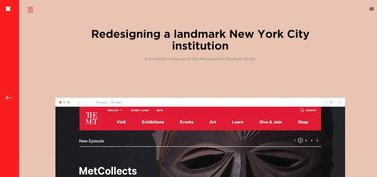
4. "The Met," by Fantasy

digital marketing case study example from fantasy

What’s the best way to showcase the responsiveness and user interface of a website?

Probably by diving right into it with a series of simple showcases — which is exactly what Fantasy does on their case study page for the Metropolitan Museum of Art.

They keep the page simple, inviting you to review their redesign of the Met’s website feature-by-feature.

Each section is simple, showing a single piece of the new website's interface so that users aren’t overwhelmed with information and can focus on what matters most.

If you‘re more interested in text, you can read the objective for each feature. Fantasy understands that, as a potential customer, this is all you need to know. Scrolling further, you’re greeted with a simple “Contact Us” CTA.

Key Learnings from the Fantasy Case Study Example

  • You don’t have to write a ton of text to create a great case study. Focus on the solution you delivered itself.
  • Include a CTA at the bottom inviting visitors to contact you.

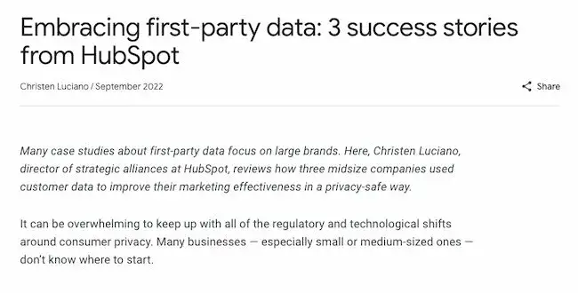
5. "Embracing first-party data: 3 success stories from HubSpot," by Think with Google

digital marketing case study example from google

Google takes a different approach to text-focused case studies by choosing three different companies to highlight.

The case study is clean and easily scannable. It has sections for each company, with quotes and headers that clarify the way these three distinct stories connect. The simple format also uses colors and text that align with the Google brand.

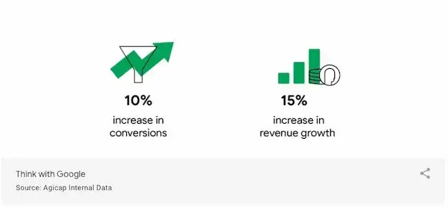
I like the focus on data in this case study. That’s a differentiator! This case study is less than a thousand words, but it's packed with useful data points.

Data-driven insights quickly and clearly show the value of leveraging first-party data while prioritizing consumer privacy.

digital marketing case study example from google

Key Learnings from the Think with Google Case Study Example

  • A case study doesn’t need to be long or complex to be powerful.
  • Clear data points are an effective way to prove value.

6. "Better Experiences for All," by Herman Miller

digital marketing case study example from herman miller

Herman Miller sells sleek, utilitarian furniture with no frills and extreme functionality, and that ethos extends to its case study page for a hospital in Dubai.

What first attracted me to this case study was the beautiful video at the top and the clean user experience. User experience matters a lot in a case study. It determines whether users will keep reading or leave.

Another notable aspect of this case study is that the video includes closed-captioning for greater accessibility, and users have the option of expanding the CC and searching through the text.

Herman Miller’s case study also offers an impressive amount of information packed in just a few brief paragraphs for those wanting to understand the nuances of their strategy.

It closes out with a quote from their client and, most importantly, the list of furniture products that the hospital purchased from the brand.

Key Learnings from the Herman Miller Case Study Example

  • Close out with a list of products that users can buy after reading the case study.
  • Include accessibility features such as closed captioning and night mode to make your case study more user-friendly.

7. "Capital One on AWS," by Amazon

digital marketing case study example from aws

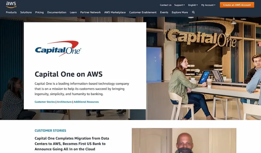
Do you work continuously with your clients? Consider structuring your case study page like Amazon did in this stellar case study example.

Instead of just featuring one article about Capital One and how it benefited from using AWS, Amazon features a series of articles that you can then access if you’re interested in reading more.

It goes all the way back to 2016, all with different stories that feature Capital One’s achievements using AWS.

This may look unattainable for a small firm, but you don’t have to go to extreme measures and do it for every single one of your clients.

You could choose the one you most wish to focus on and establish a contact both on your side and your client’s for coming up with the content.

Check in every year and write a new piece. These don’t have to be long, either — five hundred to eight hundred words will do.

Key Learnings from the Amazon AWS Case Study Example

  • Write a new article each year featuring one of your clients, then include links to those articles in one big case study page.
  • Consider including external articles that emphasize your client’s success in their industry.

8. "HackReactor teaches the world to code #withAsana," by Asana

digital marketing case study example from asana

While Asana‘s case study design looks text-heavy, there’s a good reason. It reads like a creative story, told entirely from the customer's perspective.

For instance, Asana knows you won't trust its word alone on why this product is useful. So, they let Tony Phillips, HackReactor CEO, tell you instead:

“We take in a lot of information. Our brains are awful at storage but very good at thinking; you really start to want some third party to store your information so you can do something with it.”

Asana features frequent quotes from Phillips to break up the wall of text and humanize the case study. It reads like an in-depth interview and captivates the reader through creative storytelling.

Even more, Asana includes in-depth detail about how HackReactor uses Asana. This includes how they build templates and workflows:

“There's a huge differentiator between Asana and other tools, and that’s the very easy API access. Even if Asana isn’t the perfect fit for a workflow, someone like me— a relatively mediocre software engineer—can add functionality via the API to build a custom solution that helps a team get more done.”

Key Learnings from the Asana Example

  • Include quotes from your client throughout the case study.
  • Provide extensive detail on how your client worked with you or used your product.

9. "Rips Sewed, Brand Love Reaped," by Amp Agency

digital marketing case study example from ampagency

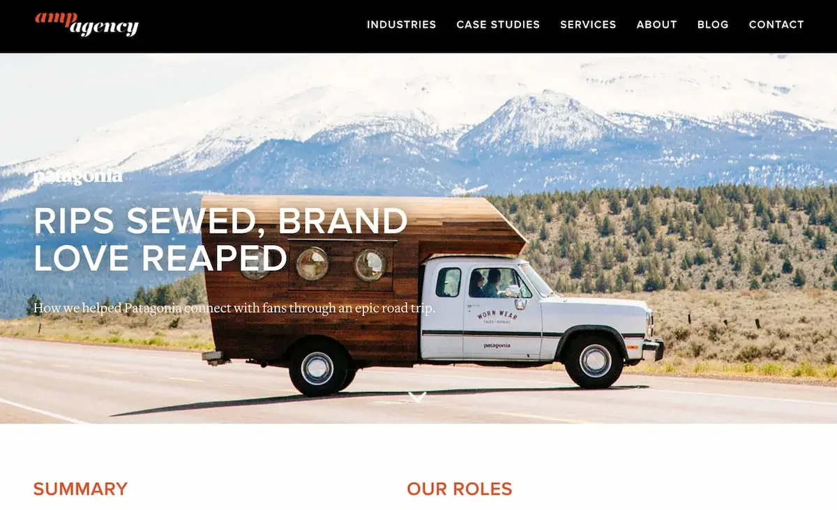
Amp Agency's Patagonia marketing strategy aimed to appeal to a new audience through guerrilla marketing efforts and a coast-to-coast road trip.

Their case study page effectively conveys a voyager theme, complete with real photos of Patagonia customers from across the U.S. and a map of the expedition.

I liked Amp Agency‘s storytelling approach best. It captures viewers’ attention from start to finish simply because it's an intriguing and unique approach to marketing.

Key Learnings from the Amp Agency Example

  • Open up with a summary that communicates who your client is and why they reached out to you.
  • Like in the other case study examples, you’ll want to close out with a quantitative list of your achievements.

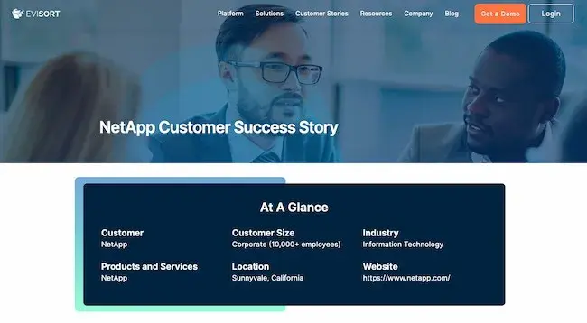
10. "NetApp," by Evisort

digital marketing case study example from evisort

Evisort opens up its NetApp case study with an at-a-glance overview of the client.

It’s imperative to always focus on the client in your case study — not on your amazing product and equally amazing team. By opening up with a snapshot of the client’s company, Evisort places the focus on the client.

This case study example checks all the boxes for a great case study that’s informative, thorough, and compelling. It includes quotes from the client and details about the challenges NetApp faced during the COVID-19 pandemic.

It closes out with a quote from the client and with a link to download the case study in PDF format, which is incredibly important if you want your case study to be accessible in a wider variety of formats.

Key Learnings from the Evisort Example

  • Place the focus immediately on your client by including a snapshot of their company.
  • Mention challenging eras, such as a pandemic or recession, to show how your company can help your client succeed even during difficult times.

11. "Copernicus Land Monitoring – CLC+ Core," by Cloudflight

digital marketing case study example from cloudflight

Including highly specialized information in your case study is an effective way to show prospects that you’re not just trying to get their business.

You’re deep within their industry, too, and willing to learn everything you need to learn to create a solution that works specifically for them.

Cloudflight does a splendid job at that in its Copernicus Land Monitoring case study. While the information may be difficult to read at first glance, it will capture the interest of prospects who are in the environmental industry.

It thus shows Cloudflight’s value as a partner much more effectively than a general case study would.

The page is comprehensive and ends with a compelling call-to-action:

“Looking for a solution that automates, and enhances your Big Data system? Are you struggling with large datasets and accessibility? We would be happy to advise and support you!”

The clean, whitespace-heavy page is an effective example of using a case study to capture future leads.

Key Learnings from the Cloudflight Case Study Example

  • Don’t be afraid to get technical in your explanation of what you did for your client.
  • Include a snapshot of the sales representative prospects should contact, especially if you have different sales reps for different industries, as Cloudflight does.

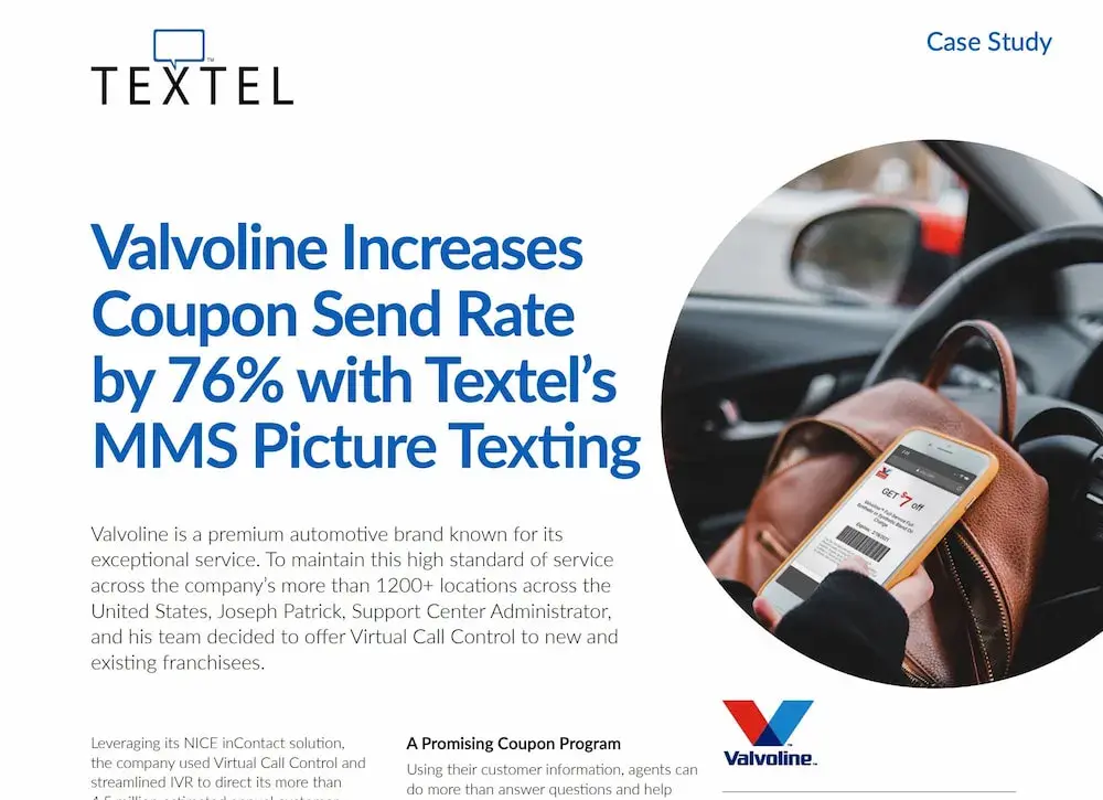
12. "Valvoline Increases Coupon Send Rate by 76% with Textel’s MMS Picture Texting," by Textel

digital marketing case study example from textel

If you’re targeting large enterprises with a long purchasing cycle, you’ll want to include a wealth of information in an easily transferable format.

That’s what Textel does here in its PDF case study for Valvoline. It greets the user with an eye-catching headline that shows the value of using Textel. Valvoline saw a significant return on investment from using the platform.

I like the smart decision of highlighting the client’s quote by putting it in green font and doing the same thing for the client’s results because it helps the reader quickly connect the two pieces of information.

If you’re in a hurry, you can also take a look at the “At a Glance” column to get the key facts of the case study, starting with information about Valvoline.

Key Learnings from the Textel Case Study Example

  • Include your client’s ROI right in the title of the case study.
  • Add an “At a Glance” column to your case study PDF to make it easy to get insights without needing to read all the text.

13. "Hunt Club and Happeo — a tech-enabled love story," by Happeo

digital marketing case study example from happeo

In this blog-post-like case study, Happeo opens with a quote from the client, then dives into a compelling heading: “Technology at the forefront of Hunt Club's strategy.”

Say you’re investigating Happeo as a solution and consider your firm to be technology-driven. This approach would spark your curiosity about why the client chose to work with Happeo.

It also effectively communicates the software’s value proposition without sounding like it’s coming from an in-house marketing team.

Every paragraph is a quote written from the customer’s perspective.

Later down the page, the case study also dives into “the features that changed the game for Hunt Club,” giving Happeo a chance to highlight some of the platform’s most salient features.

Key Learnings from the Happeo Case Study Example

  • Consider writing the entirety of the case study from the perspective of the customer.
  • Include a list of the features that convinced your client to go with you.

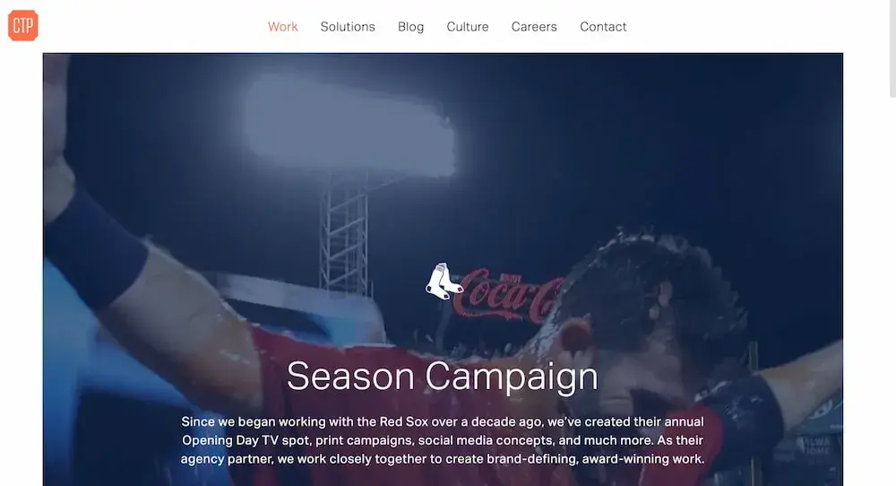
14. "Red Sox Season Campaign," by CTP Boston

digital marketing case study example from ctp boston

What‘s great about CTP’s case study page for their Red Sox Season Campaign is their combination of video, images, and text.

A video automatically begins playing when you visit the page, and as you scroll, you'll see more embedded videos of Red Sox players, a compilation of print ads, and social media images you can click to enlarge.

At the bottom, it says, “Find out how we can do something similar for your brand.”

The page is clean, cohesive, and aesthetically pleasing. It invites viewers to appreciate the well-roundedness of CTP’s campaign for Boston’s beloved baseball team.

Key Learnings from the CTP Case Study Example

  • Include a video in the heading of the case study.
  • Close with a call-to-action that makes leads want to turn into prospects.

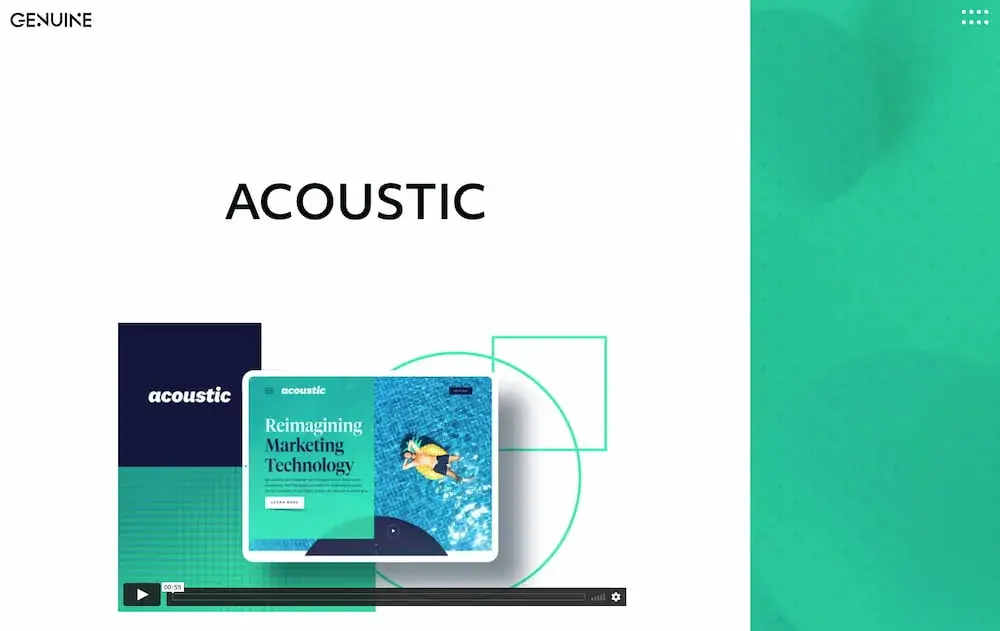
15. "Acoustic," by Genuine

digital marketing case study example from genuine

Sometimes, simplicity is key. Genuine’s case study for Acoustic is straightforward and minimal, with just a few short paragraphs, including “Reimagining the B2B website experience,” “Speaking to marketers 1:1,” and “Inventing Together.”

After the core of the case study, we then see a quote from Acoustic’s CMO and the results Genuine achieved for the company.

The simplicity of the page allows the reader to focus on both the visual aspects and the copy. The page displays Genuine's brand personality while offering the viewer all the information they need.

Key Learnings from the CTP Case Study Example

  • You don’t need to write a lot to create a great case study. Keep it simple.
  • Always include quantifiable data to illustrate the results you achieved for your client.

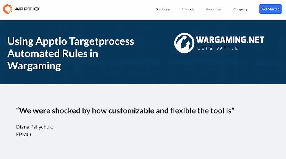
16. "Using Apptio Targetprocess Automated Rules in Wargaming," by Apptio

digital marketing case study example from apptio

Apptio’s case study for Wargaming summarizes three key pieces of information right at the beginning: the goals, the obstacles, and the results.

Readers then have the opportunity to continue reading — or they can walk away right then with the information they need. This case study also excels in keeping the human interest factor by formatting the information like an interview.

The piece is well-organized and uses compelling headers to keep the reader engaged. Despite its length, Apptio‘s case study is appealing enough to keep the viewer’s attention.

Every Apptio case study ends with a “recommendation for other companies” section, where the client can give advice for other companies that are looking for a similar solution but aren’t sure how to get started.

Key Learnings from the Apptio Case Study Example

  • Put your client in an advisory role by giving them the opportunity to give recommendations to other companies that are reading the case study.
  • Include the takeaways from the case study right at the beginning, so prospects quickly get what they need.

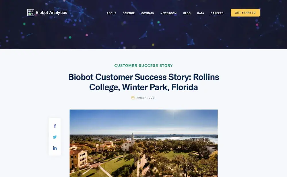
17. "Biobot Customer Success Story: Rollins College, Winter Park, Florida," by Biobot

digital marketing case study example from biobot analytics

Like some of the other top examples in this list, Biobot opens its case study with a quote from its client, which captures the value proposition of working with Biobot.

It mentions the COVID pandemic and goes into detail about the challenges the client faced during this time.

This case study is structured more like a news article than a traditional case study.

This format can work in more formal industries where decision-makers need to see in-depth information about the case. Be sure to test different methods and measure engagement.

Key Learnings from the Biobot Case Study Example

  • Mention environmental, public health, or economic emergencies and how you helped your client get past such difficult times.
  • Feel free to write the case study like a normal blog post, but be sure to test different methods to find the one that best works for you.

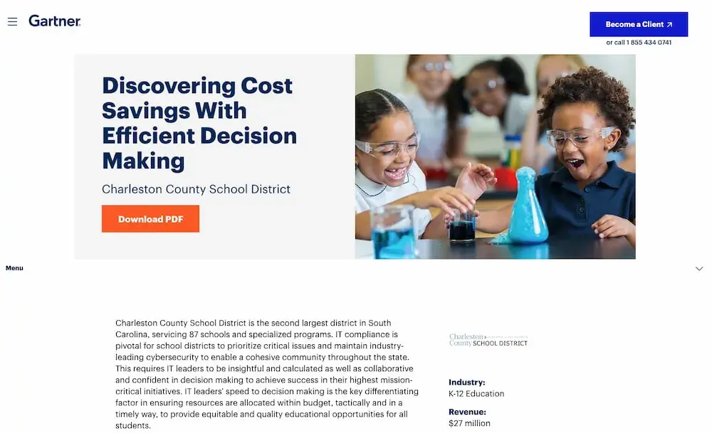
18. "Discovering Cost Savings With Efficient Decision Making," by Gartner

digital marketing case study example from gartner

You don't always need a ton of text or a video to convey your message — sometimes, you just need a few paragraphs and bullet points. I like these in Gartner’s case study.

Gartner does a fantastic job of quickly providing the fundamental statistics a potential customer would need to know, without boggling down their readers with dense paragraphs.

The case study closes with a shaded box that summarizes the impact that Gartner had on its client. It includes a quote and a call-to-action to “Learn More.”

Key Learnings from the Gartner Case Study Example

  • Keep the case study short.
  • Include a call-to-action at the bottom that takes the reader to a page that most relates to them.

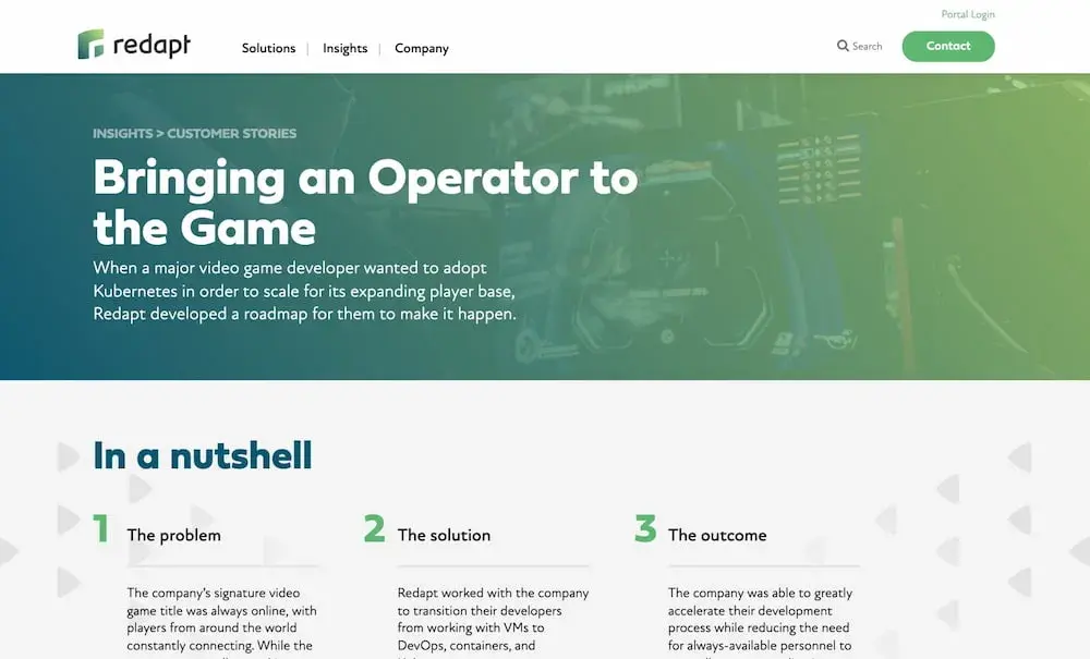
19. "Bringing an Operator to the Game," by Redapt

digital marketing case study example from Redapt

This case study example by Redapt is another great demonstration of the power of summarizing your case study’s takeaways right at the start of the study.

Redapt includes three easy-to-scan columns: “The problem,” “the solution,” and “the outcome.” However, its most notable feature is a section titled “Moment of clarity,” which shows why this particular project was difficult or challenging.

The section is shaded in green, making it impossible to miss. Redapt does the same thing for each case study.

In the same way, you should highlight the “turning point” for both you and your client when you were working toward a solution.

Key Learnings from the Redapt Case Study Example

  • Highlight the turning point for both you and your client during the solution-seeking process.
  • Use the same structure (including the same headings) for your case studies to make them easy to scan and read.

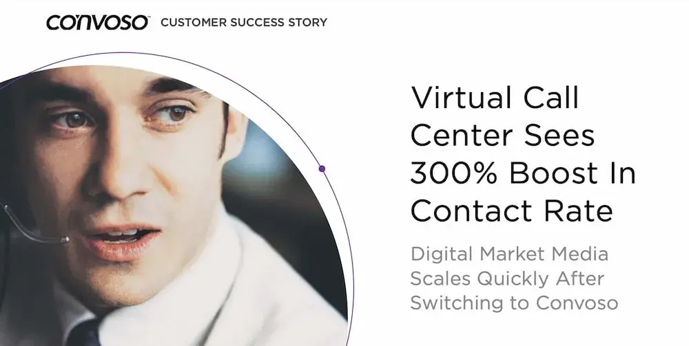
20. "Virtual Call Center Sees 300% Boost In Contact Rate," by Convoso

digital marketing case study example from Rozum Robotics

Convoso’s PDF case study for Digital Market Media immediately mentions the results that the client achieved and takes advantage of white space.

On the second page, the case study presents more influential results. It’s colorful and engaging and closes with a spread that prompts readers to request a demo.

Key Learnings from the Convoso Case Study Example

  • List the results of your work right at the beginning of the case study.
  • Use color to differentiate your case study from others. Convoso’s example is one of the most colorful ones on this list.

Digital Marketing Case Study Examples

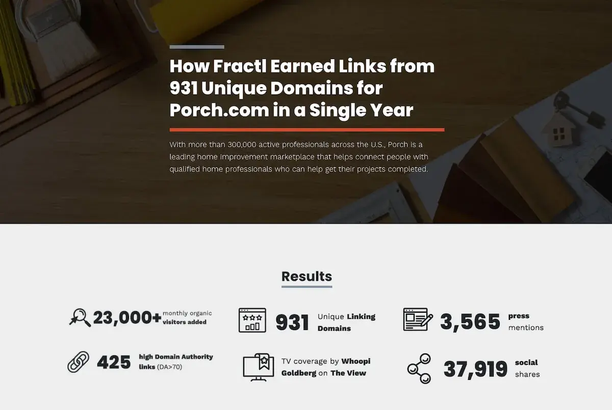
21. "How Fractl Earned Links from 931 Unique Domains for Porch.com in a Single Year," by Fractl

digital marketing case study example from fractl

Fractl uses both text and graphic design in their Porch.com case study to immerse the viewer in a more interesting user experience.

For instance, as you scroll, you'll see the results are illustrated in an infographic-design form as well as the text itself.

Further down the page, they use icons like a heart and a circle to illustrate their pitch angles and graphs to showcase their results.

Rather than writing which publications have mentioned Porch.com during Fractl’s campaign, they incorporated the media outlets’ icons for further visual diversity.

Key Learnings from the Fractl Case Study Example

  • Let pictures speak for you by incorporating graphs, logos, and icons all throughout the case study.
  • Start the case study by stating the key results, like Fractl does, instead of putting the results all the way at the bottom.

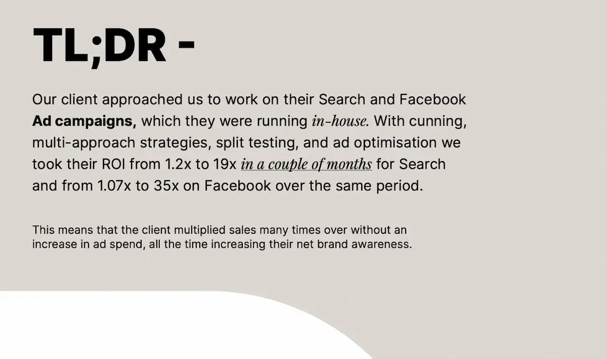
22. "In-Depth Performance Marketing Case Study," by Switch

digital marketing case study example from switch

Switch is an international marketing agency based in Malta that knocks it out of the park with this case study.

Its biggest challenge is effectively communicating what it did for its client without ever revealing the client’s name. It also effectively keeps non-marketers in the loop by including a glossary of terms on page 4.

The PDF case study reads like a compelling research article, including titles like “In-Depth Performance Marketing Case Study,” “Scenario,” and “Approach,” so that readers get a high-level overview of what the client needed and why they approached Switch.

It also includes a different page for each strategy. For instance, if you’d only be interested in hiring Switch for optimizing your Facebook ads, you can skip to page 10 to see how they did it.

The PDF is fourteen pages long but features big fonts and plenty of white space, so viewers can easily skim it in only a few minutes.

Key Learnings from the Switch Case Study Example

  • If you want to go into specialized information, include a glossary of terms so that non-specialists can easily understand.
  • Close with a CTA page in your case study PDF and include contact information for prospective clients.

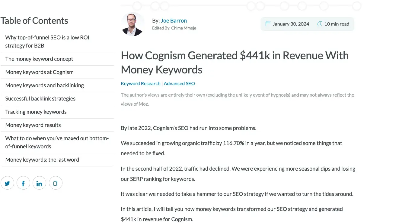
23. "Money Keywords Digital Marketing Case Study," by Cognism

Cognism SEO marketing case study

Cognism wrote one of the most in-depth case studies I’ve seen. Most case studies are often brief.

However, Cognism went deep into how it executed its strategy to showcase expertise and popularize its strategy.

The case study identified key issues with Cognism’s SEO that caused them to lose SERP rankings and had seasonal traffic decline.

Cognism’s case study introduces their unique idea of solving SEO challenges with money keywords. These are high-intent keywords that attract ready-to-buy visitors.

By introducing such ideas and spreading them, Cognism tried to improve brand awareness among its audience.

Cognism also talked about its backlink strategy, detailing how it targeted high-authority websites and tracked their progress each quarter.

They used guest blogging, leveraged outreach, and created linkable content to improve SERP rankings and boost domain authority.

They also gave examples of tools like HockeyStack, which helped with data visualization and used metrics like demo requests, generated deals, and revenue as outcomes.

Key Learnings from the Cognism Case Study Example

  • Use a table of contents to make your content more scannable and readable.
  • Talk about your process in detail to promote your ideas in your niche and gain authority.
  • Don’t be afraid to provide details on how you helped your client achieve their goals, including the tools you leveraged.

24. “How SimpleLegal Grew Traffic 515% by Embracing the Quirks of Vertical SaaS by Animalz

Animalz content marketing case study

Animalz is one of the leading content marketing agencies for B2B SaaS companies. The company uses a wide range of content strategies to deal with their client’s unique challenges.

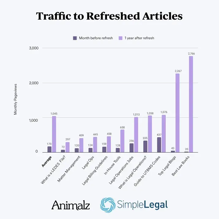
While many agencies focus on new content, Animalz increased SimplyLegal’s online presence by focusing its efforts on its existing content, updating it with fresh content, and following the latest SEO practices.

This strategy, known as content refreshing, increased their traffic by 515%.

In their case study, Animalz created graphs to show how they increased organic traffic for each article they updated.

I liked how they explained their content marketing techniques by drawing different diagrams. This way, their content was more digestible than text-only case studies.

Key Learnings from the Animalz Case Study Example

  • Use graphs to show the difference between previous and old results for readability.
  • Use different types of diagrams to explain new concepts, such as refreshing content.
  • Split up the takeaways of your case studies into bite-sized sections.
  • Always use visuals and images to enrich the case study experience, especially if it’s a comprehensive case study.

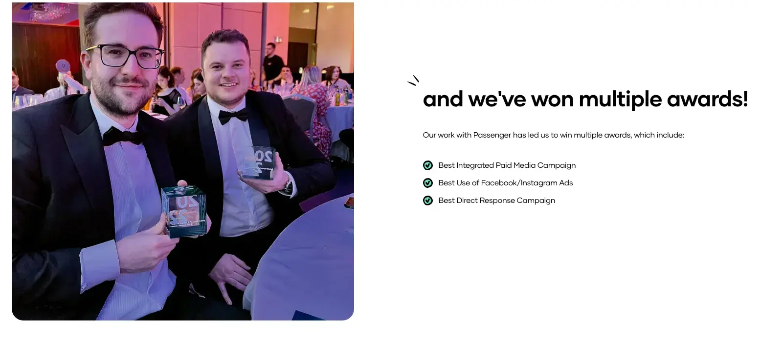
25. “Paid Social and Search Campaign for Passenger by The Social Shepherd

The Social Shepherd digital marketing case study

The Social Shepherd is an award-winning social agency. They used a more methodical approach to their case study for an ethical clothing brand, Passenger.

The agency outlined the client goals like improving scale spend, maintaining a 10x ROAS, and adapting to current assets by working on direct-response copy for paid ads.

Next, the agency showed steps they took to meet these goals, such as optimizing paid and organic media campaigns.

Similarly, they promoted their client’s expansion from the U.K. into different markets (e.g., Europe and America), thereby proving their expertise in attracting global audiences.

Key Learnings from the Social Shepherd Case Study Example

  • Outline client goals to present clear objectives for readers.
  • Promote your work by listing your achievements, such as any awards you won for the project or the goals you met.

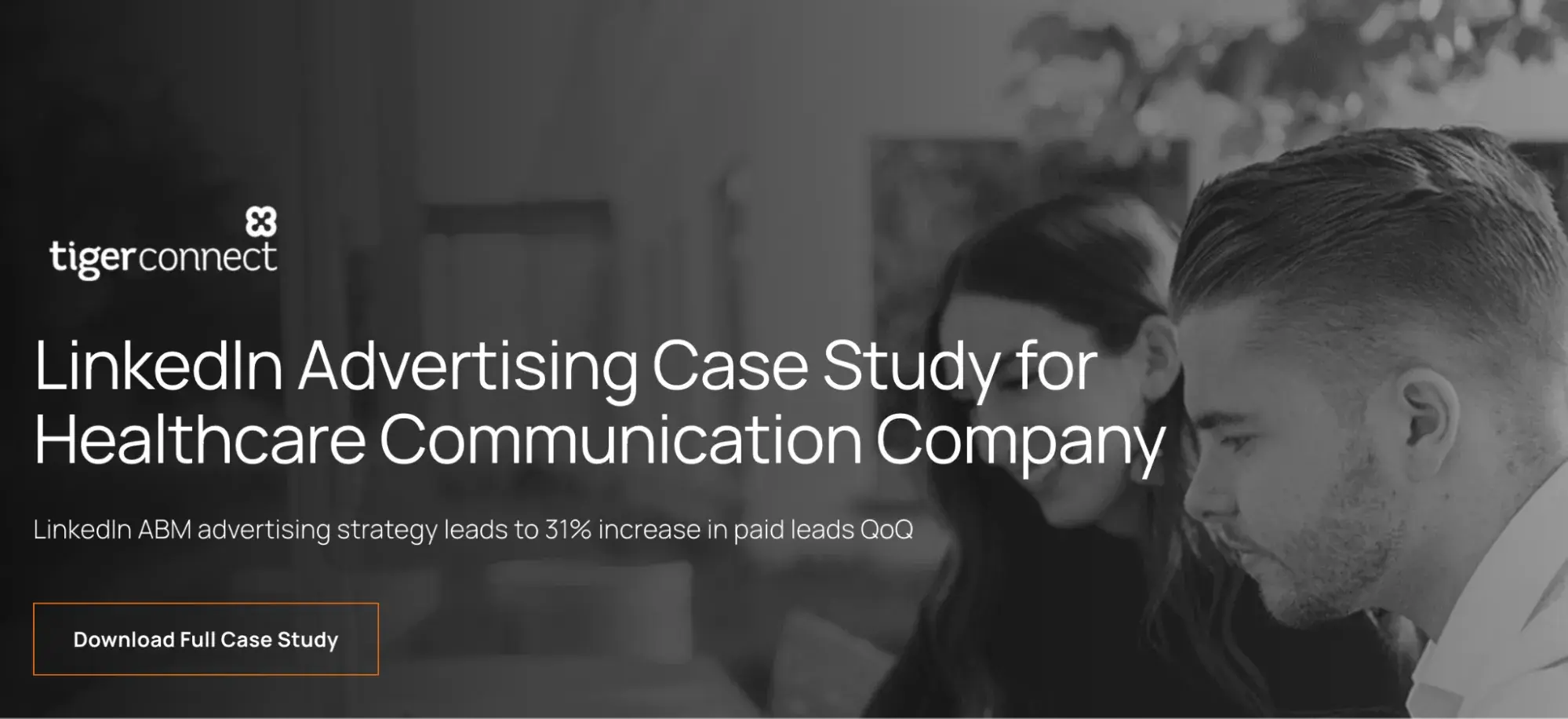
26.LinkedIn Advertising Case Study By Directive Consulting

Directive digital marketing case study

Directive Consulting’s case study for TigerConnect’s ad campaign provides a clear narrative of the latter’s challenge, strategy, and results.

The case study begins with an engaging headline that highlights a key achievement — a 31% increase in paid leads.

A brief overview is then used to explain the context of what TigerConnect does and how it helps companies in the healthcare sector.

The case study outlines the service Directive Consulting offered — PPC Management. I like how Directive Consulting used quantifiable metrics to show results.

The challenge section describes the initial problem of targeting audiences with low-volume keywords, prompting the need for a fresh approach.

The strategy section explains Directive’s approach, which is to use LinkedIn and implement account-based marketing (ABM).

Finally, the result section caps the case study with in-depth stats, showcasing the increase in paid leads, visits, and cost-per-acquisition.

Key Learnings from the Directive Consulting Case Study Example

  • Give relevant context in the client overview section. This gives readers essential background information on the client.
  • Offer a step-by-step breakdown of the strategy, including initial actions and subsequent adjustments. This helps readers understand the reasoning behind each decision.

27.Vena Solutions Case Study By Siege Media

Vena digital marketing case study

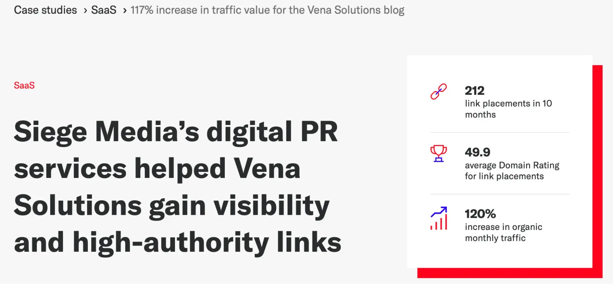
Siege Media’s case study for Vena Solutions illustrates how the former increased the latter’s organic blog traffic by over 100%.

Like all the engaging case studies, it starts with a compelling title and headline to highlight their achievement. A brief client overview lets you know what Vena Solution does.

The case study lists the services offered: digital PR and content marketing. It also outlines the challenge of creating high-ranking content and earning high-authority links, which can be tricky for certain keywords.

The results show clear metrics, such as link placements and traffic increases, via graphs. The case study also adds a carousel to slide between different graphs.

The growth summary explains Siege Media’s approach to creating top-funnel and shareable content by emphasizing stats-based posts.

This way, these articles can gain links from reputable sources. The case study also gave examples, such as “SaaS Statistics” and Remote Work Statistics.”

Key Learnings from the Vena Solutions Case Study Example

  • Give a growth summary to highlight your achievements.
  • Provide specific examples to drive the point home.
  • Let the visuals speak by including examples of the actual work you did for your client — which is especially useful for branding and marketing agencies.
  • Always close out with your achievements and how they impacted your client.

Start creating your case study today.

Now that you have excellent examples of case studies, think about a topic you'd like to write about that highlights what you did for a customer.

Before you do this, think critically about the elements to include in the case study.

Personally, I like case studies that go beyond text. Images from external websites or tools like those used in the Animalz case study are fantastic.

However, nothing beats videos like the HubSpot case study above. Where possible, get your customer on video because that’s always more believable.

Doing these equips you with a library of customer success stories, which is the most persuasive marketing material you could ever have.

The outcome is a strong portfolio of case studies, which helps you entice prospects to give you their business.

Editor's note: This post was originally published in August 2018 and has been updated for comprehensiveness.


WordPress Roundup: August 2024

Featured Imgs 23

Welcome to the WordPress Roundup, your monthly digest of the latest news and updates from the WordPress community. We bring you essential WordPress developments for all experience levels each month, keeping you informed about the latest core updates and upcoming releases. Whether you’re a seasoned developer, a dedicated site owner, or launching your first WordPress

The post WordPress Roundup: August 2024 appeared first on WP Engine.

WP Engine Appoints Samuel Monti as its Chief Financial Officer

Featured Imgs 23

AUSTIN, Texas—SEPT. 5, 2024—WP Engine, a global web enablement company providing premium products and solutions for websites built on WordPress, today announced the hiring of a new Chief Financial Officer, Samuel (“Sam”) Monti. In his new role, Monti is responsible for the leadership and management of all aspects of WP Engine’s financial organization, including corporate

The post WP Engine Appoints Samuel Monti as its Chief Financial Officer appeared first on WP Engine.

Professional Relationships: 4 Executive Tips to Improve Your Marketing Success

Featured Imgs 23

Learn how to build professional relationships that don't just open doors — but blow them wide open.

Download Now: 101 Professional Networking Tips

Building strong professional relationships is your secret weapon for marketing success. The right connections can open you up to new ideas, reveal valuable opportunities, and give you the insights you need to solve tough problems.

As Kieran and I discuss in a recent episode of Marketing Against the Grain, however, building impactful relationships takes more than just attending networking events and exchanging business cards.

So how do you find the people who can truly elevate your game? And how do you actively add value to grow those relationships?

In this post, we dig into four strategies for improving your professional relationships. Fair warning: these aren’t your typical networking tips.

We’re talking about going deep, leading with value, and mastering the art of communication — tailored for industry leaders looking to make a real impact.

Strategies for Improving Your Professional Relationships

1. Seek out 10x conversations.

Kieran and I talk to a lot of people. It’s how we solve problems and learn. But here’s the thing: not all conversations are equal. You’ve got to seek out what we call “10x conversations.”

These conversations are the ones that shift your perspective and thinking entirely, leaving you with insights that alter the way you go about your work — and even your personal life.

When you find someone like that, don’t just have one conversation and move on. Dive in deep. Have ten more conversations with that person rather than spreading yourself thin with ten different people. The value is in the depth, not the breadth.

If you’re not sure how to find these people, here’s what I do: find a person you think is awesome at what they do — and then find out who they look up to. It’s a bit counterintuitive, but trust me, it works.

The people that everyone else in the industry thinks are the best? Figure out how to spend some time with them.

Then, go a step further — seek out the five people those experts think are even better. That’s where you’ll find the real 10x conversations.

“If you can find these people,” says Kieran, “They’re going to be absolute game-changers to your ability to learn.”

2. Rethink your networking approach.

When it comes to networking, Kieran and I both agree that it’s not about how many people you meet but how well you get to know the right ones — and that generally doesn’t happen at big, crowded networking events. Instead, real value comes from smaller, more focused 1:1 settings.

For example, I recently played golf with my friend, Dave Gerhardt. We spent about four hours together, just the two of us, and by the end of it, we’d not only come up with a YouTube show idea, but we’d also tackled a bunch of other challenges that we were both facing.

That kind of focused time lets you dig deeper into topics and really get to know the person. It’s way more valuable than trying to meet dozens of people at once.

So next time you’re thinking about how to connect with someone or expand your network, think less about quantity and more about quality. Set up some one-on-one time — a dinner, a coffee, a golf game — and you’ll see the difference it makes.

3. Add value to build trust.

The more value that you bring to a relationship, the stronger the relationship becomes. It’s that simple. But you need to clearly — and consistently — demonstrate that value with every interaction.

For example, when Kieran first started out, he made it a point to jump on every call where he thought he could offer value. “I wasn’t just looking to take; I truly wanted to give where I could,” he says. “I’d join for 30 minutes, listen, and figure out how I could help.”

It wasn’t the most efficient way to build relationships, but over time, it led to deeper, more meaningful connections.

Why? Because building relationships isn’t just about being present; it’s about being the person who others can rely on for insight, support, or whatever they might need.

And when you consistently show up with something valuable to offer, you’re not just another contact in someone’s network — you’re the person they think of first when they need help or advice.

And that’s a key ingredient for building professional relationships that last.

4. Brush up on your qualitative communication skills.

Especially when you’re interacting with high-level execs like investors or founders, it’s not enough to just throw data at them — you need to tell the story behind the numbers.

Sure, executives love their charts and metrics, but they’re often more swayed by anecdotes and real-world examples. That’s where you win their buy-in, build trust, and gain the autonomy you need.

Think of it this way: as a marketing leader, you’ve got both the data and the stories at your disposal. The trick is to use them together. The data gives you credibility, but it’s the stories and anecdotes that make your argument stick.

Let’s say you’re pitching a new marketing strategy. Don’t just roll out the potential ROI. Back it up with a customer success story or some feedback that highlights why this strategy is the right move.

Executives are often swayed by what they hear from customers or industry peers, even more so than by what they see on a spreadsheet.

And remember, this tip isn’t only relevant for today. As Kieran points out, “Communicating qualitative data is a skill set that executives are going to have to hone more in the coming years, as we’re getting less and less direct attribution.”

To watch our entire discussion about improving your professional relationships, check out the full episode of Marketing Against the Grain below:

This blog series is in partnership with Marketing Against the Grain, the video podcast. It digs deeper into ideas shared by marketing leaders Kipp Bodnar (HubSpot’s CMO) and Kieran Flanagan (SVP, Marketing at HubSpot) as they unpack growth strategies and learn from standout founders and peers.

The State of Generative AI & How It Will Revolutionize Marketing [New Data + Expert Insights]

Featured Imgs 23
A writer at heart, Meghan Keaney Anderson has centered her career around content creation. So, when pivoting her career into the world of generative AI, which could supposedly replace writers, she received one resounding question from peers: Why?

Download Now: The Annual State of Artificial Intelligence in 2024 [Free Report]

Her answer? “[Generative AI] is here, and we need to steer it in the right direction to reach its potential. I hope that we as creators and marketers and business leaders will take the reins of this technology and bend the arc of its use towards something positive.”

This series explores some of the strongest opportunities for AI in the marketing world today and in the near future, backed by HubSpot original research from our State of AI Survey, and expert perspectives from major brands including Jasper, ZoomInfo, and Mention.com.

Top Generative AI Marketing Findings for 2024 [New Data]

1. 85% of marketers believe generative AI will transform content creation in 2024.

It's clear that AI is poised to revolutionize the marketing industry. But how is a different story.

So we asked marketers: In which aspects of your role do you already leverage AI?

For starters, a staggering 81% of marketers leveraging generative AI report it enhances their roles.

Here's how generative AI helps marketers with their roles:

how generative ai fits into marketing strategy

Image Source

As a blogger, one of the primary use cases for AI that I‘ve heard about has been blog creation. However, it’s not the only use case — or even necessarily the most effective one.

So far, 56% of marketers who use generative AI for content creation say it performs better than content created without it.

Creating AI tools themselves is also an incredibly effective lead-generation strategy.

As Amilah Ali, Mention’s Content Marketing Manager, told me, “Creating free AI tools has helped our brand with both brand awareness and lead generation, as individuals who use these tools are more likely to remember the Mention brand, and may also become potential customers in the future.”

If you don't have the time or resources to create your own branded AI tools, there are plenty that can help you deliver more value in your work.

For instance, Mention, a social media listening and monitoring tool, used OpenAI's GPT-3 capabilities to create an Instagram Caption Generator and Instagram Hashtag Generator. They've also created AI tools that help users generate social media bios across popular platforms like Instagram, X, and TikTok.

Helpful Content

2. 77% of marketers report that generative AI helps create more personalized content.

generative ai marketing quote, “switching to a newer tech stack is allowing us to get into loyalty and personalization at a much bigger, better, deeper level.”

Image Source

As a writer, I was hesitant to believe that a robot could do my job better than I could.

And, in truth, it can't do my job alone. But it can greatly supercharge my own productivity and even upscale my content.

In fact, 77% of marketers believe generative AI marketing is effective at making their content more personalized, 96% say personalization increases buyer repeat purchases, and 94% believe it boosts sales.

(215% more marketers will likely consider their marketing strategy effective if it offers a personalized experience.)

This makes sense: Generative AI is a powerful tool for generating strong ideas, brainstorming more unique angles for your content, and researching topics more in-depth than you otherwise could.

As Samyutha Reddy, Jasper's Head of Enterprise Marketing, told me recently, “AI augments the human experience, but it doesn't replace the human within that experience. We value writers in our society because they're able to give us a thought-provoking human perspective on the world.”

She adds, “It isn't just about summarizing facts that are out there. It's about humans sharing opinions on very real topics that help build your perspective on how you feel about something. So an AI could really never replace that human perspective.”

Helpful Content

3. Generative AI saves marketers 3 hours on a single piece of content and 2.5 hours per day.

One of the most important benefits of generative AI marketing is how much time it can save for your team.

On average, marketers told us they save three hours per piece of content and two and a half hours per day.

Wow. Let that sink in.

For a writer who needs to complete four posts a week, that translates to over 12 hours — more than a full workday! — that you can now spend up-leveling your career, seeking out more interesting angles for your topics, or focusing on other aspects of your role.

generative ai marketing quote, “ai is going to commoditize and disrupt so many businesses — the way to prevent that is to be very bold and move forward to embrace ai as quickly as possible.”

Image Source

As HubSpot's CMO Kipp Bodnar puts it, “[AI] gives you the time to obsess over your customers again.”

He goes on to provide a few examples: “It gives your sales team time to genuinely connect with customers and work with them to identify how your products can solve for their unique needs.

It gives your support team the ability to focus on complex customer challenges rather than being bogged down by tickets that could be answered by a chatbot.”

He adds, “It also gives your leaders the insights they need to make more high-impact, powerful decisions that align with what matters most to your customers.”

Helpful Content

4. Marketers who don't use AI are worried about over-reliance.

While generative AI marketing offers many benefits, some companies still don‘t plan to use it just yet. Let’s dig into the top reasons why.

The number one: 43% of marketers who don‘t use AI are worried they’ll become overly reliant on AI tools.

HubSpot's Senior Director of Content, Brad Wolverton, understands that marketers might feel an initial temptation to rely heavily on AI — but he believes that most marketers will quickly determine that AI alone doesn't enable them to produce the type of high-quality content they need to stand out.

As Wolverton puts it, “The more reliant marketers become on AI to produce content, the less differentiated that content will feel, which will put a premium on higher-quality research and writing.”

He adds, “AI-generated sites will further erode the trust people have in what they hear and view online, creating opportunities for the companies willing to double down on creative talent.”

Other concerns? 60% of marketers using generative AI are concerned about potential harm to their brand's reputation due to issues like bias, plagiarism, or misalignment with brand values.

Fortunately, these concerns don‘t mean you need to forgo leveraging AI entirely — they’re just valid reasons for practicing smart, responsible behaviors when you begin implementing AI at your company.

generative ai marketing podcast

Image Source

A few tips:

  • Be transparent with your audiences when you’re using AI. Let them know, “This blog post was written with the help of ChatGPT.” Whenever possible, being honest with your customers helps foster a sense of trust and could also provide helpful context for areas your customers could use AI. What I like: This transparency builds trust.
  • Don’t consider AI as a human replacement. AI is meant to replace menial, tedious tasks like data collection, reporting, and research — but it shouldn’t steer the ship. As a writer, for instance, you still want to check the facts behind each article generated by AI. You should also edit the output to match your own tone, voice, and perspective. Best for: Content quality control.
  • Start small. AI can feel daunting and overwhelming, so identify a few tasks on your team that could potentially benefit from AI and test out a few tools specifically designed to help you complete those tasks before thinking bigger. Pro tip: Start with lower-risk pilots.

It's equally helpful to look at how other businesses use AI and take inspiration from them.

Helpful Content

5. 55% of businesses predict that by 2024, most people will turn to chatbots over search engines for answers.

generative ai marketing, how marketers are using chatbots

Image Source

You're probably thinking — Okay, okay, I get it. AI is great. But what types of tools specifically should I be using in my role as a marketer?

For starters, the clear winner here is AI-powered chatbots. In our survey, 72% of marketers agreed that AI and automation tools like chatbots help them personalize the experience customers get with their company.

Beyond that, chatbots, including ChatGPT, Bing AI, and Google Bard, are rated the most effective for creating marketing content.

Prefer to make your own? Check out HubSpot’s Free Chatbot Builder, which enables you to create chatbot sequences without any coding and personalize chat replies with contact data pulled from HubSpot’s CRM.

Besides chatbots, marketers said other commonly used AI tools include visual AI tools (57%) and text generation tools (56%).

Unsure which tools are right for you? Take a look at 21 of the Best AI Chatbots for 2024.

One other quick note: If you plan to leverage chatbots to create content, transparency will be key.

As Litmus' Content Marketing Manager Kimberly Huang puts it, "Rule of thumb: transparency is key. Dentsu found that over 70% of survey respondents want brands to disclose when they use AI across products, services, experiences, and content."

She adds, “It may feel counterintuitive to do this, but being transparent with your audience ultimately leads to building trust. Especially as we move toward a more AI-integrated world, brands should lean into being open and honest with how they’re using AI.”

So — how can you do that?

Pringle suggests, “It’s as simple as adding in a line of copy that lets your audience know you used AI. For example, in a recent issue of our newsletter, Litmus Weekly, we used generative AI to help create content ideas. We ended the email by sharing ‘this email was written using Jasper.’”

example of being transparent about using generative ai in marketing

Image Source

Convinced generative AI is going to supercharge your own role? Keep reading to learn how to properly harness AI as your new superpower.

Helpful Content

How Marketers Can Harness AI as Their Superpower

1. Become an AI prompt and AI editing superstar.

As you begin dipping your toes into the waters of generative AI, you'll want to ensure you read up on best practices when prompting AI.

A few tips:

  • Be clear, concise, and specific in your prompts.
  • Request structured data, such as tables or lists, which helps the AI provide a more accurate response. Best for: High-quality AI output.
  • Test out different types of prompts, such as open-ended questions.
  • Test out different prompt lengths. Sometimes, shorter is better. Other times, more details are needed.
  • Be careful when prompting to ensure you're being safe with internal customer data. Pro tip: Have data protection policies.
  • Use actionable words in your prompts, like “Write,” “Summarize,” or “Translate.”
  • Be specific on how you want the AI tool to present its output to your prompt.

Take a look at the following examples of weak versus strong prompts:


Why is the first one weak? Well, imagine if you told a junior associate at your marketing firm the same thing.

I‘d imagine she’d look up at you and say, “Okay… But how long should the social media post be? Do you want me to use emojis? Which social platform are you going to post this on? And is there anything important from the introduction that you definitely want me to include?”

Treat your AI chatbot the same way you'd treat a junior associate. Provide specific, actionable prompting to get the most out of the tool.

And, if you‘re curious, here’s ChatSpot's response:

“Generative AI is reshaping content strategies for the future! Chatting with Jasper’s Samyutha Reddy, we explore the impact on marketing and SEO. Fear not, AI won’t replace us, it’ll elevate our game! #generativeai #marketing #seo

Impressive, huh?

Similar to prompting, you'll want to become adept at scoping out prompt responses and editing for consistency across your content, tone of voice, and always double-checking that the information is accurate.

As Ben Salzman, SVP, GTM Strategy & ZI Labs at ZoomInfo, which launched a GTM Playbook with AI tips for sales teams, puts it:

“In our sales AI prompts, we include a specific person that the communication would come from, along with details about the prospect who will receive the outreach, including title and company. We also add tone guidance and constraints around how the outreach should sound, and of course, the scenario of the play.”

He adds, “We found that the more information we gave, the more time we saved when it came to editing and iteration.”

Ultimately, AI won't replace humans — but the humans who know how to properly leverage AI will replace the humans who don't.

generative ai marketing quote, “generative ai is here, and we need to steer it in the right direction to reach its potential. I hope that we as creators and marketers and business leaders will take the reigns of this technology and bend the arc of its use towards something positive.”

Image Source

2. Learn how to use AI to scale marketing campaigns.

It's vital you take a multi-channel approach when creating content to attract prospects and engage with leads.

But that can be exhausting and time-intensive — which is where AI becomes your most beloved confidant.

As a marketer, you need to learn how to leverage AI to get more bang for your buck from one single piece of content.

For instance, let's say you start with a blog post. You might use an AI-powered chatbot to create social media and email copy to distribute that content.

Additionally, you might convert the blog post into a video script so you can create an AI-powered YouTube video that revolves around the same topic. What I like: Content repurposing at scale.

You might even ask AI to help you turn that blog post into sales enablement materials.

AI can ultimately help you amplify your messaging across channels and distribution engines without requiring hours of coordination with other teams to create brand-new copy for various channels. Best for: Efficiency gains.

And that's a huge win.

3. Prepare to re-evaluate your SEO strategy.

As more marketers — and consumers — begin leveraging chatbots to ask questions and seek out information rather than search engines, it stands to reason that the search landscape will change drastically.

To ensure your website is in the best position possible, it's vital you re-evaluate your long-term SEO strategy.

Aja Frost, HubSpot’s Director of English Growth, told me, “SEOs have been fighting declining click-through rates from Google since the introduction of the first search features.

With the addition of AI-powered chat on the SERPs, it’s very possible Position 1 will become the only result that gets traffic. Bard shifts positions 2-10 below the fold. Depending on the length of the Bard-generated answer, even the first position might be!”

She advises, “In the short term, SEOs should evaluate which terms their websites are ranking for that are most likely to see Bard on the SERPs (likely ‘how’ and ‘why’ queries) and what percentage of their traffic that puts at risk.

The answers will help them develop a longer-term plan — investing in ranking for lower-risk queries, finding unique ways to enrich their content that AI can’t replicate, and more.”

generative ai marketing quote, “in the short term, seos should evaluate which terms their websites are ranking for that are most likely to see Bard on SERPs (likely ‘how’ and ‘why’ queries) and what percentage of their traffic that puts at risk. The answers will help them develop a longer-term plan — investing in ranking for lower-risk queries, finding unique ways to enrich their content that AI can’t replicate, and more.

4. Become an explorer.

AI is still relatively new, and it can be scary to test out how you might leverage AI in your role. It might even be tempting to say, “I'll just keep doing it the old way. Why fix what isn't broken?”

But it's equally risky to avoid AI, which will continue to change the way other marketers create, engage, and sell. You could be left behind if you don't learn to leverage it for your own gain.

As HubSpot's Bodnar puts it, "AI is going to commoditize and disrupt so many businesses that the way to prevent that is to be very bold and move forward to embrace AI as quickly as possible."

Fortunately, this can become a fun aspect of your role. Start testing out new AI tools (a list of those can be found below).

Find out which tools are most effective for your team and share them widely across the organization. Become an explorer who is willing to slow down your current processes to test, iterate, and learn.

Trust me — in the long run, it's worth it.

The Top AI Tools to Consider Leveraging Right Now

Here's a quick and handy list of various AI tools suited for different needs.

AI Content Writing Tools

AI Image Generation Tools

AI Chatbots

AI SEO Tools

Content Assistant (in Beta)

DALL-E 2 

ChatSpot

HubSpot AI Tools

GetGenie

Jasper Art

HubSpot Chatbot Builder

AlliAI

Writesonic

Dream by WOMBO

ChatGPT

Pro Rank Tracker

Jasper

Craiyon 

Bing Chat

RankIQ

Writer

NightCafe

Google's Bard

INK

Rytr 

Midjourney

Intercom

Jasper

Copy.ai

Adobe Firefly

Watson Assistant

10Web

Getting Started

Ultimately, the power of AI begins and ends with your own imagination: How generative AI fits into your marketing strategy and other business applications will depend on the creativity and vision of those leveraging these powerful tools.

In what ways can you imagine AI supercharging your work, now and in the future?

The 24 Most Creative Ad Campaigns in History (Plus, Why I Love Them)

Featured Imgs 23

Team black or team green?

Download Now: Free Ad Campaign Planning Kit

Earlier this year, HBO launched an incredibly moving ad for the new season of its hit series “House of the Dragon.” It featured pictures of House of the Dragon banners in renowned landmarks globally, including The New York Stock Exchange.

Each spot vowed allegiance to a team or “house” in the series.

best ad campaigns, house of the dragon ad at the new york stock exchange

Image Source

The ads and buzz around the series made me go check out the show (all hail Queen Rhaenyra!). That got me thinking about ads and their impact, which eventually led me to wonder, “What is the best ad of all time?”

Now, it was a little difficult for me to come up with just one “best” advertisement of all time — which is why there are 23 in this post instead. Let’s dive in.

Table of Contents

Impactful Advertising Across the Ages

But why are these some of the best ads of all time?

Because of the impact they had on brand growth and how they hit on some universal truth that makes them memorable. In fact, some of us might not have even been alive when these campaigns first aired.

Two of the biggest challenges in advertising are measuring the value of the advertisement and ensuring it resonates with the right people.

Reaching everyone your desired customers can be tough. Your target audience are dispersed across so many different channels. Plus, the vast volume of competing ads makes it hard to stand out and make an impact on your audience.

As the nature of advertising evolves, it’s important that you do too. People can advertise anywhere, and today’s best type of ad might not be the best type tomorrow.

Types of Advertisements

As you can imagine, there are many types of advertisements — all of which run in different mediums, on different channels, and have different goals in mind for their business. Let’s see the most common ads marketers should know.

1. Print Advertising

The first print ad ran in England in 1472, according to Infolinks. Since then, this type of advertising has become unavoidable.

Print ads have run in newspapers, magazines, brochures, billboards, and flyers. In this method, the advertiser pays the publisher to place their ad in the publication.

2. Direct Mail Advertising

Direct mail involves creating and distributing printed materials to a targeted mailing list. These materials can include postcards, catalogs, brochures, letters, and promotional offers.

This method was first discovered in 1835 when the American Anti-Slavery Society (AAS) mailed print materials to southern religious and civic leaders.

Soon after, direct mail became a common advertising method used by businesses to raise awareness for their brand.

Direct mail is a tactic that should be thoughtfully deployed. I’ve received more than my fair share of junk mail that ends up directly in the trash.

However, I’ve noticed if local businesses contact me, service providers for my home reach out, or my favorite brands send coupons, I’ll keep them.

3. Radio Advertising

United States radio stations launched their first commercial broadcasts in 1920.

And while we might all drive around with our iPhones plugged in for music these days, don't let that fool you.

Radio is still a viable marketing and advertising platform today for expanding the reach of sponsored events and new products.

In this ad method, the advertiser pays the radio station to play their ad during designated breaks between music or a radio show.

4. Television Advertising

Television ads originated in the 1940s with the promotion of practical items and political campaigns. Advertisers can now use television to promote food, toys, stores, business services, and more — both to local TV channels and to national broadcast networks.

In this ad method, the advertiser pays the TV network to show their ad during designated breaks in the network's regular programming.

5. Internet Advertising

Internet advertising took root in the mid-1990s with the launch of “banner” advertisements for various telecommunications companies.

Marketers place these ads in interstitial spots on a webpage. Basically, advertisers pay the website owner to place their ads in exposed spaces peripheral to the website's own content.

But that’s just the tip of the iceberg. Internet advertising has gone on to include video, search engine marketing, and more.

6. Social Media Advertising

Social media advertising is a form of internet advertising that emerged with the introduction of social media in the 2000s.

In this ad method, advertisers promote products, services, or content through paid ads on social media platforms. That includes Facebook, Instagram, Twitter, LinkedIn, YouTube, and TikTok.

There are also many different ad formats to choose from when advertising on social media, such as image ads, video ads, carousel ads, sponsored posts, and more.

7. Mobile Advertising

Since the early 2000s, mobile advertising has been a popular method due to the widespread use of cell phones and the amount of time people spend on them.

It involves delivering promotional messages or advertisements through text messages, mobile apps, mobile websites, and push notifications.

With this method, advertisers can leverage data and create highly personalized ads based on location, behavior, and user interests.

8. Podcast Advertising

Podcast advertising gained popularity in the mid-2000s with the introduction of MP3 players, such as iPods, which made it easier for users to download and listen to podcasts on the go.

Similar to radio advertising, podcast advertising is where advertisers pay podcast owners to promote their product or service through sponsorship or ad spots in podcasts.

These ads can be inserted before, during, or after a podcast episode.

In essence, the advertising types listed above have evolved dramatically since their inception. What was once quite one-dimensional messages now carry clever, funny, or profound undertones that make the ads memorable for years to come.

After reading Jennette McCurdy’s memoir about her life as a child star, I tuned into her podcast “Hard Feelings.” The ad breaks in her show were witty, showcasing her personality.

In one, she takes a bite out of a Hello Fresh lettuce wrap, and you can hear the crunch. Memorable, indeed!

What makes a good advertisement?

No matter which method of advertising you use, one thing remains true: The best advertisements capture the attention of consumers right from the start.

I asked 10 advertising and marketing professionals what makes an ad stand out to them. This is what they said.

1. Clear and Consistent Messaging

“Memorable ads stick in your mind often due to consistent branding. When everything from the colors to the messaging aligns seamlessly, it builds a strong identity. This familiarity breeds trust and recognition,” says Cesar Cobo, chief operating officer at Webris.

Clear messaging ensures that your audience understands what you’re trying to communicate with them. Without clarity, consumers may misinterpret or fail to grasp the main point of your ad, leading to confusion and a loss of impact.

Beyond that, “A consistent brand message across all platforms ensures that your audience can easily recall who you are, even amidst a sea of competitors. Craft a bold and clear message that cuts through the noise,” Cobo notes.

As consumers are constantly bombarded with advertisements, simple and straightforward messaging can also help your brand cut through the noise and grasp their attention.

2. Storytelling

“The most impactful ads don't just sell a product — they tell a story that resonates with the viewer. An ad that can genuinely make you laugh, touch your heart, or inspire you in some way has a much better chance of sticking in your mind,” says Will Yang, head of growth and marketing at Instrumentl.

I wholeheartedly agree. Extra Gum made one of my all-time favorite commercials.

In it, a dad folds paper cranes out of gum wrappers for his daughter as she grows up. Before she moves away to college, he finds that she’s saved all of the origami cranes he’s made her. Just thinking about the ad makes me tear up.

Storytelling is essential in advertising because it allows you to connect with your audience on a deeper level.

A well-told story has the potential to hold your audience’s interest for longer, increasing the chances of delivering your message more effectively.

Telling a story can also help you differentiate your brand from competitors. By sharing unique stories that reflect your brand’s values or mission, you can establish a distinct brand identity and develop a loyal customer base.

"At the end of the day, people don't buy products; they buy stories,” Yang reminds.

3. Emotional Appeal

Emotions are a fundamental part of the human experience. I get emotional when my favorite character in a show cries or when I order takeout that isn’t as good as I thought it would be.

When advertisements appeal to emotions, they tap into universal feelings, such as joy, sadness, or empathy. This creates a sense of relatability and empathy, allowing viewers to connect with the brand on a deeper level.

“If an ad makes you laugh, you remember it, if an ad makes you angry, you‘ll remember it. If an ad reminds you of your childhood, you’ll certainly remember it.

You remember how you feel, and you associate that with the product or service,” says Brandon Gilliam, head of marketing and sales at Happy Grub.

Keep in mind that it‘s important to strike the right balance in emotional appeals and ensure authenticity and relevance to the brand and its target audience.

Emotions should be used ethically, responsibly, and in alignment with the brand’s values and positioning.

4. Building Memories

Whether your ad has a unique tagline or a load of humor, a uniquely creative approach has the power to stick with peoples’ minds and give you a competitive advantage in the crowded advertising landscape.

When I asked what makes an ad memorable to him, Casey Meraz, the CEO of Juris Digital, notes, “Surprising elements can really make an ad stick. A twist on something expected grabs attention and leaves a lasting impression.”

Meraz recalls Geico’s “Hump Day” ad. In it, a camel walks through the office asking workers to “guess what day it is.” (It was, in fact, hump day).

“The unexpected camel in an office setting broke through the usual noise. When an ad surprises, it disrupts the monotony and resonates on a deeper level, Meraz says.

When an advertisement leaves a strong impression, it continues to influence consumers. Memorable ads are also more likely to be shared and generate word-of-mouth, amplifying their reach and impact.

My personal example? Mountain Dew’s bizarre monkey-puppy-baby ad, where a slightly horrifying hybrid creature walks into the room with a bucket of soda cans.

To this day, I’m not sure if I liked the ad. But I did talk about it when it came out, and the monkey-puppy-baby haunts my dreams to this day.

5. Strategic Repetition

The key to effective advertising lies in consistent messaging. One of the things I did when I first started out as the owner of a clothing brand was to craft consistent ads across platforms.

This strategic repetition promotes a sense of familiarity with the brand and its core message.

The goal isn't to bombard viewers with your content but rather to create a cohesive experience that resonates across different platforms.

This nurtures an environment for message reception, which leads to a more memorable brand experience for your audience.

Peter Hoopis, owner of Hoopis Pickleball, notes that this is where a multi-channel approach comes in.

“Each element, from video to social media, presents a unique piece of information, yet all contribute to a central theme. This consistency builds a narrative and reinforces the message with each iteration,” Hoopis says.

6. Music

Bah da, buh, buh, buh… Now, you fill in the blank. This would be much easier to convey if I were actually sitting in a room with you, but some of you may have answered correctly. “I’m lovin’ it.”

Laia Quintana, head of marketing and sales at TeamUp, brings up the tune when discussing the power of music in ads.

“The jingle‘s catchy melody and simple lyrics create instant brand recognition and recall. This combination of music and message has made the ad timeless — every time I hear that jingle, I instantly think of McDonald’s,” Quintana says.

Everyone loves a catchy tune. Music is one of the easiest ways to evoke emotions and aid recall. People tend to remember good music, so including this element in your ad will definitely add to its appeal.

7. Striking Imagery

Let’s talk visuals! Humans are very visual creatures. Just looking at a delicious meal is enough to make you salivate, and the face of Rhaenyra Targaryen in The House of the Dragon makes viewers want to bend the knee.

Darija Grobova, a team lead for public relations at Omnisend, shares another example from the soccer realm.

“The powerful visuals of the Orange-France women’s National Football Team ad of 2023 stands out in this regard.

Using VFX, they made the female players initially look like their male counterparts, driving home a powerful message: when Orange supports the men’s team, they’re also supporting the women’s team,” Grobova says.

The real kicker (pun intended)? The visuals of the athletes.

“The use of real footage of athletes created a strong emotional connection and overturned one of the prejudices that all too often surround the players,” Grobova notes.

How your ad looks contributes to its success. Thanks to technology, there is so much you can do to play with your ads’ visuals now.

8. Prompting Action

A good ad creates a sense of urgency and prompts the audience to take action, whether it’s to make a purchase, visit a website, sign up for a newsletter, or engage with the brand in a meaningful way.

A clear call to action guides your audience on what steps they should take next.

Ultimately, prompting action ensures that advertisements are not just passive messages but active drivers of business outcomes.

So how do you create an advertising strategy that resonates? Well, this post should help with that as we explore how we can learn from ads and campaigns.

But, first, an important distinction.

An advertising campaign is a group of similar ads with a unified tone or message.

The advantage of a campaign over a standalone ad is the ability to push the same idea in different ways, across multiple mediums, and for a longer period of time without getting too repetitive or stale for the audience.

Featured Resource: Advertising Campaign Planning Kit

Track All of Your Marketing Data in One Convenient Place

Download for Free

Use HubSpot's free Advertising Campaign Kit to plan out your advertising project and learn more about which advertising type is the best for your project.

The Best Advertisements of All Time

Without further ado, here they are in no particular order: 24 of the best advertisements of all time and the lessons we can learn from them.

1. Nike: Just Do It.

Ad Campaign: Print, Television, Internet
Image Source

Did you know that once upon a time, Nike‘s product catered almost exclusively to marathon runners?

Then, a fitness craze emerged, and the folks in Nike’s marketing department knew they needed to take advantage of it to surpass their main competitor, Reebok.

(At the time, Reebok was selling more shoes than Nike). And so, in the late 1980s, Nike created the “Just Do It.” campaign.

It was a hit.

In 1988, Nike sales were at $800 million; by 1998, sales exceeded $9.2 billion.

“Just Do It” was short and sweet yet encapsulated everything people felt when exercising — and people still feel that feeling today.

Don‘t want to run five miles? Just Do It. Don’t want to walk up four flights of stairs? Just Do It. It's a slogan we can all relate to: the drive to push ourselves beyond our limits.

The Lesson

When you‘re trying to decide the best way to present your brand, ask yourself: what problem are you solving for your customers? What solution does your product or service provide? By hitting on that core issue in all of your messaging, you’ll connect with consumers on an emotional level that is hard to ignore.

2. Coke: Share a Coke

Ad Campaign: Print
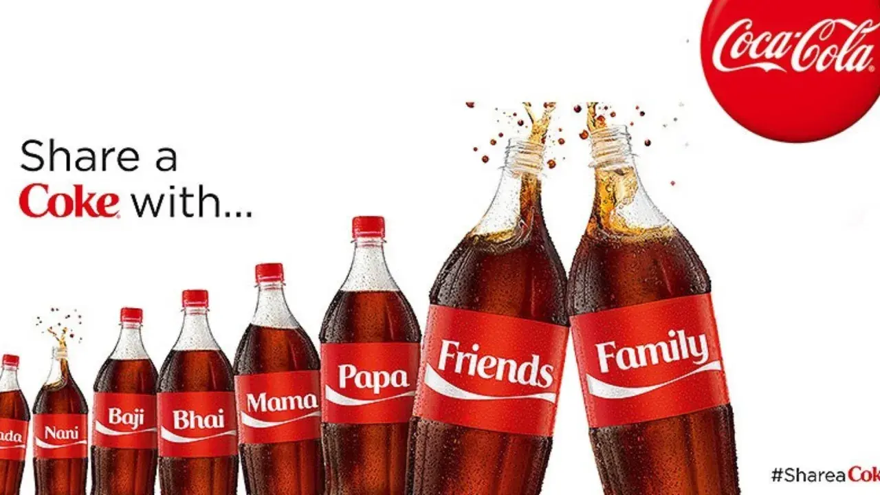
Image Source

Big brands are often hard-pressed to do something ground-breaking when they're already so big. So, what did Coca-Cola do to appeal to the masses? They appealed to individuals by putting their names on each bottle.

The Share a Coke campaign began in Australia in 2011 when Coca-Cola personalized each bottle with the 150 most popular names in the country.

Since then, the U.S. has followed suit, printing first names across the front of its bottles and cans in Coke's branded font. You can even order custom bottles on Coke's website to request things like nicknames and college logos.

This was a breaking story across the marketing and advertising industry. It enchanted many consumers, but it confused others. Why make something temporary so personal?

Either way, Coke received immediate attention for this campaign.

Pepsi even released some sassy counter-ads shortly after the campaign launched. Theirs focused on mocking the bottle names, questioning how people truly felt when they got the wrong name.

The Lesson

Coke fans are regular buyers, and the company fully leaned into that sense of individual ownership. Wondering what name you’ll get out of the vending machine was a fun thrill in and of itself — even if it isn’t yours, it encourages you to “share a Coke” with whoever's name is on the front.

3. Absolut Vodka: The Absolut Bottle

Ad Campaign: Print

Image Source

Despite having an ambiguous shape, Absolut made its bottle the most recognizable bottle in the world. Its campaign, which featured print ads showing bottles “in the wild,” was so successful that it didn‘t stop running for 25 years.

It’s the longest uninterrupted ad campaign ever and comprises over 1,500 separate ads. So, as the saying goes, “If it ain‘t broke, don’t fix it.”

When the campaign started, Absolut had a measly 2.5% of the vodka market.

When it ended in the late 2000s, Absolut was importing 4.5 million cases per year, or half of all imported vodka in the U.S.

The Lesson

No matter how boring your product looks, you can still tell your story in an interesting way. Let me repeat: Absolut created 1500 ads for one bottle. So, don’t feel afraid to be determined and differentiate your product in the same way.

4. Anheuser-Busch: Whassup (1999)

Ad Campaign: Television

When's the last time an advertisement literally changed the way we talk to one another? Allow me to answer that question with another question: “Whassup?!”

This series of commercials, which first appeared in late 1999, features a group of friends connecting on a group phone call (not very common anymore, huh?) while drinking beer and “watching the game” on TV.

It starts gently: “What are you doin‘?” Someone asks. “Watching the game, havin’ a Bud” (a Budweiser), someone replies.

As more friends pick up the phone, hilarity ensues: “WHASSUP!?” is yelled back and forth, becoming a classic catchphrase and an icon of beer-drinking culture that constantly ran on sports networks over the next few years.

The Lesson

The ad took pop culture by storm during the Super Bowl in 2000, and you can still hear its echoes today. Why? Anheuser-Busch showed us just how silly and informal an ad can be without ruffling feathers or going off-brand.

Dare to celebrate your audience's absurdities. The more genuine your ad is, the more valuable your product is.

5. Miller Lite: Great Taste, Less Filling (1974)

Ad Campaign: Print, Television
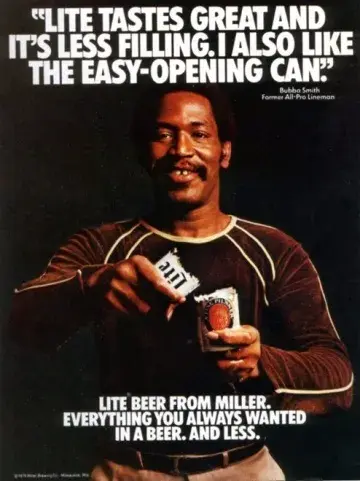
Image Source

Think it's easy to create a whole new market for your product?

The Miller Brewing Company (now MillerCoors) did just that with the light beer market — and dominated it.

The goal of the “Great Taste, Less Filling” campaign was getting “real men” to drink light beer, but they were battling the common misconception that light beer can never actually taste good.

Taking the debate head-on, Miller featured masculine models drinking their light beer and declaring it great tasting.

The Lesson

For decades after this campaign aired, Miller Lite dominated the light beer market it had essentially created.

What‘s the lesson marketers can learn? Strive to be different. If people tell you there isn’t room for a product, create your own category so you can quickly become the leader.

6. Always: #LikeaGirl (2015)

Ad Campaign: Television, Internet

Always, the feminine product brand, hit a home run with this advertisement.

That's not because it went viral after the commercial ran in the 2015 Super Bowl, but because it was a groundbreaking message that hundreds of millions of people repeated long after the campaign was over.

The campaign began as a commercial explaining the stigma behind playing sports “like a girl” — implying that the boy‘s way is better or correct.

By the end of the ad, the message is both clear and inspiring: girls are just as fit and capable as boys are, particularly during puberty — a stage of life that’s extremely important to Always and its women’s products.

The message is now a holistic initiative by Always and a hashtag that's still used on social media today.

The Lesson

Acknowledge not just your audience but the challenges they face—especially the ones that reflect your time or culture. Not every societal issue is off-limits to marketers and advertisers. Take a stand on the ones you know your audience supports, and you'll access a customer base that identifies with your passion.

7. Volkswagen: Think Small (1960)

Standalone Ad: Print
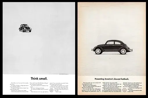
Image Source

Many marketing and advertising professionals like to call Volkswagen‘s “Think Small” campaign the gold standard.

Created in 1960 by a legendary advertising group at Doyle Dane & Bernbach (DDB), the campaign set out to answer one question: how do you change people’s perceptions not only about a product but also about an entire group of people?

See, Americans always had the propensity to buy big American cars—and even 15 years after WWII ended, most Americans were still not buying small German cars.

So what did this Volkswagen advertisement do? It played right into the audience‘s expectations. You think I’m small? Yeah, I am. They never tried to be something they weren’t.

The Lesson

That‘s the most important takeaway from this campaign: don’t sell your company, product, or service as something it's not. Consumers recognize and appreciate honesty.

8. Google: Year in Search (2017)

Ad Campaign: Internet

This isn‘t the oldest or most well-known advertisement on our list, but it’s become the most powerful over its nine-year (and still ongoing) existence. So powerful and so true you forget it's an advertisement.

Year in Search began in 2009 as “Zeitgeist,” a written report of the public‘s most common Google searches over the previous 12 months. The following year, Google adapted it for a three-minute video.

Since then, it’s been a bold, yearly reminder of how much we depend on Google for information on the news and events that give the entire world pause. Check out the company's latest video from 2021 above.

The Lesson

Remind your customers how much you care that they care. These stories elicit a variety of emotions but ultimately unite everyone — no matter what Google products they might like — through an uplifting message of how our usage of the company reflects the best in all of us.

9. Dos Equis: The Most Interesting Man in the World (2006)

Ad Campaign: Television, Pre-roll

Image Source

You know who he is. The man smokes Cuban cigars, surrounds himself with beautiful women, and drinks Dos Equis beer.

Cooling down indulgent vices, such as beer, desserts, or luxury items, is key to creating a successful campaign. And The Most Interesting Man in the World is one of the coolest commercial guys out there.

At the end of every commercial, he says: “I don't always drink beer, but when I do, I prefer Dos Equis. Stay thirsty, my friends.”

The Lesson

The hilarious hyperbole employed in this campaign makes it memorable the next time viewers head out to buy some beer.

And even though Dos Equis recently replaced The Most Interesting Man with a new actor, the original actor’s popularity in meme culture will never decline because of his short, sweet, and memorable tagline — and the cool dude vibe it makes viewers harken back to.

10. California Milk Processor Board: Got Milk? (1993)

Ad Campaign: Print
Image Source

Thanks to the California Milk Processor Board's “Got Milk?” campaign, milk sales in California rose 7% in just one year.

But the impact ran across state borders, and to this day, you still can't escape the millions of “Got [Fill-in-the-Blank]?” parodies.

Note, though, that the ad didn‘t target people who weren’t drinking milk; it instead focused on the consumers who already were.

The Lesson

It‘s not always about getting a brand-new audience to use your products or services. Sometimes, it’s about getting your current audience to appreciate and use your product more often.

Turn your audience into advocates, and use marketing and ad content to tell them why they should continue enjoying the product or service you’re already providing.

11. Metro Trains: Dumb Ways to Die (2012)

Ad Campaign: Internet, Radio

Yes, you read that right: Dumb Ways to Die.

In Melbourne, Australia, Metro Trains wanted to convey a simple message: no horsing near train tracks. Disorderly conduct could lead to injuries or even death.

Still, instead of typical warning signs or announcements inside train stations, Metro Trains came up with Dumb Ways to Die, a song that has garnered 157 million YouTube views since it debuted in 2012.

The song is, unsurprisingly, about dumb ways to die. For example, poking a grizzly bear with a stick or taking your helmet off in outer space.

Frankly, it features a catchy little chorus you won't be able to stop humming to yourself (because singing it is a little morbid): “Dumb ways to die, so many dumb ways to die.”

At the end of the video, after you've watched adorable cartoon characters dying in the dumbest of ways, you get to the moral of the story:

There are many dumb ways to die, but the dumbest possible way would be if you died while standing on the edge of a train platform, drove through a railroad sign, or tried to cross over a train track.

The video ad went viral on YouTube. The song was available on iTunes and even played over the radio with an accompanying ad.

The Lesson

This beloved, now-famous campaign communicates a simple idea in a creative and memorable way — and you don‘t feel you’re being nagged the way some public service announcements do. Consider using creativity to convey your message if your subject matter is grim or boring.

12. Apple: Get a Mac (2006)

Ad Campaign: Television

While there have been many great Apple campaigns, this one takes the cake. The video above is just one of a series of iterations of this campaign, and the Mac vs. PC debate ended up being one of the most successful campaigns ever for Apple.

The company experienced 42% market share growth in its first year with its help. These commercials tell Apple's audience everything they need to know about the product without being overt.

The Lesson

Just because your product does some pretty amazing things doesn‘t mean you need to hit your audience over the head with it. Instead, explain your product’s benefits in a relatable way, so consumers can see themselves using it.

13. Clairol: Does She or Doesn't She? (1957)

Standalone Ad: Print
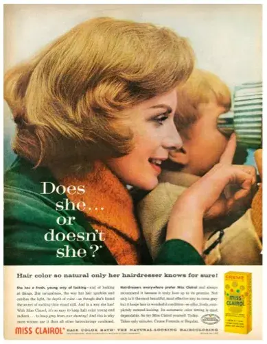
Image Source

The first time Clairol asked this question in 1957, the answer was 1 to 15 — as in, only 1 in 15 people were using artificial hair color. Just 11 years later, the answer was 1 of 2, according to TIME Magazine.

The ad was apparently so successful that some states stopped requiring women to denote hair color on their driver’s licenses. You know you’ve hit a nerve when your ad campaign changes things at the DMV.

Clairol did the opposite of what most marketers would do: they didn‘t want every woman on the street running around saying they were using their product.

They wanted women to understand that their product was so good that people couldn’t tell if they were using it or not.

The Lesson

Sometimes, simply conveying how and why your product works is enough for consumers. Showing becomes more effective than telling.

14. De Beers: A Diamond is Forever (1999)

Ad Campaign: Print, Television
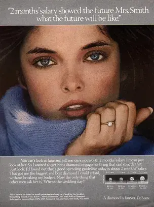
Image Source

In 1999, AdAge declared De Beers’ “A Diamond is Forever” the most memorable slogan of the twentieth century.

But the campaign, which proposed (pun very much intended) the idea that no marriage would be complete without a diamond ring, wasn’t just riding on the coattails of an existing industry.

De Beers actually built the industry. It presented the idea that a diamond ring was a necessary luxury.

According to the New York Times, N. W. Ayer’s game plan was to “create a situation where almost every person pledging marriage feels compelled to acquire a diamond engagement ring.”

The Lesson

Advertising can make a relatively inexpensive product seem luxurious and essential.

15. Old Spice: The Man Your Man Could Smell Like (2010)

Ad Campaign: Television, Internet
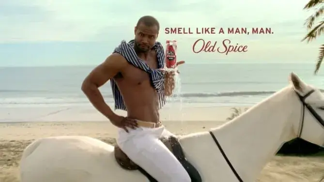
Image Source

The very first part of Old Spice's “The Man Your Man Could Smell Like” campaign, created by Wieden + Kennedy and launched in February 2010, was the following commercial. It became a viral success practically overnight:

That video has over 51 million views as of this writing. Several months later, in June 2010, Old Spice followed up with a second commercial featuring the same actor, Isaiah Mustafa.

Mustafa quickly became “Old Spice Guy,” a nickname Wieden + Kennedy capitalized on with an interactive video campaign in which Mustafa responded to fans' comments on Facebook, Twitter, and other social media websites with short, personalized videos.

In about two days, the company had churned out 186 personalized, scripted, and quite funny video responses featuring Mustafa responding to fans online.

According to Inc., these videos saw almost 11 million views, and Old Spice gained about 29,000 Facebook fans and 58,000 new Twitter followers.

“We were creating and sending miniature TV commercials back to individual consumers that were personalized, and we were doing it on a rapid-fire basis,” Jason Bagley, former creative director at Wieden + Kennedy and a writer for the campaign, told Inc.

“No one expects to ask a question and then be responded to. I think that's where we broke through.”

The Lesson

If you find your campaign‘s gained momentum with your fans and followers, do everything you can to keep them engaged while keeping your messaging true to your brand’s voice and image.

16. Wendy’s: Where’s the Beef? (1984)

Ad Campaign: Print, Television
Image Source

Is it enough to say this campaign was successful because it featured a giant hamburger bun and a cute set of old ladies? No? I didn't think so.

Wendy‘s took a more daring approach in this advertising campaign: it targeted its competitors. The simple phrase “Where’s the beef?” was used to point out the lack of beef in competitors‘ burgers — and it quickly became a catchphrase that encapsulated all that was missing in their audience’s lives.

While you can't predict when a catchphrase will catch on and when it won‘t, Wendy’s (wisely) didn't over-promote their hit phrase. The campaign only ran for a year, allowing it to gently run its course.

The Lesson

Be careful with your campaign successes and failures. Just because you find something that works doesn’t mean you should keep doing it repeatedly to the point it’s played out. Allow your company to change and grow, and you may find that you can have even greater success in the future by trying something new.

17. Procter & Gamble: Thank You, Mom (2012)

Ad Campaign: Television

Seriously, you wouldn‘t expect a household and cleaning products company commercial to pull at the heartstrings like that, would you?

Lately, though, Procter & Gamble (P&G) has launched some of the best ads we’ve ever seen from the consumer goods industry.

That's because P&G identified the story behind the story of Olympic athletes — the stories of the supportive moms who pushed these world-class athletes throughout their entire lives leading up to that crowning moment.

And yes, they probably had to do a lot of laundry and cleanup along the way (presumably using P&G products).

The Lesson

Make your audience cry (just kidding). The season or time period of your ad is important. But even if you run an ad during the Olympic Games, like P&G did, make sure it has longevity and a message that can influence people no matter when or where they see it.

Emotional and nostalgia marketing are powerful tactics to get people to make buying choices, so if there's a bigger, more universal story behind your product or story, tap into it — and showcase it front and center.

18. KFC: “FCK” (2018)

Standalone Ad: Print
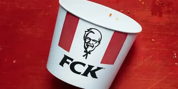
The ad above isn‘t just an empty bucket of KFC with the company’s letters jumbled around. It's also not a normal, unprompted promotion of fried chicken.

This ad is an apology and perhaps the most creative one of all time.

In February 2018, KFC's business in the U.K. ran out of chicken. You read that right: a poultry company ran out of poultry.

It‘s not every day that a business stumbles upon the most ironic PR crisis in company history, so when it happens, all eyes are on the business’s response. Well, we're happy to report that KFC stuck the landing.

With the help of the creative agency Mother London, KFC took out a full-page ad in Metro, the U.K.'s newspaper, rearranging its three famous initials to create a hilarious, albeit explicit, response to its product shortage.

The ad depicts a KFC bucket that reads, “FCK” — as if to say, “FCK, this is embarrassing.” (You can fill in the missing letter ... )

Beneath this design, the company apologizes for what it realizes is an inexcusable, if not slightly funny, failure.

The Lesson

No business is above a good old-fashioned sorry. And if you can laugh at yourself in the process, you‘ll only make it better. KFC’s ad shows how to combine humility, class, humor, and ultimately company pride in a message that can help you bounce back from the bad press ...

... and even come out the other side with a net-positive result for your brand.

19. Cartier: “Panthère de Cartier” featuring V (Kim Taehyung) (2023)

Ad Campaign: Print, Internet

Image Source

When wandering into the waters of K-pop, I learned a few things early on: 1) do not ever question somebody’s bias, and 2) don’t ever underestimate the BTS army.

Cartier learned these lessons too, bringing them into this partnership with V, one of BTS’ members.

The ad creates a disruptive and memorable impact by blending high fashion with celebrity influence, using V‘s global popularity to draw attention.

The ad’s aesthetic sophistication and strategic use of a high-profile ambassador all contributed to its standout nature, capturing viewers’ attention and leaving a lasting impression.

It was reported that The Cartier Panther Necklace 18k Yellow Gold sold out within minutes on the luxury brand website after it was announced that Kim Taehyung became their brand ambassador and was shown wearing it in recent viral pictures.

The Lesson

Influencer marketing can work if the image and brand of the influencer matches that of the brand. In this case, Kim Taehyung’s elegance and charisma perfectly align with Cartier's luxurious image, making the ad both captivating and influential among a broad audience.

20. Nike: “You can’t stop us” (2020)

Ad Campaign: Internet
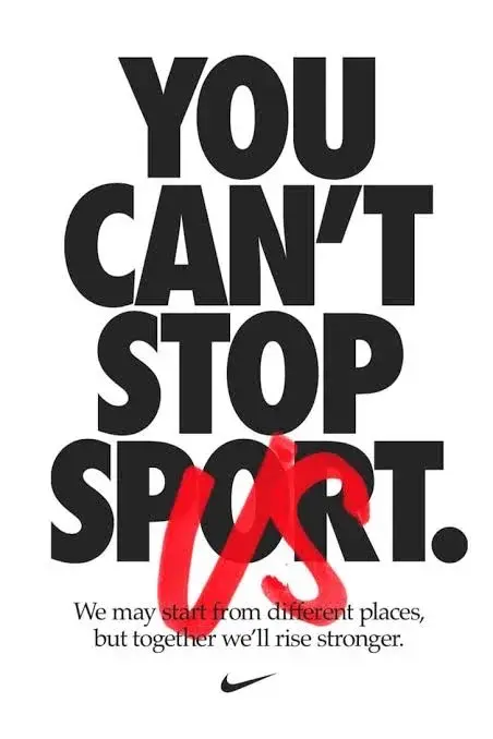
Image Source

Nike has always been known for its innovative and inspiring marketing campaigns, such as “Just Do It” (seen earlier on this list).

“You Can’t Stop Us” is a campaign that celebrates the return of sports after the pandemic. The ad is a video montage of athletes from different sports and backgrounds, highlighting the resilience and diversity of the sports community.

The video, which was released in July 2020, has been viewed over 100 million times on YouTube and has won several awards, including a Grand Prix at Cannes Lions.

The Lesson

Cultural relevance, inclusivity, and diversity are some factors that make up a great ad. Nike used all three, including music, narration, and powerful imagery at a time when the world was adjusting to a new reality, which made this ad a hit with customers.

21. Dove: “Real Beauty Sketches” (2023)

Ad Campaign: Internet

Image Source

If someone asked you to describe yourself, what would you say?

More than half of women globally agree that when it comes to how we look, we might be our own worst critic. Our perception of ourselves is far less positive than it should be. Our beauty standards can be too exacting.

The ad addressed this issue by featuring an FBI-trained forensic artist who drew two sketches of several women — one based on their own description and another based on a stranger’s description.

The difference between the two sketches was striking and it beautifully conveyed the message that we are more beautiful than we think.

This ad was disruptive because it challenged the traditional beauty standards set by the industry. Instead of using models with perfect features, Dove chose to highlight the beauty of everyday women.

What made this ad great was its emotional impact. It resonated with women around the world who could relate to the feeling of being too hard on themselves.

The ad was not just selling a product. It was promoting a positive self-image, and that’s what made it stand out.

The Lesson

The success of this ad lies in its authenticity and its ability to connect with the audience on a deeper level. This is a great example of how advertising can be used to not just sell products but also to promote positive social change.

22. Just Eat: “Did Somebody Say” (2023)

Ad Campaign: Internet

Image Source

“Ohm you thought it was just burgers and fries? They got more flavors than you tasted or you heard in your life. Ooh — this is what the app do, it ain’t only fast food. Switching styles like opera to rap too.”

This ad was an unexpected visual and musical delight. Using a hilarious mix of opera and hip hop, Just Eat released a beautiful music video with stunning visuals featuring Christina Aguilera and Latto just belting out praises for the U.K. delivery brand. The ad quickly went viral on social media, boosting brand awareness.

The Lesson

Like I said earlier, music can be a powerful way to convey your brand message in an ad and make it memorable. I saw this ad last year on TikTok, and till today I can still hear Christina belt “Thai rice, sticky icky” in my head.

23. Snickers: “You are not you when you’re Hungry” (2008)

Ad Campaign: Television, Internet
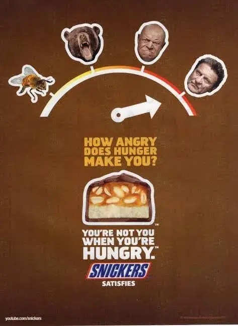
Image Source

In 2007 growth for Snickers lagged behind other global chocolate brands and they started losing market share. Projections showed that if it remained on the same trajectory, the brand would lose its position as the world’s leading chocolate bar.

They needed fame and more customer engagement. Fast.

To make this ad, they tapped into a core human experience: hunger. The impact was almost instant, increasing the sales of Snickers to $376 million globally.

This ad also generated 400 million incremental and unpaid media impressions with a media value equal to $28.6 million, making Snickers famous.

The Lesson

When making an ad, finding something that you core audience relates to is essential. People eat chocolate bars for lots of different reasons, but the main outcome that they want is satisfaction. Snickers realized this and factored that into their ad, making it relatable.

24. Charli xcx: “Brat” (2024)

Ad Campaign: Internet, Location-based Advertisement
Image Source

If you’ve been online, you know that 2024 is the year of brat summer, a reference to pop star Charli xcx’s sixth studio album. The branding for the record itself: the word “brat” in stretched-out Arial font over a bright green background.

The album’s simple visual identity made making user-generated content a breeze. TikTokers make lists in the same font proclaiming what is Brat (sunglasses in the club) and what is not (being self-conscious on the dance floor).

The simple X endorsement “kamala IS brat” was enough to have the candidate’s social team redesign their social branding in the same Brat green.

I could write a dissertation about the marketing behind the album. But, let’s get specific and talk about the Brat wall. Buckle up for some lore.

A few days before the album dropped, a wall in Williamsburg’s was painted lime green. When the album came out the phrase “i’m your fav reference” was added, lyrics from one of the album’s songs.

The wall continued to change. It was painted white with the phrase “brat and it’s the same but there’s three more songs so it’s not” to signal that a deluxe addition of the album would soon drop. The wall proclaimed “lorde” when a remix with the New Zealand singer was dropped.

In short, the wall went viral, like the album and the singer herself.

The Lesson

Brat showcases the power of cohesive branding. A simple color and text pairing took the internet by storm. Fans turned to a literal wall, decoding it for messages about what would happen next. I appreciate how Charli’s team harnessed the power of simplicity to build hype.

Use these advertisement examples to inspire your own ads.

Advertising is one of the most important aspects of any business, and it can be a make-or-break factor in terms of success.

What makes a great advertising campaign? It must be memorable, catchy, and above all else, it must effectively sell your product or service.

With careful planning and execution, your next advertising campaign could be the one that takes your business to new heights. Good luck!

Editor's note: This post was originally published in January 2019 and has been updated for comprehensiveness.

20+ Best Cinematic Color Grading Presets (For DaVinci, Premiere + More)

Featured Imgs 23

Cinematic color grading is all about creating mood, atmosphere, and emotion in your visual narratives. It’s what separates ordinary footage from the breathtaking scenes you see in blockbuster films.

However, mastering color grading can be a complex and time-consuming process. That’s why high-quality presets are a game-changer, offering an efficient way to apply sophisticated looks to your videos with just a few clicks.

In this post, we’ve compiled a selection of the best cinematic color grading presets for popular platforms like DaVinci Resolve, Premiere Pro, and more. Each preset is carefully chosen for its ability to deliver stunning, film-like quality across a variety of styles, from dramatic and moody tones to vibrant, colorful palettes.

Check out the collection below and be sure to download the free LUTs as well.

30 CINEMATIC LUTS for Color Grading

This is a must-have collection of cinematic color grading presets offering 30 professional cinematic color looks designed for any Rec709 color space videos. It also includes a LUT converter for Vlog, Dlog, and Slog to Rec709. Utilize them to infuse color grading effects into your clips, enhancing the visual storytelling. A video tutorial accompanies this pack, simplifying the process for beginners.

Movie Tones Cinematic Color LUTs

This is an impressive array of color grading presets designed to add that bold, movie-like look to your footage. These color grading LUTs can transform your video content into a cinematic masterpiece with a simple click. The LUTs offer color tones ideal for enhancing visual storytelling.

Movie LUTs Color Presets

You can use this cinematic color grading preset pack to achieve Hollywood-movie-like color grading for photos and videos. Compatible with popular software like Adobe Premiere Pro, Adobe After Effects, Davinci Resolve, and Final Cut Pro, these presets work perfectly with any FPS and resolution as well as drone cameras.

Bold Cinematic Color Presets

This pack of cinematic color grading presets includes versatile LUTs, ideal for photo and video, including drone footage. They function with any FPS and resolution, require no plugins, and are compatible with many popular software, including Adobe Premiere Pro, After Effects, Davinci Resolve, and Final Cut Pro. Easy to use, they can enhance numerous media projects, from production videos to special events.

Cinematic Wedding Color LUTs

A creative color grading preset pack perfect for enhancing wedding videos. This LUTs pack helps to achieve cinematic color grading quickly, bringing a professional touch to your footage. It’s a practical solution for adding depth and charm to precious memories, making them even more memorable. This tool is simple to use yet impactful, guaranteed to elevate your wedding videos.

Cinematic Movie Color LUTs

A unique creative cinematic color grading preset bundle that adds a colorful cinematic touch to your projects. Offering a collection of different color profiles, it ensures your work stands out with aesthetically appealing and professional-looking visuals. It’s incredibly versatile and user-friendly, making it perfect for film enthusiasts and content creators aiming for a high-quality cinematic look.

Film Color Grading LUTs Pack

This color grading preset pack is ideal for rendering a cinematic touch to your visuals. It offers color look-up tables (LUTs) specially designed for film-like color grading looks. These presets are an investment that simplifies your post-production process, enhancing your visuals with the texture and depth of professional film aesthetics.

Cinematic Film Color Grading Presets

A creative collection of color grading presets that provides cinematic color Look-Up Tables (LUTs). This bundle offers modern cinematic visual styles, enhancing your videos with the rich, dramatic tones often associated with professional cinema projects. It’s a great asset for adding a touch of Hollywood flair to your film and video creations.

Modern Cinematic Film LUTs

A creative resource that offers bold cinematic color grades to your films. It transforms your footage into a visually stunning cinematic experience, capturing the essence of tried-and-true film aesthetics. With this asset, creating a compelling visual narrative becomes seamless and straightforward. It’s an essential tool to elevate your film production.

Classic Film Cinematic Color Grading LUTs

This is a creative color grading preset pack that offers a vintage touch to your visuals. These cinematic color Look-Up Tables (LUTs) allow you to transform the color and tone of your media, mimicking the timeless appearance of classic films. A great tool for enhancing your projects with nostalgia-inducing, cinematic flair.

Cinematic Film LUTs Pack

A creative color grading preset pack designed to enhance your visuals with bright cinematic color grades. The presets are highly recommended for elevating the overall aesthetics of your footage, giving you professional-grade cinematic looks in a user-friendly package. Perfect for filmmakers and content creators seeking to level up their projects.

Aerial Cinematic LUTs for Drone Videos

This LUTs pack is designed to transform drone footage into captivating cinematic stories. This pack, tailored for Final Cut Pro X and Apple Motion, includes 21 expertly created LUTs. Incorporating them into your work is straightforward, thanks to the user-friendly controls of the editing software. They help to enhance storytelling with stunning color grading.

Slog2 Cinematic and Standard Color LUTs

An ideal color grading preset collection for enhancing your wide dynamic range videos. These creative tools allow you to achieve that coveted cinematic look, elevating the visual storytelling of your content. Simple to use yet powerful, they promise to transform your footage, adding depth, mood, and captivating color tones to your creative projects.

Blast Cinematic Movie LUTs

Spruce up your videos with this cinematic movie LUTs pack. This pack features 25 cinematic LUTs and 42 “Log to Rec 709” LUTs perfect for films, social videos, presentations, and more. Adding a tasteful color grading to your work is as easy as drag-and-drop, no matter the resolution. Boasting improved modern and stylish visuals, this pack is a true game-changer.

Cinematic Color Grading LUTs Pack

An exciting collection of color grading presets that transforms your video footage with a film-style look. This pack contains unique cinematic LUTs that give your projects an amazing, visually striking dimension. It’s ideal for filmmakers and videographers seeking to elevate their storytelling abilities through immersive, cinema-quality aesthetics.

Vibrant Cinematic Color LUTs

Give your videos a cinematic edge with this professional LUTs collection. Designed specifically for DaVinci Resolve, this pack of 24 high-quality lookup tables enhances colors, boosts contrast, and lends a professional polish to your film projects. Turn ordinary footage into a visual delight and create cinematic masterpieces effortlessly with these LUTs.

70 Cinematic Color Grading LUTs

This bundle offers an easy way to bring professional, film-like aesthetics to your video content. Compatible with various editing software and cameras, these presets enable an outstanding color grading potential with just a few clicks. Whether it’s footage for YouTube, an independent film, or music videos, these LUTs can utterly transform and enhance your visuals.

1000 Cinematic Color Presets Bundle

This color grading preset pack delivers a variety of LUTs to transform your videos into cinematic works of art. Offering 1000 unique presets spread across categories like cinematic, vintage, and travel, the bundle supports popular video editors, including Premiere Pro and After Effects. Beyond color grading, the bundle provides 15 unique VHS looks, 5 old film looks, and light leaks to add a retro touch to your content.

Free Cinematic Color Grading Presets

70 FREE LUTs for Cinematic Color Grading

This is a collection of 70 color-grading LUTs for videos. It includes a wide variety of color looks, including cinematic looks, to give your video projects a professional look. There are also 17 LUTs for enhancing Log footage.

48 FREE Custom LUTs for Log Footage

A hand-crafted bundle of color-grading LUTs for improving and optimizing log footage. This pack includes 48 different LUTs for making your videos look professional. They feature vintage and cinematic filters as well.

29 Free LUTs for Videos

This video LUTs bundle also comes with a mixed collection of color grading presets for both optimizing and enhancing your videos. It includes 29 different LUTs that feature high-quality color looks and filters.

Free Cinematic LUTs for Photos & Videos

This free LUTs pack is designed to give a cinematic look and feel to your videos and photos. It includes several color-grading LUTs with professional-looking filters that will instantly enhance your videos with a more dramatic look.

Node.js or Laravel in 2024: Decoding the Best Framework for Your Next Project

Featured Imgs 23

In the ever-evolving landscape of web development, choosing the right framework is crucial for the success of your next project. As we dive into 2024, two popular frameworks often come up in discussions: Node.js and Laravel. Both have their unique strengths and are suitable for different types of projects. In this article, we’ll dissect their …

The post Node.js or Laravel in 2024: Decoding the Best Framework for Your Next Project first appeared on Lucid Softech.