Gen Z, AI, and the Power of Creator Marketing

Featured Imgs 23

As AI reshapes marketing, the next generation of decision-makers is placing more trust in creators than in brands. Here’s how to use creator marketing strategies to keep your business relevant.

Download Now: Free Marketing Plan Template [Get Your Copy]

Marketing strategies evolve with the technological shifts of each era, continuously redefining how businesses connect with consumers.

In the early days of the internet, outbound marketing tactics like billboards and direct mail were the go-to approach. Then came Google and social media, giving rise to inbound marketing platforms like HubSpot.

Now, we’re entering a new and highly disruptive cycle, this time driven by AI.

This early ‘discovery’ phase — which Kieran and I anticipate will last 5-7 years before stabilizing — is marked by rapid innovation and an overwhelming influx of fragmented AI tools.

But the real challenge isn’t just about keeping pace with AI; it’s about understanding how to connect with a new generation of decision-makers — particularly Gen X and Gen Z — while everything else is changing. But how?

As discussed in a recent episode of Marketing Against the Grain, we believe that the answer lies in creator-led marketing. Here’s why — and how you can get started today.

Why the New Generation of Decision Makers Trust Creators over Brands

As new generations step into key decision-making roles within companies, their approach to purchasing decisions is significantly different from that of their predecessors.

“Data shows that the new, younger generations rely primarily on social media and human-to-human connections when evaluating software, solutions, and other business needs,” Kieran explains.

They’re not interested in traditional brand pitches or product specs alone; instead, they seek raw insights, authentic voices, and a sense of community.

This shift underscores the need for brands to prioritize creator-centric content to connect with these new decision-makers online — especially as AI, despite its advancements, isn’t yet capable of delivering the nuanced, human-centered content that creators offer.

“It used to be that people trusted brands. Now creators have become the most trusted brands in our society.” So how do you pivot your marketing strategy?

Three Ways to Integrate Creator Marketing Strategies into Your Marketing Plan

Learn how to revamp your marketing plan by incorporating these three creator-led approaches, along with resources from HubSpot’s Free Marketing Plan Template.

1. Transform Employee Expertise into Content

One of the most underutilized, strategic content assets within companies is the deep industry knowledge of their employees. These individuals not only understand the challenges that customers face but also the intricacies of the product — insights that external agencies or third-party influencers may not have.

Identifying who these experts are within your business, and then putting them in front of a camera, is a high-impact way to turn critical knowledge into compelling, relevant video content. (Plus, video is harder to replicate with AI.)

Especially for audiences that are skeptical of overly-polished brand messaging and AI-generated content, showcasing real, human expertise elevates your brand’s authority and trustworthiness. It also adds a nice personal touch by showing the ‘faces’ behind the business.

2. Hire In-House Creators Dedicated Entirely to Content Creation

Beyond using existing in-house knowledge, a second approach is to hire new employees solely dedicated to content creation. What’s key here, however, is that these new hires are given the autonomy to focus exclusively on creating content, free from the distractions of daily operational tasks.

"Allow them to experiment at scale and function entirely like independent creators,” says Kieran. “This way, they can really learn what works — and what doesn’t — for your company by experimenting, testing, and iterating.”

By giving in-house creators the space to innovate and refine their ideas, you ensure that your content stays fresh and relevant. This strategy also enables you to harness the agility that defines successful independent creators, while still benefiting from their understanding of your business goals and brand ethos.

3. Partner with Influencers to Expand Access to Walled Gardens

As social media shifts toward ‘walled gardens,’ platforms are increasingly restricting the ability to share external links, reducing your capacity to direct traffic outside the platform.

“LinkedIn posts with external links are five to six times less effective,” says Kieran.

And X (formerly Twitter) has introduced features like private likes, hinting at a broader strategy to keep users and their interactions confined within the platform.

Partnering with external influencers offers a strategic way to maintain — or even grow — your presence on these increasingly closed platforms. Influencers have already built trust and credibility within their communities, allowing them to organically integrate your product into their content.

This enables your brand to connect with a targeted, engaged audience and increase awareness where direct marketing efforts are otherwise limited.

To watch our entire discussion about creator-led marketing, check out the full episode of Marketing Against the Grain below:

This blog series is in partnership with Marketing Against the Grain, the video podcast. It digs deeper into ideas shared by marketing leaders Kipp Bodnar (HubSpot’s CMO) and Kieran Flanagan (SVP, Marketing at HubSpot) as they unpack growth strategies and learn from standout founders and peers.

Introducing

Category Image 076

I created a little library at work to make those “skeleton screens” that I’m not sure anyone likes. […] We named it skellyCSS because… skeletons and CSS, I guess. We still aren’t even really using it very much, but it was fun to do and it was the first node package I made myself (for the most part).

Regardless of whether or not anyone “likes” skeleton screens, they do come up and have their use cases. And they’re probably not something you want to rebuild time and again. Great use for a web component, I’d say! Maybe Ryan can get Uncle Dave to add it to his Awesome Standalones list. 😉

The other reason I’m sharing this link is that Ryan draws attention to the Web Components De-Mystified course that Scott Jehl recently published, something worth checking out of course, but that I needed a reminder for myself.


Introducing <shelly-wc> originally published on CSS-Tricks, which is part of the DigitalOcean family. You should get the newsletter.


from CSS-Tricks https://ift.tt/yMOhIXK
Gain $200 in a week
via Read more

Useful Tools for Creating AVIF Images

Category Image 076

AVIF (AV1 Image File Format) is a modern image file format specification for storing images that offer a much more significant file reduction when compared to other formats like JPG, JPEG, PNG, and WebP. Version 1.0.0 of the AVIF specification was finalized in February 2019 and released by Alliance for Open Media to the public.

You save 50% of your file size when compared to JPG and 20% compared to WebP while still maintaining the image quality.

In this article, you will learn about some browser-based tools and command-line tools for creating AVIF images.

Why use AVIF over JPGs, PNGS, WebP, and GIF?

  • Lossless compression and lossy compression
  • JPEG suffers from awful banding
  • WebP is much better, but there’s still noticeable blockiness compared to the AVIF
  • Multiple color space
  • 8, 10, 12-bit color depth

Caveats

Jake Archibald, wrote an article a few years back on this new image format and also helped us to identify some disadvantages to compressing images, normally you should look out for these two when compressing to AVIF:

  1. If a user looks at the image in the context of the page, and it strikes them as ugly due to compression, then that level of compression is not acceptable. But, one tiny notch above that boundary is fine.
  2. It’s okay for the image to lose noticeable detail compared to the original unless that detail is significant to the context of the image.

See also: Addy Osmani at Smashing Magazine goes in-depth on using AVIF and WebP.

Data on support for the avif feature across the major browsers from caniuse.com

Browser Solutions

Squoosh

Screenshot of Squoosh.

Squoosh is a popular image compression web app that allows you to convert images in numerous formats to other widely used compressed formats, including AVIF.

Features
  • File-size limit: 4MB
  • Image optimization settings (located on the right side)
  • Download controls – this includes seeing the size of the resulting file and the percentage reduction from the original image
  • Free to use

Cloudinary

Cloudinary’s free image-to-AVIF converter is another image tool that doesn’t require any form of code. All you need to do is upload your selected images (PNG, JPG, GIF, etc.) and it returns compressed versions of them. Its API even has more features besides creating AVIF images like its image enhancement and artificially generating filling for images.

I’m pretty sure you’re here because you’re looking for a free and fast converter. So, the browser solution should do.

Features

  • No stated file size limit
  • Free to use

You can find answers to common questions in the Cloudinary AVIF converter FAQ.

Command Line Solutions

avif-cli

avif-cli by lovell lets you take your images (PNG, JPEG, etc.) stored in a folder and converts them to AVIF images of your specified reduction size.

Here are the requirements and what you need to do:

  • Node.js 12.13.0+

Install the package:

npm install avif

Run the command in your terminal:

npx avif --input="./imgs/*" --output="./output/" --verbose
  • ./imgs/* – represents the location of all your image files
  • ./output/ – represents the location of your output folder
Features
  • Free to use
  • Speed of conversion can be set

You can find out about more commands via the avif-cli GitHub page.

sharp

sharp is another useful tool for converting large images in common formats to smaller, web-friendly AVIF images.

Here are the requirements and what you need to do:

  • Node.js 12.13.0+

Install the package:

npm install sharp

Create a JavaScript file named sharp-example.js and copy this code:

const sharp = require('sharp')

const convertToAVIF = () => {
    sharp('path_to_image')
    .toFormat('avif', {palette: true})
    .toFile(__dirname + 'path_to_output_image')
}

convertToAVIF()

Where path_to_image represents the path to your image with its name and extension, i.e.:

./imgs/example.jpg

And path_to_output_image represents the path you want your image to be stored with its name and new extension, i.e.:

/sharp-compressed/compressed-example.avif

Run the command in your terminal:

node sharp-example.js

And there! You should have a compressed AVIF file in your output location!

Features
  • Free to use
  • Images can be rotated, blurred, resized, cropped, scaled, and more using sharp

See also: Stanley Ulili’s article on How To Process Images in Node.js With Sharp.

Conclusion

AVIF is a technology that front-end developers should consider for their projects. These tools allow you to convert your existing JPEG and PNG images to AVIF format. But as with adopting any new tool in your workflow, the benefits and downsides will need to be properly evaluated in accordance with your particular use case.

I hope you enjoyed reading this article as much as I enjoyed writing it. Thank you so much for your time and I hope you have a great day ahead!


Useful Tools for Creating AVIF Images originally published on CSS-Tricks, which is part of the DigitalOcean family. You should get the newsletter.


from CSS-Tricks https://ift.tt/bLlHG8x
Gain $200 in a week
via Read more

The “Other” C in CSS

Category Image 052

I think it’s worth listening to anything Sara Soueidan has to say. That’s especially true if she’s speaking at an event for the first time in four years, which was the case when she took the stage at CSS Day 2024 in Amsterdam. What I enjoy most about Sara is how she not only explains the why behind everything she presents but offers it in a way that makes me go “a-ha!” instead of “oh crap, I’m doing everything wrong.”

(Oh, and you should take her course on Practical Accessibility.)

Sara’s presentation, “The Other ‘C’ in CSS”, was published on YouTube just last week. It’s roughly 55 minutes of must-see points on the various ways CSS can, and does, impact accessibility. I began watching the presentation casually but quickly fired up a place where I could take thorough notes once I found myself ooo-ing and ahhh-ing along.

So, these are the things I took away from Sara’s presentation. Let me know if you’ve also taken notes so we can compare! Here we go, there’s a lot to take in.

Here’s the video

Yes, CSS affects accessibility

CSS changes more than the visual appearance of elements, whether we like it or not. More than that, its effects cascade down to HTML and the accessibility tree (accTree). And when we’re talking about the accTree, we’re referring to a list of objects that describes and defines accessible information about elements.

There are typically four main bits of info about an accTree object:

  • Role: what kind of thing is this? Most HTML elements map to ARIA roles, but not all of them.
  • Name: identifies the element in the user interface.
  • Description: how do we further describe the thing?
  • State: what is its current state? Announce it!

The browser provides interactive features — like checking a checkbox that updates and exposes the element’s information — so the user knows what happens following an interaction.

Accessibility tree objects may also contain properties and relationships, such as whether it is part of a group or labeled by another element.

Example: List semantics

CSS can affect an object’s accessible role, name, description, or even whether it is exposed in the accTree at all. As such, it can directly impact the screen reader announcement. We shared a while back how removing list-style affects list semantics, particularly in the case of Safari, and Sara explains its nuances.

/* Removes list role semantics in Safari */
/* Need to add aria-role=list */
ul {
  list-style: none;
}

/* Does not remove role semantics in Safari */
nav ul {
  list-style: none:
}

/* Removed unless specifically re-added in the markup */
ul:where([role="list"]) {
  list-style: none;
}

/* Preserves list semantics */
ul {
  list-style: "";
}

display: contents

CSS can completely remove the presence of an element from the accessibility tree. I took a screenshot from one of Sara’s slides but it’s just so darn helpful that I figured putting the info in a table would be more useful:

Exposed to a11y APIs?Keyboard accessible?Visually accessible (rendered)?Children exposed to a11y APIs?
display: none
visibility: hidden
opactity: 0 and filter: opacity(0)
clip-path: inset(100%)
position(off-canvas)
.visually-hidden
display: contents

The display: contents method does more than it’s supposed to. In short, we know that display controls the type of box an element generates. A value of none, for example, generates no box.

The contents value is sort of like none in that not box is generated. The difference is that it has no impact on the element’s children. In other words, declaring contents does not remove the element or its child elements from the accTree. More than that, there’s a current bug report saying that declaring contents in Firefox breaks the anchoring effect of an ID attribute attached to an element.

Eric Bailey says that using display: contents is considered harmful. If using it, the recommendation is to set it on a generic <div> instead of a semantically meaningful element. If we were to use it on a meaningful interactive element, it would be removed from the accTree, and its children would be bumped up to the next level in the DOM.

Visually hiding stuff

Many, many of us use some sort of .visibility-hidden class as a utility for hiding elements while allowing screenreaders to pick them up and announce the contents. TPGi has a great breakdown of the technique.

.visually-hidden:not(:focus):not(:active) {
  width: 1px;
  height: 1px;
  overflow: hidden;
  clip: rect(0 0 0 0); /* for IE only */
  clip-path: inset(50%);
  position: absolute;
  white-space: nowrap;
}

This is super close to what I personally use in my work, but the two :not() statements were new to me and threw me for a loop. What they do is make sure that the selector only applies when the element is neither focused nor activated.

It’s easy to slap this class on things we want to hide and call it a day. But we have to be careful and use it intentionally when the situation allows for us to hide but still announce an element. For example, we would not want to use this on interactive elements because those should be displayed at all times. If you’re interacting with something, we have to be able to see it. But for generic text stuff, all good. Skip to content links, too.

There’s an exception! We may want an animated checkbox and have to hide the native control’s appearance so that it remains hidden, even though CSS is styling it in a way that it is visible. We still have to account for the form control’s different states and how it is announced to assistive tech. For example, if we hide the native checkbox for a custom one by positioning it way off the screen, the assistive tech will not announce it on focus or activation. Better to absolutely position the checkbox over the custom one to get the interactive accessibility benefits.

Bottom line: Ask yourself whether an interactive element will become visible when it receives focus when deciding whether or not to use a .visually-hidden utility.

CSS and accessible names

The browser follows a specific process when it determines an element’s accessible name (accName):

  • First, it checks for aria-labelledby. If present, and if the ID in the attribute is a valid reference to an element on the page, it uses the reference’s element’s computed text as the element’s accessible name.
  • Otherwise, it checks for aria-label.
  • Otherwise, unless the element is marked with role="presentation" or role="none" (i.e., the element does not accept an accName anymore), the browser checks if the element can get its own name, which could happen in a few ways, including:
    • from an HTML elemnenty, such as alt or title (which is best on an <iframe>; otherwise, avoid),
    • from another element, like <label> or <legend>, or
    • from its contents.

At this point, Sara went into a brief (but wonderful) tangent on <button> semantics. Buttons are labelable elements and can get their accName by using an aria-label attribute, an aria-labelledby attribute, its contents, or even a <label> element.

ARIA takes precedence over HTML which is why we want to avoid it only where we have to. We can see the priorities and overrides for accessible names in DevTools under the Accessibility tab when inspecting elements.

DevTools exposing the accessibility tree of the document and aria attributes for a selected anchor element.

But note: the order of priority defined in the accName computation algorithm does not define the order of priority that you should follow when providing an accName to elements. The steps should like be reversed if anything. Prioritize native HTML!

CSS generated content

Avoid using CSS to create meaningful content. Here’s why:

<a href="#" class="info">CSS generated content</a>
.info::before {
  content: "ⓘ" / "Info: ";
  /* or */
  content: url('path-to-icon.svg') / "Info: ";
}

/* Contents: : Info: CSS generated content. */

But it’s more nuanced than that. For one, we’re unable to translate content generated by CSS into different languages, at least via automated tools. Another one: that content is gone if CSS is unavailable for whatever reason. I didn’t think this would ever be too big a concern until Sara reminded me that some contexts completely strip out CSS, like Safari’s Reader Mode (something I rely on practically every day, but wish I didn’t have to).

There are also edge cases where CSS generated content might be inaccessible, including in Forced Colors environments (read: color conflicts), or if a broken image is passed to the url() function (read: alt text of the image is not shown in place of the broken image, at least in most browsers, yet it still contributes to the accName, violating SC 2.5.3 Label in Name). Adrian Roselli’s article on the topic includes comprehensive test results of the new feature, showing different results.

Inline SVG is probably better! But we can also do this to help with icons that are meant to be decorative to not repeat redundant information. But it is inconsistent as far as browser implementation (but Sara says Safari gets it right).

/* like: <img src="icon.svg" alt=""> */
.icon {
  content: url('path/to/icon.svg') / "";
}

So, what can we do to help prevent awkward and inaccessible situations that use CSS generated content?

  • Avoid using CSS pseudo-elements for meaningful content — use HTML!
  • Hide decorative and redundant CSS content by giving it an empty alt text (when support is there and behavior is consistent).

CSS can completely strip an element of its accName…

…if the source of the name is hidden in a way that removes it from the accessibility tree.

For example, an <input> can get its accName from a <label>, but that label is hidden by CSS in a way that doesn’t expose it to a11y APIs. In other words, the <label> is no longer rendered and neither are its contents, so the input winds up with no accName.

Showing the HTML for a label-input pair and CSS that uses display: none to hide the label.

BUT! Per spec:

By default assistive technologies do not relay hidden information, but an author can explicitly override that and include hidden text as part of the accessible name or accessible description by using aria-labelledby or aria-describedby.

So, in this case, we can reuse the label even if it is hidden by tacking on aria-labelledby. We could use the .visually-hidden utility, but the label is still accessible and will continue to be announced.

Using aria-labelled by on an text form input with DevTools showing the input's accessible name which is pulled from the label element.

CSS does not affect the state of an element in the accTree

If we use a <button> to show/hide another element, for example, the <button> element state needs to expose that state. Content on hover or focus violates SC 1.4.13 which requires a way to dismiss the content. And users must be able to move their cursor away from the text and have it persist.

CSS-only modals using the checkbox hack are terrible because they don’t trap focus, don’t make the page content inert, and don’t manage keyboard focus (without JavaScript).

Popovers created with the Popover API are always non-modal. If you want to create a modal popover, a <dialog> is the right way to go. I’m enamored with Jhey Tompkins’s demo using the popover for a flyout navigation component, so much so that I used it in another article. But, using popover for modal-type stuff — including for something like a flyout nav — we still need to update the accessible states.

There’s much more to consider, from focus traps to inert content. But we can also consider removing the popover’s ::backdrop for fewer restrictions, like making background content inert or trapping focus. Then again, something like a popover-based flyout navigation violates SC 2.4.12 Focus Not Obscured if it covers or obscures another element with focus. So, yes, visibility is important for usability but we should shoot for better usability that goes beyond WCAG conformance. (Sara elaborates on this in a comment down below.)

So… close the popover when focus leaves it. Sara mentioned an article that Amit Sheen wrote for Smashing Magazine where it’d be wise to pay close attention to how a change is communicated to the user when a <select> menu <option> is selected to update colors on the page. That poses issues about SC 3.2.2 where something changes on input. When the user interacts with it, the user should know what’s going to happen.

Final thoughts

Yeah, let all that sink in. It feels good, right? Again, what I love most about Sara’s presentation (or any of them, for that matter) is that she isn’t pointing any condemning fingers at anyone. I care about oodles accessible experiences but know just how much I don’t know, and it’s practical stuff like this where I see clear connections to my work that can make me better.

I took one more note from Sara’s talk and didn’t quite know where to put it, but I think the conclusion makes sense because it’s a solid reminder that HTML, CSS, and, yes JavaScript, all have seats at the table and can each contribute positively to accessible experience:

  • Hacking around JavaScript with CSS can introduce accessible barriers. JavasScript is still useful and required for these things. Use the right tool for the job.

The “Other” C in CSS originally published on CSS-Tricks, which is part of the DigitalOcean family. You should get the newsletter.

Preparing for the upcoming Java Interview in September 2024 with BlackRock

Featured Imgs 23

Hello, i've cleared my java certification exam and got the job interview. The interview will be held in the next month on 22 September 2024. I want to prepare for each every questions because i believe it would be the toughest round with BlackRock. This is my best call and I don't want to miss it. Anyone has any helpful resource related to Java Interview Questions please share.

How to Use AI for Technical SEO, Straight from HubSpot’s Tech SEO Team

Featured Imgs 23

HubSpot’s 2024 State of Marketing Report found that marketers save around 2.5 hours per day with AI. Further, 60% of marketers see AI tools as helpful assistants in their jobs.

Download Now: The Annual State of Artificial Intelligence in 2024 [Free Report]

When it comes to technical SEO and AI, specifically, I set out to answer three burning questions: Are SEO folks using AI? If so, how? And is it actually worth it?

To find answers, I contacted members of HubSpot’s technical SEO team and practitioners from my external network.

If you’re asking yourself the same questions, you’ve come to the right place. Let’s get into the good stuff!

Table of Contents

How to Use AI for Technical SEO

Technical SEO refers to anything you do that makes your site easier for search engines to crawl and index. Technical SEO, content strategy, and link-building strategies all work together to help your pages rank highly in search.

AI can be leveraged in various ways to help your technical SEO strategy. The first five use cases are from HubSpot’s internal SEO team.

The final three are from SEO practitioners in my network doing interesting things with AI for tech SEO purposes.

1. Improve Internal Linking Architecture

I know what you’re thinking: Isn’t internal linking on-page SEO? As with most things in SEO, it depends. (You knew that was coming at some point, folks, so I got it in early for good measure.)

You might not figure out anchor text for individual links as part of your technical SEO efforts. However, you will need to factor in internal linking as part of a site’s overall link architecture. To get a clear picture, you’ll need a bird’s-eye view of any existing internal linking.

Enter Killian Kelly’s use case for AI. Kelly is a marketing manager and SEO content strategist working on HubSpot’s EN blog strategy.

“I‘m currently looking into ways we can enhance our blog’s internal linking structure by using Screaming Frog‘s Ngram tool,” says Kelly.

“It’s going to be incredibly useful for navigating through the large amount of content on HubSpot’s blog. The tool is excellent at identifying both linked and unlinked keywords within the content, which is very helpful for internal linking.”

ai technical seo: using Screaming Frog’s Ngram tool to find internal linking opportunities

Image Source

Kelly adds, “During this exploration, I stumbled upon the possibility of integrating OpenAI with Screaming Frog. This will allow us to use ChatGPT prompts during the crawl, which can help automate and optimize different aspects of SEO.”

Kelly explains that the integration should help automate tasks like writing and optimizing alt text for images, creating anchor text, and structuring data automatically.

It can also automatically classify the content into themes, which he thinks would be very helpful for understanding page intent and possible correlations between content types and performance.

Best for: Many of the AI automations mentioned above are more relevant to on-page SEO. So, I think this use case would benefit you if you have a mixture of on-page and tech in your role. And let’s face it, that’s a lot of us these days.

2. Generate Schema Tags

The next four use cases come from Sylvain Charbit, the senior marketing manager on HubSpot’s tech SEO team. He discusses using AI to generate schema tags, conduct log file analysis, and more.

“There are a few ways to use AI for technical SEO, the most common one being to generate Schema tags,” says Charbit. “These small blocks of code are used to display rich results in search (among other things).”

ai technical seo: using Jasper Chat to generate Schema tags

Image Source

There are a ton of AI-powered schema markup generators available online. If you’re already using Jasper.ai for your content efforts, you can use Jasper Chat to create schema markup.

Of course, there’s OpenAI’s ChatGPT. I know of many folks who use the free version for this task.

As with anything AI-related, you’ll want to validate what the tool spits out to make sure it’s accurate and functional.

Best for: SEO practitioners who aren’t very comfortable with coding. But even if you are, it can help you save time.

3. Log File Analysis

“Another way we leverage AI for technical SEO is to have it analyze part of our logs (the one without sensitive user data) and recognize behavior patterns,” says Charbit.

“Maybe Googlebot is getting stuck somewhere or crawling many URLs with no interest. AI allows us to know what is going on in a flash and to act accordingly.”

Disclaimer alert: I haven’t personally tested this. However, you should be able to use the Data Analysis GPT in ChatGPT to add some AI magic to your log file analysis. Theoretically, it should be as simple as dragging and dropping your log file into the GPT and asking it a question to get started.

ai technical seo: using Open AI’s Data Analysis GPT to analyze a log file

Image Source

Asking Open AI’s Data Analysis GPT questions about data from a log file

Image Source

If you’d like to explore this concept further, I found this tutorial pretty helpful!

<iframe width=“560” height=“315” src=“https://www.youtube.com/embed/8CpXdAamxeA?si=Gu_8IY8MuUpssmZX” title=“YouTube video player” frameborder=“0” allow=“accelerometer; autoplay; clipboard-write; encrypted-media; gyroscope; picture-in-picture; web-share” referrerpolicy=“strict-origin-when-cross-origin” allowfullscreen></iframe>

Best for: SEO practitioners who want to recognize behavior patterns at speed.

4. Get a Second Opinion on Your Code

HubSpot’s Sylvain Charbit shares another use case for AI in technical SEO.

“Additionally, getting an opinion from AI on a block of code can be useful to detect an issue if a manual review doesn't provide any results,” Charbit says.

I’d say that in this case, whatever AI tool you use to validate your code, it should, as the cool kids say, function as your “intern.”

That’s opposed to taking the lead with your code. In short, for this use case, you must have the skills and knowledge to recognize whether AI is hallucinating.

Best for: SEO practitioners with a competent understanding of code but would like a second opinion.

5. Communicate Technical Ideas to Decision-Makers

“Last but not least, communication! Being able to simplify and communicate technical SEO is crucial to getting buy-in from decision-makers,” says Charbit.

He adds, “As I am constantly head down into technical stuff, I can sometimes forget that some terms or facts are not known to many people. AI reminds me of this and improves collaboration with multiple stakeholders by providing more digestible information.”

If I were to do this, I think I’d probably enlist Grammarly, one of my go-to AI-enhanced tools, for the task. Why? It’ll accomplish two things at once.

First things first, it’ll check the text for spelling, grammar, and tone. Second, you can use the new “Increase the impact of your text” feature to highlight any parts of the text that you might need to clarify for a beginner audience.

I’d also highly recommend the “Clarity” function. I’ve been really impressed with how much that’s improved in the last year or so!

Using AI for technical SEO: Setting the Audience goals in Grammarly

Image Source

I’d start by setting the “Audience” goal to “General.” I’d then click “Increase the impact of your text.”

I do have a word of warning for this Grammarly feature, though. Sometimes, it can be a little over the top with its suggestions. Then, before you know it, rather than filling in your audience's potential knowledge gaps, you’re actually talking down to them.

I generally use this feature to highlight potential areas for improvement rather than using the solutions presented by Grammarly.

ai technical seo: using the Increase the impact of your text feature in Grammarly

Image Source

Best for: SEO practitioners who need to communicate technical ideas — including the business benefits of implementation — to non-technical stakeholders.

6. Track Headers During Audits

Next, Mike Ciffone, an SEO consultant at Ciffone Digital, shares how he’s been using AI for technical SEO audits.

“While perhaps not the most glamorous use of AI, in my audits, I’ve been using it to keep track of headers,” says Ciffone. “When I fire up Screaming Frog, I use the JavaScript execution feature to store the HTTP response of each URL. Then, with AI, I’m simply asking questions and getting told the story.”

Ciffone asks AI questions like:

  • Are there any patterns in response codes?
  • Where are we getting the most cache misses?
  • Do I have X-robots headers setting no-index/nofollow or canonicals anywhere?

He adds, “In my opinion, there’s way too much instinct involved in auditing for AI to be very useful for any sort of automation (for now at least). However, as a personal assistant, it’s drastically improved my efficiency and shortened my turnaround times.”

Best for: SEO practitioners working with the combination of having a separate mobile site (e.g., m.example.com), multiple language and geo versions, and also working with a progressive web app versus merely a responsive site.

7. Deploy Schema at Scale

I wanted to build upon the schema tag generation use case presented by Sylvain Charbit (number two on this list.)

So I contacted International SEO Consultant Aarne Salminen, who I noticed talking about generating schema templates in bulk to deploy sitewide in MostlyMarketing’s Slack community.

“I do this for sites that have hundreds of content types = schema templates and millions of URLs,” says Salminen. “If you have just a few types of content, I might not go the AI route, but on large-scale projects, it seems to speed up things, including setting everything up.”

Salminen adds, “I don't use AI in any active component in the process because reliability is most likely still an issue. So it is in the preprocessing stage and/or planning stage, where you build up templates per content type, keeping the big picture of the website infrastructure and internal connections in mind.”

I asked Aarne to share what this process looks like. He said he feeds it the data of their site, such as Screaming Frog type of data with identified and manually verified page types, and lets the AI run the first pass of suggestions.

After that, he verifies and validates the AI input, tweaks it, and does a second pass if need be. Then, he verifies and validates again, and finally, it goes to implementation.

Best for: SEO practitioners working on sites that have large quantities of content types and URLs.

8. Visualize Google Search Console (GSC) Data

Last but not least, I learned about this use case from Sreeram Sharma, an SEO consultant and co-founder of Angleout.

“I use ChatGPT to visualize the GSC data while looking for pages that were hit or gained traffic during a specific time period,” says Sharma. “This helps me to plot a graph and visualize stuff rather than using Tables or Looker Studio. I like using this approach compared to Looker Studio.”

I asked Sharma to expand upon the process:

“I run a screaming frog audit and export it into sheets, then use vlookup to map them with clicks + impressions before/after traffic drop. Now, I upload the sheet to ChatGPT and ask it to visualize and show a correlation of the number of tech errors versus the drop in traffic.”

A correlation of pages with increased impressions and clicks from ChatGPT

Image Source

A correlation of pages with decreased impressions and clicks from ChatGPT

Image Source

Sharma adds, “This helps me get an approximate idea of traffic drop and makes it a bit easier to explain to my clients on monthly calls. So far, they've loved it.”

Best for: SEO practitioners looking for an alternative to Tables or Looker Studio.

Adding AI to Your Technical SEO Strategy: Yay or Nay?

Ever since OpenAI unleashed ChatGPT in the winter of 2022, there's been a ton of hype around AI.

Upon the back of the release — and seemingly in the blink of an eye — we went from AI being a developing concept, bubbling away in the background, to it being everywhere. Integrated into anything and everything.

The floodgates had truly opened.

Now, it‘s the summer of 2024. You look to your left: AI. You look to your right: Oh, hello, that’s some more AI. But unlike 2022, the dust has settled somewhat, and maybe you're like me, constantly asking: Is the juice really worth the squeeze?

When it comes to AI for technical SEO, the answer is both yay and nay. Honestly, it depends on your unique situation. That said, there are two things I can say with absolute confidence:

1) There‘s literally no point using AI for tech SEO simply for the sake of it. If it doesn’t add value to your process (i.e., save you time and improve efficiency), it's hype — plain and simple.

2) If you remove the human from tech SEO at this stage, where AI is right now, you're cooked.

On the latter point, will this change in the future? Who knows. I personally don‘t think you can ever fully remove humans from SEO. But that’s just my humble opinion.

What do you think?

Top Shopping Trends of 2024 & How They’ve Changed [New Data]

Featured Imgs 23

Shopping trends have drastically changed over the past few years. While most of us previously browsed retail stores on a Saturday to find great deals, we now turn to Instagram to find discounts offered by influencers.

Download Now: The State of U.S. Consumer Trends [Free Report]

And rather than watching TV ads to find out about new products, nowadays, most of us stumble across ads in between YouTube videos.

Here, we'll explore the shopping trends of 2024, as discovered in our State of Consumer Trends Survey, to ensure you're able to meet customers where and when they'd prefer to shop. Let's dive in. 

Table of Contents

How Shopping Trends Changed in 2024

1. Consumers prefer flexibility over subscription models.

These days, consumers have a lot of flexibility in how they purchase products.

They can make a one-time purchase or join a subscription service. Thanks to popular platforms like Afterpay and Klarna, they can also pay full price or via installments.

However, this flexibility may not be necessary. A staggering 63% of consumers still prefer purchasing products whenever the need arises. Only 17% actually prefer purchasing a product on a subscription basis. 

"I've seen a few 'grocery subscription' services pop up over the last year or two," HubSpot staff writer Erica Santiago says. "Basically, you sign on to get a certain item on a monthly basis. But I prefer getting items as I need them because I don't like getting roped into a commitment to purchase if that makes sense."

@erikeepswriting

To learn more, check out our post “Top Shopping Trends of 2024 and How They’ve Changed” on the HubSpot blog #marketing #shopping #hubspot

♬ Brunch (Lofi) - Muspace Lofi

She explains, "Let's say I typically order a lot of fruits and veggies, so I subscribe to a service that delivers my usual quantity of fruits and veggies each month.

However, the summer rolls around, and I'm out of town a lot for vacations, weddings, etc. Now I have all the produce coming in that I might not have time to eat. Or, I have to remember to pause the subscription while away."

Santiago says a subscription sounds like too much of a hassle to manage and is not always a guarantee that she'll save money.

"I have too many subscriptions as it is, and I'm always getting emails from these services about subscription prices increasing," she says.

"It can be a pain to remember what to cancel, what's worth the investment. I'd rather just buy things as I need them."

Moreover, consumers prefer to purchase products at full price. Only 21% of consumers prefer purchasing a product with installments.

"An installment is like another monthly payment I need to remember along with my list of other monthly payments, even if it's temporary," Santiago explains.

"Again, I'd rather buy something once, pay it in full, and not worry about it until the next time I need it again."

 A staggering 63% of consumers still prefer purchasing products whenever the need arises. Only 17% actually prefer purchasing a product on a subscription basis. 

2. Baby Boomers are skeptical about shopping via social media, but they're coming around.

According to our report, a slim 8% of Baby Boomers feel comfortable making purchases directly on social media. Though Baby Boomers are skeptical about shopping via social media, things could be turning around.

20% of Baby Boomers have discovered a new product on social media in the past 3 months — a 41% jump from May 2022. On top of that, 8% of boomers have bought a product on social media in the past three months, a more than 50% jump from May 2022.

While these stats are promising, it's important to meet your consumers where they are right now. So, if you're audience skews older, you might get more traction with other channels like TV ads and search.

3. A company's stance on social issues remains important to Millennials and Gen Z'ers, but the quality of the products reigns supreme.

Consumers do want to support companies that share their values. For example, 64% of consumers want companies to reduce their environmental impact.

However, numbers suggest it's not as big of a deciding factor as previous years:

  • 58% of consumers believe companies should donate a portion of their profits to charity, a 3% decrease from 2023. 
  • 76% of consumers believe companies should try to improve the well-being of their employees, up only 1% from May 2022.
  • Only 7% of consumers say whether companies donating the proceeds from their purchases to charity is the most important factor in their purchasing decision. 

When a company takes a genuine stand, it can be an effective way to build trust and credibility with consumers. However, consumers care most about the quality of a product or service and whether it's worth their money. 

Our study found that 51% of consumers say the quality and price of a product are the most important factors in their purchasing decisions. Furthermore, one of the top concerns consumers (44%) have with buying items online is the quality, according to our survey. 

The Top Shopping Trends of 2024

1. For Gen Z, influencer recommendations matter more than recommendations from friends and family, but that gap is narrowing. 

According to our survey, a little over a fifth of Gen Z consumers (22%) prefer to discover new products on social media via influencers, and 29% of millennial consumers say the same.

Furthermore, 27% of Gen Z consumers say they've made a purchase based on an influencer's recommendation in the last three months, and 36% of millennial consumers say the same.

Influencer marketing has remained an effective strategy for brands over the past few years, which is why 50% of marketers plan to increase their investment in it in 2024.

However, our survey shows a slight shift in the trend, at least among Gen Z consumers. Only 9% of Gen Zers in our survey said recommendations from friends and family are among the most important factors in their purchasing decisions.

This is only 2% less than the amount of Gen Zers who say the same about influencer recommendations. 

That said, most millennials and Gen Zers in our survey still have a lot of trust influencers and consider their recommendations in their purchasing decisions.

This makes sense in many ways: Influencers are traditionally considered experts in their niche. If I follow a makeup influencer, I can safely assume he or she knows more about makeup than most of my friends.

For e-commerce businesses, this is powerful news: It means you no longer need to rely on word-of-mouth alone (though word-of-mouth should still be a part of your strategy).

Instead, it's wise to focus your efforts on influencer marketing since influencers have demonstrated a level of influence over their audiences that surpasses even that of friends and family.

2. Gen Zers prefer to discover new products via social media — but they still like to make purchases in-store.

Our State of Consumer Trends Survey found 40% of Gen Zers (ages 18-24) have discovered new products on social media in the last 3 months, followed by internet searches (28%), and word of mouth (26%). 

If your e-commerce business is targeting Gen Zers, then, it's vital you focus your efforts on social media rather than paid ads when it comes to attracting new leads to your products and educating those leads on your products.

Additionally, when asked which content formats Gen Zers prefer for learning about a product and its features on social media, the majority (48%) said they'd like to learn about a product through a short-form video like a TikTok or Reel.

The same percentage applies to social media marketplaces where purchases happen off the app, like Facebook Marketplace.

However, 38% of Gen Zers say they'd still prefer to purchase a product in-store.

This is an important call-out: While you'll want to focus on social media for your lead generation efforts, it's still vital to have a strong, effective in-store shopping option for those who would like to make the final sale in person.

40% of Gen Zers (ages 18-24) have discovered new products on social media in the last 3 months.

3. When it comes to millennials and Gen X, social media is the most popular option for discovering new products.

Similar to Gen Zers, social media (34%) is the most popular method among millennial buyers for discovering new products.

However, YouTube ads (29%) are a close second for millennials, which means that if you're targeting a millennial demographic, you might want to consider investing in YouTube and YouTube Ads to get their attention. 

And if your target audience is Gen X (35-54-year-olds), social media is also the most popular option. The majority of Gen X (28%) say they prefer to discover new products via social media.

Plus, 27% of Gen X buyers also search the internet for new products, so SEO is another good option here.

4. Millennials, Gen Xers, and Gen Zers prefer to discover new products via short-form videos.

What do Gen Zers, millennials, and Gen Xers all have in common? Well, the majority of them (48%, 47%, and 36%, respectively) prefer discovering new products via short-form videos.

So, if you're aiming to attract those three generations, you'll want to consider short-form videos like TikTok or Instagram Reels.

What do Gen Zers, millennials, and Gen Xers all have in common? Well, the majority of them (48%, 47%, and 36%, respectively) prefer discovering new products via short-form videos.

5. Mobile phones are the most popular device for online shopping, but most consumers prefer buying in-store. 

The majority of consumers in our survey (62%) say they prefer shopping online with their mobile phone over using a tablet, computer, laptop, or other device.

You'd think this would mean they prefer making purchases via a mobile app or their phone. Surprisingly, that isn't the case! 64% of consumers in our survey actually prefer purchasing items in-store.

"I find new products online all the time, and I'll even do some 'virtual window shopping," says HubSpot's Santiago. "Basically, I'll peruse different online stores via my phone and not always with the intention of buying anything."

However, like the 52% of millennials in our survey, Santiago says she prefers purchasing items in-store. 

"I like being able to hold an item in my hand to get a feel for the quality or trying on clothes in a fitting room, and those are experiences you really only get if you're shopping in person," she says.

Again, ensure that your in-store experience is just as delightful, easy, and effective as your digital store. 

And, if you're an e-commerce business, it's critical your website is mobile-optimized, and you have mobile-responsive product pages.

If I'm scrolling a company's products and I find it's too difficult or cumbersome on my phone, I typically ditch the website – and don't return. So it's vital you ensure you're following mobile best practices (including large text, lots of white space, responsive templates, and mobile-friendly calls-to-action).

6. Price and quality matter most when it comes to making a purchasing decision — but not always in that order.

Most of our Gen Z (40%) and Boomer respondents (71%) say price is the most important factor when deciding to buy a product. 

However, our survey suggests that price is actually second to quality in the eyes of Millennials and Gen Xers. Most of our Millennial respondents (33%) rank quality as the number one factor when deciding on a purchase, and 46% of Gen Xers say the same. 

According to our survey, quality is the second most important factor for Gen Z and Boomers. No matter the order, price, and quality are the top two deciding factors, so make sure your products are fairly priced and of high quality. 

7. Short-form video offers huge advertising opportunities.

Short-form video is the most popular video length on social media. As a result, TikTok — and other short-form video platforms — are becoming viable advertising channels. In fact, 37% of consumers in our survey want to learn about products through short-form videos like TikToks or Reels.

On top of that, 52% of U.S TikTok users say the advertisements they see on the platform are fun and engaging — which are two ingredients for effective ads.

The Shopping Trends to Expect in 2025

Here are a few trends you'll continue to see: 

  • Omnichannel retailing will be a priority. Our survey results show that mobile, online, and in-store shopping are all important to consumers across generations to varying degrees. So, expect to see businesses lean heavily into omnichannel retailing. In other words, businesses will ensure the shopping experience is consistent, connected, and delightful no matter how or where customers are shopping. 
  • Sustainable and ethical practices will be crucial in retaining consumer trust. Consumers care a lot about a company's values and ethics. For example, we found that 64% of consumers agree that companies should try to reduce their environmental impact. So, think of ways your company can operate sustainably and ethically for both the planet and your consumers. 
  • Prepare to see a lot of micro and nano-influencers in short-form video advertisements. Short-form video is still a preferred medium for many consumers learning about new products and marketers continue to see success with micro and nano influencers. So, it makes sense you're going to see more influencers promoting products and services on short-form video platforms like Instagram Reels, YouTube Shorts, and TikTok.

When creating an effective e-commerce strategy, it's vital you take the time to understand how shoppers want to shop today — and into the future.

Shopping behaviors change over time. The more your business can meet the evolving needs of your consumers, the more likely you are to continue to succeed well into the future.

What Jobs Will AI Replace & Which Are Safe in 2024 [+ Data]

Featured Imgs 23

Is AI taking over jobs in 2024?

Get Started with HubSpot's AI Campaign Assistant

A quarter of workers are worried it is.

There’s even a website called “Will Robots Take My Job?” where you can input a job title and see the likelihood of AI taking it over. I’ll admit that I’m even affected by this fear, checking the website more often than I’d like to admit.

The site is interesting to explore, but it’s important to understand the facts. So, I took a deep dive into the site to see what jobs have staying power and which don’t.

In this post, I’ll discuss the impact it’s already had, a list of jobs that AI can and cannot replace, and expert advice on how to future-proof your career and come out on top.

Table of Contents

Artificial intelligence disruption is already happening.

AI once posed the most significant disruption to assembly lines. The recent AI boom has changed that, as advancements have introduced AI to many different industries and businesses, and more and more workers leverage it to do their jobs.

For example, salespeople are using AI to analyze sales calls faster, bloggers and content creators are already using AI to streamline the writing process, and customer support reps are bringing customers faster solutions.

Salespeople are now using AI to analyze sales calls faster, marketers and digital creators are creating multi-channel content at greater speed, and customer support reps are bringing customers faster solutions.

Such functions lead to greater ROI for businesses, and this is shooting the AI optimism off the roof according to our 2023 State of AI report.

woman with sign that says only ask questions if you have already tried with chatgpt

Image Source

However, as advancements continue, will the disruption become so great that the workforce will find themselves asking, will ChatGPT replace me?

HubSpot Co-Founder and CTO Dharmesh Shah has a positive outlook on the future of AI. In fact, he thinks bots and AI will make us better at our jobs and more secure in our careers, not the other way around.

Samyutha Reddy, Jasper’s head of enterprise marketing, thinks similarly. Her teams regularly use generative AI, but she’s still actively hiring because AI can’t replace the human experience.

“We value writers in our society because they‘re able to give us a thought-provoking human perspective on the world…it’s about humans sharing opinions on very real topics that help build your perspective on how you feel about something. So an AI could really never replace that human perspective,” she says.

Despite the expert opinions of Shah and Reddy, you might still be anxious about where your career stands. I sometimes find myself lying in bed, scrolling through Reddit threads about the robot uprising. So, I put my mind at ease by turning to data.

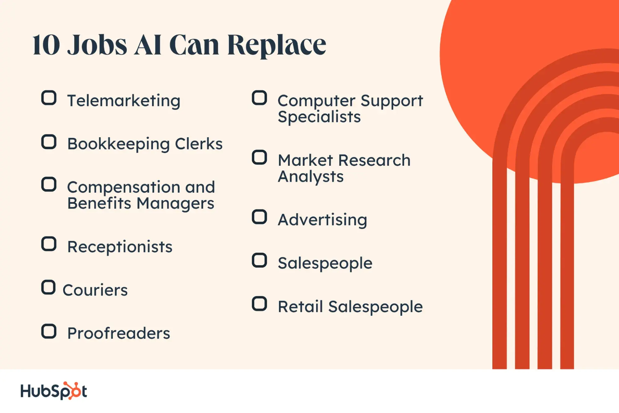
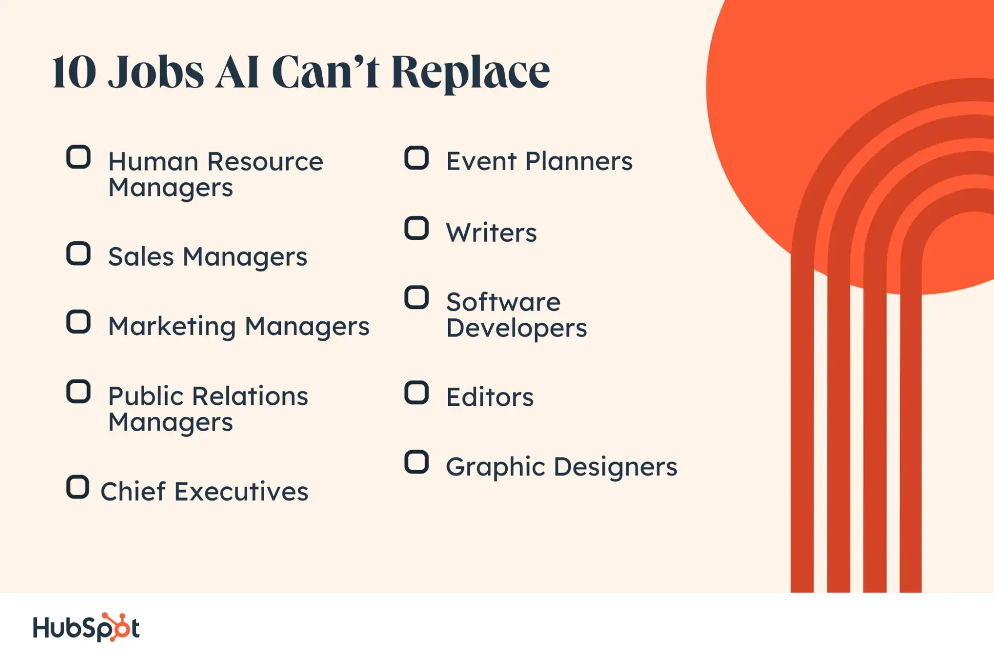
Based on current data and the website Will Robots Take My Job?, I’ll explore what jobs AI can replace highlighting ten positions with a higher likelihood. I’ll also explore which jobs are safe from AI, highlighting ten job roles least likely to be replaced by this technology.

What jobs can AI replace?

Once in the past, concerns over machines replacing human jobs rose with the automation of physical tasks common in factories and warehouses. Now, the same is happening with AI and the fear of it replacing human intelligence in the workplace.

“Think about your position and what your position will transform to in the next 12 to 24 months. Whether you like it or not, this is happening, and it is going to happen so fast that it will change the fabric of our society. If you haven't already done so, search for whatever your title or your position is and look at all the [AI] tools that exist within that,” Duran Inci, CEO at Optimum7 says.

Before ChatGPT exploded in 2022 and unleashed the capabilities of AI to the average user, AI had already been making inroads in the sector. Business leaders were already hiring AI specialists, devising ways to use the technology to 10x their productivity, according to a report by PwC.

Between 2012 and 2023, jobs with AI-specific skill requirements increased sevenfold. In contrast, regular jobs only doubled within the same timeframe. But while the demand for professionals with technical AI skills may be on the rise, traditional jobs with high exposure to AI may be left on the back burner.

And from a Pew Research Center study, one in five Americans work a job with “high exposure” to (this exposure is measured by how much of the job’s most important activities can be performed or supported by AI).

Job roles that involve work activities like “getting information, processing information, analyzing data and information, thinking creatively, evaluating information to determine compliance with standards, making decisions or solving problems, performing for or working directly with the public, and more” fall under that category.

And these are the jobs that AI can replace. Not entirely, but to a significant extent affecting 30% of current worked hours by 2030.

“I would say 40% to 50% of creative and generic positions are already 80% there, and you will lose millions of dollars in the next 10 to 20 years if you don’t already have the plus version of ChatGPT and if you don't already use it,” Inci continues.

What this means is that the greater the level of AI exposure a job has, the greater the risk of replacement.

Here are some examples.

1. Telemarketers

Future of Employment Study Likelihood: 99%

Will Robots Take My Job? Likelihood: 100%

Why: You probably already receive robocalls on behalf of various products and services, and career growth in the telemarketing space is expected to decline by 18.2% by the year 2032. This is largely because of the requirements to be successful. Unlike other roles, these jobs often require repetitive and predictable tasks that can easily be automated.

However, successful human telemarketers have a level of social perceptiveness and emotional awareness that machines can never replicate.

2. Bookkeeping Clerks

Future of Employment Study Likelihood: 99%

Will Robots Take My Job? Likelihood: 100%

Why: Jobs in this role are expected to decline 4.5% by 2032, and it‘s no surprise why — most bookkeeping is becoming automated if it hasn’t been already. QuickBooks, FreshBooks, and Microsoft Office already offer software that does the bookkeeping for you, so it's no surprise this job has such a high probability.

3. Compensation and Benefits Managers

Future of Employment Study Likelihood: 96%

Will Robots Take My Job? Likelihood: 41%

Why: As companies grow, especially across multinational markets, a human and paper-based system can present more hurdles, time delays, and costs. That’s why there is a 64% chance of full automation within the next two decades.

Automated benefits systems can save time and effort by providing benefits to large numbers of employees, and companies like Ultipro and Workday are already being widely adopted.

4. Receptionists

Future of Employment Study Likelihood: 96%%

Will Robots Take My Job? Likelihood: 93%

Why: Pam predicted this back on The Office, but in case you‘re not a fan, she said automated phone and scheduling systems can replace a lot of the traditional receptionist role — especially at modern technology companies that don’t have office-wide phone systems or multinational corporations.

But, receptionists develop relationships in the office that give them a unique advantage in providing customized support compared to an algorithmic system.

5. Couriers

Future of Employment Study Likelihood: 94%

Will Robots Take My Job? Likelihood: 95%

Why: Couriers and delivery people are already being replaced by drones and robots, so it’s only a matter of time until this space is dominated by automation altogether.

6. Proofreaders

Future of Employment Study Likelihood: 84%

Will Robots Take My Job? Likelihood: 100%

Why: Only a few jobs have a 100% risk level and this is unfortunately one of them. Proofreading software is everywhere. From Microsoft Word’s simple spelling and grammar check to Grammarly and Hemingway App, there are a lot of technologies out there that make it easy to self-check your writing.

On the other hand, the relationship a proofreader develops with a client gives them an understanding of the intention behind a writer's work and the contextual knowledge needed to successfully complete a project.

7. Computer Support Specialists

Future of Employment Study Likelihood: 65%

Will Robots Take My Job? Likelihood: 52%

Why: The field is projected to grow by 6.2% by 2032. But with so much content on the internet with instructions, step-by-step guides, and hacks out there, it’s no surprise companies will rely more heavily on bots and automation to answer support questions from employees and customers in the future.

8. Market Research Analysts

Future of Employment Study Likelihood: 61%

Will Robots Take My Job? Likelihood: 40%

Why: Market research analysts play an incredibly important role in developing messaging, content, and products, but automated AI and surveys can compile this information more and more efficiently.

While automated research tools can have a leg up in scale, speed, and accuracy, a human researcher has hands-on knowledge and personal experience that an algorithm can’t develop. Human researchers that leverage automation tools can create a more effective process.

9. Advertising Salespeople

Future of Employment Study Likelihood: 54%

Will Robots Take My Job? Likelihood: 52%

Why: As advertising shifts away from print and TV and towards web and social media landscapes, people simply aren't needed to manage those sales for marketers who want to buy ad space.

Social media platforms make it easy for people to buy space through free application program interfaces (APIs) and self-serve ad marketplace, removing the salesperson and making it faster and easier for users to run their ads.

Even the ads themselves are leaning more and more in artificial intelligence. When looking at actors or voice actors, we're also seeing a trend of companies using AI voices for advertisements like commercials.

10. Retail Salespeople

Future of Employment Study Likelihood: 92%

Will Robots Take My Job? Likelihood: 66%

Why: Companies are democratizing the shopping experience with features like self-checkout, and the modern buyer is much more internet-savvy and more likely to do internet research and make a buying decision on their own.

On the other hand, the care a retail salesperson brings during a 1:1 interaction differs from automated and unemotional support, and many consumers prefer to interact with humans during the support process.

10 Jobs AI Can Replace

What jobs are safe from AI?

Although data suggests generative AI could expose over 300 million full-time jobs across the US and Europe to automation, certain roles remain largely immune to this. Going by the exposure scale, these jobs have medium to low exposure to AI.

This is because their most important work activities range from:

  • Training and teaching others
  • Performing general physical activities
  • Repairing and maintaining equipment
  • Establishing and maintaining interpersonal relationships
  • Resolving conflicts and negotiating with others
  • Developing and building teams
  • Selling or influencing others
  • Judging the qualities of objects, services, or people 
... and so much more.

What these activities revolve around are uniquely human traits like emotional intelligence, contextual creativity, discernment and manual labor that AI cannot replicate yet. This is also echoed by the World Economic Forum’s (WEF) top 10 work skills of 2025, some of which include:

  • Analytical thinking and innovation.
  • Critical thinking and analysis.
  • Creativity, originality, and initiative.
  • Leadership and social influence.
  • Complex problem-solving.

And this is true for business leaders and their hiring practices. At GuerrillaBuzz, Co-Founder Yuval Halevi, says they rely mainly on human creativity to drive their marketing efforts. “We apply AI mainly to repetitive and time-consuming tasks, removing the monotony and freeing up time for more creative work.”

In the words of Ian Shine at the WEF, these jobs are safe because “one of the human brain’s biggest advantages over AI is the fact that it is attached to a real human body.”

Without further ado, here are some jobs that are safe from AI.

1. Human Resources Managers

Future of Employment Study Likelihood: 0.55%

Will Robots Take My Job? Likelihood: 14%

Why not: It’s kind of in the name — but your company’s Human Resources department will likely always need a human at the helm to manage interpersonal conflict with the help of non-cognitive and reasoning skills. Problem solving, contextual understanding, and unique business knowledge also make a human better equipped for this job.

The field is projected to grow 7.3% by 2032 as companies scale and need more robust structures for supporting and helping employees.

2. Sales Managers

Future of Employment Study Likelihood: 1.3%

Will Robots Take My Job? Likelihood: 30%

Why not: Sales managers need high emotional intelligence to hit their monthly quotas, network and collaborate with customers, and motivate and encourage the larger sales team. Managers also have to analyze data and interpret trends. The high levels of intelligence required and the constant need to adapt to new situations make this role safe from automation.

3. Marketing Managers

Future of Employment Study Likelihood: 1.4%

Will Robots Take My Job? Likelihood: 18%

Why not: Marketing managers have to interpret data, monitor trends, oversee campaigns, and create content. They also have to nimbly adapt and respond to changes and feedback from the rest of the company and customers, making this another human-forward career AI isn't quite ready to replicate.

A unique contextual understanding and previous business experience make a human stand out from an automated system.

4. Public Relations Managers

Future of Employment Study Likelihood: 3.7%

Will Robots Take My Job? Likelihood: 8%

Why not: Successful public relations (PR) managers rely on a network of relationships and contacts to procure press placements and buzz for the companies they represent, making this another completely safe role.

PR managers who have to raise awareness around an issue or mission need a particularly human touch to raise funds or get people to participate in a campaign, too — and jobs are expected to grow 7.6% by 2032.

Most importantly, PR managers are often on the go, attending events and being on hand to provide support if need be — a computer will never be able to do this.

5. Chief Executives

Future of Employment Study Likelihood: 1.5%

Will Robots Take My Job? Likelihood: 0%

Why not: It‘s nearly impossible to automate leadership — after all, it’s hard enough to teach it. Chief executives must inform broad strategy, represent companies' missions and objectives, and motivate huge teams of people working for them. Executives also have years of prior experience that make them successful.

Companies may answer to stakeholders and boards of directors, who likely wouldn't want a robot giving them an earnings report, either.

6. Event Planners

Future of Employment Study Likelihood: 3.7%

Will Robots Take My Job? Likelihood: 8%

Why not: Event planning is a growing field, and if you ask anyone on our events team here at HubSpot, whether you're planning an event for employees, customers, or an industry event with tens of thousands of attendees, the planning process has many, many moving parts involved.

Planners have to coordinate and negotiate with vendors, contractors, and freelancers to make things come together, and the organizational and people skills involved will make this another near-impossible role to automate.

Planners also attend events, ready to step in and troubleshoot on the spot. An automated tool simply couldn’t be present.

7. Writers

Future of Employment Study Likelihood: 3.8%

Will Robots Take My Job? Likelihood: 49%

The large score difference is likely due to developments and advancements in language models post-2013 that can write entire blog posts or social media content.

Why not: Writers have to ideate, create, and produce original written material, something that AI writing tools have not yet been able to replicate in the same way as humans (see recent BuzzFeed controversy about AI-generated travel articles).

There are also many types of writers, some of which might be more at risk. An experienced journalist will likely be favored over AI, but a freelance copywriter may no longer be needed by a business that now uses AI to write Instagram captions.

8. Software Developers

Future of Employment Study Likelihood: 4.2%

Will Robots Take My Job? Likelihood: 39%

The large score difference is likely because of new back-end tools that help web developers write entirely new code, fill in gaps, and debug.

Why not: Software engineering and development is complex enough for human beings, and the time and skill investment needed to create applications, software, and websites will be tough to replicate — especially since developers need to execute perfectly to create great products for customers.

The field is expected to grow by 30.3% by 2032, so if you‘re a software developer, you’re sitting pretty for now.

what jobs will ai replace, coding

Image Source

9. Editors

Future of Employment Study Likelihood: 5.5%

Will Robots Take My Job? Likelihood: 45%

Why not: While the automated proofreading technology mentioned previously can take a load off, editors have to review writers' submission for clarity, accuracy, comprehensiveness, and originality.

Some software can spot-check for clarity and scan for plagiarism, but the editor role must be carried out by a human in order to read work as another human would.

Today, 86.33% of marketers who use AI, for example, always make edits to the content that AI produces, according to our State of AI in Marketing survey.

10. Graphic Designers

Future of Employment Study Likelihood: 8.2%

Will Robots Take My Job? Likelihood: 34%

Why not: Image generators like Midjourney and DALL-E make it easy for people to create what they want, but graphic design is an artistic and technical field best suited for someone with fine arts training and experience. Like writing, graphic design work must be original and tailored to a unique use case.

If a graphic designer is working with a business, it also requires building a relationship between both parties throughout the design process. Plus, some image creators have been found to plagiarize artists' work — a lawsuit is likely the last thing people want.

10 Jobs AI Can’t Replace

Navigating Artificial Intelligence

Kate O'Neill, the author of Tech Humanist and founder of KO Insights, explains that jobs that require emotional intelligence will be safer in the immediate future:

“This is going to be a continuously moving target, but for the time being, what AI can't do well is use emotional intelligence, understand situational context, make judgment calls, and generally see nuance and meaning like we do.”

“That means any kind of job that benefits from these kinds of human attributes is better off done by a human. A computer or robot may assist you in performing efficiently, but for now, you're the one who adds the expertise on how to perform appropriately,” she adds.

This is echoed by Halevi, who says, "Having knowledge that's beyond the obvious is crucial. AI tools like ChatGPT and Gemini can sometimes provide inaccurate or misleading information."

"Without a deep understanding of your specific area, you might be misled or produce subpar work. Expertise ensures you can critically evaluate AI outputs and maintain high-quality standards."

Even for jobs that are more likely to be impacted, there are always reasons why a human with real-life experience and expertise is a better fit. The best way to navigate the fast-moving world of artificial intelligence is to stay informed and adaptable.

How to Future-Proof Your Career

Between January and May 2023, 417,500 jobs were cut. However, only 3,900 were reportedly because of artificial intelligence — less than 1%. Still, regardless of what happens, you might be wondering how to future-proof your career. The answer? Re-skilling.

On a Marketing Against The Grain Episode, Kipp Bondar, HubSpot’s chief marketing officer, says, “As I think about the evolution of AI, I think about one of the things that’s going to go part and parcel with it is the need to be amazing at re-skilling our workforce all around the world.” (Listen to the full episode here).

Re-skilling doesn’t mean preparing for the worst. Most jobs expect employees to engage in some sort of professional development, so this might be routine for you.

For example, you could explore different AI tools and how to leverage them in your day-to-day role. HubSpot’s AI tools, for instance, give you access to a suite of AI tools that could perform functions like content creation, data analysis, and even build a chatbot.

hubspot ai tools

Image Source

Or you could take a course to learn a new skill. As Shah said above, AI’s most significant impact will likely be helping us be more effective in our careers.

But, if your job is impacted, having taken the time to re-skill leaves you more prepared for future opportunities where you present yourself as a multifaceted candidate.

Learning from others is another great way to stay on top of the changing AI landscape and learn new skills. HubSpot has spoken to experts that have leaned into AI and incorporated it into their processes, and their insight is a valuable way to get ideas for re-skilling.

Here are some helpful resources:

Your experience is your greatest asset.

All technological revolutions impact how people work, and AI will simply follow this pattern, having the most impact on rote and mundane tasks to save us time.

No matter what happens, your experience is your greatest asset in the face of a changing landscape. To stay up to date on AI and the trends, HubSpot’s State of AI pillar houses all the information you need.

How My Brand Went Viral: 16 Small Brands That Made It Big (And What You Can Learn)

Featured Imgs 23

You don’t have to be in marketing to know what it means to “go viral,” but the dream of saying, “My brand went viral”? — That’s definitely unique to our profession.

Learn how to run more impactful, measurable marketing campaigns.

Marketing managers are even credited with coining the phrase back in the 1980s, but it’s safe to say a lot has changed since then.

“Going viral” is slowly giving way to “becoming a meme” these days, but either way, we mean getting lots of attention on the Internet, especially on social media.

Think the 10,000 retweets Oreo got on its famous “You can still dunk in the dark” Super Bowl tweet in 2013 or the 154 million views Solo Stoves' covert collaboration with Snoop Dogg generated in 2023.

But let’s be honest; these big brands have it easy.

Global brands have agencies and well-staffed marketing teams standing by to pounce on current events and trends. Plus, they have large, established audiences paying attention and ready to spread timely content.

What are the little guys supposed to do? How can we grab some of the viral glory? Let’s talk through how 16 small (or formally small) brands made it happen and what you can learn from their stories.

16 Small Brands That Went Viral On Social Media

1. Janet Heller Fine Jewelry

Everyone’s still talking about the Paris Summer Olympics — and not just about the athletes.

After winning gold in the all-around gymnastics final, gymnast Simone Biles showed off a diamond-studded gold goat pendant (representing being the GOAT or “Greatest Of All Time”) to cameras.

And then, of course, fans everywhere wanted their own.

The pendant was custom-made for Biles by Janet Heller Fine Jewelry, a jeweler of 15 years based in Southern California.

After Biles’ win, Heller received thousands of requests for the pendant but will not be replicating it. She explains, “The goat can't be replicated. Simone is one of a kind."

While Heller won’t be selling more goats, the attention she received from the piece has been overwhelming.

She told ABC News affiliate KABC, “I've made many gorgeous pieces for many beautiful people, but I have to say that this is probably the pinnacle of my career so far.”

The lesson on how to make your brand go viral? Showcase your talent in unique ways.

Sure, we can’t all get legendary athletes to show our product on globally watched television events. Sucks, I know.

But let’s dial this back to what business owner Janet Heller did do: She made something different. Heller offers lots of beautiful jewelry on her website, but Biles’ commission was unique and memorable.

It’s easy to look past products that are just like everything else out there, but if you make something people have never seen before, you’re one step closer to grabbing attention, getting shared, and going viral.

2. Mike Hege & Pridemore Properties

In July 2024, Mike Hege, a real estate agent at Pridemore Properties, asked his 27-year-old marketing manager to edit a video of him to put on his social media.

What they made was a compilation of outtakes of Mike breathing, thinking, and essentially “Millennial pausing.”

The Gen Z marketing manager proceeded to post the video to the company’s Instagram page with the caption, “Asked my Gen Z employee to edit a video for me, and this is what I got!” and the Internet loved it.

As I write this, the video has over 5.3 million likes on Instagram and almost 150K views on TikTok.

It has even sparked a trend thousands of brands have participated in, including one of my favorite local restaurants in Connecticut, Haven Hot Chicken:

The lesson on how to make your brand go viral? Humanize your brand.

Looking at Pridemore’s Instagram account, it’s clear the team is no stranger to creating light-hearted content — and this is by design.

Hege explained to TODAY.com that the team wants to expand its social media presence beyond content focused on North Carolina real estate and often shows their humanity in their content.

He shared, "We want to help people through the process of finance and real estate. [Our editor] tries to convey that we can have a good time, are real people, and have fun and be on the lighter side.” Clearly, it worked.

Learn more about humanizing your brand in our article, “How to Humanize a Brand: 15 Best Tips for Humanizing Your Voice.”

3. Dominique Ansel Bakery

Studio shot showing five of Dominque Ansel’s cronut pastries on a table.

Image Source

Pastry chef Dominique Ansel was not very familiar with doughnuts when someone pointed out that his New York bakery didn't have one on the menu.

Originally from France, he grew up eating croissants. So, taking the inquiry seriously, Ansel returned to his roots and invented a new twist on the doughnut — the Cronut.

In 2013, Ansel's Cronut gained steam after a food blogger from Grub Street documented their experience. Traffic to the bakery website rose by more than 300%, and hundreds lined up daily to get their hands on the trendy pastry.

The lesson on how to make your brand go viral? Capitalize on exclusivity.

Initially, each batch of Cronuts took Ansel's team three days to prepare, which meant the numbers were limited.

Now, a decade later, you can join a pre-order list or place an order, but you'll still find a line outside of Ansel's bakery (really), hoping to get a hold of one of the 350 made fresh daily.

Because quantities are limited, getting a cronut is a delicious bragging right and an exclusive experience, which makes people want it even more.

If you’re wondering how your brand can go viral, try limiting production of or access to your offering to build hype. The scarcity effect can be a powerful marketing tool.

Learn more about it in our article, “The Scarcity Principle: How 7 Brands Created High Demand.”

4. Lala Hijabs

Nothing says “2020s” like the story of Lala Hijabs.

Sana and Will Saleh are a young married couple with two children who grew quite an audience on TikTok sharing videos about their everyday lives as Muslims in America and an interracial couple.

During the COVID-19 pandemic, both Salehs lost their jobs.

But when they realized the handmade tie-dye hijabs (head coverings or scarves worn by some Muslim women in public) that Sana occasionally wore in their videos were getting a lot of attention, they decided to use their life savings to start a business.

They explained, “When people began asking where we got [the hijabs] from, we decided to hype up the business before we even began forming it — people loved it and anticipated the huge launch!”

Since its launch, the family-owned business has gained over 145K followers and 4.4 million likes on TikTok, with 60% of its sales coming through the app. It also has over 27 million followers on Instagram.

The lesson on how to make your brand go viral? Build a community first.

We’ve heard it time and time again. Communities foster brand loyalty and deeper customer relationships for businesses, and that has proven very true with Lala Hijabs.

The Saleh Family had already been on TikTok for about a year before they had the idea for the business. But once they did, they already had a hoard of customers lined up for their product and rooting for their success.

How do you build a community exactly? Here are a few resources to help you get started:

5. Cards Against Humanity

Cards Against Humanity — the self-proclaimed “party game for horrible people” did not come from some hip Silicon Valley incubator.

Instead, it was the brainchild of eight high school friends from Chicago, with the goal of “being funny and having people like us," co-creator Max Temkin explained.

Screenshot of Cards Against Humanity’s homepage showing examples of the game cards.

Image Source

The product has been available for free download on their website since day one. Eventually, they started a Kickstarter campaign to print the cards for sale as well.

The team raised 400% of its original $4,000 goal and became the number-one game on Amazon within a month of its 2011 launch.

The lesson on how to make your brand go viral? Establish your brand and stay true to it.

Cards Against Humanity has always touted itself as the game for misfits, and that unorthodox brand is carried throughout its marketing.

In 2013, they ran a satirical anti-Black Friday sale where they actually increased the price of the game, saying “Today only! Cards Against Humanity products are $5 more. Consume!” Their sales inexplicably increased.

In 2016, their Black Friday campaign featured a live video of the company "digging a holiday hole“ and asking people to donate to its ”cause." They raised close to $30,000 with the stunt.

And in 2017, they launched their first-ever Super Bowl ad featuring nothing but a potato and a clever article about why the ad “failed.”

Cards Against Humanity is one of the clearest cases of knowing and staying true to your brand. Their copy, creative, and campaigns are unapologetically their own, just like the game.

It’s a brand that speaks to its audience and, as of 2023, Cards Against Humanity is a $500 million company.

Learn more about establishing your voice in “Creating Your Brand Voice: A Complete Guide.”

6. Metro Trains Melbourne

Even 11 years later, there’s a good chance you’re already humming this catchy little viral song in your head. It’s ok, so am I.

Melbourne’s metro system wasn’t a small brand per se, but it certainly wasn’t global when it launched the "Dumb Ways to Die" (DWTD) safety campaign.

Before the campaign, the organization had information at stations, but nothing really elicited positive changes in behavior, so tried something different.

They brought on the agency McCann Melbourne to help, and DWTD was born.

By April 2014, the campaign had been viewed 77 million times on YouTube (Today, it’s 312 million). The accompanying game became the number one free app in 101 countries. In six weeks, DWTD had garnered an estimated $60 million in earned media.

The most important change that came out of the campaign? A 21% reduction in railway accidents and near misses.

The lesson on how to make your brand go viral? Start outside your target audience.

Reflecting on the campaign‘s inception, Metro Trains’ Chloe Alsop explained, “We kept returning to the same thing: it's really hard to get hit by a train. Wrong or careless behavior is required.”

So, rather than crafting something serious or heartbreaking, as so many safety videos would, they went with a memorable and shareable campaign that earned worldwide attention.

This global impact approach was actually by design.

McCann created the original campaign using North American voices and characters because they believed “the video had to go viral first, later it would catch the attention of the real target audience.”

Today, the campaign has become a franchise used by metro transit around the world. The takeaway for us? As McCann spokesperson John Mescall says, “It used to be ‘Think global, act local.' That's no longer true; we need to think and act globally.”

7. Saucemoto

Saucemoto is another Kickstarter success story by none other than a company that produces a plastic sauce holder that plugs into a car's air vent. They earned attention on the crowdfunding platform in 2017 with an innuendo-filled video.

The campaign sought $10,000 and netted $63,308 while gaining over 50 million views across social media. Two years later, it scored a $45,000 deal with Kevin O’Leary on ABC’s “Shark Tank.” As of 2022, the company was valued at $200,000.

The lesson on how to make your brand go viral? Use humor.

Both Saucemoto’s Kickstarter video and their Shark Tank pitch were filled with jokes poking fun at how “absurd” the product was. But that humor grabbed people’s attention and made them listen.

The truth is that Saucemoto solves a real and relatable, albeit silly, problem, and if they hadn’t used humor to capture people’s interest, they might not have seen the same level of growth and popularity.

8. Datz Deli

Datz Deli was just a small, family-run corner store selling snacks and a variety of Caribbean and Guyanese dishes in Jamaica, Queens, New York, when owner Joshua Dat opened its doors in December 2022.

But then Johnny Eats posted his now famous TikTok video about the location’s signature “Mac Patty” — a Jamaican beef patty sliced, placed between coco bread filled with mac and cheese and topped with meat and sauce of your choice — and there was no turning back.

The video generated 1.3 million views, and the sandwich became the subject of hundreds more.

By August, Dat reported selling more than 10,000 sandwiches a month, roughly 400-600 a day and was projected to bring in over one million dollars in his first year in business. “We don’t sleep anymore,” Dat told Eater.

The social media hype caught the attention of Business Insider, CNBC, and The Kelly Clarkson Show, among others.

Today, Dat has opened a second location in Manhattan and plans to expand to other major cities. He also continues to sell out regularly — Trust me, I went last month, and they were already out of the jerk chicken option. I was heartbroken.

The lesson on how to make your brand go viral? Collaborate with influencers

During his interview with Kelly Clarkson, Dat recounted how he collaborated with food blogger Johnny Eats to create the video that would ultimately set the “Mac Patty” trajectory in motion.

Eats got new, unique content for his platform, and Dat was exposed to Eats’ audience of over 220,000 followers across social media.

Having only been open for a few months, this was a smart and invaluable partnership for Dat.

Want to learn more about collaboration and co-marketing? Check out these resources:

Bonus: Get personal.

While Johnny Eats’ video was the catalyst for the deli’s media attention, the family’s personal touch is what they continue to highlight in videos, interviews, and articles.

Customers regularly praise the team's kindness and hospitality, even during long wait times and crowds.

Furthermore, Dat started the business to give his father something to call his own and to create stability and structure for his entire family, a goal he is very open about.

His personal, human story is one that people from all walks of life connect with and want to support.

9. Chubbies

Screenshot showing the Chubbies shorts selection on its website.

Image Source

Love ‘em or loathe ‘em, Chubbies have left their mark on the apparel industry.

The founders are four Stanford buddies who bonded over their mutual love of short shorts and the belief that “if you had a really cool pair of shorts, people would talk about it."

After testing their idea for Chubbies at a Fourth of July beach party, their website launched in September 2011 without a big-budget campaign. They simply started by emailing college fraternity presidents, and they sold out in days.

Today, they generate over $13 million in revenue.

The lesson on how to make your brand go viral? Ditch the formality.

Witty emails, unapologetic copy, and “bro-friendly” photography set them apart, and their guerilla-style email tactics spread the Chubbies name and product through college towns everywhere.

Their voice, and style were casual and informal — just like their product. This caught people’s attention and kept it even as they grew, expanded their offerings, and were acquired.

When trying to go viral, especially on social media, this laidback approach grabs far more attention than sounding corporate and professional.

10. Love Your Melon

Love Your Melon is a brand I was introduced to by an old teammate many years ago, and I've been a fan of it ever since.

The hat and apparel brand started in 2012 as a part of a class project for Zachary Quinn and Brian Keller, two students at the University of St. Thomas in Minnesota.

Quinn and Keller set up a stand outside of Quinn’s family restaurant with 400 hats. He promised that for every 200 hats they sold, one would be donated to a local child with cancer. They sold out in two days.

As Forbes detailed, “Within a week, word of Quinn and Keller’s mission went viral. Their Facebook page blew up. Orders came in one after the other, doubling every time."

"Within a few months, Quinn had dropped out of college, and Love Your Melon had morphed from a class project into a full-fledged start-up with the simple goal of putting a hat on every child battling cancer in America.”

Today, Love Your Melon’s website claims they have donated nearly $10 million to children’s cancer and put over 270,000 beanies on children battling it. The brand continues to donate $1 for every product they sell.

Screenshot of Love Your Melon’s website sharing details on its mission and charitable donations.

Image Source

The lesson on how to make your brand go viral? Highlight your cause or mission.

Anyone who owns a Love Your Melon product will rave about their quality and comfort, but there are no shortage of imitations on Etsy and Amazon.

What sets the company apart is their mission. When you buy a Love Your Melon product, your dollar isn’t just going to a cold retailer; it’s going towards helping children and families in need with the goal of eradicating Cancer.

You should not just embrace a cause or mission to go viral — people can sense that inauthenticity from a mile away.

However, if you have something that genuinely fits your offering or brand value, using your platform and resources gives your audience something greater to get behind.

11. Chatbooks

A four-minute viral video? That’s pretty unheard of in today’s 30-second Reel world, but it paid off for Chatbooks.

The video that put Chatbooks on the map showed viewers how to use the then-new app that turns their social media photos into albums via a funny, matter-of-fact mom running errands and spending time with her kids.

Chatbooks sold 1 million subscriptions in its first 18 months, racked up over 1 million views on YouTube, and has over 400,000 “likes” on Facebook. They also continue to post honest, pain-point-driven videos featuring the same now-recognizable mom.

The lesson on how to make your brand go viral? Showcase relatable pain points.

Why was Chatbooks video so successful? They nail their buyer persona and the problems they face.

The video features a busy, realistic mom. She speaks to the audience with all the advice, sarcasm, and "I get it, I've been there,“ relatability you'd look for from a fellow cool mom. It closes with a catchy tagline: ”Done is better than perfect."

It's easy to phone in your user personas, targeting general groups, but Chatbooks went the extra mile.

They clearly considered how their persona thinks, what she worries about, how she's spending her time, and how photos figure into her hectic schedule.

The result? A video their target audience couldn't help but share.

12. National Cowboy and Western Heritage Museum:

The National Cowboy and Western Heritage Museum is a museum in Oklahoma City that celebrates the history of the American West and Native American art.

Like most of us, it was forced to close its doors during the 2020 COVID-19 pandemic, but a small team, including head of security Tim Tiller, still watched over the grounds.

Tiller was recruited to run the museum’s social media while it was closed, and the internet fell in love.

A social media novice at the time, Tiller’s humor and behind-the-scenes photos across Twitter, Instagram, and Facebook drew thousands of likes and comments.

And today, the museum has over 400,000 followers across its Twitter, Instagram, and Facebook profiles.

The lesson on how to make your brand go viral? Hone in on a “creator.”

People follow brands on Instagram but are more likely to follow and engage with other people, especially people they care about and like.

A smart way for your business to capitalize on this is to recruit specific creators, like Tiller, to appear regularly in your content.

These individuals are like your “spokespeople,” giving your audience someone human to recognize and root for rather than just a cold, faceless brand.

In this scenario, the brand went viral because people were no longer just following a museum with lifeless artifacts; they were following a friendly face with a personality in Tiller.

Note: My teammate Meg Prater, who grew up in Oklahoma, can confirm Tiller remains a local hero and is the subject of much merchandise.

13. Mohawk Chevrolet

Mohawk Chevrolet, a car dealership in Malta, New Jersey, went viral after starting a spoof of the popular series “The Office” on its social media.

Episodes of “The Dealership” drop on the company’s TikTok every Tuesday, and they’ve generated over one million likes and 150k followers on the platform.

@mohawkchevrolet Replying to @Carrigan moebs Episode 6 of The Dealership, "Star Quality"⭐️ #theoffice #cardealership #cdk #officelife #officehumor #chevy #mohawkchevrolet #fyp ♬ original sound - Mohawk Chevrolet

They are certainly not the first to parody the series, but they are arguably one of the most successful, grabbing the attention of USA Today and Complex, among other media outlets.

It even inspired other brands to start their own spoofs, including Pridemore Properties, which we talked about earlier.

The lesson on how to make your brand go viral? Use popular culture to connect with your audience.

Mohawk Chevrolet may have made it big with “The Dealership,” but they are no strangers to poking fun at popular culture in their content. Scroll down their feed, and you’ll find videos influenced by HBO’s “Game of Thrones” and the “Star Wars” franchise.

Using pop culture or current event references is a fun and memorable way to grab people’s attention and show personality.

Screenshot of a comment from a Mohawk Chervolet TikTok video showing a followers love of their content and services.

Image Source

This is a fun and easy way to resonate with your audience and make them want to work with you. So, get creative.

14. Eva Kor and Candles

In 2017, BuzzFeed did a profile on Auschwitz survivor Eva Kor and her Holocaust memorial museum, Candles, in Terre Haute, Indiana.

Before the video, the museum was quite small and had suffered its share of hardship. However, the profile gave Kor a global platform to share a story of heartbreak, bravery, and remembrance that connected with millions.

After its publication, a visit to the cherished local museum became a must, and many shared their experiences on social media. Many people in Terre Haute will enthusiastically tell you about their first time at Candles.

Now, millions of people know about the museum and get to spread that message.

In 2019, two Indiana natives teamed up with PBS to release a documentary highlighting Kor’s legacy.

The lesson on how to make your brand go viral? Share a human story.

Everyone has a story to tell. Candles' story is one of strength, passion, and perseverance — feelings everyone can relate to.

By telling your story and what motivates your business, you may also capture the hearts and attention of the masses.

15. Liquid Death

Liquid Death is far from a small brand now, but when it was started in 2017, it was a bit of an anomaly.

Screenshot of the Liquid Death website showing their product selection.

Image Source

It was water — just like Poland Spring or Aquafina — but it was distributed in a can rather than a plastic, see-through bottle, and it was marketed like alcohol. It wasn’t anything new, but at the same time, it was.

Gen Z and millennials loved it.

The brand has over three million followers and 5.2 million on TikTok, and, according to NBC News, it is valued at about $1.4 Billion.

It is also reported that Liquid Death “hit $263 million in global sales and can be found in 113,000 retail outlets across the U.S. and U.K.”

The lesson on how to make your brand go viral? Challenge the norm.

It’s safe to say Liquid Death isn’t like other purified water brands.

Forget images of lakes and rivers. Liquid Death uses skulls and rock stars like Ozzie Osbourne. It even has a digital “Murder Head Death Club” filled with NFTs and merchandise giveaways for fans to enjoy.

It’s more of a lifestyle than just water, and that’s what makes it stand out.

Brad Avery, senior reporter for industry news group BevNET explained to NBC:

“When you look at branding in the bottled water category, so much of it has revolved around themes like the purity of the water, superior levels of hydration, etc. Liquid Death took off in part because it was a subversion of all the tropes of bottled water marketing that we’re familiar with.”

As sober and alcohol-free lifestyles become increasingly popular in the United States, especially among younger generations, Liquid Death’s marketing wants consumers to know that healthy alternatives can still be fast-paced and exciting.

16. Dollar Shave Club

We can’t talk about small brands that went viral and not mention Dollar Shave Club (DSC).

At this point, the razor company’s inaugural video from 2012 is a legendary case study in video marketing.

Co-founder Michael Dubin wrote and starred in the video and had a friend shoot it in a single day for less than $4,500.

It spoke flawlessly to common shaving pain points, poked fun at the company, and announced to the world that it was ready to shake up a previously forgettable industry.

90 minutes after the video went live, the company's servers crashed due to all the traffic the video generated. Over the next two days, DSC received 12,000 orders.

DSC was bought for $1 billion in 2022, and today, its “Our Blades Are F***ing Great” video has 28 million views.

The lesson on how to make your brand go viral? Make a boring industry exciting.

Shaving has always been a part of life; it’s not really something worth talking about with your friends, but DSC made it one with its marketing.

Its video, candid voice, and revolutionary solution (quality razors shipped straight to your door for just $1) breathed new life into the shaving industry. These were all novelties worth sharing and talking about.

Not to be the bearer of bad news, but there’s no guarantee that your brand will ever go viral.

In most cases, it’s luck by chance or even an algorithm. The best thing you can do is to use the tips and lessons learned from these 16 brands to continuously create high-quality, original content and deliver great products and services.

Sound like a lot of work? Honestly, it’s what you should be doing anyway.

With this approach, if and when your small brand goes viral, people won’t just share or notice you and disappear. Rather, they’ll stick around because they know you have something valuable to offer.

The YouTube Growth Strategy Mr. Beast, Cocomelon, & Like Nastya Use to Dominate the Internet (Creator Remixes 2024)

Featured Imgs 23

YouTube growth strategies continue to be a hot topic among marketers. In fact, most marketers plan to increase their YouTube budgets this year and say the platform has the highest growth potential in 2024.

Anytime you’re talking about YouTube growth (and I talk about growth a lot as the founder of Thompson Media Group), Jimmy Donaldson’s Mr. Beast channel is high on the list.

→ Free Templates: How to Use YouTube for Business [Download Now]

It’s easy to understand why. Today, the Mr. Beast YouTube channel has 240 million subscribers, the second most of any channel on the platform. There are many reasons why this channel is so popular, but the strategy I recommend most to my clients centers on expanding their view of who their ideal customer is.

YouTube’s Power Players Use This Growth Strategy

What’s the million-dollar strategy for growing your audience and your customer base? The answer is surprisingly straightforward: inclusion marketing. Yep, that’s it. I’ve built an entire consulting business around helping brands grow with inclusion in marketing and belonging, and I can spot a great strategy from a mile away.

For example, Mr. Beast employs inclusion marketing by offering his content in multiple languages. Reed Duchscher, his talent manager, explains that this is one of the primary forces driving his rapid growth.

screenshot of a linkedin post annoucing that Mr. Beast hit 200 million youtube subscribers

The strategy here is simple: get your content and products in front of more people who have the problem your brand solves. More qualified eyeballs mean more people consuming your content and buying your products.

Globalization as a growth lever is nothing new. That’s why you’ll see McDonald’s, Netflix, and Nike developing localized content around the globe.

Remember, a different language doesn’t mean we don’t have the same problem — or can’t benefit from the same solution.

As an inclusive marketing strategist and consultant, I tell my clients it’s never been easier or more cost-effective to grow your brand by including a broader diversity of consumers. I spend a ton of time talking about practical ways to use inclusive marketing as a growth lever on my podcast, Inclusion & Marketing.

This episode goes deep on how to grow your brand through globalization, including localizing your content.

And it’s not just Mr. Beast who’s embracing this strategy.

Cocomelon, Kids Diana Show, and Like Nastya have all snagged coveted spots in the top 10 most subscribed YouTube channels. How? Each of them makes their content available in multiple languages — and has earned millions of fans as a result.

Think this is just for kid cartoons and hype engines? Think again. Even business-focused brands such as GaryVee, VidIQ, and IKEA are embracing inclusion marketing.

How You Can Reach a Global Audience

These creators aren’t creating dozens of assets at a time. They’re creating one video and localizing it into other languages using dubbing and voiceover.

Once the dubbed content is made, there are two approaches creators use to get localized content to their audiences.

1. Language-Specific Channels

Cocomelon, Kids Diana Show, and Like Nastya all have multiple YouTube channels, each dedicated to specific languages.

Kids Diana Show has 119 million subscribers on the English language version of the channel. She’s added more than 72 million additional subscribers, with language channels hosting the same, but localized, content.

Like Nastya has 113 million subscribers on her English language channel. Her brand has more than 82 million additional subscribers on other language channels.

Business channels have seen success here as well. VidIQ has 1.78 million subscribers on their English language channel. And they’ve added an additional 351,000 subscribers on the Spanish language channel alone.

2. One Channel, Multiple Languages

The outlier here is Mr. Beast, who previously hosted several different channels dedicated to various languages. In 2022, that changed.

Around this time, YouTube began working with top creators like Mr. Beast to test out multi-language audio. This new feature allows creators to manage one channel by uploading different audio, thumbnails, and descriptions to their accounts.

When a user comes across the video, it’s automatically shown to them in their local language. This allows creators to deliver a seamless customer experience for their audience while also being more efficient content managers.

YouTube noted that creators who tested this multi-language audio feature saw 15% of their watch time come from views in the video’s non-primary language.

While this feature isn’t yet available to all accounts, YouTube plans a phased rollout of the functionality to more creators.

How To Use Localization In Your Brand

Of course, it’s important to consider the customer experience you’re delivering to your audience.

Over the years, I’ve interviewed dozens of consumers with identities from underrepresented and underserved communities. A common frustration they share is feeling like brands fall short by delivering substandard experiences to them.

One Spanish-speaking consumer told me that when brands don’t make their content available in Spanish, he feels like they send the message that “people who speak Spanish aren’t important.”

When it comes to engaging new consumer groups, I always coach my clients to be intentional about delivering experiences that make consumers feel seen, cared for, and like they are important rather than an afterthought. As a result of taking this approach, more of the people you want to serve will feel like they belong with you.

The end goal of this strategy is to create video content that’s accessible to people who speak other languages. But there are lots of ways to get there.

Here’s a quick video where I walk through a few of those options and provide examples and considerations for each one. I even drop some reactions and feedback from a Spanish-speaking consumer.

1. Use human-dubbed content.

Many of today’s top YouTube channels, including Mr. Beast, use a company called Unilingo to dub videos using professional translators and voiceover talent.

If you’ve ever watched a movie with audio in another language, you’ll notice that great care is taken to ensure the voiceover looks and sounds like the original. Tone match and synchronicity deliver a better experience to the end user.

Think of this as a moment to delight your audience by working with a human voice-over artist skilled in matching the original speaker's energy, emotion, and intonation.

2. Use AI-dubbed content.

Ok, ok. I know I just told you to use human-dubbed content. But I realize that sometimes it’s just not possible.

If you haven’t noticed, the market is flooded with AI tools right now. That means you’ve got options for dubbing using artificial intelligence. Simply upload your video, select a voiceover you like, and in just a few minutes, you have a dubbed video.

If you use this option, it’s important to have the translated version verified by certified translators before publishing.

Although AI-powered translations are often good, there are nuances associated with localizing content. You’ll also want to maintain your brand voice and tone — something that can be difficult to capture with a language learning model.

The AI will translate your content verbatim when what you’re really after is transcreation. In a transcreation, you choose the words and phrases that capture the full intention and essence of what you’re saying.

In the podcast episode below, I go deep into translation, transcreation, and the proactive choices you must make when localizing content. For instance, should your brand be using gender neutral language (gendered language is very common in languages like Spanish and French), and if so, how should you approach nuances here? These decisions will have a big impact on how people perceive your brand.

3. Add multi-language subtitles to your video.

Subtitles are another way to make your YouTube videos more accessible. You can upload multiple subtitle files in other languages directly in your YouTube content studio.

youtube video subtitles landing page

YouTube also gives you the option to upload localized thumbnails, titles, and video descriptions to deliver a consistent experience in the end user’s local language.

When a user arrives on your video, they’ll hear your original audio while reading the subtitles in their preferred language.

image of the youtube translation popup window

The same rules apply when ensuring you have a high-quality subtitle translation that human translators either transcreated or verified.

Break Through the Noise with Inclusive Video Content

Think beyond your existing audience to grow your YouTube channel and your business.

Start where you can, and make improvements over time as you learn more about what your new global audience needs most from you.

Once you get into the groove of expanding content reach using inclusion, you’ll develop new relationships with new audiences that will allow them to reach new levels of success. And, at the end of the day, that’s your goal, right?

New call-to-action

Crafted With Code: Performance Showcase

Featured Imgs 23

This year’s Crafted With Code showcase has already highlighted five projects recognized by the Webby Awards and WP Engine, each featuring beautifully designed, highly accessible digital experiences.  Now, Crafted With Code is shining a light on some of the most performant projects submitted to the Webbys this year. The Webby Awards exist to honor excellence

The post Crafted With Code: Performance Showcase appeared first on WP Engine.

16 Great Examples of Welcome Emails for New Customers [Templates]

Featured Imgs 23

Welcome emails can arguably be one of the most powerful tools for setting an incredible first impression for pre-email customers. Nevertheless, the process of creating a persuasive welcome email is not always smooth.

Good welcome email examples can serve as the inspiration to make an amazing first impression.

→ Download Now: 8 Free Customer Onboarding Templates [Free Kit]

Having so long been in the role of a copywriter, I always find myself in search of good email examples. In this blog, I‘ve pulled together the most inspiring welcome emails that I’ve come across that will help you create your own.

Table of Contents

Pro tip: Use HubSpot's free email marketing software to easily create a high-quality welcome email sequence like the ones featured below.

HubSpot email template

Each example below showcases different tactics and strategies for engaging new email subscribers. Let's dive in.

The Components of an Impressive Welcome Email

I believe that one factor that really impacts the customer onboarding proces s is the welcome email.

While there’s no one-size-fits-all format, there are several key components that can help your email stand out from the crowd and connect with your intended audience. These include:

1. Compelling Subject Lines

Making sure recipients actually open your emails is the first step in making a good impression.

Subject lines are critical, so opt for short and straight-to-the-point subjects that state clearly what you’re sending, who it’s from, and why it matters to potential customers.

Pro tip: Keep email subject lines short enough to get your point across and grab the recipient's attention. A good rule of thumb is to keep it to 30-70 characters in length.

2. Content Recommendations

While the main purpose of welcome emails is to introduce your brand, it’s also critical to add value by providing the next steps for interested customers.

Pro tip: I think a good place to start would be by offering links to your website‘s great content, which will give your customers more context if they’re curious about what you do and how you do it.

3. Custom Offers

Personalization can help your welcome emails stand out from the pack. Customized introductory offers on products are something consumers often want.

If you base these offers on the information they’ve provided or data available to the public through social platforms, welcome emails can help drive ongoing interest.

4. Clear Opt-Out Options

It’s also important to offer a clear way out if users aren’t interested. Make sure all your welcome emails contain “unsubscribe” options that allow customers to select how much (or how little) contact they want from you going forward.

In my opinion, if there’s one thing that sours a budding business relationship, it’s the incessant emails that aren’t easy to stop. So, always give customers a way to opt out.

Examples of Standout Welcome Emails

So, what does a great welcome email look like?

I’ve collected some standout welcome message series examples that include confirmation messages, thank you emails, and offer templates to help you with your customer onboarding process from start to finish — and make a great impression along the way.

1. Food52

Type of Welcome: Confirmation

Welcome email from Food52

Sometimes, the tiniest of elements in a welcome email can speak volumes about a brand. When it comes to Food52's welcome email, the preview text at the top of the email, “We brought snacks,” definitely accomplishes this.

Also known as a pre-header or snippet text, the preview text is the copy that gets pulled in from the body of an email and displayed next to (or beneath) the subject line in someone‘s inbox.

So when you see Food52’s welcome email in your inbox, you get a taste of their brand's personality before you even open it.

Welcome email preview from Food52

I also liked how Food52‘s welcome email does a good job of building trust by putting a face (make those two faces) to their name. As soon as you open the email, you see a photograph and message from the company’s founders.

What I like: I particularly like the introduction of the email copy, which reads, “Hello there! We're very excited that you're here,” as this sets a welcoming and friendly tone from the onset, making the reader know that they are appreciated and they belong.

2. Monday.com

Type of Welcome: Video

Monday.com welcome email

From the subject line down to the conversational tone in the email body, the welcome email above keeps it friendly and simple, so the focus stays on the introductory video inside.

Monday.com is a task management tool for teams and businesses. The welcome email you receive when you sign up makes you feel like a CEO because Roy Man is speaking directly to you.

What I like: I love how the email even personalizes the opening greeting by using the recipient's first name, which is well known for increasing email click-through rates (especially if the name is in the subject line).

In my experience, the more you can make your email sound like a one-on-one conversation between you and your subscriber, the better.

If you have just so many details that you need to inform your new customer about, follow Monday.com's lead and embed a video rather than spelling them all out in the email itself.

3. Kate Spade

Type of Welcome: Thank You

Kate Spade welcome email

Let‘s face it: The internet-using public is constantly bombarded with prompts to sign up for and subscribe to all sorts of email communications.

So, as a brand, when someone takes the time to sift through all the chaos to intentionally sign up for your email communications, it’s a big deal.

To acknowledge how grateful they are to the folks who actually take their time to subscribe, Kate Spade uses a simple but effective tactic with their welcome emails. They say “Thank You” in big, bold lettering.

What I like: To be honest, I am a big fan of what this email looks like. The envelope graphic — which virtually simulates the joy of receiving a physical thank you note — is a nifty and visually appealing way to draw attention to the email.

4. Lyft

Type of Welcome: New Customers

Lyft welcome email

I think if there‘s an ideal "attitude" that welcome emails should give off, Lyft has it.

The company’s simple but vibrant welcome email focuses entirely on the look and feel of the app, delivering a design that's as warm and smooth as the lifts that Lyft wants to give you.

At the same time, the email‘s branded pink call-to-action (CTA) draws your eyes toward the center of the page to "Take a Ride," inviting language that doesn’t make you feel pressured as a new user.

What I like: I particularly like the email's simplistic look, white space, and a CTA to perform the desired task. This makes it easier for the customers to concentrate on the primary message and take the intended action.

5. Munk Pank

Type of Welcome: About Us

Munk Pack welcome email

The Munk Pank's welcome email is the story of why the company was founded. This is a healthy snack store founded by a husband and wife.

In their welcome email, they mention that they started the company because they never seemed to find nutritious snacks to keep them energized and on the go.

In my opinion, this is an excellent version of a welcome email. The brand lets its customers know they can relate to the problems they‘re facing and that they’ve been there. This helps in building trust and relatability.

It also gives customers a peek into what they should expect from their products.

The email ends by sharing the company’s mission to help them live a healthy lifestyle.

I also like how this welcome email lets subscribers know that they're joining a tribe that is concerned about their healthy eating and lifestyle, a mission that goes beyond snacks.

What I like: A personal message from the founder gives the product a face and acknowledges the brand’s dedication to making people’s lives healthier.

6. Who Gives a Crap

Type of Welcome: Product Story

Who Gives a Crap welcome email

Who Gives a Crap is an organization that sells organic toilet paper, and they're passionate about it. I found their welcome email to be equally fun and informative.

They state all the reasons why you should opt for organic and eco-friendly products. Then, they sweeten the pot (pun intended) by noting that they donate 50% of their profits to global sanitation projects.

The email reminds the buyer that they still get the toilet paper at the same price they do in the supermarket. It also has a compelling CTA in its welcome email: 10% off its products for people who subscribe to its email list.

The company added its “Shop Now” button for convenience, so if readers are convinced to buy, they can do so in one click.

What I like: I like that the email is entirely in a playful tone while the message is extremely clear about the company's nature-friendly principle and donation policy.

This creates a message that is both fun and informative, and it becomes something that someone will remember for a long time if it is their first experience with the business.

7. SAXX Underwear

Type of Welcome: Free Gift or Offer

Saxx Underwear welcome email

SAXX Underwear specializes in men's underwear, and its welcome email is very catchy and creative.

The subject line, “Welcome to you and your balls,” is just a taste of how the company uses a humorous and relatable tone to connect with its audience.

Their welcome email is visual, too. It demonstrates their comfort guarantee with images of models wearing their boxers. The welcome email also gives a 10% off code for first-time buyers and directs them to their store.

To me, what really stands out in the SAXX Underwear welcome email is the tone of the copy and the careful yet bold and catchy choice of words.

What I like: I'm impressed by the sincerity of the brand in the first email when it presents the refund policy.

Knowing that they can return the product very easily if they are not fully satisfied with the brand’s items makes the customers who are choosing a product for the first time feel more confident, and as a result, they might try the products.

8. InVision

Type of Welcome: Product Demo

InVision welcome email

When you sign up for InVision's free prototyping app, the welcome email makes your next step very clear.

To guide people on how to use InVision’s app, the company’s welcome email doesn't simply list out what you need to do to get started. Instead, it shows you what you need to do with a series of quick videos.

Given the visual, interactive nature of the product, this makes a lot of sense.

What I like: I find this welcome email particularly helpful. In fact, it offers a step-by-step guide to further interactions. This highlights the user-friendliness that the company provides, along with the smooth onboarding process.

9. Drift

Type of Welcome: Confirmation

Drift welcome email

There is no fancy design work, videos, or photos. The welcome email Drift sends after signing up for its newsletter is a lesson in minimalism.

I love how the email opens with a bit of candid commentary on the email itself.

“Most people have really long welcome email sequences after you get on their email list,” Dave from Drift writes, before continuing: “Good news: we aren't most people.”

What follows is simply a bulleted list of the company's most popular blog posts. And the only mention of the product comes in a brief postscript at the very end.

Based on my experience, if you‘re trying to craft a welcome email that’s non-interruptive and laser-focused on adding value instead of fluff, this is a great example to follow.

What I like: The conversational tone of the email creates a personal feel that clearly distinguishes it from the common marketing communication, which is usually impersonal and generic.

10. Inbound

Type of Welcome: Event Signup

INBOUND welcome email

Inbound attracts business professionals from all over the world. I believe that is the reason why its event confirmation email is simple and easy to follow, with useful links for event information, help, and accessibility.

Keep scrolling, and you’ll see even more useful additions, like:

  • Links to add the event to your calendar.
  • Social media sharing buttons.
  • Directions through Google Maps.

What I like: I like how this all-in-one approach of the welcome email ensures that even if people who wish to attend only see one email, it will include everything they need.

11. Creative Capital

Type of Welcome: New Donor

Creative Capital welcome email

Nonprofit marketing can be a challenge, but this email sheds light on endless possibilities. In this welcome email, donors to Creative Capital get a healthy dose of inspiration.

The email begins with a striking GIF that combines the work of supported artists with bright thank-you messages. It continues with a poetic message about the types of artists the org supports.

This is a chance to inspire every donor. It reminds them who their donation is supporting and why that action has massive value.

What I like: I really like how the animated GIF at the email's beginning does all that to catch the attention and set the tone for the rest of the message.

12. Baltic Born

Type of Welcome: Customer Loyalty

Baltic Born welcome email

Frequent shoppers can end up in more loyalty programs than they can count, so it’s important for these welcome emails to stand out and show off a big offer.

From the start, this email focuses on concrete rewards. Then, it gives a clear explanation of Baltic Born’s reward system. It continues with a button that compels the recipient to get more points.

And, the monochromatic design is attractive but not distracting or overwhelming, making it easy to read on mobile devices.

What I like: The effective part of the email is that it tells everything about the loyalty program in a straightforward way and gives easy guidelines on how to get the points.

This makes it easy for me to engage with the brand and feel rewarded for my loyalty.

13. PepTalkHer

Type of Welcome: Confirmation

PepTalkHer

While many subscribers click submit to solve a problem, positivity is key in a welcome email. This org supports women on their path to wage equality.

It could be tempting for this email to start with emotionally charged language or statistics that show how big a problem the gender pay gap is.

Instead, PepTalkHer shows its understanding of its target audience. This email centers on the support, value, and overall awesomeness of this community.

It also adds useful links to social media and website channels. This helps jump-start each signup’s journey.

What I like: I think it’s amazing that this email’s priority is placed on the benefits it brings to the reader. This creates a sense of belonging and encourages long-term engagement.

14. Third Love

Type of Welcome: Discount Code

Third Love

As generative AI runs to the forefront of email marketing strategy, personalization is more important than ever before.

This email grabs subscribers with a personalized offer. The customer experience begins with a well-designed online quiz.

Then, the results of that quiz are woven into a useful and personal email that includes size and product recommendations, along with a discount offer.

What I like: I love the email's writing style, which provides a personal touch and a signoff that sounds both supportive and genuine.

15. Swipe Files

Type of Welcome: New Customers

Swipe Files

There’s nothing quite like a personal welcome email to make an impression on new subscribers. I believe that good writing is good thinking, and this welcome email is a great example of that idea.

This message reads authentic, kind, and curious. It uses direct language, easy-to-read paragraphs, and simple CTAs. This shows every subscriber what they’re getting into with their subscription and leaves them excited for more.

What I like: This email is more of a personal letter from the founder and less of a welcome email. That's what makes it stand out and appealing to the reader.

16. Oui the People

Type of Welcome: Discount Code

Oui the People welcome email

I think powerful graphics are a great way to make a strong first impression.

After signing up for skincare brand Oui the People’s mailing list, the welcome email that hits your inbox makes a gorgeous visual statement that shows the brand’s vision and personality. Then, it uses bold type to make a compelling offer.

The copy that follows not only matches but amplifies the vibe of the opening image.

“Together, we’re going against the grain of traditional beauty to create (damned good) products that feel like they were designed just for you and all of your glorious complexity. Life-changing, not you-changing.”

The one-two punch of graphics, CTA, and copy makes this welcome email difficult not to engage with.

What I like: I love how the powerful and poetic copy perfectly complements the email‘s visuals, reinforcing the brand’s unique vision and values.

Welcome Email Templates

Need help getting your welcome email efforts off the ground? I’ve got you covered with free welcome message templates that streamline the connection process.

Each template shows a different way you can welcome your customers. These examples make it simple to send a welcome email to meet your customers’ needs at their current spot in the customer journey.

1. About Us

An About Us welcome email introduces new subscribers to your company with a firsthand story. It gives you a chance to share who you are, what you do, and what you stand for.

This helps you develop a relationship with your subscribers, which can help them feel more invested in your brand.

I strongly believe that this is also a chance to set the right expectations about the content or benefits you offer to your subscribers.

Click to Save Template

Hey [First name],

Welcome to [Brand name]. We're thrilled to have you join us on our mission to [insert company mission or vision].

We started [Brand name] to solve [insert the problem your product or service solves] because [creation story for your founder(s)]. We want to inspire people to [insert big-picture product impact].

We are constantly refining our product to live up to our vision.

We believe that [our product] will make a difference for you too, and we can't wait to hear your story. Please feel free to reply to this email and tell us about you and what you hope to achieve.

Thank you for joining us on this journey. We look forward to hearing your story.

Looking forward to hearing more,

[Signature]

Click to Save Template

2. Product Story

Product story emails showcase your product or service and give you a chance to educate and inspire with your welcome. A product story welcome email doesn't just have to be about how you created your product. It can tell stories about:

  • The problem your product or service solves.
  • Product benefits.
  • The materials you use to make your product.
  • Key product features.

This welcome email can help you expand brand awareness as well as improve customer engagement and conversions.

3. Video

Video welcomes are a quick and powerful way to connect with new customers, subscribers, or employees. You can feature the people, culture, or messaging that represent your brand in your video. Videos are also a great way to share:

  • Product features and benefits.
  • Tutorials.
  • Promotions.

Video welcome emails can help your business stand out from companies sending text-only email communication. They're also a quick way to grab attention as you begin your relationship with a new contact.

Welcome to [Brand name], [first name of your subscriber].

We're excited to share this video message [insert link to the video]. It will tell you a little bit about [content of your video].

Watching this quick video is just the first step toward reaching your goal of [desired outcomes for contact]. Our team is always here to offer you the guidance and resources you need.

Thank you for being a part of the [Brand name] community.

[Signature]

Click to Save Template

4. Free Gift or Offer

Free gifts and welcome offers give new subscribers and customers a tempting reason to engage with your brand. I think they can be very useful for creating urgency.

These welcome emails are also a great way to highlight personalized offers for the latest addition to your email list.

A free offer or exclusive gift can improve customer retention and loyalty, as well as build anticipation for future offers.

Hey [First name] —

Welcome to [Brand name]!

As the latest (and greatest) addition to our community, we‘d like to give you a free [insert gift item]. It’s our way of saying thank you for choosing us for your [product type] needs.

To claim your [offer], just add the promo code FREEGIFT at checkout, and your gift will be on the way to you soon.

If you have any questions or feedback until then, please get in touch at [contact information]. We're always here to help.

All best,

[Signature or Brand name]

Click to Save Template

5. Event Signup

An event signup welcome email is key to the event registration process. This one piece of communication:

  • Confirms successful event registration.
  • Offers important event logistics.
  • Highlights speakers and other event details.
  • Prepares attendees for the event.

This type of welcome email is also a first step to connecting with a customer. It builds trust and shows how they can benefit from further engagement.

Hi [Attendee name],

Thank you for registering for [Event name]. We can't wait for you to join us during this important event.

This email includes your registration confirmation, event location, date, and more.

  • [Registration Confirmation Details]
  • [Attendee name]
  • [Attendee email]
  • [Registration type (such as VIP, General Admission, etc.)]
  • [Number of tickets]
  • [Confirmation code]
  • [Event name]
  • [Event location]
  • [Date and time]

This session will include [featured panels, speakers, sessions]. We‘ve also organized [meeting rooms, mixers] for networking opportunities and connecting with your peers.

You’ll also have the chance to see [special events, attendee-only exclusives].

Note: You‘ll need your confirmation code or badge to enter the event, and we’ve attached a PDF with other helpful tips.

If you have any questions about your registration, contact [Event organizer] or respond to this email.

Thank you again for registering for [Event name]. We can't wait to see you there!

Best regards,

[Signature]

Click to Save Template

6. Confirmation

Confirmation emails can sometimes feel cold or impersonal, so this is another email where it‘s vital to add some welcome. A confirmation email assures your subscriber or buyer that they’ve successfully completed the signup.

It's also a chance to share useful information to make them feel more comfortable about what comes next.

For example, you might want to add order details, shipping, or the day of the week your newsletter comes out.

Based on my understanding of customer experience, personalizing this welcome email can go a long way to building trust with your subscribers.

Hi [First name],

Thank you for your [subscription] to [Newsletter or Brand name]!

There‘s just one more step to complete the process and join [Brand name’s] community of [term that describes your customers, such as business owners, rock stars, nature lovers]. Click the link below to confirm your subscription.

With that one click, you‘ll be the first to know the latest updates, products, and resources from us. You’ll also have access to quality content and support.

Thank you again for subscribing. We can't wait to share and learn with you.

[Signature]

Click to Save Template

7. Free Trial

Your welcome email for a free trial is important because it sets the tone for your relationship with each customer. I feel this is a chance for you to say thank you, offer extra help, and set expectations for your product.

This first email is also a chance to show users how to make the most of your product and point out features and benefits they might miss on their own.

This welcome email has a specific goal — to turn that free trial into a paying customer. With that in mind, it's important to strike a balance. This email should point out tips, features, and details but not overwhelm with too much information.

Hi [First name]!

Thank you for signing up for your free trial of [product or Company name]. We can't wait for you to try out our [product].

With your free trial, you'll have access to [popular features] so you can test what works for you. To make the most of your free trial, [outline the first step], then [list two or three potential use cases].

If you're looking for support or instructions, check out [links to support, help, and social media resources]. You can also take a quick look at the product video below for a quick walk-through.

We'll be in touch with next steps for your trial soon. Until then, thank you again for choosing [product or brand name]!

Hoping this is helpful,

[Signature]

Click to Save Template

8. Thank You

Thank you welcome emails lead with gratitude to your subscribers and customers. Whether they're signing up for your newsletter, RSVPing for an event, or making a purchase, this welcome email leads with the positive.

Hi [First name],

Thank you for choosing [Brand name]. We're so happy you decided to [join, subscribe, complete a purchase].

Giving you a great experience is our top priority — and on that note, we want to make sure you know that our [Customer loyalty team, customer support team, social media community] is here with news, offers, and more just for you.

Again, thank you for choosing [Brand name]. We look forward to offering you quality products and winning service for many years to come.

All best,

[Signature]

Click to Save Template

9. Welcome Email Template for New Customers

Your new customer welcome email often marks the beginning of the customer relationship. This email usually contains a lot of information. It might include order confirmation, product information, helpful tips, or a review request.

At the same time, I believe it needs to set a tone that emphasizes the character and value of your brand and products. So, it needs to be welcoming, engaging, and encouraging.

Hi [Customer],

This is really exciting: Welcome (officially) to [your product or service here]. We’re so lucky to have you.

[I/we] are here to help make sure you get the results you expect from [your product or service], so don’t hesitate to reach out with questions. [I’d/we’d] love to hear from you.

To help you get started, [I/we] recommend checking out these resources:

  • [Resource 1]
  • [Resource 2]
  • [Resource 3]

If you need support, you can reply to this email or give us a call at [555-555-5555]. [I/we] can talk you through the details and information you need to get started.

Looking forward to hearing from you,

[Your company/name]

Click to Save Template

10. Discount Code

In my experience, discount codes always make great welcome emails. This is because they lead with something your subscriber wants.

It encourages a purchase, but this email is also a chance to show appreciation, develop brand awareness, or boost new products.

To make the most of these emails, I always try to add limited-time or occasion-specific offers. This adds urgency and gives you a chance to quickly boost your customer relationship.

[First name],

You don‘t have to wait to experience [popular products]. As a welcome to our community, we’re offering you a special discount.

To use your discount, just enter the code WELCOME10 when you check out. You can use this code to purchase [specific products or special promotion].

One more thing: Be sure to take advantage of this offer before [expiration date].

If you need any help or guidance using your discount code, just get in touch with [support team information.]

Thank you!

[Signature]

Click to Save Template

11. Customer Loyalty

Some customers will get more than one welcome email from you, so it's important to make your welcome email specific.

One example is your customer loyalty program. When someone signs up to be an affiliate or joins an incentive program for your brand, they need a different kind of welcome.

As you draft this email, focus on personalized connection. Whether you're offering thanks for their support, sharing sneak peeks, or giving exclusive offers, each customer needs to feel special.

Use surveys, interactive features, and integrations to collect feedback from current customers. Then, once your subscribers become loyal customers, you can use these tools to make your loyalty welcome email super personal.

Hey [First name],

Welcome to [Brand loyalty program]! You‘ve joined an exclusive group of customers who make our brand and products better, and we are so excited you’re here.

Customer loyalty at [Brand name] means [outline top loyalty program benefits]. It's a personal thank you for choosing our products.

Your membership also includes these perks:

[Benefit 1]

[Benefit 2]

[Benefit 3]

To make the most of your benefits, [share first steps to activate membership].

We also want to hear from you! Contact us with any questions or feedback — our team is always here to help.

Your first purchase, [name of first product purchase], set you on the path to becoming one of our most loyal customers. We can‘t wait to see what you’ll do as part of our [Loyalty program] community.

Kind regards,

[Signature]

Click to Save Template

12. New Donor

Each new donor has a major impact on your business's future. So, the way that you welcome each donor is a key part of their experience.

This welcome email is a chance to offer thanks, review your company's mission and vision, or ask for continued or deeper engagement. The donor welcome email is also a time to:

  • Share inspirational stories.
  • Highlight the problems your organization is working to solve.
  • Offer recent data on the status of your work.

Dear [Donor name],

I'm writing to personally welcome you to [Nonprofit Organization name]. Thank you again for your generous donation.

Your contribution is making an immediate impact on our work to [revisit your mission and/or vision].

With your support, our team will continue to [outline important services and impact]. With continued work together, we can make a lasting difference.

We will stay in touch with updates and events at [Nonprofit Organization name]. We'll also share critical updates on how your contribution is improving [share recent data and statistics toward critical goals].

Thank you again for your donation and for choosing to be a part of [Nonprofit Organization name]’s vision.

Best regards,

[Signature]

Click to Save Template

Now that you’ve seen some great examples of welcome emails and templates, let’s dig into the process of writing a great email and catching customer attention.

[Paragraph Snippet]

1. Write a catchy subject line.

Research shows that while more than 90% of welcome emails are opened, just 23% of them are actually read. That means if your welcome email doesn't catch the eye of your new customers, they may not know you sent it at all.

The best tool you can leverage to increase email open rates is the subject line. A catchy and actionable subject line can draw customers in and make them curious about your content.

Here are a few strategies that I follow while writing a subject line:

  • Always include what your email is promoting and how it will benefit your customers.
  • Keep it concise. This is because the reader can only see a sentence or two in the preview.
  • Give enough information to pique the reader's interest, but not all so that they need to open your email for the full details.

2. Restate your value proposition.

Although this may seem like an unnecessary step to take, it can actually offer some significant benefits.

The most obvious benefit is that it gives the customer some reassurance that they made the right decision signing up. I believe it's never a bad thing to remind customers why they created an account with you.

This clarifies exactly what they can expect to achieve with your product or service.

This also gives you the opportunity to clearly explain any ancillary services or features that you offer that could create more stickiness with your business.

This is especially true if you have a complex solution with unique features that customers might not know about.

3. Show the next onboarding steps.

Now that you've reminded them why they signed up, get them fully set up with your product or service. Usually, there are steps that users must take after signing up to get the most out of the platform. Examples include:

  • Completing their profile information.
  • Setting preferences.
  • Uploading necessary information (such as contacts into a CRM, profile picture for a social media profile, etc.).
  • Upgrading their account or completing an order.

4. Generate the “A-ha” moment.

This is one of the most important steps to take in a welcome email, and there's a substantial and data-driven reason behind that.

Former Facebook head of growth, Chamath Palihapitiya, discovered that if you can get a user to acquire seven friends within 10 days, they are much more likely to see Facebook's “core value” and become a returning active user.

This is known as an “a-ha moment,” in which the customer understands how they benefit from using your product or service.

The goal is to get the user to this aha moment as quickly as possible so your product sticks and the customer achieves success as soon as possible.

This will produce a better overall customer experience and ultimately help your business grow.

To get this done, first identify your business's “core value” and the obstacles or prerequisites customers must complete to receive this value. Then, you can use your welcome email to guide new customers through these tasks.

5. Add helpful resources.

As mentioned in the previous step, you want the user to see the value immediately. But, customer success doesn't stop there. Depending on the nature and complexity of your product, customers may need more help.

For example, customers might need guidance on troubleshooting, using advanced features, or getting the most value out of your core features.

It‘s likely that you’ve already created help content addressing common questions from customers. Whether it's tutorial videos, an FAQ page, or helpful blog posts containing best practices, this help content is essential to customer success.

Why not include it in your welcome email? This gives them the tools they need upfront without forcing them to search for the information after a problem arises.

6. Provide customer service contact information.

The final step to setting your customers up for success is making sure that they know how to contact you.

You can spend all the time in the world creating excellent help content, but you can't foresee every possible problem that will arise for your customers.

Even if you could, customers are only human, and not all of them will be willing to pore through your help resources to find the answer to their questions. So it's best to be forthright with customers on how they can get in touch with you for help.

In my experience, adding this contact information to your welcome email is a great way to lay the foundation of trust needed for building a relationship. It drives customer loyalty and reassures readers that you’re available if they need you.

The best place to add your contact information is in your email signature. This way, you won’t distract recipients from reading the body of the email, but your contact details will still be easy to find. Avoid sending customers on a treasure hunt just to find a way to ask you a simple question. This will lead to frustration and send them into the arms of your competitors.

Including your profile picture in your signature is another best practice. This reassures the reader that there’s actually a human behind the email, which makes you that much more approachable in case they ever need to contact you.

You can set up a signature containing these elements easily with a tool like HubSpot’s email signature generator. Just select a template, type in your details, add your picture, and you’re done. 

7. Conclude with a call-to-action.

You should wrap up your welcome email with a call-to-action that entices customers to begin the onboarding process.

After you‘ve demonstrated your company’s values and explained how you're going to help them achieve their goals, customers will be eager to get started.

So, make things easier for them by providing a button at the end of the email that triggers the first step in the onboarding process.

Here's one example of what this could look like:

Welome to Food52

Pro tip: To scale the process, you can use the steps above to create an AI prompt that will generate a first-draft welcome email in seconds.

Just plug your value props, next steps, and CTA into a tool like HubSpot’s Campaign Assistant to get started. You can even use the same prompts to create matching ad copy or landing page content.

Get Started with HubSpot's Campaign Assistant

How to Write an Employee Onboarding Welcome Email

Welcome emails aren't just for customers. The onboarding process has a huge impact on how the new employees feel about your company, so it's important to give it the time and energy it deserves.

One of the important parts of this process is the onboarding welcome email. It has to match the company’s tone and outline all the expectations you have for the new employee.

If this is your first time writing an onboarding email, you’ll find the following steps helpful.

Here are the steps that I follow when writing an onboarding email.

1. Decide on the content of your onboarding email.

Before you start, it's important that you are aware of the content of an onboarding welcome email.

The contents are going to vary based on the conditions. For example, an email onboarding remote employees is completely different from an onboarding email for an employee who will work onsite.

For an onsite employee, the onboarding email should include:

  • Welcome events.
  • First-day schedule.
  • Arrival instructions.
  • How to access their workstation.
  • Break room details (where to warm lunch, get coffee, etc.).
  • Dress code.
  • What they're required to bring (passport, ID, social security card, or any other paperwork).
  • Parking information.
  • Contact information.

For a remote employee, the content may include:

  • First-day schedule.
  • Contact information.
  • Signup details for collaboration tools.
  • Welcome video conference meeting (time to be held).

Again, you can change the content based on your company's needs.

2. Decide on the tone you want to use in your email.

The next thing you need to decide on is the tone you want to use in your onboarding email. Do you consider your company friendly, casual, or super formal?

Whatever your answer is, it should be reflected in the tone of the onboarding email. This gives the employee an idea of the kind of workplace environment they should expect.

It also sets the tone your new employee is expected to use when representing your brand.

3. Draft your onboarding email.

The next step is to draft your onboarding email. While the tone of your email might change to fit your needs, here is an example of a template you can use.

Dear [Employee's name],

We are very excited to welcome you to [company name]. Please remember to carry your ID to get easy access to our premises. We expect you to be in the office by [time], and our dress code is [formal/super casual].

At [company name], we pride ourselves on creating the best environment for our employees. As you‘ll see, our team has already prepared your workstation for you and set up your software to make your first day easy. You’ll also be given access to your designated parking spot, a customized company bag, t-shirt, and mug, among other goodies.

Our team has also planned all the details for your first week to ensure you settle easily. You‘ll receive a document with your schedule and agendas for your first week from HR when you arrive. Human Resources will also help you fill out the required paperwork and answer all your questions. After the meeting with HR, you’ll be assigned a mentor who will show you the ropes of our company and how we get things done.

Our team is excited to meet you during the [planned event].

If you need any clarity before you arrive, please contact me by phone [phone number] or email. I'll be more than happy to help.

Welcome to the [company name], [employee name]. We are looking forward to working with you and watching you grow and soar to greater heights!

Warm Regards,

[Signature]

Click to Save Template

4. Edit your email.

After writing your email, make sure you edit it to include all the necessary details.

I always make sure to check for any grammatical errors with tools like Grammarly and HubSpot's AI Email Writer if a copy needs a refresh. You can also have a colleague double-check the email.

Remember to attach any necessary documents, links, or images as supplemental information.

5. Send or schedule the email.

Lastly, send the email or schedule it so it’s received in a timely manner. For example, you want to avoid sending an onboarding welcome email on Sunday evening, which may give the wrong impression.

This will allow the new employee to be psychologically prepared and find the necessary documents.

Make a Great First Impression

Bottom line? Whether it's in person, over the phone, or by email, first impressions matter.

Your welcome email is often the first chance a prospective customer or contact has to see what your brand is all about, and if you don’t stick the landing, they’ll likely go somewhere else.

Luckily, writing a great welcome email can be simple. You need to focus on what matters, such as compelling subject lines, great content, personalized offers, and always, always a way to opt-out.

Your first impression can help lay the groundwork for long-term relationships. And, the welcome email examples I have shared in this blog will help you in this process and inspire you to create your own standout welcome emails.

Influencer Marketing Strategy: How to Build a Plan Creators & Customers Will Love [+ Templates]

Featured Imgs 23

Everyone can have influence, but not everyone can be an influencer. And I say this as someone who has participated in several influencer campaigns but would never claim the label.

Download Now: Ultimate Guide to Influencer Marketing

This title “influencer” rightfully belongs to an elite group of people who can reliably elicit interest or action in others. And if you’re a marketer, this power of influencer marketing strategies is not one you can ignore.

According to Influencer Marketing Hub, the influencer marketing industry is set to grow to approximately $24 Billion by the end of 2024. Yup, that’s “billion” with a B, and it’s with good reason.

Influencers are proven to foster engagement, drive traffic and clicks, and generate conversions and sales. But before your brand can reap any of these benefits, it needs a well-thought-out influencer marketing strategy. I’ve got you covered there.

Table of Contents

According to Aspire, 63% of marketers say influencer-generated content performs better than other brand content.

Consumers trust influencers more, finding them authentic and relatable. In fact, Sprout Social has found that 49% of all consumers make daily, weekly, or monthly purchases because of influencer posts, and 30% say they trust influencers more today than they did just six months ago.

This might be why 85% of marketers believe influencer marketing is an effective strategy, and 60% who already invest in it intend to increase their investment.

Even companies that hired smaller influencers got impressive results. Aspire found that “Nano-influencers” (people with fewer than 1,000 followers) consistently achieve the highest engagement across all platforms, at an average engagement rate of 4.39%.

So, the possibilities are vast. Speaking of possibilities, influencer marketing strategies can contain a variety of different types of campaigns.

Types of Influencer Marketing Campaigns

Over the years, I’ve done a number of gifted campaigns for brands. Many also offered an affiliate or discount code like this one for Ladykind CBD.

93% of creators are willing to do campaigns like these so long as they’re fans of the brand and can stand by the product’s quality. But this may not be the best option if you’re trying to partner with someone unaware of your brand.

Thankfully, influencer marketing campaigns come in all different shapes and sizes.

Some popular types include:

  • Affiliate or Discount Codes: Influencers are given a unique discount code to share in their content to drive sales for your brand and earn them commission. This is best for driving sales.
  • Contests and Giveaways: Influencer gives away one of your products on their platform. This is especially great for growing both of your followings.
  • Sponsored Posts: Influencer posts about your product for a fee. This is great for reaching an influencer’s audience and building awareness.
  • Gifting: Influencer posts about your product in exchange for a free product. This is also great for building awareness.
  • Takeovers: Influencer posts from your brand’s social media. They can post in-feed posts, go LIVE, or do a series of posts on a specific topic. This is best for building awareness and engagement.
  • Collaboration: Working with an influencer to deliver your target audience a new product, service, or content. Collaboration is a good option for generating sales and awareness. (More on these in the next section.)

All of these are effective and beneficial in their own right. However, what you choose depends on what makes sense for your audience, budget, and the influencer you’re working with.

Influencer Marketing vs Influencer Collaboration

Before we keep going, I think it’s important to clarify one thing: Influencer marketing and influencer collaboration are often used interchangeably, but they are not the same thing.

An influencer collaboration is actually a tactic that falls under the greater umbrella of influencer marketing. It has its own little quirks — like influencers themselves.

A collaboration occurs when a business works with an influencer to develop something new for a shared audience, such as a new product or piece of content. The collaboration incorporates elements of both brands and appeals to both audiences.

A great example from a few years back is the e.l.f. Cosmetics collaboration with Nabela Noor, #elfxonabela.

Noor is an influencer who became popular for her makeup tutorials and messages of self-love. Collaborating with the cosmetics brand popular with younger buyers to create a collection of beauty products and brushes inspired by her values was a natural fit.

Note: A product collaboration like this obviously requires a larger investment than other influencer marketing tactics, but it can be beneficial if you have a bigger budget or resources.

If you’re a small business or your means are more modest, content collaborations like this recipe from Chef Gordon Ramsay and Bite Originals may be more your speed.

Either way, collaborations are one of the most exciting and effective approaches to influencer marketing. Why? They offer something new for audiences to sit up and pay attention to.

Types of Influencers

In addition to different types of influencer campaigns, it’s important to understand the different kinds of influencers.

There are influencers with different subject matter focuses, such as food, fitness, finance, and fashion (yes, I did love that alliteration). But these don’t require an explanation.

The influencer types we’re discussing here involve audience size and reach. With that in mind, there are four main types of influencers: mega, macro, micro, and nano.

  • Mega-Influencers: 1M+ followers (i.e., Gary Vaynerchuk or Amanda Seales). Yes, technically, celebrities can also be considered mega-influencers. But since their audiences and impact extend far beyond social media, we’re going to keep them in their own category in this article.
  • Macro-Influencers: 100,000 - 1 million followers (i.e., Neil Patel or Julissa Prado)
  • Micro-Influencers: 10,000 - 100,000 followers (i.e., Goldie Chan or Milang Garcon)
  • Nano-Influencers: Fewer than 10,000 followers (i.e., Noelle Graham or me, I suppose — Hi!)

The size of an influencer’s audience gives you a better idea of your initial reach by working with them.

Of course, hashtags and other things can always get in front of more people. But knowing how many people they already have following them (as well as their level of engagement) will help you set goals, performance expectations, and compensation.

Now that you know the basics of influencer marketing, how do you develop your strategy?

How to Create an Influencer Marketing Strategy

Let’s dig into eight steps to help you create and implement an influencer marketing strategy.

Graphic displaying a checklist for creating infuencer marketing strategies

1. Identify and define your audience.

Before launching any campaign, you need to know who you are trying to reach — in other words, who your audience is. Once you understand that, it’ll be much easier to find an influencer to match your needs.

A noteworthy example of this can be seen in the dating app Tinder. Most of the app’s users are 18-25 years old, so the team hired influencers in this age bracket to promote its app.

Tayler Holder, a singer-songwriter, was one of the influencers who participated in the campaign. One of his posts was just a photo of him wearing a Tinder-branded shirt and a short caption, “Swipe right and come find us on @tinder,” but it has nearly 500k likes.

So, take note of your buyer persona, specifically their demographics, psychographics, buyer lifecycle stage, or preferred channel.

2. Define your goals.

Next, ask yourself what you’re trying to achieve with that audience.

Are you trying to increase brand awareness or drive engagement? Do you want to spruce up your lead generation method? Do you want to build on the loyalty and goodwill of your existing audience?

Define your goal and work backward to determine the steps needed to achieve it. This will also help you determine your success metrics.

For example, in 2021, Dunkin Donuts wanted to increase app downloads and popularity with younger consumers, so it hired Charli D'amelio. D’amelio is a popular Gen Z influencer who is frequently seen drinking Dunkin’s iced coffee in her videos.

@dunkin That's right. It's THE CHARLI. WITH SWEET COLD FOAM! 🔥🔥 @charlidamelio #CharliDunkinRemix ♬ original sound - Dunkin'

They even launched a drink named after her that her 143 million TikTok followers were eager to try. The app's download increased by 57% when Dunkin Donuts released the drink and inspired thousands of posts on social media.

Screenshot showing the results for #charlidunkinremix on TikTok

Image Source

3. Define your budget.

Like your goals and audience, defining your budget helps narrow down who you can actually partner with in your influencer marketing strategy.

For example, if you’re on a limited budget, you may use an independent influencer instead of an agency. Or you may lean toward a nano or micro-influencer as they are typically more affordable.

Budget will also help you determine how you compensate your influencers, as some personalities are okay with partnering in exchange for free products or services.

Influencer Marketing Hub offers a detailed breakdown of what goes into the cost of hiring an influencer.

Graphic showing the average cost per post for different tiers of influencers.

Image Source

4. Decide on the platform(s) you want to use.

One good thing that happened during the pandemic is that the usage of all social media platforms rose. That means there’s certainly no shortage of platforms for you to consider for influencer marketing.

Take this time to choose what platform you want to focus on based on your target market and goals.

It’s best to look at your existing audience’s behavior and data, but if you’re just getting started this chart from WordStream can give you more direction.

Graphic showing the major differences for marketers between the most popular social media platforms.

Image Source

5. Choose your campaign type(s).

The type of influencer campaign you run depends on your goals and the target audience’s preferences.

If you’re trying to grow your subscriber numbers on YouTube, you’ll likely want to create something video-based with someone popular on the platform. Or, if you want to boost sales, you may want to opt for a discount code.

For example, Audible partnered with best-selling author Tim Ferriss to offer listeners to his podcast a discount on his books and other Audible content.

Screenshot of the Tim Ferriss collaboration page on Audible’s website.

Image Source

This partnership delivered a relevant offer to the target audience, benefiting Audible, Tim Ferriss, and his podcast listeners simultaneously.

Some statistics to keep in mind from Aspire:

  • 40% of marketers are already saying short-form video has the highest return on investment.
  • Instagram's most popular influencer campaign format is Stories, with over nine million partnership posts reported
  • YouTube influencer content gets the highest engagement, with an average engagement rate of 49.5%.

6. Identify your influencer(s).

Sarah Corley, a good friend and Senior Marketing Campaign Strategist at Sprout Social, regularly collaborates with influencers to create content for the social tech company.

She explains, “The key to successful influencer marketing strategies is finding and identifying people who naturally align with your brand’s values. When an influencer already lives in harmony with your brand and its mission, you can create a more authentic partnership with trust at the center.”

For instance, if you’re promoting wellness supplements, you have a better chance of achieving your goals with influencers in health and fitness than those mainly interested in new fashion trends.

“[Alignment] also allows the influencer to do what they do best — stay authentic to their voice and content style, which is important to the success of the content,” Corley continued.

Using an influencer marketing platform is an easy way to find influencers in your niche, but you can also do your research on social media. For example, searching #fitness on IG will get you over 1 million posts from different fitness influencers.

Screenshot showing the post results for #fitness on Instagram.

Image Source

Sometimes, it can also be smart not to work with someone in your niche but rather someone popular with your target audience.

Take this recent partnership from Zillow and Jools Lebron (aka @joolieanniemarie).

Coming off Lebron’s “Very Demure” viral TikTok video, Zillow collaborated with the creator to visit homes and identify those she would consider cutesy and demure.

While she is not an expert in real estate, Lebron is extremely popular with younger generations right now. So, she was a smart choice for generating engagement for the real estate company.

To choose your influencers, Ksenia Newton & Emily Smith at Brandwatch suggest keeping these questions in mind:

  • Does the influencer post content relevant to your industry or brand?
  • Does the influencer have a credible engagement ratio?
  • Has this influencer worked with similar brands in the past?
  • Does the influencer’s style and personality fit your brand guidelines?

Note: Once you narrow down the influencers you’d like to work with, you’ll have to create your proposal.

7. Develop a plan for your launch and promotion.

Once your content and campaign are set, how do you plan to get the word out about it?

While you’re working with an influencer to market your product, it’s also a partnership. As Corley continued, “Look for ways to support the influencer, their goals, and their community — a true partnership is a two-way street.”

Link to it on your social channels. Mention it in your email newsletter. Draft a blog article or press release. Do your due diligence in engaging and promoting the campaign on your end, then document the potential tactics in your strategy.

8. Track your success.

Once your campaigns are out in the wild, you’ll want to track their performance. This will help you know if and when you reach your goals and gather data to refind future campaigns.

Depending on your goals, this may mean tracking website traffic, the number of new followers, conversions, or other metrics.

Platforms like the Meltwater Influencer Marketing Suite help you measure your influencer campaign success, but you can also track your data using a simple spreadsheet.

We have some free templates to get you started.

Graphic displaying a checklist for creating an influencer proposal for your influencer marketing strategies.

1. State your goals.

What do you want to achieve with this influencer marketing campaign? It could be better brand awareness, increased subscription rates, high traffic, or high engagement. Whatever your goal is, it should be stated clearly in your presentation.

Pro Tip: A great influencer is busy. To avoid overcomplicating and lengthening the proposal, provide only the necessary data in your proposal. (i.e. where your numbers stand now and what you hope to see them to.)

This information is important when scoping projects and negotiating prices.

2. State the responsibilities of the influencers.

How should the influencers participate in the marketing campaign? State all of the influencer’s responsibilities.

Responsibilities can include creating content, developing hashtags, editing images, or sharing content on their page. If you have specific quantities in mind, you can also include those here.

3. Describe your audience.

You’re likely pitching a particular influencer because they already appeal to your existing audience. However, it’s still smart to include an overview of your target in your proposal to clarify expectations.

This also lets you get more granular about any specific traits or interests of the market that could make your influencer content stand out.

4. Show visual examples.

Influencer marketing is mainly about visuals. So, before you reach out to an influencer, research and take screenshots of the campaigns you like. These resources will give your influencer an idea of what kind of content you’re looking for.

Skeepers, an influencer platform I belong to, sets a great example:

Screenshot showing how the brand RoC Skincare shares content examples in its influencer proposals on Skeepers

Screenshot showing a content example shared by RoC Skincare on the Skeepers influencer marketing app.

In all of the proposals on Skeepers, brands must include details on what they’d like to see and hear in the finished content as well as links to examples of content they like.

5. Don’t be overly specific.

Although you want to ensure your collaborators understand your expectations, you don’t want to micromanage them. Instead, deliver that creative brief we discussed earlier.

At the end of the day, no one knows the influencer’s audience and how to reach them better than the influencer themselves.

Leave room for them to take creative liberties and create a campaign that will best accomplish your goals.

The Influencer Contract Checklist

After you’ve made your proposal to an influencer, you need a contract to formalize the partnership.

Graphic displaying a checklist for creating an influencer contract for your influencer marketing strategies.

An influencer contract is a document that contains the details of the agreement between the influencer and a business. It typically includes the terms of content creation, legal protection for both parties and compensation received, among other details.

It‘s important to have a contract to hold the influencers you’re working with accountable and safeguard your investment. But what should it include?

1. The Parties Involved

First, your contract should include both parties' official full names. That means the names appearing in the contract are legal and acceptable in a court of law, not simply a social media handle.

I mean, we all may know our favorite influencers by “Mr. Beast” or “Lady Gaga,” but your contract better read James Donaldson or Stefani Germanotta if you want it to hold any weight.

Use simple language to describe everything in this section to avoid any kind of misinterpretation in the future.

2. The Expiration Date

How long will you be working with the influencer for this particular campaign? However short or long it may be, stating the dates is essential.

This section should clarify whether it‘s a one-time campaign and, if not, the terms of renewing the contract. For example, you can set your influencer’s contract to one year, with the option of renewing it based on the parties' agreement.

3. The Terms of Compensation

What will you offer the influencer in exchange for their services? It could be money or a free product or service.

Regardless of what you'll offer, your contract should state it clearly. The structure of this payment will also vary from one agreement to another.

For example, your terms could state that the influencer should issue an invoice after the agreed-upon content is posted, and you'll pay them X dollars 30 days after sending their invoice.

Or if it's a one-time campaign, you could agree on paying half the money before the campaign and the rest after the influencer hits their key performance indicator (KPI).

4. Each Parties’ Responsibilities

There are several important parts to an influencer marketing campaign, including:

  • Campaign Development
  • Content Creation
  • Content Approval
  • Content Publication
  • Content Promotion

Your contract needs to document who is responsible for what to avoid confusion.

5. The Type of Content/Campaign

What kind of content are you expecting from the influencer? Is it a guest post, a vlog, or a Reel? State the expectations clearly.

If you expect multiple content formats, mention exactly how they should be delivered. For example, you could state you need four Reels and four social media posts twice a week.

6. The Content/Campaign Requirements

Depending on the type of campaign, content creation could be entirely your influencer’s responsibility, or you may collaborate. Either way, you want to be aligned and make the process easy for the influencer you’re partnering with.

The best way to ensure this is to create a detailed creative brief and share a media kit.

Once again, Skeepers always makes sure to detail the “dos and don’ts” of the content a brand requests. These color-coded checklists have been extremely helpful before submitting a post:

Screenshot showing how brands share content guidelines with influencers in the Skeepers app.

7. The Approval Process

Influencer marketing involves a lot of collaboration, but you also need to ensure everything created accomplishes what you need. Make sure to document this in your contract.

While the influencer may have the most creative control, in some instances, your marketing team may have some suggestions or edits to the content before posting.

Ensure you mention how many revision rounds the influencer should expect to make and if revisions guarantee extra pay.

8. The Content Copyright

If you want the right to edit or modify the influencer‘s content, it’s important to include content copyright in the contract. Your copyright terms should also allow you to use their images or logos when posting related content.

On the other hand, the influencer might want access to the content they edit. If this is the case, be sure to mention when they can access the content, how long they're allowed to access the content, and whether they retain the copyright forever.

9. The Publication Agreement

A publication agreement details when the influencer will publish the content. Do you publish once, twice a week, or several times a day?

Ensure you capture all these details on your contract and include any penalties the influencer will face if they don't comply.

Other additions the influencer must make to the content when uploading it, such as promo codes, hashtags, or tracking links, should be included.

10. A Restrictive Covenant or Non-Compete

A restrictive covenant is an agreement on the length of time an influencer isn't allowed to work with a competitor after the campaign.

So first, define your competitors and include them in the contract. Additionally, ask the influencer to confirm that they have no written contracts with your competitors.

11. A Sunset Clause

A sunset clause dictates the length of time your sponsored content should appear on the influencer's pages. Without a definite period, many influencers can delete the sponsored content once they’ve been paid or after a short period.

Be clear on how long the content should stay on the influencer's page before they can delete it.

12. A Cancellation Clause

What happens if the influencer feels you're no longer a good fit for their audience? Or they break the agreement, and you can no longer continue working with them?

Prepare for these scenarios by having a cancellation clause in place. It should cover any penalties or repayment.

13. Image Authenticity

Image manipulation isn't a new concept — especially with the rise of AI. Ensure you have a clause that protects you from image manipulation.

While you want your products to appear appealing, you also want to ensure customers don't feel cheated when they receive your product.

Plus, image manipulation may also trigger platforms to flag your ad for false advertising or even remove your content.

14. A Morality Clause

You can't control what an influencer does, but you can protect yourself with a morality clause.

Remember, how they conduct themselves during the campaign can damage your brand's reputation by association.

Therefore, some guidelines can protect you, like discontinuing the contract when they conduct themselves in any way that puts your brand at risk.

The bottomline when it comes to a contract? Corley detailed, “When you’re working with influencers, transparency is important. Start by laying out the details that you have and be open to negotiation. Always remember that surprises cause delays!”

Putting Your Influencer Marketing Strategy Into Action

Influencer marketing strategies, like most great marketing strategies, take a bit of trial and error to get right, but once you do, the benefits can be immense.

At the end of the day, people buy from businesses they trust to deliver on their promises. And with an influencer your audience knows and loves on your side, half this trust is already built.

Use the checklists and tips outlined in this article and start reaping the traffic, leads, sales, and overall success that can come with influencer marketing.

Editor's note: This post was originally published in August 2019 and has been updated for comprehensiveness.

The Losing Test That Led to 4% More Leads (We Took the L so You Don’t Have To)

Featured Imgs 23

Today, I’ve got a special treat for you, something most companies won’t share: a peek at one of our losses.

A “best practice” that failed so hard we had to pause part of the test early. And, if I can wax clickbait-y for a moment, it’s a tactic you may be using in your calls-to-action as we speak.

So come for the trainwreck, but stick around for the lesson, because what we learned led to 4% more leads from our CTAs.

Free Download: A/B Testing Guide and Kit

And I’m going to show you how to recreate it. (The improvement, that is. Not the trainwreck.)

The Best Practice That Wasn’t

I turn to AJ Beltis, principal marketing manager of conversion strategy, when I need absolute authority on two things: 1) pop-culture movie references, and 2) content conversion.

So when I read an internal brief where a supposed best practice caused a 14% loss in conversion rate, I ran to him like Luke flying back to Obi-Wan.

Screenshot of ABC test on CTA language

It all started with a test of the wording on our CTA buttons. Long-time readers may remember that our anchor texts were once a grab-bag of different styles.

“It was up to the bloggers’ discretion because each of those CTAs was individually placed,” AJ explains. “So sometimes it was ‘Get the template,’ sometimes it was ‘Download now.’”

And because we test everything, when we set out to make our CTAs more consistent, we started by testing different language options. The test variants were:

  • The Control: “Get the [Product Type]”
    Cut and dry. Straight to the point. A great example of our old anchor text strategy. 
    Example: “Get the Template”
  • The Best Practice: “Get the Free [Product Type]”

Same as above, only now we add “free” as an enticement. A pretty non-controversial tactic you’ll see in every CTA guide.
Example: “Get the Free Template”

  • The Wildcard: “Get the Free [Specific Product]”

Here we add a description of the offer to the button itself. At the time, this felt redundant because there was already a description above the button, but hey, let’s try it.
Example: “Get the Free Social Media Calendar Template”

Author CTA variant examples

We were so confident in the results that we put our money where our mouse was and slapped the test on 25 of our highest lead-driving blogs.

“We felt pretty comfortable with the risk because we weren’t removing anything or changing anything drastic,” AJ says. “So it was a reasonably safe way to test something.”

John Hammond felt the same way in Jurassic Park.

What Went Wrong (and What Went Right)

Within two weeks, Variant B cratered our conversion rate by 14%, until we finally paused that branch to mitigate losses to our heavy-hitting lead generators.

So, why didn’t the best practice work?

“One theory is that whenever you see something labeled as ‘free’ on the internet, it might have a spammy connotation.”

In other words, like Pavlov’s dogs, we’ve all been trained to see “Free Download” and immediately scroll past what is surely a scam and/or an ED cure.

Ah, but what about Variant C? The one we dismissed as redundant?

That one actually boosted our conversion rate by 4% overall, and by 7% among new visitors.

So, why did this variant work where the other failed?

AJ believes it’s all about using visual cues to highlight keywords the reader is looking for.

“When people are reading a blog post, they’re often just kind of skimming as quickly as possible to get an answer,” he says with a shrug and a sideways smile. “I’ve been a blogger and it sucks to say, but no one is typically reading all 1,200 words that you put your time and effort into.”

(But not you, dear reader. Not you … Right?)

Say a visitor is skimming to learn about social media content calendars. Suddenly they see a big orange button that offers a social media content calendar template.

“This is the specific thing that I want and it’s free? I’ll get it.”

Quote from AJ Beltis about keywords in anchor text

The Takeaways About CTAs

To see the biggest takeaway, scroll back up and check out the CTA button right beneath the title of this very blog. You’ll see that we no longer include descriptive text above the button, and instead use the description on the button itself.

Some of AJ’s other insights:

1. Test Every-freaking-thing. (Or “Don’t take best practices at face value.”)

Trusting best practice alone would have damaged our conversion rate, and we might have never known why.

Similarly, if we hadn’t tested what we assumed was the redundant option, we would never have found a win.

“If we had just tested ‘free’ versus the control, the test wouldn’t have worked,” AJ points out. “But because we tested ‘free’ versus the control versus ‘free [specific thing]’, that extra layer worked.”

2. Use Keywords in Your Anchor Text

“If you can use those buzzwords they’re looking for, that’s going to be more successful. Using the words ‘content calendar template’ or ‘planning template’ when they’re reading a blog about social media content calendars … they’re already thinking about that word, so psychologically, it might hook them a little faster.”

Placing keywords in your anchor text is also a win for accessibility, as it helps folks who use screen readers to know what they’re clicking on.

3. DO Test on Your Biggest Lead Drivers

After getting beat worse than Rocky by Apollo, you might think we switched to testing on less important pages, but that’s not the case.

As Rocky says: “It ain‘t about how hard you’re hit, it's about how you can get hit and keep moving forward.”

As AJ says: “When we look at testing our top pages, that’s also where the biggest opportunity for growth is. If we were to be a little safer by testing pages that don’t convert as well, we might not have been able to detect the magnitude of how successful or unsuccessful a tactic might be.”

Quote from AJ Beltis on top pages being the biggest opportunities for growth

4. Trust your audience above authority.

And that includes me, AJ, and Obi-Wan.

Always trust your audience’s reaction over what you find in any guide.

“Respond to your audience,” AJ says. “Some audiences might find a test that we ran to not be a good match. Whereas, we might look for inspiration from other companies, run it on the HubSpot blog audience, and find that their test doesn’t work for us.”

5. Test your offers, too.

Amid all this talk about CTAs, AJ drives one final point home: Your CTA is only as good as what it’s offering.

So test what you’re offering, too.

“We use templates because templates work for us. We don’t do webinars because webinars don’t work for us. Some companies, all they do is webinars, because that’s what works for their content sphere.”

How to Test Your CTA Button Text and Offers

Unlike in Rebecca’s test of paid ad landing pages, for this one you do want to test one element at a time. So be sure to test your anchor text and content offers separately.

You’ll also want to use a tool that evenly splits your traffic across the variants—something like Convert, VWO, or, hey, Content Hub!

  1.  Navigate to the test page.
  2.  Click on the file menu and then chooseNew,” then “Run A/B Test.”
  3.  Enter a name for each variation.

This should be something descriptive that will be easy to remember. If you look at the first screenshot, you’ll see we simply used “Original Page,” “Variant B - Free,” and “Variant C - Free + Description.”

  1.  Click “Create variation.”
  2.  Edit the anchor text or the destination of the link (but not both!)

For this time of optimization, you’ll get better results by testing one change at a time. (Though you can certainly test multiple variations on that one change.)

To recreate AJ’s test, try out a description of the offer within the anchor text. Heck, you may even want to try using “free.”

  1.  Click “Publish” in the upper right corner, then “Publish now.”

No matter what you decide to test, be sure to keep an eye on the results over time. Be ready to pull that emergency brake so you can avoid your own trainwreck.

Inclusion as a Customer Acquisition Strategy (+ Examples)

Featured Imgs 23

Welcome to Creator Columns, where we bring expert HubSpot Creator voices to the Blogs that inspire and help you grow better.

I’m the founder of an inclusive marketing strategy consultancy. As I’ve worked with clients of various sizes across industries over the years, I’ve observed that many marketers and business leaders still don’t fully understand the business benefit of inclusive marketing.

Free Kit: How to Build a Brand [Download Now]

Smart brands engage in inclusive marketing because they know it helps them make a bigger impact on a broader audience while increasing sales.

While most marketers wouldn’t intentionally exclude consumers, not excluding is not the same as actively including. True inclusion, and the ability to consistently acquire new customers from underrepresented and underserved communities requires intention.

Why Smart Brands Invite Consumers With Varying Identities to be Their Customers

To illustrate, imagine you want to be friends with a new group of people, so you decide to throw a party. A good host wouldn’t just put a sign out that says “Hey, everybody come to my party.” A savvy host would actively spread the word so the new group knows they are invited.

Smart hosts who want to welcome a specific group of people ensure they get a direct invitation to the party.

And then, effective hosts ensure all the details and experience of the party are well planned out, to ensure that when the group you wanted to attend arrives at your party, they have such a wonderful time they don’t want to leave and are excited about attending the next one.

This free How to Build a Brand kit from HubSpot will help you with resources you need to create a brand that makes more of the people you serve feel like they belong with you, and crave attending more of your “brand parties.”

There are many ways brands can go about acquiring new customers. However, when it comes to consumers from underrepresented and underserved communities, I often need to remind my clients that it isn’t enough just to communicate “you are welcome here.”

Brands must intentionally invite people from these communities to be their customers because they have long been ignored and underserved by brands.

Consumers from marginalized communities are often skeptical of brands’ intentions, particularly those who suddenly start to engage after ignoring them for so long.

These consumers don’t know if a brand’s efforts are genuine, opportunistic, or short-lived, so they often keep their distance until they know that a brand is committed to serving and supporting their community

As such, as brands are working to acquire consumers from underrepresented and underserved communities, it is necessary to invite them in a manner that makes them feel seen, supported, and like they belong with you.

Here are some examples of how brands have leaned into inclusive marketing as a customer acquisition strategy for specific identities they want to serve.

Examples of Brands Leaning Into Inclusive Marketing as a Customer Acquisition Strategy

1. Walmart Supports Neurodivergent Consumers

In 2023, after listening to feedback from both customers and team members, Walmart decided to implement sensory-friendly hours each day from 8-10 AM in all their stores across the United States and Puerto Rico.

During this time frame, stores dim the lights, lower the music, and program static images on television screens, to offer a less stimulating environment.

Data shows that sensory processing disorder (SPD) impacts between 5-16% of school-aged children in the U.S. and about 20% of the world’s population. SPD is commonly seen in people with attention deficit hyperactivity disorder (ADHD), Autism, and post-traumatic stress disorder (PTSD).

Because Walmart has taken the time to “see” consumers who have a need for a lower-stimulating shopping environment, the brand removed barriers that prevented consumers and caregivers of people with SPD from shopping in its stores and invited them in.

Inclusive Customer Acquisition Strategy Example: Walmart

Image Source

In this episode of the Inclusion & Marketing podcast, I sat down with three experts who are all neurodivergent. They shared their experiences and practical advice for brands who want to ensure neurodivergent consumers and caregivers feel like they belong with your brand.

2. Lululemon Expands to Serve Consumers Who Wear Larger Sizes

Back in September 2020, athleisure retailer Lululemon made a decision to invite people who wear larger sizes to be customers. The retailer did this by expanding their range of sizes offered to go beyond size 14, up to size 20.

In the two full years following the decision to be more size-inclusive, the brand posted the largest growth increases it had seen in eight years, at 42% and 30% respectively.

The average clothing size for a woman in the U.S. and Europe is 16. As such, by offering more sizes, Lulemon was able to acquire a new group of customers, who previously weren’t able to fit their clothes.

Inclusive Customer Acquisition Strategy Example: Lululemon

Image Source

3. Fenty Beauty Extends Makeup Brush to Women of All Complexions

One of my favorite examples of a brand that has acquired a broad diversity of consumers with inclusion is Fenty Beauty.

Rihanna’s brand launched in 2017 with 40 shades of foundation to be inclusive of people of all complexions who want to wear makeup. The unprecedented launch broke many sales records in its early days, with many shades for both darker and lighter complexions selling out.

After seeing the response to consumers who wore “less common” shades of foundation being invited to be customers of Fenty Beauty, other make-up brands adjusted their approach and started offering 40 shades of makeup as well.

Being inclusive became the standard for any brand that wanted to acquire new customers on a consistent basis.

Inclusive Customer Acquisition Strategy Example: Fenty Beauty

Image Source

4. VidIQ Reaches Out to Spanish-Speaking Consumers

Software company VidIQ decided to invite Spanish-speaking YouTubers to become their customers by making educational videos in Spanish for the community.

The U.S. has the second largest population of Spanish speakers in the world (behind Mexico), and it is the second most spoken native language in the world (behind Mandarin).

Creators who prefer to learn and use tools in Spanish can do so as VidIQ makes an intentional effort to make its existing tools available in Spanish.

This image shows a Spanish language video on the brand’s Spanish language channel, highlighting how consumers can access the VidIQ Academy with Spanish subtitles, as well as how to adjust the software’s settings to work in Spanish.

Inclusive Customer Acquisition Strategy Example: VidIQ

5. KitKit Shows Muslim Consumers They See Them

The KitKat Canada team invited the Muslim community to be their customers. The brand introduced the KitKat Iftar bar — thirty KitKats people can use to break their fast each day while observing Ramadan.

By designing the bar specifically for Ramadan, the brand made it clear that it sees the Muslim community in a way that many other brands do not. As such, the brand can acquire new customers during Ramadan that can later convert to loyal customers all year long.

6. Mattel Adapts Games to be Colorblind Accessible

Toymaker Mattel leaned into inviting people who are colorblind and or visually impaired to be their customer.

The toymaker declared that by year-end 2024, 80% of the games in its extensive catalog, including Uno, Tumblin’ Monkeys, and Blokus will be colorblind accessible. The brand stated that percentage will move to 90% by year-end 2025.

Mattel recognized that being blind or colorblind doesn’t diminish a person’s desire to enjoy playing games with family and friends. As a result, the brand collaborated with experts in color deficiency and co-created with people who experience color blindness to create solutions that work for a broader group of consumers.

Inclusive Customer Acquisition Strategy Example: Mattel

This episode of the Inclusion & Marketing podcast summarizes lessons learned from an interview with Google’s Chief Brand Accessibility Officer, on how the brand approaches accessibility.

7. MasterCard Solves a Real Problem for Transgender Cardholders

MasterCard invited transgender people to be their customers by solving a real need they had when it came time to buy something. If a transgender or non-binary consumer looks different from what the name on their card says, it often puts them in an uncomfortable position when making a purchase.

Solving real problems for people from underrepresented and underserved communities makes it easier for them to choose you.

In this episode of the Inclusion & Marketing podcast, I sat down with an LGBTQ+ expert who shared lots of wonderful insights on how to build an LGBTQ+ inclusive brand.

It’s Time to Invite More People to be Your Customer

Acquiring customers from underrepresented and underserved communities requires intentionality with your products, marketing, policies, and communications.

Make it clear to the people you want to serve that you see them, support them, and have designed an environment that makes them feel like they belong with you.

Once you do, not only will you acquire more people from those communities, but you’ll earn their loyalty as well.

Understanding Gutenberg Blocks, Patterns, and Templates

Category Image 091

Developers suffer in the great multitudes whom their sacred block-based websites cannot reach.

Johannes Gutenberg (probably)

Long time WordPresser, first time Gutenberger here. I’m a fan even though I’m still anchored to a classic/block hybrid setup. I believe Johanes himself would be, too, trading feather pens for blocks. He was a forward-thinking 15th-century inventor, after all.

My enthusiasm for Gutenberg-ness is curbed at the theming level. I’ll sling blocks all day long in the Block Editor, but please, oh please, let me keep my classic PHP templates and the Template Hierarchy that comes with it. The separation between theming and editing is one I cherish. It’s not that the Site Editor and its full-site editing capabilities scare me. It’s more that I fail to see the architectural connection between the Site and Block Editors. There’s a connection for sure, so the failure of not understanding it is more on me than WordPress.

The WP Minute published a guide that clearly — and succinctly — describes the relationships between WordPress blocks, patterns, and templates. There are plenty of other places that do the same, but this guide is organized nicely in that it starts with the blocks as the lowest-level common denominator, then builds on top of it to show how patterns are comprised of blocks used for content layout, synced patterns are the same but are one of many that are edited together, and templates are full page layouts cobbled from different patterns and a sprinkle of other “theme blocks” that are the equivalent of global components in a design system, say a main nav or a post loop.

The guide outlines it much better, of course:

  1. Gutenberg Blocks: The smallest unit of content
  2. Patterns: Collections of blocks for reuse across your site
  3. Synced Patterns: Creating “master patterns” for site-wide updates
  4. Synced Pattern Overrides: Locking patterns while allowing specific edits
  5. Templates: The structural framework of your WordPress site

That “overrides” enhancement to the synced patterns feature is new to me. I’m familiar with synced patterns (with a giant nod to Ganesh Dahal) but must’ve missed that in the WordPress 6.6 release earlier this summer.

I’m not sure when or if I’ll ever go with a truly modern WordPress full-site editing setup wholesale, out-of-the-box. I don’t feel pressured to, and I believe WordPress doesn’t care one way or another. WordPress’s ultimate selling point has always been its flexibility (driven, of course, by the massive and supportive open-source community behind it). It’s still the “right” tool for many types of projects and likely will remain so as long as it maintains its support for classic, block, and hybrid architectures.


Understanding Gutenberg Blocks, Patterns, and Templates originally published on CSS-Tricks, which is part of the DigitalOcean family. You should get the newsletter.