Why do you choose to buy products and services from certain brands even when cheaper options exist? It often comes down to a compelling brand mission — like these 35 mission statement examples.
Brands use a mission statement to express their values. As consumers, we like to patronize businesses that have values we believe in.

A strong mission statement makes it easy for consumers to understand your values and feel confident purchasing from you.
Still, loyalty doesn’t happen overnight. Building brand loyalty, like creating mission and vision statements, takes time. You may just find the inspiration that you need in someone else’s mission statement, so we’ve gathered 35 example mission statements to help make your research easy.
If you’re in a bit of a time crunch, use this table of contents to find precisely what you’re looking for to inspire the development of your company’s mission.
Table of Contents
What is a mission statement?
A mission statement is a simple statement about the goals, values, and objectives of an organization. A mission statement summarizes why a business exists and helps a company respond to change and make decisions that align with its vision.
This brief description helps customers, employees, and leadership understand the organization’s top priorities.
An effective mission statement will naturally change over time. As a company grows, it may reach its early goals, and they’ll change. It’s important to revise mission statements as needed to reflect the business’s new culture as it achieves its goals and develops new targets.
What makes a good mission statement?
A great mission statement combines physical, emotional, and logical elements into one exceptional customer (and employee) experience that you value as much as they do. A good mission statement will not only explain your brand’s purpose but will also foster a connection with customers.
When your brand creates a genuine connection with customers and employees, they’ll stay loyal to your company, thereby increasing your overall profitability.
Mission statements also help you stand out in the marketplace, differentiating your brand from the competition.
I’ve personally observed that there’s more brand recognition for companies when consumers think they have an important mission.
When wearing a pair of TOMS shoes, I’ve noticed that people comment more on my shoes than when I’m wearing Converse or Nike shoes (which are both more well-known brands). TOMS famously created the One for One® model, where they vowed to donate one pair of shoes for every one purchased.
A memorable company mission makes your product more noteworthy.
What are the three parts of a mission statement?
Your mission statement should clearly express what your brand does, how it does it, and why the brand does it. You can quickly sum this up in your mission statement by providing the following:
- Brand purpose. What does your product or service do or aim to offer and for whom?
- Brand values. What does your company stand for? For example, are you environmentally conscious and provide a more sustainable solution to solve a problem? Values are what make your company unique.
- Brand goals. What does your company accomplish for customers? Why should they purchase from you instead of other competitors?
With these three components, you can create a mission that is unique to your brand and resonates with potential customers. Next, we’ll guide you step by step on how to write a proper mission statement to build on as your company evolves.
How to Write a Mission Statement
You understand the importance of a well-crafted mission statement that effectively summarizes a company’s purpose, but how do you write one? Let’s look at the steps to write a good mission statement, and then we’ll dive into mission statement examples to inspire your creativity.
- Explain your company’s product or service offering.
- Identify the company’s core values.
- Connect how your company’s offering aligns with your values.
- Condense these statements into one.
- Refine your mission statement.
1. Explain your company’s product or service offering.
A good mission statement helps prospects understand what your company does in a literal sense. This means explaining your offering in basic, clear terms. Your explanation should answer the most basic questions like:
- Are you selling a product or service?
- Why would customers buy it?
- How does your offering solve for the customer?
Record your answers and focus on how your product or service brings value to your buyer personas, otherwise known as your target audience.
2. Identify the company’s core values.
Now, this is where you can start thinking bigger. You didn’t just make a product or service at random. Instead, you’re most likely motivated by a set of core values. This is particularly important for socially conscious businesses and brands that care about well-being.
Core values are deeply ingrained principles that guide a company’s actions. Take HubSpot’s culture code, HEART, for example:
- Humble.
- Empathetic.
- Adaptable.
- Remarkable.
- Transparent.
These are principles that not only company employees respect but are principles that our customers appreciate as well. By identifying core values that hold meaning on personal and organizational levels, you’ll have an appealing set to add to your mission statement.
3. Connect how your company’s offering aligns with your values.
So, how can your company offering serve your core values? You need to draw a connection between the two in a way that makes sense to the public.
For example, if one of your core values centers on innovation, you want to frame your product or service as pushing boundaries and explaining how it helps customers innovate their lives or business practices. Essentially, you’re taking the literal benefit of the offering and expanding it to serve a higher purpose.
4. Condense these statements into one.
A mission statement can be as short as a single sentence or as long as a paragraph, but it’s meant to be a short summary of your company’s purpose. You need to state the what, who, and why of your company:
- What — The company offering.
- Who — Who you’re selling to.
- Why — The core values you do it for.
Condense this to be between one and three sentences long. At this stage of development, it’s often helpful to write several mission statement drafts to help process ideas and experiment.
Once you have successfully conveyed your brand’s message, it’s time to refine and perfect your mission statement.
5. Refine your mission statement.
Above all, your mission statement stands as a marketing asset that is meant to be:
- Clear.
- Concise.
- Free of fluff.
Your mission statement should clearly outline the purpose of your company offering, capture the company spirit, and show the common goals the company is working to achieve.
Have other team members or advisors read your mission statement draft and make adjustments if needed according to their recommendations. This is normally a slow process for brands, and I’ll share ideas and company mission statement examples in a moment to help inspire creativity in the writing process.
What is a vision statement?
A vision statement is aspirational and expresses your brand’s plan or “vision” for the future and potential impact on the world. They often serve as a guide for a brand’s future goals and explain why customers and employees should stick around for the long haul.
What makes a good vision statement?
A good vision statement should be bold and ambitious. It’s meant to be an inspirational, big-picture declaration of what your company strives to be in the future. It gives customers a peek into your company’s trajectory and builds customer loyalty by allowing them to align their support with your vision because they believe in the future of your brand as well.
What are the three parts of a vision statement?
Your company vision is meant to be inspirational while also aligning with the company’s mission. A vision statement should have the following characteristics:
- Aspirational and ambitious. Have a lofty outlook for what you want your business to accomplish? Here’s the place to put it. Your vision statement should be aspirational and showcase how your business will grow in the future.
- Practical and achievable. While your statement should be ambitious, it shouldn’t be impossible. Set a goal that is both challenging and practical.
- General. Your vision should be broad enough to encompass all of your brand’s overall goals. Think of it as an umbrella for your mission statement and company objectives to nest under.
Both mission and vision statements are often combined into one comprehensive “mission statement” to define the organization’s reason for existing and its outlook for internal and external audiences — like employees, partners, board members, consumers, and shareholders.
The difference between mission and vision statements lies in the purpose they serve.
Mission Statement vs. Vision Statement
A mission statement clarifies what the company wants to achieve, who they want to support, and why they want to support them. On the other hand, a vision statement describes where the company wants a community, or the world, to be as a result of the company’s services.
Thus, a mission statement is a roadmap for the company’s vision statement.
A mission statement is a literal quote stating what a brand or company is setting out to do. This lets the public know the product and service it offers, who it makes it for, and why it’s doing it. A vision statement is a brand looking toward the future and saying what it hopes to achieve through its mission statement. This is more conceptual, as it’s a glimpse into what the brand can become in the eyes of the consumer and the value it will bring in the long term.
In summary, the main differences between a mission statement and a vision statement are:
- Mission statements describe the current purpose a company serves. The company’s function, target audience, and key offerings are elements that are often mentioned in a mission statement.
- Vision statements are a look into a company’s future or what its overarching vision is. The same elements from the mission statement can be included in a vision statement, but they’ll be described in the future tense.
Now that we know what they are, let’s dive into some useful examples of each across different industries.
Mission and Vision Statement Template
 Free Guide: 100 Mission Statement Templates & Examples
Need more examples to build your mission statement? Download our free overview of mission statements — complete with 100 templates and examples to help you develop a stand-out mission statement.
Write a mission statement with these useful templates, like the example below:

1. Life Is Good: To spread the power of optimism.

Image Source
The Life is Good brand is about more than spreading optimism — although, with uplifting T-shirt slogans like “Seas The Day” and “Forecast: Mostly Sunny,” it’s hard not to crack a smile.
There are tons of T-shirt companies in the world, but Life is Good’s mission sets itself apart with a mission statement that goes beyond fun clothing: to spread the power of optimism.
This mission is perhaps a little unexpected if you’re not familiar with the company’s public charity: How will a T-shirt company help spread optimism? Life is Good answers that question below the fold, where the mission is explained in more detail using a video and with links to the company’s community and the Life is Good Playmaker Project page.
What we like: Life is Good has a lofty, yet specific, mission statement. It’s a hard-to-balance combination.
2. sweetgreen: Building healthier communities by connecting people to real food.
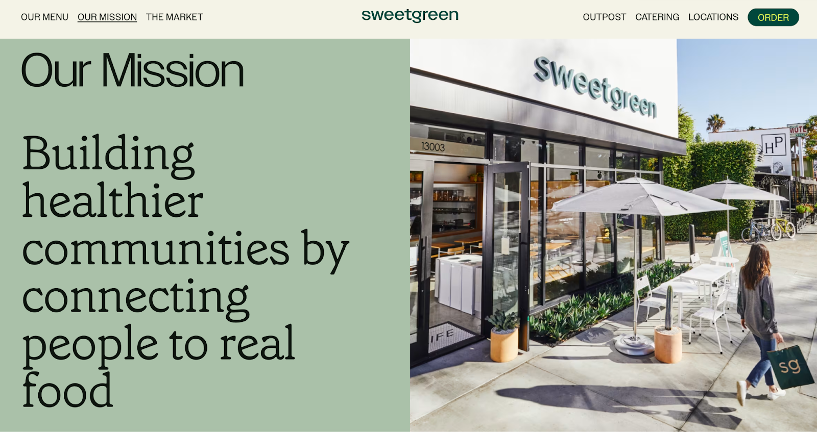
Image Source
Notice that sweetgreen’s mission is positioned to align with your values — not just written as something the brand believes.
The language lets us know the company is all about connecting its growing network of farmers growing healthy, local ingredients with us — the customer — because we’re the ones who want more locally grown, healthy food options.
The mission to connect people is what makes this statement so strong. And, that promise has gone beyond sweetgreen’s website and walls of its food shops: The team has made strides in the communities where it’s opened stores as well. Primarily, it offers education to young kids on healthy eating, fitness, sustainability, and where food comes from.
What we like: Inclusive language is built into this statement.
3. Patagonia: Patagonia is in business to save our home planet.
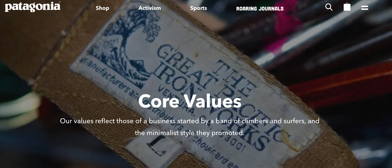
Image Source
A previous vision of Patagonia’s mission statement was “Build the best product, cause no unnecessary harm, use business to inspire and implement solutions to the environmental crisis.”
Patagonia’s mission statement spotlights the company’s commitment to helping the environment and saving the earth. The people behind the brand believe that among the most direct ways to limit ecological impacts is with goods that last for generations or can be recycled so the materials in them stay in use.
In the name of this cause, the company donates time, services, and at least 1% of its sales to hundreds of environmental groups worldwide.
If your company has a similar focus on growing your business and giving back, think about talking about both the benefits you bring to customers and the value you want to bring to a greater cause in your mission statement.
What we like: This mission statement example from Patagonia succinctly combines their products and activism into one memorable sentence.
4. American Express: Become essential to our customers by providing differentiated products and services to help them achieve their aspirations.

Image Source
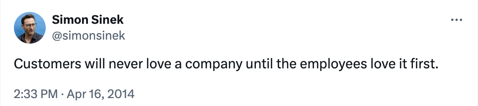
Image Source
The tweet above is from Simon Sinek, and it’s one that we repeat here at HubSpot all the time. American Express sets itself apart from other credit card companies in its list of values, with an ode to excellent customer service, which is something it’s famous for.
We especially love the emphasis on teamwork and supporting employees so that the people inside the organization can be in the best position to support their customers.
What we like: The emphasis on teamwork and supporting employees so that the people inside the organization can be in the best position to support their customers.
5. Warby Parker: To inspire and impact the world with vision, purpose, and style.
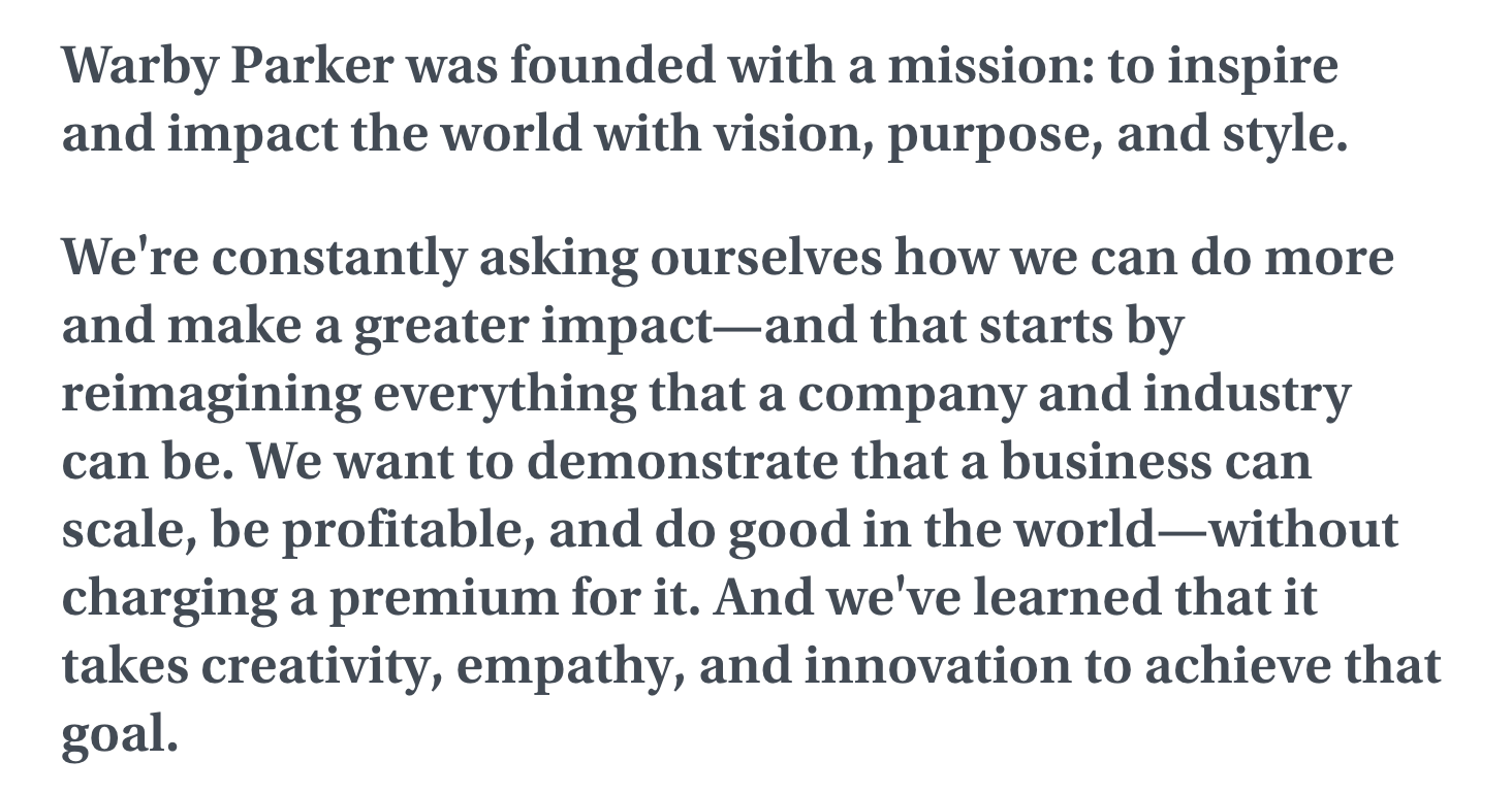
Image Source
In one sentence, the brand takes us to the root of why it was founded while also revealing its vision for a better future.
The longer-form version of the mission reads: “We’re constantly asking ourselves how we can do more and make a greater impact — and that starts by reimagining everything that a company and industry can be. We want to demonstrate that a business can scale, be profitable, and do good in the world — without charging a premium for it. And we’ve learned that it takes creativity, empathy, and innovation to achieve that goal.”
The mission statement’s success all comes down to spot-on word choice.
What we like: Warby Parker doesn’t hold back on letting its unique personality shine through.
6. InvisionApp: Transform the way people work together by helping them collaborate better. Faster. On everything. From anywhere.

Image Source
This mission statement from InvisionApp is:
- Brief.
- Authentic.
- Business babble-free.
As a result, it makes the folks at InvisionApp seem trustworthy and genuine.
What we like: This mission statement uses short senses and powerful words to be as pointed as possible.
7. Penguin Randomhouse: To ignite a universal passion for reading.

Image Source
Penguin is speaking to an audience that is excited to expand their horizons and explore new narratives. This mission statement focuses on the power of story and how it can shape lives. With that, the publishing house makes its mission more than just releasing books.
What we like: Penguin creates a mission that everyone can relate to. Who doesn’t love a good story?
8. IKEA: To offer a wide range of well-designed, functional home furnishing products at prices so low that as many people as possible will be able to afford them.
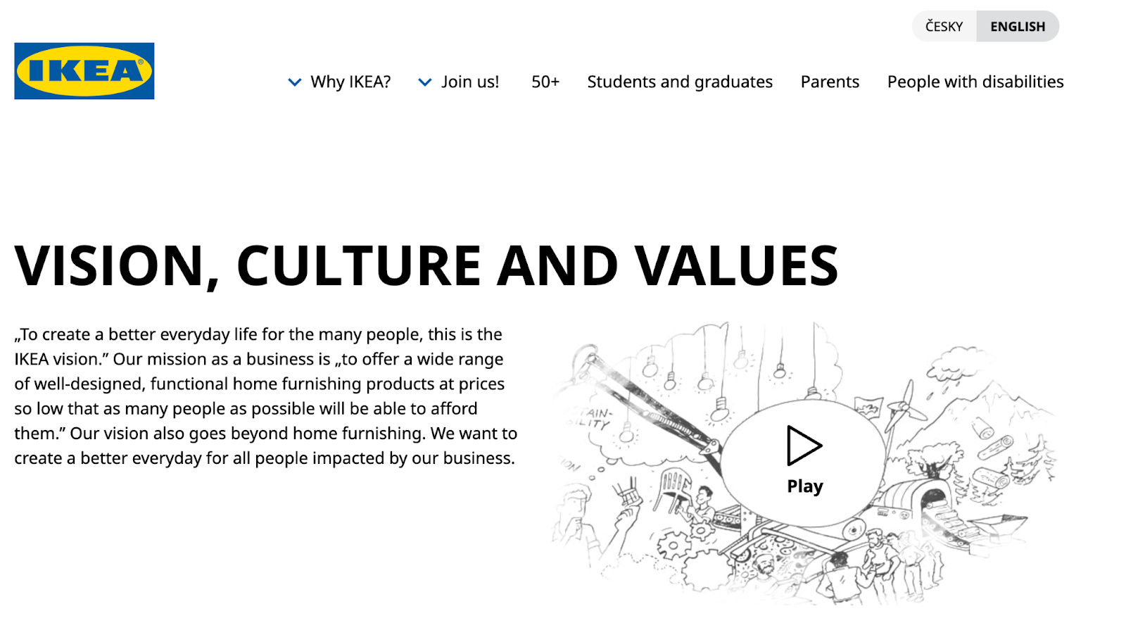
Image Source
The folks at IKEA dream big. Their vision-based mission statement communicates their mission of making everyday life better for their customers.
It’s a partnership: IKEA finds deals all over the world and buys in bulk, then we choose the furniture and pick it up at a self-service warehouse.
“Our business idea supports this vision ... so [that] as many people as possible will be able to afford them,”the brand states
What we like: Using terms like “as many people as possible” makes a huge company like IKEA much more accessible and appealing to customers.
9. Nordstrom: Our mission is to continue our dedication to providing a unique range of products, exceptional customer service, and great experiences.

Image Source
A previous version of Nordstrom’s mission statement was, “Offering customers the very best service, selection, quality, and value.”
When it comes to customer commitment, few companies are as hyper-focused as Nordstrom is. Although clothing selection, quality, and value all have a place in the company’s mission statement, it’s clear that it’s all about the customer: “Nordstrom works relentlessly to give customers the most compelling shopping experience possible.”
If you’ve ever shopped at a Nordstrom, you’ll know the brand will uphold the high standard for customer service mentioned in its mission statement. Associates are always roaming the sales floors, asking customers whether they’ve been helped, and doing everything they can to make the shopping experience a memorable one.
What we like: The use of the term “great experiences” creates the feeling that Nordstrom cares about retaining customers instead of making on-off sales, which breeds customer loyalty.
10. Cradles to Crayons: Provides children from birth through age 12 living in homeless or low-income situations with the essential items they need to thrive — at home, at school, and at play.
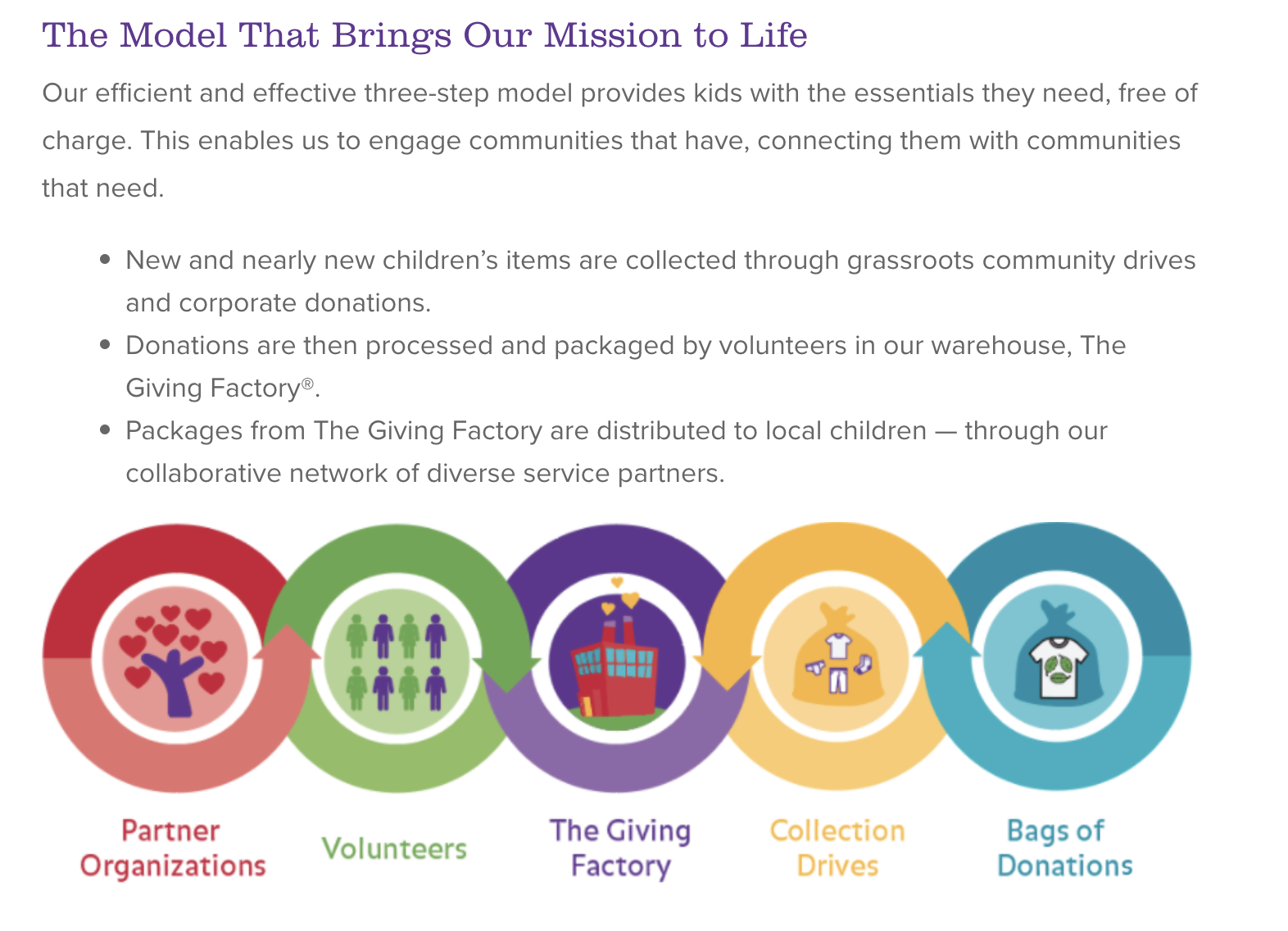
Image Source
Cradles to Crayons divided its mission and model into three sections that read like a game plan:
- The Need.
- The Mission.
- The Model.
The “rule of three” is a powerful rhetorical device called a tricolon that’s usually used in speechwriting to help make an idea more memorable. A tricolon is a series of three parallel elements of roughly the same length — think, “I came; I saw; I conquered.”
What we like: This mission statement begins by feeling very detailed but zooms out to encompass the overall wellbeing of its target audience.
11. Universal Health Services, Inc.: To provide superior quality healthcare services that patients recommend to family and friends, physicians prefer for their patients, purchasers select for their clients, employees are proud of, and investors seek for long-term returns.

Image Source
A company thrives when it pleases its customers, its employees, its partners, and its investors — and Universal Health Services endeavors to do just that, according to its mission statement.
As a healthcare service, it specifically strives to please its patients, physicians, purchasers, employees, and investors.
What we like: The brand places emphasis on each facet of the organization by capitalizing the font, making it easy to skim and digest.
12. JetBlue: To inspire humanity — both in the air and on the ground.

Image Source
JetBlue is committed to its founding mission through lovable marketing, charitable partnerships, and influential programs — and we love the approachable language used to describe these endeavors. For example, the brand writes how it “set out in 2000 to bring humanity back to the skies.”
For those of us who want to learn more about any of its specific efforts, JetBlue offers details on the Soar With Reading program, its partnership with KaBOOM!, the JetBlue Foundation, environmental and social reporting, and so on.
On its website, JetBlue breaks down all these initiatives well with big headers, bullet points, pictures, and links to other web pages visitors can click to learn more. JetBlue also encourages visitors to volunteer or donate their TrueBlue points.
What we like: JetBlue has to straddle two sides of its business: the flight experience (in the air) and the entire experience that customers have with buying flights (on the ground). This mission statement is short but manages to encompass both sides of the company.
13. Workday: Our core values guide everything we do — employees, customer service, innovation, integrity, fun, and profitability.
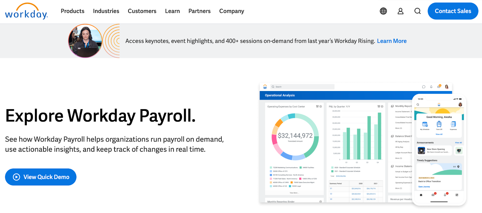
Image Source
Workday, a human resources (HR) task automation service, doesn’t use its mission statement to highlight the features of its product or how it intends to help HR professionals improve in such-and-such a way.
Instead, the business takes a stance on values.
There’s a lot of great tech out there, but at Workday, it revolves around the people. Their mission statement observes the state of its industry — which Workday believes lacks a human touch — and builds company values around it.
What we like: This mission statement is confident yet kind.
14. Lowe’s: Together, deliver the right home improvement products, with the best service and value, across every channel and community we serve.
 Image Source
Sometimes, the best way to communicate is to be direct. Lowe’s mission statement does this beautifully, and it’s also a great lesson in how the words and phrases you choose show your audience the force behind your mission.
This mission statement begins with the word “together.” So, no matter what location, products, or channel, the top priority of its mission is that it happens as a team.
That focus on togetherness also creates a foundation for the volunteer, scholarship, and charitable work that this organization does.
What we like: This statement hones in on the who, how, what, and why behind this powerful home improvement brand.
15. Tesla: Accelerating the world’s transition to sustainable energy.

Image Source
A car company’s punny use of the word “accelerating” is just one reason this mission statement sticks out. But, Tesla makes this list because of how its mission statement describes the industry.
It may be a car company, but Tesla’s primary interest isn’t just automobiles — it’s promoting sustainable energy. And, sustainable energy still has a “long road” ahead of it (pun intended) — hence the world’s “transition” into this market.
Ultimately, a mission statement that can admit to the industry’s immaturity is exactly what gets customers to root for it — and Tesla does that nicely.
What we like: The Tesla mission statement uses incredibly well-chosen words to communicate multiple meanings and make customers think about the industry as a whole, not just the company.
16. Invisible Children: Invisible Children exists to end violent conflict and foster thriving ecosystems in solidarity with our world’s most at-risk communities.

Image Source
A previous version of Invisible Children’s mission statement was “Partners with local peacebuilders across central Africa to end violent conflict through locally-led solutions.”
Invisible Children is a nonprofit organization that raises awareness around the violence affecting communities across Central Africa, and the company takes a confident, decisive tone in its mission.
The most valuable quality of this mission statement is that it has an end goal. Many companies’ visions and missions are intentionally left open-ended so that the business might always be needed by the community. But Invisible Children wants to “end” violent conflict facing African families with local solutions.
It’s an admirable mission that all businesses — not just nonprofits — can learn from when motivating customers.
I’ve personally volunteered for Invisible Children, and I’ve seen firsthand this mission statement isn’t something that sits on their website gathering dust. It’s understood by every individual at every level of the organization, from youth volunteers to leadership.
What we like: You don’t need to ask yourself, “What does Invisible Children do again?” when looking at their work. A clear, visible line can be drawn from every social media post, fundraising effort, and public campaign to this mission statement.
17. TED: Spread ideas, foster community, and create impact.
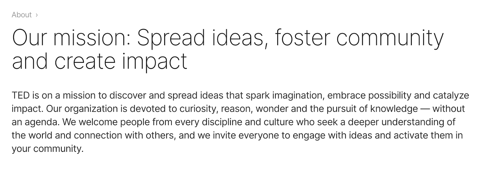
Image Source
We’ve all seen TED Talks online before. Well, the company happens to have one of the most concise mission statements out there.
TED, which stands for “Technology Education and Design,” has a succinct mission statement that starts with “Spread ideas.”
Sometimes, the best way to get an audience to remember you is to zoom out as far as your business’s vision can go. What do you really care about?
TED has recorded some of the most famous presentations globally. Then, it hones in on what great ideas can do — foster community and create impact.
What we like: This mission statement shines through in every Talk you’ve seen the company publish on the internet.
18. Microsoft: To empower every person and every organization on the planet to achieve more.

Image Source
Microsoft is one of the most well-known technology companies in the world. It makes gadgets for work, play, and creative purposes on a worldwide scale, and its mission statement reflects that. Through its product offering and pricing, it can empower every person and organization.
What we like: This statement encompasses both the organizations and the individuals that use Microsoft products.
19. Disney: To entertain, inform, and inspire people around the globe through the power of unparalleled storytelling.
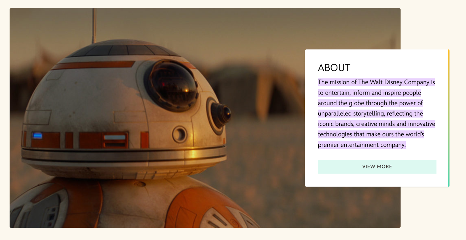
Image Source
Disney’s mission statement goes beyond providing ordinary entertainment. It intends to tell stories and drive creativity that inspires future generations through its work.
What we like: This is an exceptional mission statement because it goes beyond giving consumers programs to watch, but ones that excite and change the way people see themselves and the world around them.
20. Meta: Giving people the power to build community and bring the world closer together.

Image Source
Meta, formerly known as Facebook, is a major social media organization with a concise vision statement. It provides a platform to stay in touch with loved ones and potentially connect to people around the world.
What we like: This is a concise mission statement, but it still manages to encompass two enormous points: the company’s origin (Facebook) and the future of the internet.
21. Vista Equity Partners: By providing technology expertise, operational guidance, and capital for sustainable growth, we empower organizations across all industries to stay ahead in the digital economy.

Image Source
Many businesses sell a clear and easy-to-understand product or service, but other companies need to combine branding with product education. This means that some mission statements need to not only communicate how a brand does business but also make it easy to see what it’s selling.
Vista Equity Partners is a leading technology brand that supports a wide range of people, technologies, and products. In its mission statement, it clarifies what its company offers and why. It does this using the terms its audience uses most often to describe how it can help.
What we like: This mission statement creates a skillful balance of product education and audience identification.
22. Dunkin’: Everything we do is about you. We strive to keep you at your best, and we remain loyal to you, your tastes, and your time. That’s what America runs on.

Image Source
Dunkin’ (previously Dunkin’ Donuts) has a mission that goes beyond remaining a large coffee chain. Rather, the brand wants to be the consummate leader in the coffee and donut industry. It wants to become a place known for fun, food, and recreation.
This example touches on the evolution of the company. Depending on your age, Dunkin’ makes you think of donuts and a “cheat day” from your healthy eating goals. I think of Saturday mornings from my childhood when my parents would occasionally surprise us with donuts for breakfast.
“Donuts” was dropped from the company’s name in 2019, helping Dunkin’ keep up with changing consumer trends and embrace the popularity of their coffee.
What we like: This example looks to the future while also giving a nod to its necessary evolution.
23. Nike: To bring inspiration and innovation to every athlete* in the world. *If you have a body, you are an athlete.

Image Source
The Nike mission statement includes a unique element: an asterisk and a footnote expanding on their language choice.
It's concise yet answers a question that they know the athletic industry struggles to answer: What defines an athlete? It manages to simultaneously be informative and bring inspiration to their branding.
What we like: This mission statement articulates the target audience with very specific yet inclusive language.
24. Starbucks: To inspire and nurture the human spirit — one person, one cup, and one neighborhood at a time.

While the idea of paying $3 for a cup of coffee seems normal now, Starbucks had to fight to justify its prices when they were a new brand. They positioned themselves on the market as being another place to gather locally, one that didn’t revolve around alcohol.
The Starbucks mission statement touches on this subtly with the use of the word “neighborhood.” It’s a concise statement that speaks to their founding principles and, of course, includes their flagship product: a quality cup of coffee.
What we like: Good mission statements use emotional language, and the Starbucks mission statement does that well with the terms “inspire,” “nurture,” and “human spirit.”
25. Google: Google’s mission is to organize the world’s information and make it universally accessible and useful.

Google has become so synonymous with modern life that its brand name has become a verb. It’s estimated that there are 99,000 Google searches every second, and the search engine is only one of its products.
Google has more products than consumers know about, but their mission statement doesn’t go into all of them (and if it tried, no one would ever read the whole thing). Instead, it touches on what we all love about Google: how useful the product is. This company mission statement reminds us of what we love best about the brand.
What we like: Google is a customer-centric company, and consumers feel that immediately when reading its mission statement.
Now that we’ve gone over successful mission statements, what does a good vision statement look like? Check out some of the following company vision statements — and get inspired to write one for your brand.
1. Alzheimer’s Association: A world without Alzheimer’s and all other dementia.

Image Source
The Alzheimer’s Association conducts global research and gives quality care and support to people with dementia. This vision statement looks into the future, where people won’t have to battle this currently incurable disease. With the work that it’s doing in the present, both employees and consumers can see how the organization achieves its vision by helping those in need.
What we like: This vision statement is ambitious and broad enough to be an umbrella statement in line with a brand's mission.
2. Teach for America: One day, all children in this nation will have the opportunity to attain an excellent education.

Image Source
Teach for America creates a network of leaders to provide equal education opportunities to children in need. This organization’s day-to-day work includes helping marginalized students receive the proper education they otherwise wouldn’t have access to. Its vision statement is what it hopes to see through its efforts — a nation where no child is left behind.
What we like: “One day” is an unspecified amount of time, which makes sense for such an ambitious goal, and yet that doesn’t stop it from being their goal.
3. Creative Commons: Help others realize the full potential of the internet.

Image Source
This nonprofit’s vision statement is broad. It helps overcome legal obstacles to share knowledge and creativity around the world. By working closely with major institutions, its vision is an innovative internet that isn’t barred by paywalls.
What we like: The vision for this brand is limited to the internet, yet “full potential” allows for a lot of creativity.
4. Chipotle: We believe that food has the power to change the world.
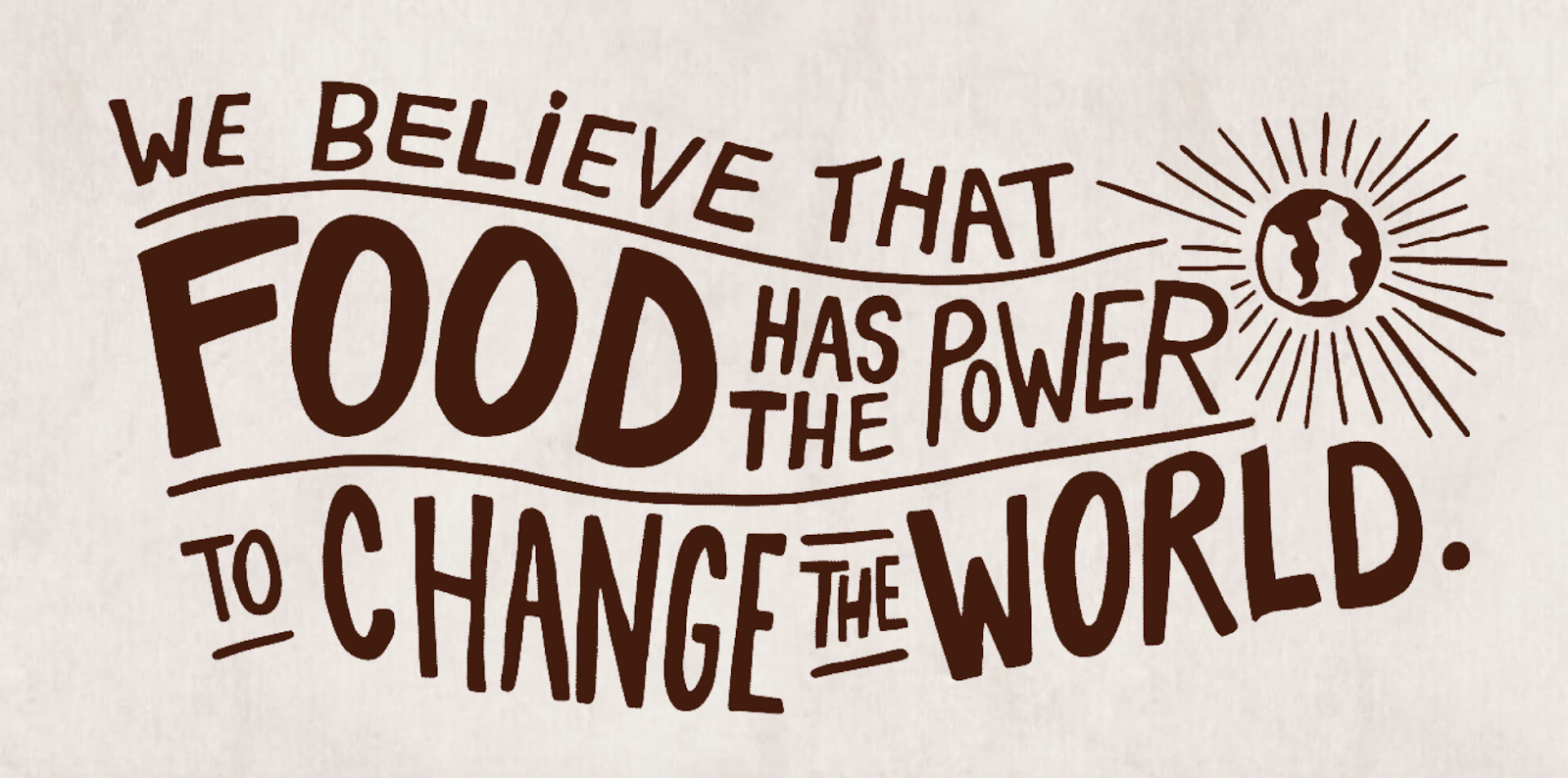
Image Source
Delicious tacos, burritos, and bowls aren’t the only things that Chipotle is passionate about. Many fast food brands differentiate with products. But Chipotle offers a belief instead. This idea fuels practices like using local and organic produce, using responsibly raised meat, and cutting greenhouse emissions.
What we like: Chipotle’s vision statement makes it clear what inspires and drives the actions of this international brand.
5. Australia Department of Health: Better health and wellbeing for all Australians, now and for future generations.

Image Source
This government department has a clear vision for its country. Through health policies, programs, and regulations, it has the means to improve the healthcare of Australian citizens.
What we like: The phrase “now and for future generations” communicates the long-term commitment of this health department.
6. LinkedIn: Create economic opportunity for every member of the global workforce.

Image Source
LinkedIn is a professional networking service that gives people the opportunity to seek employment. Its vision statement intends to give employees of every level a chance to get the jobs they need.
What we like: Although “every member of the global workforce” seems like an uncountably large number, having it as their vision keeps LinkedIn always working for improvement and further outreach.
7. Purely Elizabeth: We believe that food can heal.

Image Source
Purely Elizabeth is a food brand selling granola, oatmeal, and cereal products. Its extended vision statement reads: “When you eat better, you feel better. It’s that simple. That’s why we use superfoods with vibrant flavors and rich textures to create delicious foods to help you thrive on your wellness journey.”
Food brands have a lot of competition, and this brand’s broad and inspiring vision offers a chance to connect more deeply with customers. Its podcast, blog, and recipe resources offer useful tools and tips for anyone looking to heal their bodies with their food choices.
What we like: This vision statement is simple but powerful.
8. AllHere: Connecting All Families with the Right Support at the Right Time.

Image Source
Attendance is a big challenge for schools and families, especially with students in middle and high school. AllHere offers AI services like mobile messaging to overcome administrative and communication challenges. This helps students, parents, and teachers get the support they need for student success.
What we like: This vision statement emphasizes that this challenge is bigger than individual habits. It’s an empowering vision of an educational system that works for everyone.
9. Southwest: To be the world’s most loved, most efficient, and most profitable airline.

Image Source
Southwest Airlines is an international airline that strives to serve its flyers with a smile. Its vision statement is unique because it sees itself not just excelling in profit but outstanding customer service, too. Its vision is possible through its strategy and can lead its employees to be at the level they work toward.
What we like: Southwest gets it right — by being well-loved and efficient, they can become the most profitable airline. Putting customers first makes a business successful.
10. Supergoop!: Change the way the world thinks about sunscreen.

Image Source
For a vision statement to excite, but not overwhelm, it should be both broad and specific. Company mission statement examples like the one above from Supergoop! show that it may be tricky, but it’s also possible to balance those two extremes.
This vision says that sunscreen is important AND that sunscreen is more than sunscreen. This simple statement helps the audience think more about what its products are and what they should expect from those products. It’s about education, awareness, and quality.
What we like: This vision statement keeps the tone positive, bright, and direct.
Inspire Through Brand Values
It was Anna Lappé who said, “Every time you spend money, you’re casting a vote for the kind of world you want.” Conscious consumerism is an economic trend that brands should pay attention to. Consumers are certainly paying attention.
Now that you understand the power of a great mission statement and you have these mission statement examples to learn from, you’re ready to take this step in your own brand.
Brand values play a much more significant role in customer loyalty than you think. Showing that your business understands its audience — and can appeal to them on an emotional level — could be the decision point for a customer’s next purchase.
We hope you found some insight from these mission statement examples and that they help you brainstorm your inspiring vision and mission statements for your business.
Editor’s note: This post was originally published in August 2014 and has been updated for comprehensiveness.


![Free Download: How to Create a Style Guide [+ Free Templates]](https://no-cache.hubspot.com/cta/default/53/76520ae5-1a3b-4055-9e8e-95e150b90965.png)


![Download Now: 10 Competitive Analysis Templates [Free Templates]](https://no-cache.hubspot.com/cta/default/53/b3ec18aa-f4b2-45e9-851f-6d359263e671.png)


![Download Now: 100 ChatGPT Prompts for Marketers [Free Guide]](https://no-cache.hubspot.com/cta/default/53/c497a8fe-0f60-4244-9cb1-5bed4d1e5ab6.png)