How many social accounts does a "modern" person have? What do you think about this?
Other Looks at the Conditional Border Radius Trick
Remember when Ahmad Shadeed wrote about that border-radius “toggle” he found in Facebook’s CSS? It was interesting! I covered it. A few weeks after that surge of linkage, a couple of articles came out digging into it a little deeper.
In “Evaluating Clever CSS Solutions,” Michelle Barker wonders how clever is too clever?
While undoubtedly clever, and super interesting to read about, I side with Robin Rendle in the CSS-Tricks newsletter when he says:
I can’t help but feel that it’s a little too smart.I have to agree here. Tricks like this have their place, and Facebook (which can clearly afford to hire the best of the best CSS developers) might be one of them. But speaking personally, when forced to pick between a trick like this and an ever-so-slightly less optimal but far more readable solution (say, a media query), in 99% of cases I’d plump for the latter.
Michelle is aware that a media query isn’t the same solution here. A non-clever solution would be a container query. I agree as well. I almost never opt for tricky solutions in production, as even if they seem to work, I worry about the long term maintenance and sometimes even the fragility of the solution.
Stefan Judis looked at how we might pull of the same “conditional border-radius” idea only using the upcoming container queries syntax.
/* If the container's width is equal to or greater than
   the viewport width, remove the border-radius */
@container (width >= 100vw) {
  .conditional-border-radius {
    border-radius: 0;
  }
}
That’s pretty darn clear to me. Stefan also mentions that if we could use the theoretically upcoming @when feature, it could be even clearer:
@when container(width >= 100vw) {
  .conditional-border-radius {
    border-radius: 0;
  }
}
@else {
  .conditional-border-radius {
    border-radius: 1em;
  }
}
That is a big maybe, as there is no evidence these brand new specs will overlap like this. I hope they do though. CSS has gotten much more logical and readable over the years and this would keep that train moving.
Oh, and I mentioned this in the last article…
The
9999multiplication means that you’ll never get low-positive numbers. It’s a toggle. You’ll either get8pxor0pxand nothing in between. Try removing that part, resizing the screen, and seeing it sorta morph as the viewport becomes close to the component size
But I regretted not putting a video in there to make the concept clearer, so I’ll rectify that here.
The post Other Looks at the Conditional Border Radius Trick appeared first on CSS-Tricks. You can support CSS-Tricks by being an MVP Supporter.
Don’t Sleep on These Five Conversion Rate Optimization Tactics to Boost Your Sales
You could have a beautiful website and get tons of traffic. However, if your visitors are not converting, you’ll need to apply some tweaks, reassess your strategies, and use the best-fitting tools to turn visitors...
The post Don’t Sleep on These Five Conversion Rate Optimization Tactics to Boost Your Sales appeared first on 85ideas.com.
This Week In Web Design – November 12, 2021
Semantic menu context
Scott digs into the history of the <menu> element. He traced it as far back as HTML 2 (!) in a 1994 changelog. The vibe then, it seems, was to mark up a list. I would suspect the intention is much like <nav> is today, but I really don’t know.
Short story: HTML 4 deprecated it, HTML 5 revived it—this time as a “group of commands”—and then HTML 5.2 deprecated it again. Kind of a bummer since it has some clear use cases.
So, it’s been quite the roller coaster for ol’ <menu>! There never seems to be any easy wins for HTML evolution. As of now, it’s in “don’t bother” territory:
I really wrote this post as a sort of counter point to the often uttered phrase “use semantic HTML and you get accessibility for free!” That statement, on its surface, is largely true. And you should use semantic HTML wherever its use is appropriate.
<menu>, unfortunately, doesn’t really give us all that much, even though it has clearly defined semantics. Its intended semantics and what we actually need in reality are better served by either just using the more robust<ul>element, or creating your ownrole=toolbar,menubar, etc.. Using this semantic element, for semantics sake, is just that.
To Shared Link — Permalink on CSS-Tricks
The post Semantic menu context appeared first on CSS-Tricks. You can support CSS-Tricks by being an MVP Supporter.
Effective way to do digital marketing
What are the effective way to do digital marketing?
React vs Angular vs Vue: Which Framework to Choose in 2022
When starting a new web app development, a lot of business owners ask themselves: "What tools are the most suitable to use?" “What web framework to choose for the project?”
JavaScript will obviously be the core as it provides the most extensive front-end functionality today. But a dilemma arises when choosing a development environment, namely the best JavaScript web frameworks because each is endowed with unique features.
Typically, the controversy is centered around three frameworks - React, Angular and Vue. In this article, we consider the advantages and disadvantages of each web framework as well as its popularity among developers. As a result, each business owner will choose his side on the neverending battle of React vs Angular vs Vue.
Developers' Choice
First of all, we analyzed developers’ surveys, including Stack Overflow and The State of JavaScript. Every year they provide the most accurate information regarding the popularity and state of web app development.
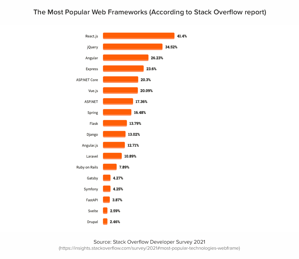
According to Stack Overflow Developer Survey 2021, React.js was named as the most commonly used web framework (among both categories: all respondents and among professionals). Angular took 4th place among all respondents (22.96%) while professional developers (26.23%) choose Angular as their most commonly used web framework. Despite the rapid development of Vue.js, this framework takes only 6th place in the ranking among professional developers (20.09%) and 5th among all respondents (18.97%).
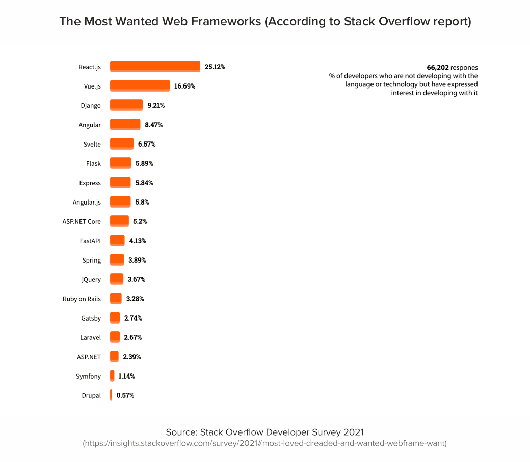
Newcomer Svelte takes the top spot as the most loved web framework. At the same time, developers most of all enjoy working with React (69.28%) and Vue (64.41%), and Angular (55.82%). Among those who have not previously developed applications using these frameworks, React.js turned out to be the most desirable to learn (25.12%). It is followed by Vue.js (16.69%), followed by Angular (8.47%).
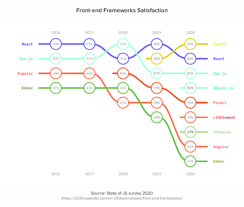
State of JS survey is this annual report is a major indicator of the development of JavaScript in general and all the tools associated with it. Predominantly, developers are happy with the workflow with React.js (88%) and Vue.js (85%), while Angular is 42% satisfied.
With regard to web app frameworks usage, most of the respondents chose React (80%) and Angular (56%) as the leading frameworks to solve problems. Starting from 2017, the popularity and usage of Vue (49%) started to grow, increasing the percentage of framework usage year after year.
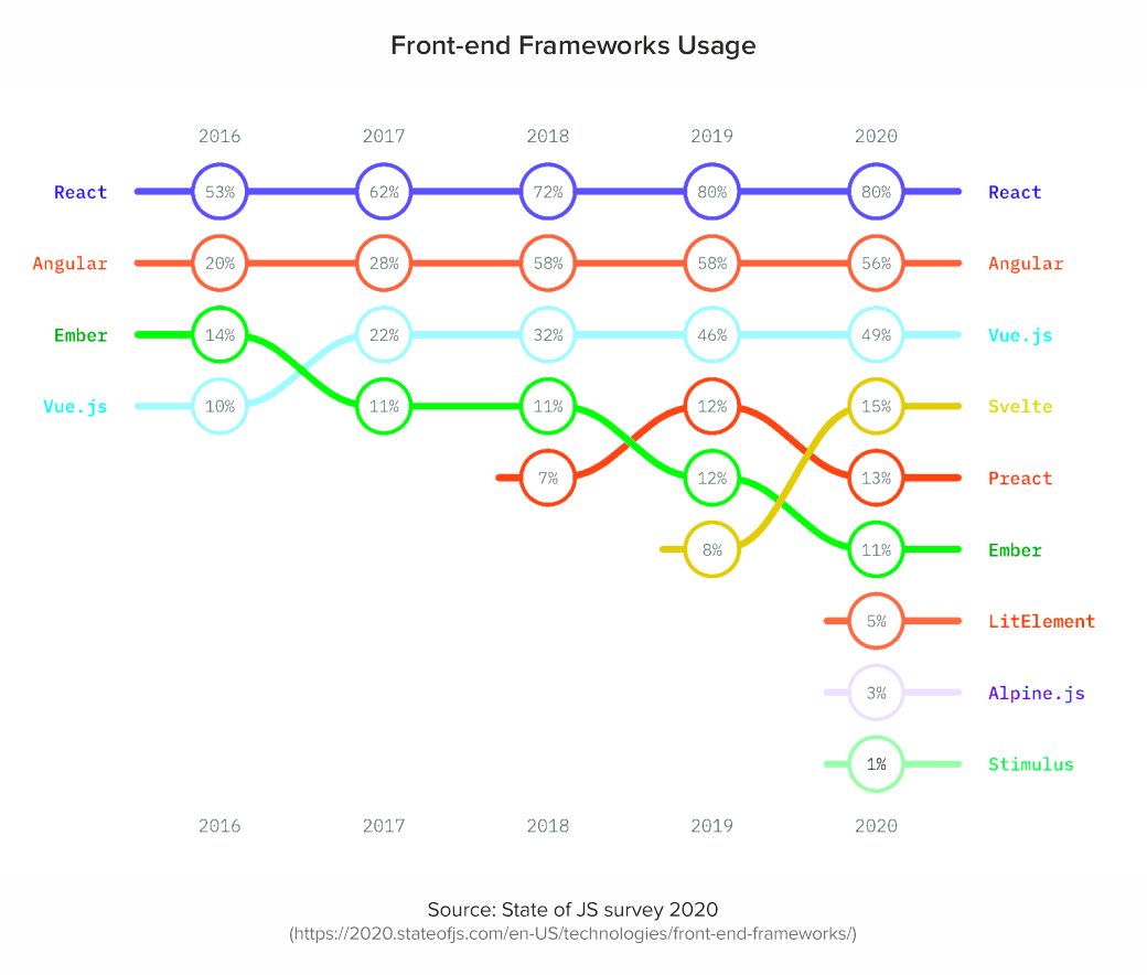
It is noteworthy that relatively small businesses prefer React.js and Vue.js, while large companies (100+ 1000 employees) use Angular more often. Nevertheless, these indicators are approximately equal.
One of the important indicators of the development of a technology stack is the number of package downloads. NPM trends show the most accurate statistics for each tool, including not only the number of downloads but also the Github data.
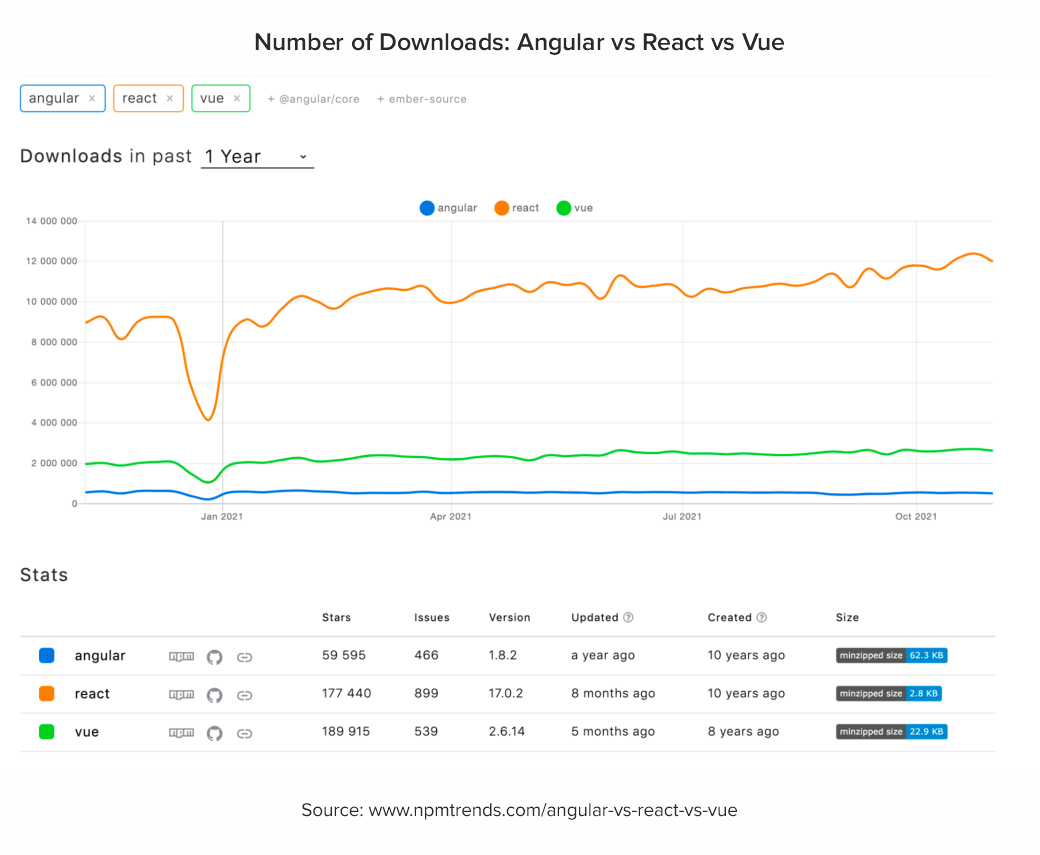
Framework Development
Angular releases major updates, usually every six months. Since it is characterized by dependence on previous versions and components, the framework has a service with a detailed description for version migration. In addition, Angular has an Ivy compiler that indicates errors if they occur before the interpreter executes the code. The framework is based on the RxJs library and, in principle, functional code is based on reactive programming, which, in turn, leads to a declarative paradigm: the code is easily covered by unit tests, and testing tools come out of the box.
React is quite active in changing public APIs and behavior, and the updates themselves through versions are usually simple. Since Facebook stands for stability, there is full compatibility between versions and the ability to connect libraries of different versions to the application.
The dynamics of Vue development is the highest of the presented frameworks. The modular system includes all the attributes of the JS framework, working with full backward compatibility. And when moving from one version to another, Vue has a helper tool that runs in the console to help assess the state of the application.
Availability of Developers in the Market
If we evaluate the popularity of jobs with a request for specialists in these web frameworks, the Google Trends data looks like this.
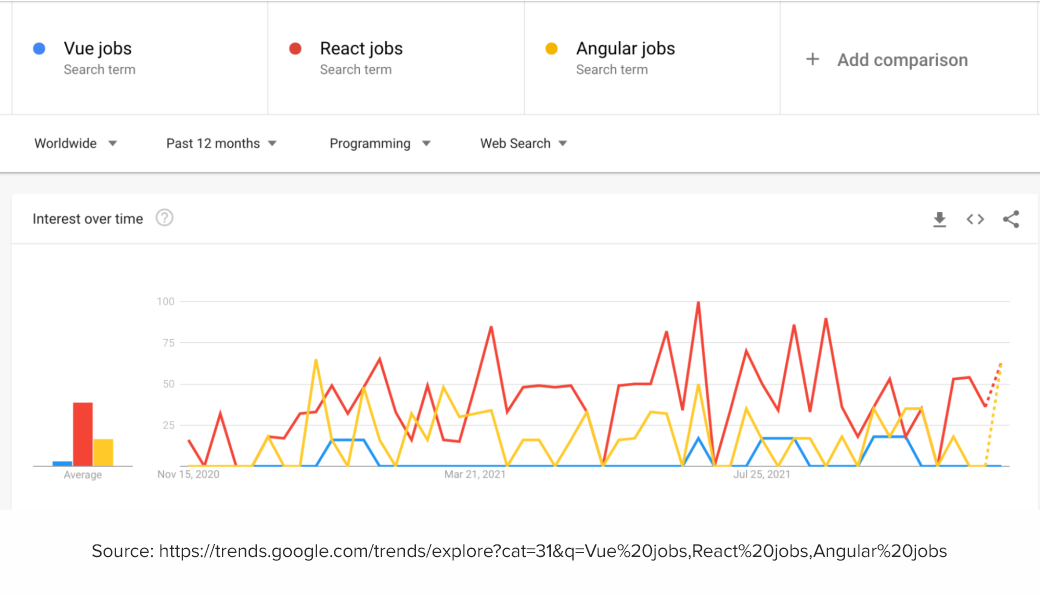
It’s important to mention that most job listings say that they require experience with one of a few named frameworks, but a large share of those listings is actually hiring for React work. So, the job market reflects a clear hierarchy of React followed by Angular then Vue by almost every site sample. It’s worth noting the different cultures of the sites sampled. They all clearly have Vue as the third-tier framework, and Angular not too far off from React.
What is the Best Web Framework for the Project?
Angular as a framework is used to develop large applications, due to a number of architectural solutions come out of the box, including TypeScript. On the one hand, this can be a limitation, and on the other hand, it can be a quick solution to a standard case. There are also DI mechanisms for ease of testing and dependency replacement. Angular as a framework is highly specialized. And the threshold for entering development on it is quite high. In addition to the knowledge of an ordinary JS developer, you need to have a good understanding of how this framework works.
React has a large arsenal of related libraries. It is suitable for any task. It can be applied for MVP, small and medium projects. It can also be chosen for the development of sites with minimal business logic at the front, since there is a boilerplate. However, in React there are no "imposed" solutions out of the box, so competent specialists with good development experience and knowledge of both architectural patterns and the work of native JS (engine, in particular) are required. Otherwise, the likelihood of the appearance of irrelevant code (or, in professional slang, "crutches") in the project will increase.
Vue is suitable for medium applications and MVPs. High speed at the start allows you to make an MVP in a short time. The scalability of the Vue application will also help to dynamically develop the project. The cost of starting on this framework is lower than that of React due to the convenient CLI and a good supported set of libraries out of the box. At the same time, the ease of scaling is higher than that of Angular. Plus, Vue is easier to learn, so companies have begun to place more emphasis on hiring developers with knowledge of Vue.
Now let's take a look at each web application framework separately and talk about the pros and cons.
Pros and Cons of React Framework
React.js has been ranked #1 for the third year in a row. Some developers have no complaints about this framework at all, since it is rapidly evolving and becoming more stable. One of the key reasons behind the popularity of React.js is the support from the reputable company Facebook. Services such as Instagram, Whatsapp and Twitter work today on the basis of this development environment. They are all very fast and eye-catching. This has ensured a high level of trust in React.
Advantages of React
Maintained and supported by Facebook, framework has the large community;
Clear and detailed documentation;
Relatively easy learning curve;
Flexible in structure;
One-way data binding approach;
Uses virtual DOM to enhance the performance;
Ability to create reusable and easy-to-test code.
Disadvantages of React
Extensive flexibility meaning that devs have too much choice;
Extensive templates of JSX may seem confusing.
React will be the perfect solution for flexible and dynamic web applications with a high traffic. The framework will be suitable for projects with simple and clean frontend and high level of scalability. Companies that use React: Facebook, Instagram, New York Times, Airbnb, Netflix, Atlassian, Dropbox, Whatsapp, Codecademy.
Pros and Cons of Angular Framework
Angular has long been the top choice for UI development. So, it became part of the popular MEAN stack. Angular is perfect for complex and highly interactive web applications. Maintained by Google, Angular has a hight level of trust and a huge community of developers who constantly contributed to the solution.
Advantages of Angular
Maintained by Google, Angular has a huge community and defined implementation methodology;
Detailed tech documentation;
MVVM (Model-View-ViewModel) pattern;
Providing dependencies in modules;
One-way data binding approach.
Disadvantages of Angular
Quite steep learning curve, since a developer has to know additional tools like TypeScript, RxJS library, etc..
Migration issues from the older versions to the newer one.
Angular framework is perfect for complex and large-scale projects. If the business owner plans to scale the business in the future, Angular is the best choice since it guarantee smooth scalability of application. Companies using Angular are Google, Upwork, PayPal, Forbes, Samsung, Delta, Grasshopper.
Pros and Cons of Vue Framework
Recently, the popularity of Vue has grown without the input of large community of devs or organizations. Due to framework flexibility and easy learning path, Vue became one of the most beloved tools among frontend developers.
Advantages of Vue
Short learning curve since the syntax is quite simple;
Detailed documentation;
Easy structure;
Flexible integrations which can be easily setup with Typescript, JSX, etc.;
Two-way data binding approach;
Allow scale the product with no time.
Disadvantages of Vue
Maintained by a small team and supported by a small community, so there could be lack of resources.
Vue might be the perfect choice for the applications that tend to be released quickly to the market. In addition, this framework will benefit the development of high-performance, small and lightweight applications. Companies using Vue: Grammarly, Xiaomi, WizzAir, Adobe, Behance.
Final Thoughts … So, what to choose?
When choosing the best web framework for your projects, you should pay attention to popularity, speed of stack development, availability of specialists in the market, areas of application, and the project requirements.
Answering one of our clients' favorite questions - "What framework should I use for web app development?" we, first of all, advise you to pay attention to how well thought out the architecture of the project.
If it is well thought out and there is an understanding of the final look of the product, Angular may be the most obvious choice. In case the project is MVP, React or Vue will do their job best. Having accumulated all our development experience, we recommend choosing Angular for large-scale and complex projects. React is perfect when you need high performance, and the project itself is implemented under tight timing conditions. And if you have a minimum of time to train specialists in the framework and need a small project or MVP, you can safely choose Vue.
If you still have some questions regarding what web framework to choose, drop us a line in the contact us section below and we gladly help you!
341: Challenges
Marie and Chris talk about CodePen Challenges, which have been going strong for many years now. The gist is that you pop in and make something along a theme. The “challenge” is doing the work (they aren’t meant to be tricky otherwise). We’ve seen people seriously level up their skills by participating, but of course, there is no obligation, and no prizes other than the satisfaction of a job well done.
One interesting twist is that Chris used to do a lot of the challenges while Marie was running the podcast, but we just up and switched jobs and we both prefer our new jobs much better (for now!).
Time Jumps
- 00:51 Explaining how time works
- 01:45 Having monthly themes
- 06:33 Sponsor: Netlify
- 08:08 How to be a part of challenges
- 13:03 Putting together the challenge collections
- 17:04 Makes sense from a business perspective
- 19:28 Swapping roles and creating more joy for everyone
- 25:47 Using better dashboards to build fun things
Sponsor: Netlify
Just look at the October 2021 changelog at Netlify. They are always building things and making the features they offer better. We know firsthand how difficult that is to pull off, so hats off! One feature (BETA) that is definitely worth a look is On-Demand Builders. What a great idea for making your builds and deploys fast and efficient.
The post 341: Challenges appeared first on CodePen Blog.
How to increase website traffic ?
Hello, Anyone know which strategies can I use to increase website traffic?
How to Remove Render-Blocking JS & CSS for Site Speed
 While the aesthetics of a website are important, its content and loading speeds keep people coming back. WordPress supplies users with a sophisticated toolbox of plugins and themes to create their very own custom websites quickly. However, these themes and plugins require JavaScript (JS) and Cascading Style Sheets (CSS) to work. WordPress creates them automatically […]
The post How to Remove Render-Blocking JS & CSS for Site Speed appeared first on WPExplorer.
Number one rank
How to rank number one using SEO?
WordPress Polyglots Team Launches New Monthly Newsletter
WordPress’ Polyglots team has published the first edition of a new monthly newsletter aimed at helping contributors stay informed and engaged with the team’s activities.
WordPress has been translated by volunteers for more than 15 years since version 1.2, with the earliest contributions from the Hindi, French, Japanese, and Norwegian communities. Since that time the Polyglots team has grown to include the work of 55,427 translation contributors. They have also adopted more efficient tools like P2 and Slack to stay connected, but some translators find it difficult to follow the constant stream of posts and meetings.
The monthly newsletter was launched to provide a short-format digest of all the significant happenings and discussions in the translation community. It will include news related to upcoming releases and Polyglots tools, condensed so contributors don’t have to keep a close eye on the team’s P2 blog, Slack channels, or RSS feed.
The first edition features a brief summary of the month-long WordPress Translation Day 2021 event, which brought in 697 new translation contributors. Altogether the contributor teams submitted 518,710 approved translation strings during 22 local and six livestream events.
The majority of people using WordPress are using it with a translation. As of October 2021, 55.36% of WordPress sites are running a translated site. That figure is slowly inching upward as WordPress adoption grows in the non-English speaking world.
Even if you’re not a member of the Polyglots team, this newsletter is a good way to stay up-to-date with the exciting frontier of WordPress translations. Subscribers can sign up to receive monthly Polyglots updates directly via email.
How to show 2nd drop-down field after first drop-down selection is chosen?
Im trying to modify a web script where a drop-down works successfully. How can another drop-down field appear only after a selection has been made from the first drop-down list? Heres the current code:
<?php if ($pt->page == 'category' && $pt->show_sub == true) { ?>
<div class="pull-right col-md-3 no-padding-left">
<select name="type" class="form-control form-group" id="sub_categories_">
<?php echo $pt->sub_categories_array["'".$_GET['id']."'"]; ?>
</select>
<div class="pull-right col-md-2 col-sm-2 text-right"><h5>{{LANG sub_category}}</h5></div>
and this:
$(document).on('change', '#category_id', function(event) {
event.preventDefault();
id = $(this).val();
$('#sub_category_id').html(sub_categories_array["'"+id+"'"]);
});
$(document).on('change','#sub_categories_', function(event) {
window.location.href = site_url+'/videos/category/<?php echo($_GET['id']) ?>/'+$('#sub_categories_').val();
});
any guidance is appreciated
CSS Grid Can Do Auto Height Transitions
Bonafide CSS trick alert! Nelson Menezes figured out a new way (that only works in Firefox for now) that is awfully clever.
Perhaps you know that CSS cannot animate to auto dimensions, which is super unfortunate. Animating from zero to “whatever is necessary” would be very helpful very often. We’ve documented the available techniques. They boil down to:
- Animate the
max-heightto some more than you need value, which makes timing easing imprecise and janky. - Use JavaScript to measure the final size and animate to that, which means… using JavaScript.
Nelson’s technique is neither of those, nor some transform-based way with visual awkwardness. This technique uses CSS Grid at its core…
.expander {
  display: grid;
  grid-template-rows: 0fr;
  transition: grid-template-rows 1s;
}

.expander.expanded {
  grid-template-rows: 1fr;
}
Unbelievably, in Firefox, that transitions content inside that area between 0 and the natural height of the content. There is only a little more to it, like hiding overflow and visibility to make it look right while maintaining accessibility:
That’s wonderful. Let’s get some stars on this issue and maybe Chrome will pick it up. But of course, even better would be if auto height transitions just started working. I can’t imagine that’s totally outside the realm of possibility.
The post CSS Grid Can Do Auto Height Transitions appeared first on CSS-Tricks. You can support CSS-Tricks by being an MVP Supporter.
Create Educational Courses with MasterStudy LMS
 Good LMS plugins can be hard to come by. Due to the complex nature of paid course websites, it can be hard to land that perfect plugin which comes with everything you need without being overly expensive. This is doubly true if you want fancier features like student grading and course builders. Sure, you could […]
The post Create Educational Courses with MasterStudy LMS appeared first on WPExplorer.
How do I know if PPC is right for me?
Introduction
With the proliferation of internet-enabled devices, there are more ways than ever before to advertise your business. One powerful option for any small business is Pay-Per-Click advertising (PPC). This type of digital marketing requires a budget to be effective, but it can be an excellent way for small businesses to get their products in front of potential customers. PPC campaigns have five main advantages: they’re less expensive than ads on TV or radio; they target the right people; results happen faster; people spend more time looking at their screens; and you can use them in conjunction with other types of marketing like print media, SEO or social media. Let’s look a little closer at these benefits.
5 Advantages for using Pay-Per-Click advertising (PPC):
1) It’s less expensive than other forms of advertising.
PPC is cheaper than buying ad space on TV, radio, or newspaper ads because you only pay when someone clicks on your ad. Television and radio ads have set prices, which can end up costing thousands of dollars for one commercial slot. Ad space in newspapers and magazines also has to be purchased as part of a contract that may take months or years to complete; this leaves no room for fluctuation during slow business periods. PPC, by contrast, allows you to adjust the budget as needed based on traffic levels: reduce your budget during slower times and increase it back up when demand picks up again. Not only is this more convenient, but it’s also more cost-effective.
2) It targets the right people.
PPC is an excellent way to target potential customers because you can choose keywords that relate directly to your business. This means that when someone searches for a term related to your industry, they see your ad. For example, if you own a bakery and wanted to target people who live nearby looking for a place where they could pick up something sweet, you would input “bakery near me” as one of the search terms for your campaign. A PPC ad allows you to hone in specifically on those who will be most interested in what you have to offer.
3) Results happen faster.
Another benefit of PPC advertising is that results happen fast. You get to see how many clicks you’re getting in real-time, so you can make adjustments on the fly if needed. If you want to increase your budget because of positive feedback from customers, there is no contract or approval process involved like with traditional print media advertising. Additionally, organic search results don’t work in real-time; when someone searches for a term you have listed in Google Ads, they may not click on your ad right away. This means that it could take weeks or months before you see any significant traffic. This is a great alternative in the meantime.
4) People spend more time looking at their screens.
PPC ads are displayed when people are actively searching for something online, so they are more likely to notice your ad than they would be with other forms of advertising. 67% of internet users are more likely to buy something after they have researched it online, so you are reaching people at the exact moment that they are most interested in your product.
5) It can be used in conjunction with other advertising methods.
Like any marketing campaign, PPC is most effective when used along with other types of ads. You may want to start by using only ads on Google or Bing, for example, while testing different keywords and ad copy to see what works best for your business. Once you know what kinds of campaigns get the most clicks and conversions, you can choose whether or not you want to try additional digital marketing tools like social media or email marketing.
Conclusion:
PPC is a great way to reach customers in a cost-effective and targeted manner. The five main advantages of PPC are that it’s less expensive than other forms of advertising, targets the right people, results happen faster, people spend more time looking at their screens and you can use them in conjunction with other types of marketing like print media or SEO. If you’re still on the fence about whether or not this form of digital advertising is for you, feel free to reach out to us!
How to Create Additional Image Sizes in WordPress
Do you want to create additional image sizes in WordPress?
By default, WordPress automatically creates several copies of image uploads in different sizes. Additionally, WordPress themes and plugins can also create their own image sizes.
In this article, we’ll show you how to easily create additional image sizes in WordPress and use them on your website.

Why Create Additional Image Sizes in WordPress?
Normally, all popular WordPress themes and plugins handle image sizes very well. For instance, your WordPress theme may create additional sizes to use as thumbnails on archive pages.
However, sometimes these image sizes may not fit your own requirements. You may want to use a different image size in a child theme or a post grid layout.
You can do this by creating additional image sizes in WordPress and then calling these sizes whenever you need them.
That being said, let’s take a look at how to create additional image sizes in WordPress.
Registering Additional Image Sizes for your Theme
Most WordPress themes including all the top WordPress themes support post thumbnails (featured image) feature by default.
However, if you are creating a custom WordPress theme then you will need to add support for post thumbnails by adding the following code to your theme’s functions.php file.
add_theme_support( 'post-thumbnails' );
Once you enable the support for post thumbnails, you can now use the functionality of registering additional image sizes by using the function add_image_size().
The add_image_size function is used in the following format:
add_image_size( 'name-of-size', width, height, crop mode );
Example code can look like the following:
add_image_size( 'sidebar-thumb', 120, 120, true ); // Hard Crop Mode
add_image_size( 'homepage-thumb', 220, 180 ); // Soft Crop Mode
add_image_size( 'singlepost-thumb', 590, 9999 ); // Unlimited Height Mode
Now if you notice, we have specified three different sorts of image sizes. Each has different modes such as hard crop, soft crop, and unlimited height.
Let’s cover each example and how you can use them in your own projects.
1. Hard Crop Mode
As you may notice, there is a “true” value added after the height. This tells WordPress to crop the image exactly to the size that we have defined (in this case 120 x 120px).
This method is used to ensure that everything is exactly proportionate. This function will automatically crop the image either from the sides or from the top and bottom depending on the size.

2. Soft Crop Mode
By default, soft cropping mode is turned on this is why you do not see any additional value added after the height. This method resizes the image proportionally without distorting it. So you might not get the dimensions that you wanted. Usually, it matches the width dimension and the heights are different based on each image’s proportion. An example display would look like this:

Unlimited Height Mode
There are times when you have super long images that you want to use in your design, but you want to make sure that the width is limited. For instance, infographic images tend to be very long and usually wider than the content width.
This mode allows you to specify a width that will not break your design while leaving the height to be unlimited.

Displaying additional image sizes in your WordPress theme
Now that you have added the functionality for the desired image sizes lets take a look at displaying them in your WordPress theme. Open the theme file where you want to display the image and paste the following code:
<?php the_post_thumbnail( 'your-specified-image-size' ); ?>
Note: This bit of code must be pasted inside the post loop.
That’s all you really have to do to display the additional image sizes in your WordPress theme. You probably should wrap it around with the styling that fits your need.
Regenerating Additional Image Sizes
If you are not doing this on a brand new site, then you probably will have to regenerate thumbnails.
The add_image_size() function only generates the sizes from the point it was added into the theme. This means any post images that were added prior to the inclusion of this function will not have new sizes.
To fix this, you need to regenerate the new image size for older images. This is made easy by the plugin called Regenerate Thumbnails. Once you install and activate the plugin, a new option is added under the menu: Tools » Regenerate Thumbnails

You’ll see the option to regenerate thumbnail for all images or just the featured images. We recommend regenerating all images to avoid any unexpected behavior or broken images.
For more details, see our article on how to easily regenerate new image sizes in WordPress.
Enabling Additional Image Sizes for your Post Content
Even though you have enabled image sizes in your theme, the usage is limited only to your theme which does not make any sense.
All image sizes are being generated regardless, so why not make it available for the post author to use within the post content.
You can do this by adding the following code to your theme’s functions file.
function wpb_custom_image_sizes( $size_names ) {
    $new_sizes = array(
        'homepage-thumb' => 'Homepage Thumbmail',
        'singlepost-thumb' => 'Infographic Single Post'
    );
    return array_merge( $size_names, $new_sizes );
}
add_filter( 'image_size_names_choose', 'wpb_custom_image_sizes' );
Don’t forget to save your changes after adding the code.
You can now go and upload an image to a WordPress post or page. In the image block settings you’ll see your custom image sizes under the ‘Image size’ option.

You and other authors working on your website can now select these size options when adding images to posts and pages.
We hope this article helped you learn how to create additional image sizes in WordPress. You may also want to see our article on the best image compression plugins for WordPress and our WordPress performance guide to improve your website speed.
If you liked this article, then please subscribe to our YouTube Channel for WordPress video tutorials. You can also find us on Twitter and Facebook.
The post How to Create Additional Image Sizes in WordPress appeared first on WPBeginner.
What’s the Difference Between Landing page vs Website?
Do you want to learn the difference between landing page vs website?
Many small businesses wonder whether they should make a landing page or a full-fledged website to showcase their online presence.
In this article, we’ll show you the difference between landing page vs website and which one you should make for your business.

What is a Landing Page?
A landing page is a stand-alone web page designed for a specific purpose and goal. It is a highly versatile tool that can be used in marketing, advertising, and lead generation campaigns.
It can also be used as a coming soon website for a business, a single-page website on its own, a product sales page, and more.

Landing pages are specifically designed for higher conversions. They have unique design characteristics that make it easier for users to perform the desired action.
This action could be signing up for an email list, purchasing a product, filling out a form, and more. These actions are referred to as ‘Call to action’.
Overall, the goal of landing pages is to minimize distractions that could take users away, and provide them with all the information they need to take action.
A landing page could also be a stand-alone website on its own with different sections all leading to one clear call to action.

What is a Website?
A website is a collection of different landing pages and sections to help your users find what they’re looking for.
For instance, a typical business website can have an about section, a separate blog page, a contact us page, products and services pages, and more.
There are many different types of websites and they can all have different pages for different features.
How a Website Differs from a Landing Page?
Unlike a landing page, a website can have multiple pages of information with different goals and purposes.
Not each page on a website is as highly focused on conversions as a landing page.
For instance, a business website may want users to get information about all the products and services they are offering. It may also give users multiple calls to action to choose from (e.g. make a purchase, ask for quote, join email list, follow on social media, and more).
Different types of websites would have different goals and a website gives them more ways to engage the audience.
A website could also be supported by multiple landing pages for their marketing campaigns.
For instance, a membership website may utilize a landing page for a subscription plan or an eCommerce store may want to create a pre-launch landing page for an upcoming product.
Landing page vs Website – Which One to Choose?
Many beginners struggle to decide between landing page vs website and which one to choose?
The answer lies in your own requirements and what you want to achieve for your business.
If you want to quickly launch a product, create an online presence for your business, capture potential leads and customers, then a landing page would be an easy way to go.

On the other hand, if you want to create a multi-page online presence for your business, use an eCommerce cart, sell online courses, start a blog, and more, then you will be better off with a website.
Remember you can always choose to create a landing page as a single-page website. You can also convert your landing page to a full-fledged website as your business grows.
Similarly, you can also create a complete website with multiple pages and still add landing pages for specific campaigns.
What Do I Need to Make a Landing Page vs Website?
You’ll need a domain and a web hosting account to create a landing page or a website.
A domain name is the location of your website or landing page (e.g. wpbeginner.com). This is what your users will type in their browsers to view your landing page or website.
The web hosting account is where your landing page or website files will be stored.
Normally, a domain costs around $16 per year, and hosting plans start at $7.88 per month (usually paid annually). Now this is a significant amount if you are just starting out.
Luckily, our friends at Bluehost has agreed to offer a free domain name and a generous discount on hosting for WPBeginner users.
Basically, you can get started for just $2.75 per month.
→ Click Here to Claim This Exclusive Bluehost Offer ←
Bluehost is one of the biggest hosting companies in the world and an officially recommended WordPress hosting provider.
Once you have signed up for a hosting account, Bluehost will automatically install WordPress for you.
WordPres is the world’s best website builder and makes it super easy to create a website or make landing pages. Simply log in to your hosting account and then login to your WordPress account dashboard.

How to Make a Landing Page for My Business
The easiest way to make a landing page is by using SeedProd. It is the best landing page builder on the market and allows you to easily create landing pages using a drag and drop interface and without writing any code.
First, you need to install and activate the SeedProd plugin. For more details, see our step by step guide on how to install a WordPress plugin.
Note: There is also a free version of SeedProd available that you can use to give it a try. However, you’ll need to upgrade to unlock all features and templates available in the premium version.
Upon activation, you need to enter your SeedProd license key. You can find this information under your account on the SeedProd website.

You can now start building your first landing page.
Simply head over to SeedProd » Pages page and click on the ‘Create new landing page’ button.

Next, you will be asked to choose a template page as a starting point for your landing page. SeedProd comes with dozens of beautiful templates that you can completely modify or you can even start with a blank template.

This will bring up a popup asking you to provide a name for your landing page. Enter a name for your page and then click on the ‘Save and Start Editing the Page’ button.

SeedProd will now load the page builder interface with a live preview of your chosen template.

You can simply point and click on any item in the live preview to edit it. You can also add new blocks from the left column to your page.
SeedProd comes with all commonly used elements as blocks. Each block has its own settings that you can adjust using a simple user interface.
It also includes blocks for WooCommerce and integrations for all popular email marketing services under the ‘Connect’ tab.

Once you are satisfied with your landing page, you can click to save or publish your page to make it live.

Publishing Landing Page as Homepage for Your Domain
Now if you want to only display your landing page when someone enters your domain name, then you’ll need to set it up as your homepage in WordPress.
Simply go to Settings » Reading page. From here you need to select ‘A static page’ under ‘Your homepage displays’ option.

After that, go ahead and select the landing page you created earlier as your ‘Homepage’. Don’t forget to click on the Save changes button to update your settings.
Creating Landing Pages for Other Domain Names?
What if you wanted to create landing pages for other domain names? This comes in handy if you have multiple domains to cover different markets and regions.
SeedProd comes with built-in domain mapping support. This allows you to easily create a landing page in SeedProd and map it to any other domain name.

For more details, see our tutorial on how to easily add a custom domain for your landing page in WordPress.
How to Make a Complete Website for My Business
WordPress is the most powerful website builder used by millions of business websites, eCommerce stores, blogs, news and media sites.
Since you have already installed WordPress on your Bluehost account, you can simply login to your account dashboard and start working on your website.
First, you want to add new pages by visiting Pages » All Pages page and clicking on the Add New button.

WordPress comes with a powerful editor that allows you to easily add design and content elements to your pages as blocks. To learn more, see our tutorial on how to use WordPress editor.
Tip: Need ideas for pages? See our list of the most important pages to create for a new WordPress website for some excellent ideas.
Next, you would want to choose a design for your website. WordPress comes with thousands of free and paid themes for all sorts of websites.
Bonus Tip: Need help choosing a theme, see our expert pick of the most popular WordPress themes or take a look at these great themes for business websites.
Once you have found a theme you want to use, you can go to Appearance » Themes page and click on the Add New button to install it.

See our tutorial on how to install a WordPress theme for detailed instructions.
The real power of WordPress comes from its plugins. These are like apps for your WordPress websites that you can install to extend its features. Start by checking out our pick of the essential WordPress plugins.
Need more help with your new website? See our detailed tutorial on how to make a website with step by step instructions.
We hope this article helped you learn the difference between landing page vs website. You may also want to see our guide on how to promote your business on a budget and our tips on quickly getting more traffic to your website.
If you liked this article, then please subscribe to our YouTube Channel for WordPress video tutorials. You can also find us on Twitter and Facebook.
The post What’s the Difference Between Landing page vs Website? appeared first on WPBeginner.


