Do you want to highlight the author’s comments in WordPress posts on your website?
Highlighting the author’s comments in your WordPress blog can help you build engagement. Users are more likely to leave a comment when they see the author is actively participating in the discussion.
In this article, we’ll show you how to easily highlight the author’s comments in WordPress to boost engagement.

Why Highlight Author’s Comments in WordPress?
Comments are a great way to build user engagement on your website. If you want to get more comments on your articles, then you can encourage that by actively participating in the discussions.
For a new WordPress blog, you can easily reply comments during comment moderation. If you run a multi-author blog, then you can encourage authors to take part in the discussion as well.
However, most WordPress themes don’t distinguish between comments and list them using the same style.

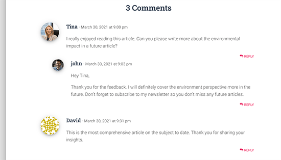
A casual reader may scroll through the comments, not realizing the additional content contributed by the author in the discussion.
Highlighting author’s comments helps you remedy that and makes the author’s comments stand out and be more noticeable.
The ultimate goal here is to encourage new users to join in the comments and ultimately subscribe to your newsletter or become a customer.
That being said, let’s take a look at how to easily highlight author comments in WordPress.
Highlighting Comment Author in WordPress
The easiest way to highlight comments by post author is by adding custom CSS to your WordPress theme. This allows you to easily add the code needed and see a live preview of how it would look on your website without saving it.
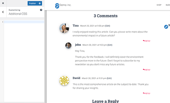
First, you need to visit Appearance » Customize in WordPress admin area. This will launch the WordPress theme customizer interface. You’ll notice a bunch of options in a column on your left and a live preview of your website.

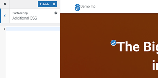
From here, you need to click on the Additional CSS tab. This will open a text area where you’ll be adding the Custom CSS.

However, you would want to see how the custom CSS will look when applied. To do that, you need to navigate to a blog post that contains comments by a post author.

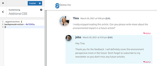
Scroll down to the comments section and then add the following custom CSS in the Custom CSS box on the left.
.bypostauthor {
background-color: #e7f8fb;
}
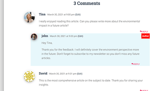
You’ll immediately notice the author comment change matching the Custom CSS you entered.

So how does this all work?
You see WordPress adds some default CSS classes to different areas of your website. These CSS classes are there regardless of which WordPress theme you are using.
In this sample code, we have used the .bypostauthor CSS class which is added to all comments added by a post author.
Let’s add some more CSS styles to make it even more prominent. Here is a sample code that adds a small ‘Author’ label to the comments by the post author and a border around the author’s avatar image.
.bypostauthor:before {
content:"Author";
float:right;
background-color:#FF1100;
padding:5px;
font-size:small;
font-weight:bold;
color:#FFFFFF;
}
.bypostauthor .avatar {
border:1px dotted #FF1100;
}
This is how it looked on our test website.

Highlighting Comments by User Role in WordPress
Now, many WordPress blogs have team members responsible for answering comments. Popular websites may have post author, administrator, and moderators all answering comments to boost user engagement.
How do you highlight a comment added by a staff member that is not the actual author of the post?
There is an easy hack to achieve that. However, it requires you to add custom code to your WordPress website. If you haven’t done this before, then see our article on how to easily add custom code in WordPress.
First, you need to add the following code to the code snippets plugin or your theme’s functions.php file.
if ( ! class_exists( 'WPB_Comment_Author_Role_Label' ) ) :
class WPB_Comment_Author_Role_Label {
public function __construct() {
add_filter( 'get_comment_author', array( $this, 'wpb_get_comment_author_role' ), 10, 3 );
add_filter( 'get_comment_author_link', array( $this, 'wpb_comment_author_role' ) );
}

// Get comment author role
function wpb_get_comment_author_role($author, $comment_id, $comment) {
$authoremail = get_comment_author_email( $comment);
// Check if user is registered
if (email_exists($authoremail)) {
$commet_user_role = get_user_by( 'email', $authoremail );
$comment_user_role = $commet_user_role->roles[0];
// HTML output to add next to comment author name
$this->comment_user_role = ' <span class="comment-author-label comment-author-label-'.$comment_user_role.'">' . ucfirst($comment_user_role) . '</span>';
} else {
$this->comment_user_role = '';
}
return $author;
}

// Display comment author
function wpb_comment_author_role($author) {
return $author .= $this->comment_user_role;
}
}
new WPB_Comment_Author_Role_Label;
endif;
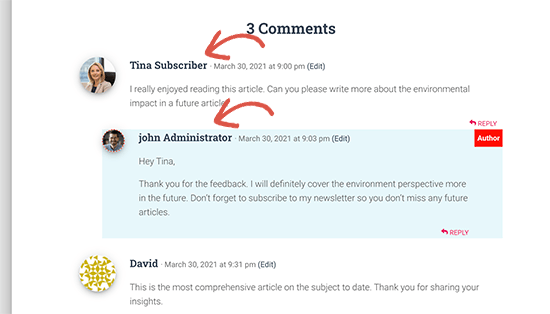
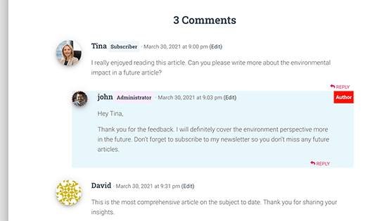
This code simply adds the user role label next to the comment author’s name. This is how it would look without any custom styling.

Let’s make it a little prettier by adding some custom CSS. Go to Appearance » Customize page and switch to the Additional CSS tab.
After that, you can use the following CSS to style the user role label in the comments.
.comment-author-label {
    padding: 5px;
    font-size: 14px;
    border-radius: 3px;
}

.comment-author-label-editor {
background-color:#efefef;
}
.comment-author-label-author {
background-color:#faeeee;
}

.comment-author-label-contributor {
background-color:#f0faee;
}
.comment-author-label-subscriber {
background-color:#eef5fa;
}

.comment-author-label-administrator {
background-color:#fde9ff;
}
This is how it looked on our test site. Feel free to modify the code to match your theme’s colors and style.

For more details, you may want to read our article on how to add user role labels to WordPress comments.
We hope this article helped you learn how to highlight author comments in WordPress. Want to see how users interact with your website? See our tutorial on how to track user engagement in WordPress, and how to add web push notification on your WordPress site to grow your traffic.
If you liked this article, then please subscribe to our YouTube Channel for WordPress video tutorials. You can also find us on Twitter and Facebook.
The post How to Highlight Author’s Comments in WordPress appeared first on WPBeginner.


