Please give us some tips to get local listing ranking. Thank you for the help!
How Can We Improve Google Local Listing Ranking?


Tips, Expertise, Articles and Advice from the Pro's for Your Website or Blog to Succeed
Please give us some tips to get local listing ranking. Thank you for the help!

TravelPerk, a business travel SaaS provider, has opened an API platform. The API allows customers and partners to build custom apps in HR and expense management areas. TravelPerk expects to expand the use case capabilities in the future.

Collecting leads has never been as much fun! Thanks to our free 5-star plugin, Forminator, you can now create engaging quizzes and capture emails simultaneously.
Plus, you can easily manage your leads, integrate the emails with a 3rd party app (like Mailchimp, Aweber, etc.), automatically run submission reports, and more!
Quizzes are highly engaging, can offer personalized feedback, are interactive, and entertaining. Combine all of these elements with Forminator –the best form builder for WordPress– and you have a powerful and creative way to generate leads in just a few simple steps.
In this article, we’ll be going over how to:
You’ll have your lead generating quiz up quickly and added to your WordPress site in no time.
So…
I think that’s the best answer, too.
It takes only a switch of a button to get the lead generator feature on your next quiz.
From the Forminator dashboard, simply click Create, name the quiz, and pick whether you want to create a knowledge or personality quiz. When you hit Continue, activate the option for collecting email leads in one-click.
One-click and your quiz is primed for collecting leads.
It’s that simple! There’s nothing more to get your lead generating quiz started.
From here, you’re ready to…
When it comes to adjusting your quiz, you’ll see all of the available options in the Edit section of the dashboard.
Since we’ve covered the basics already on creating a quiz in other articles (check out the quiz section in Getting the Most Out of Forminator for more details), we’ll jump down to Leads.
When you’re in this section, the Lead Generation Form area is where you can customize the default lead generation form. To edit, just click on the pencil in the container that shows the quiz’s name, and it will open up in a new tab.

When you open the new tab, you’ll find the default fields are already in place. These include:

Add as many fields as you feel are necessary by clicking Insert Fields. Also, adjust the default ones by clicking on each area’s gear icon.
With Forminator’s drag-and-drop functionality, you can arrange the fields any way you want. Also, delete any fields with one-click.
When it comes to editing the rest of the form, you’ll notice that Email Notifications and Integrations are locked. That’s because these are shared settings between the quiz and form modules. They’re configured back in the quiz editor (which we’ll get to in a moment).

Everything else is accessible and editable.
In the Appearance section, you can pick the form container’s design style, change colors of separate areas, use custom fonts, create an optional border, adjust the spacing, and even add custom CSS.
Blue? Bold? Want a new font? You can do it all from here.
Choose what you want to happen after a form is successfully submitted in the Submission Behavior section.
In terms of validation, you decide if you want validation checks when the user submits the form using Ajax (which is recommended). The live method will inspect fields at the same time as the user fills them out.
Plus, you can enable inline validation with one-click.
Also, the Submission Indicator can be activated to show a loader on your form until it’s submitted.

You can enable autofill, boost security by enabling Honeypot protection & enabling logged in submissions only, and set the life span of the form for submissions.
We’ll add some added protection to this quiz with Honeypot.
In the Settings area, it’s possible to disable the store submissions in your database.
Also, determine how long you want to retain the form’s submission form by the number of days, customize how you’d like to handle erasure requests, and, if your form contains files, decide if the file gets deleted with deleted submissions.

The global privacy settings can also be accessed from here, where you can adjust however you’d like.

You’ll also notice that the status is Published. That’s because when created, it’s automatically connected to the quiz module.

Since it’s published, all you need to do is save any changes by clicking on Update.

You can adjust the settings at any time if you ever need to make changes.
Now that we have the default lead generation form set up, you can hop back over to the tab that has the quiz editor, and you’ll be able to adjust additional settings.
In the Leads section, you’ll notice that you now have Form Placement and Skip Form options.

Form Placement is where you want to embed the lead generation form. You can choose between the beginning of the quiz or before showing the results.
If you want to give users the option to skip the form, you can enable the Skip Form feature.
Enter a customized message when you enable the Skip Form feature.
You can configure the Appearance and Behavior of the quiz, too. For help with this, please refer to our documentation on Appearance and Behavior.
We can now get back into the Email Notifications and Integrations area since we set up the lead generation default. They were locked, but are now accessible. This is where we’ll set up email notifications every time a user opts into the quiz.
In the Email Notifications area, set up the Admin Notification and Participant’s Notification.

In terms of setting up, both of these fields function the same.
You can edit the message to the admin & participants that will go out after opting in, edit what emails the message goes out to, create advanced customizations with the email (e.g. CC & BCC), and add conditions.
Customize email notifications the way you want them.
Plus, in our new form data dropdown list, you can add quiz and form data in the body of your emails.
Add any specific piece of data in the emails that you’d like.
If you have any 3rd party apps integrated with Forminator, you can connect them in the Integrations area. Just click on the plus sign, and that particular app will walk you through on how to connect.

Once connected, you can start collecting the quiz’s data with any supported integrated app.
Once you have your quiz set up the way you’d like, hit Publish. Then, Forminator will give you a shortcode that you can use on any post, page, or acceptable widget.
Forminator hands over the shortcode as quick as that.
Simply copy and paste the code, and that’s it. Your quiz is now ready to collect leads!
Viewing and monitoring submissions is quick and easy. The Quizzes dashboard gives you an immediate glimpse of activity.
You can see when the last submission was made, the number of submissions in the last 30 days, and easily access the submissions for a specific quiz.

To see submissions from a specific quiz, locate the name of the quiz, tap on the gear icon, and then View Submissions.

Once you click View Submissions, Forminator brings up all the submissions to that particular quiz. It shows the submission date & time, email address, first name, and information from other fields you included.

By clicking on the dropdown on individual submissions, you can view detailed information, quiz results, and any details on 3rd party integrations.
All of the field information is displayed here and quiz results.
Want to download the data? That’s a click away.
Click on Export and you can download a CSV file. Plus, you can apply submission filters and schedule exports by specific times, making them automatically emailed directly to you.
Manually or schedule exporting the data.
A: With a 5-star rating and many tens of thousands of active downloads, we have to side with our four-eyed friend as the best lead generating quiz maker because he makes it quick, easy, and free to do.
Plus, Forminator can create contact & registration forms, collect payments, make polls, perform calculations, and much more. He’s continuously updated, thanks to Forminator’s awesome team of developers and designers.
To check out what else is coming out with Forminator, check out our Roadmap. And to learn more, you can always refer to Forminator’s documentation.
Finally, for a quick overview of what we just covered, be sure to watch this short video:
Need a recap? Check out this video.
Happy lead-generating quiz making!

We can spend hours learning, but if we’re not able to recall, retrieve, or demonstrate what we’ve learned somehow, we’re doing ourselves a major disservice. And it’s going to take longer to achieve our learning goals. In this post, I’ll...
The post Tips to Help You Succeed in Online Learning appeared first on Treehouse Blog.

Social media has become one of the biggest marketing platforms for eCommerce stores. With Facebook alone having almost three billion ...
Read moreHow to Integrate Social Media with eCommerce: 4 Essential Steps
The post How to Integrate Social Media with eCommerce: 4 Essential Steps appeared first on WPArena.
With Document Studio, you can specify a different reply-to email address for outgoing email message. When the recipient hits the “Reply” or “Reply All” button, the To field in their email reply gets populated with the email address that you’ve specified as the Reply-to email at the time of sending.
You can even specify more than one email addresses in the reply-to field, separated by commas, and they will all show up in the To field of the reply field.
The reply-to addresses can also be dynamic and can be based on data in your Google Sheets and Google Forms. For instance, if you have a question in your Google Form that asks the form respondent’s email address, that email can be set as the reply-to address.
Thus, when you reply to the email message, the reply will automatically go to the form respondent’s inbox.
To get started, open your Google sheet, go to the add-ons menu and choose Document Studio. Next click on the Open menu to open the Document Studio sidebar. Expand the Mail Merge section and click on visual email editor.

This opens the visual email template designer. Specify the address(es) in the Reply-to addresses field as shown in the screenshot.
If you are specifying a dynamic field, enclose the question title (or the column header) inside double curly braces like {{Email Address}}.
Troubleshooting: Gmail may not always send replies to the email address specified in the reply-to field. See solution - Gmail ignores reply-to setting.


Hey guys,
My name is Kapil and I have been working as a freelancer for the last 4 years. I can perfrom SEO, Social media, Article writing, Forum Posting, Classified ad posting, Social media marketing, Youtube video creation and promotion, Data entry, Web Research, Keyword Research, Documents, PDF to MS Word, Image to MS Word, Image to Text, Link building, Online Search, Office Documents (PowerPoint, Excel, Word etc.), any type data entry task and any specific Task according to your instruction.
This Pandemic has taken away almost all of my work. So, this is my request that if anybody need any of the above mentioned service or do you have any task related to them then please message me here. I really need some work and hope you people would help me in getting some work for me.
Thanks and Regard
One of the significant components of any WordPress website is its theme. If we know how to fix some of its errors, we can enjoy a smooth WordPress experience. Keep reading to learn about some...
The post CSS Related WordPress Errors and How to Fix Them appeared first on 85ideas.com.
A demo is meant to get the respective website buyers, visitors, and customers. Therefore, it depicts the best of the features in their most refined forms as a demo. You may get customers by presenting...
The post Demo Contents and their Related Errors appeared first on 85ideas.com.
Finding it hard to fix some standard WordPress error that keeps popping up on your website? If So, Read on to find the best solutions! Aesthetics play a vital and crucial role whenever you wish...
The post Image Related WordPress Errors and How to Fix Them appeared first on 85ideas.com.
WordPress is a highly popular platform that gives webmasters a chance to build stunning websites with little effort. You don’t need any coding knowledge to use WordPress and it will only take you a few...
The post How to Fix Most Common WordPress Error appeared first on 85ideas.com.


The future of eCommerce looks incredibly bright. With more than one million products being sold online on a daily basis, ...
Read more5 Technical Tips for Your eCommerce Business
The post 5 Technical Tips for Your eCommerce Business appeared first on WPArena.


Time is something we all need more of, but how can you get more of it when there is only 24 hours in a day? Sadly there is no way to put more hours into each day, but what you can do is be more efficient with your time so you can follow your dreams. Here is how I was more efficient during my college years, which allowed me to run a business at the same time.
Saving time creates time to focus on you and your goals. But finding time is only half the battle. You need to remain as productive as possible with the time you have to make the most of it.
Need help? Here are 51 free productivity apps that can help you out.
We have a cryptocurrency business, with 5 years of experience, 100% operational, and already generating significant recurring revenues with very limited online marketing.
Looking for an expert in Web/Social Marketing to joint-venture.

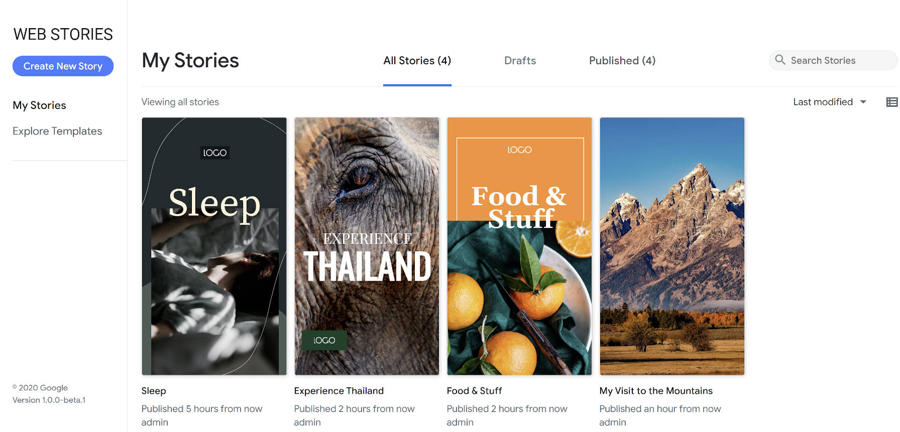
Two and a half months after the launch of its public beta, Google released its Web Stories for WordPress plugin. So far, the plugin has over 10,000 active installations and has garnered a solid five-star rating from four reviews.
Google created the Web Stories format through its AMP Project to allow publishers to create visually-rich stories. It is primarily geared toward mobile site visitors, allowing them to quickly jump through story pages with small chunks of content.
The Web Stories plugin creates a visual interface within WordPress for creating Stories. It breaks away from the traditional WordPress interface and introduces users to an almost Photoshop-like experience for building out individual Stories. The Stories editor is completely drag-and-drop.
The plugin also offers eight predesigned templates out of the box that cover a small range of niches. However, according to Google’s announcement, the company plans to add more templates in future updates.
“Firstly…the power of Stories,” wrote Jamie Marsland, founder of Pootlepress, in a Twitter thread. “Stories are how we (humans) see the world and share our experiences. Up to now the platforms that we have to tell stories have been limited to books/films/tv/websites/blogs/instagram stories etc.”
“Websites are ok for telling stories but in many ways the format doesn’t really fit the linear arc of storytelling. When Marshall McLuhan said ‘the medium is the message’ in 1964 he was talking about how the medium itself has a social impact, and change the communication itself…and the possibilities for what is communicated and how it is perceived. But we should keep coming back to Stories. Stories are the key here imo. Now we have an open format to tell Stories, and we have an open platform (WordPress) where those Stories can be told easily.”
Marsland finished his thread by saying that using Stories as a replacement for a brochure or website is a missed opportunity. He said that it was a platform for storytelling and should be used as such.
It is far too early to tell if Web Stories will simply be a fad or still in wide use years from now. The technology certainly lends itself well to telling stories, particularly in mobile format, but I doubt we have seen the best of what is possible on the web. The format feels too limited to be the end-all-be-all of storytelling. It is merely one medium that will live and die by its popularity with users.
With the right design skills, some people will craft beautiful Web Stories. And, that is just what Marsland has done with the first Story he shared:
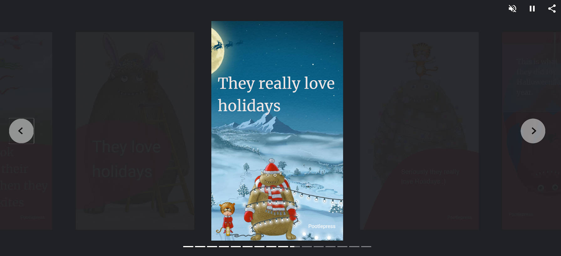
I agree with his conclusion. Web Stories should be about storytelling. When you move outside of that zone, the technology feels out of place.
Where I disagree is that websites are not ideal for storytelling. Ultimately, the WordPress block editor will allow artistic end-users to craft intricate stories, mixing content and design in ways that we have not seen. We are just now scratching the surface. I expect our community of developers to build more intricate tools than what the Web Stories plugin currently allows, and we can do so in a way that revolutionizes storytelling on the web.
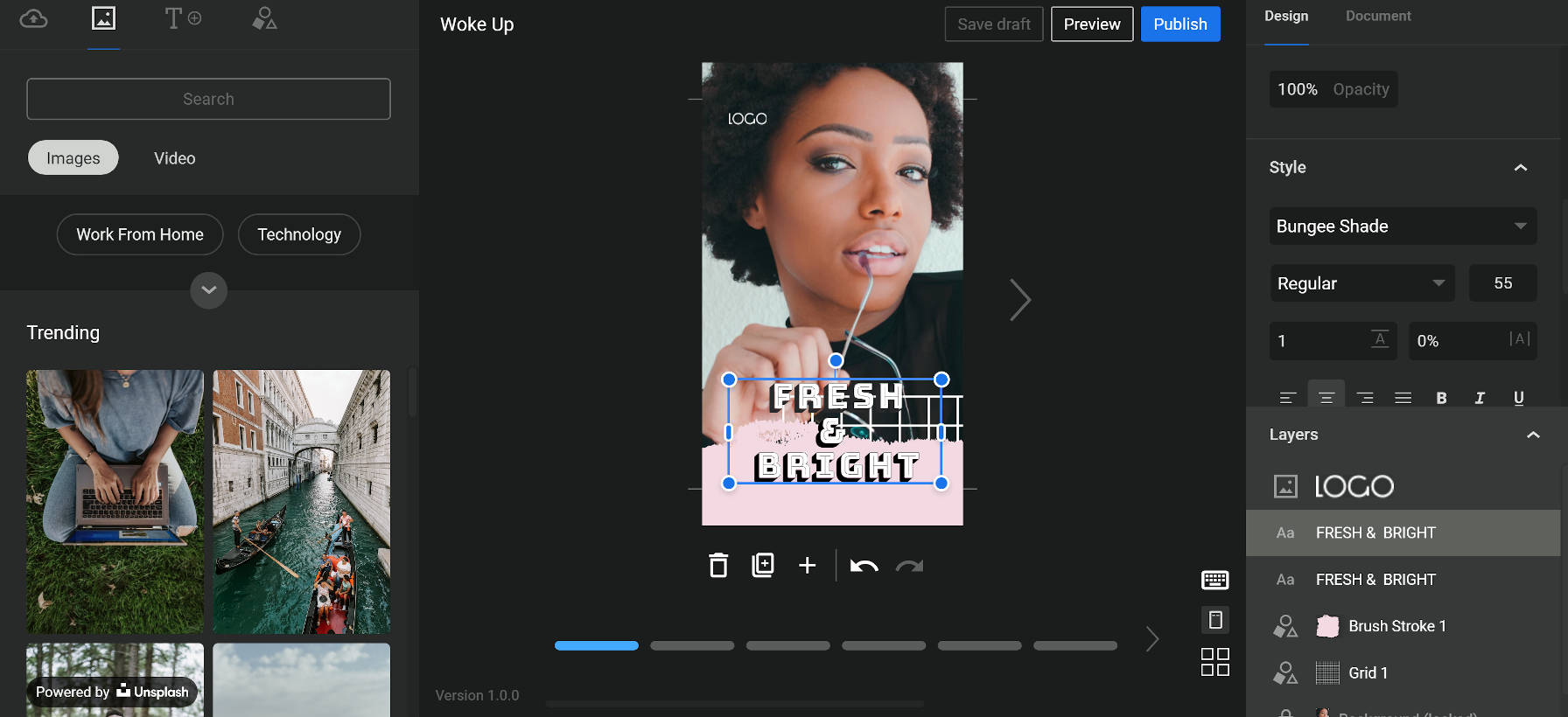
The Web Stories plugin now adds support for Unsplash images and Coverr videos out of the box. The plugin adds a new tab with a “media” icon. For users of the first beta version of the plugin, this may be a bit confusing. The previous media icon was for a tab that displayed the user’s media. Now, the user’s media is under the tab with the “upload” icon.
It is also not immediately clear that the Unsplash images and Coverr videos are not hosted on the site itself. There is a “powered by” notice at the bottom of the tab, but it can be easy to miss because it blends in with the media in the background.
Media from Unsplash and Coverr is hosted off-site and not downloaded to the user’s WordPress media library. I could find no mention of this in the plugin’s documentation. Such hotlinking was a cause for debate over the recent official release of the Unsplash plugin.
Google also announced it planned to add more “stock media integrations” in the near future. According to a document shared via a GitHub ticket, such future integrations may include Google Photos and GIF-sharing site Tenor.