Global CSS options with custom properties

Featured Imgs 23

With a preprocessor, like Sass, building a logical “do this or don’t” setting is fairly straightforward:

$option: false;

@mixin doThing {
  @if $option {
    do-thing: yep;
  }
}

.el {
  @include doThing;
}

Can we do that in native CSS with custom properties? Mark Otto shows that we can. It’s just a smidge different.

html {
  --component-shadow: 0 .5rem 1rem rgba(0,0,0,.1);
}

.component {
  box-shadow: var(--component-shadow);
}

<!-- override the global anywhere more specific! like
     <div class="component remove-shadow">
     or
     <body class="remove-shadow"> -->
.remove-shadow {
  --component-shadow: none;
}

Direct Link to ArticlePermalink

The post Global CSS options with custom properties appeared first on CSS-Tricks.

Strapi Community Edition Now Generally Available

Featured Imgs 23

Strapi, an open-source headless CMS, has announced the general availability of the Strapi Community Edition. The project has been five years in the making, and the company is excited to see continued growth in the Strapi community now that it's generally available. In a blog post announcement, the Strapi team recapped the journey thus far, which includes over 1 million downloads, over 400 contributors, and almost 5,000 Strapi community projects on GitHub.

A First Look at `aspect-ratio`

Category Image 052

Oh hey! A brand new property that affects how a box is sized! That’s a big deal. There are lots of ways already to make an aspect-ratio sized box (and I’d say this custom properties based solution is the best), but none of them are particularly intuitive and certainly not as straightforward as declaring a single property.

So, with the impending arrival of aspect-ratio (MDN, and not to be confused with the media query version), I thought I’d take a look at how it works and try to wrap my mind around it.

Shout out to Una where I first saw this and boy howdy did it strike interest in folks. Here’s me playing around a little.

Just dropping aspect-ratio on an element alone will calculate a height based on the auto width.

Without setting a width, an element will still have a natural auto width. So the height can be calculated from the Aspect ratio and the rendered width.

.el {
  aspect-ratio: 16 / 9;
}
Demo

If the content breaks out of the Aspect ratio, the element will still expand.

The Aspect ratio becomes ignored in that situation, which is actually nice. That’s why the pseudo-element tactic for Aspect ratios was popular, because it didn’t put us in dangerous data loss or awkward overlap territory when content got too much.

But if you want to constrain the height to the Aspect ratio, you can by adding a min-height: 0;:

Demo

If the element has either a height or width, the other is calculated from the Aspect ratio.

So aspect-ratio is basically a way of setting the other direction when you only have one.

Demo

If the element has both a height and width, aspect-ratio is ignored.

The combination of an explicit height and width is “stronger” than the Aspect ratio.

Factoring in min-* and max-*

There is always a little tension between width, min-width, and max-width (or the height versions). One of them always “wins.” It’s generally pretty intuitive.

If you set width: 100px; and min-width: 200px; then min-width will win. So, min-width is either ignored because you’re already over it, or wins. Same deal with max-width: if you set width: 100px; and max-width: 50px; then max-width will win. So, max-width is either ignored because you’re already under it, or wins.

It looks like that general intuitiveness carries on here: the min-* and max-* properties will either win or are irrelevant. And if they win, they break the aspect-ratio.

.el {
  aspect-ratio: 1 / 4;
  height: 500px;

  /* Ignored, because width is calculated to be 125px */
  /* min-width: 100px; */

  /* Wins, making the Aspect ratio 1 / 2 */
  /* min-width: 250px; */
}

With value functions

Aspect ratios are always most useful in fluid situations, or anytime you essentially don’t know one of the dimensions ahead of time. But even when you don’t know, you’re often putting constraints on things. Say 50% wide is cool, but you only want it to shrink as far as 200px. You might do width: max(50%, 200px);. Or constrain on both sides with clamp(200px, 50%, 400px);.

This seems to work inutitively:

.el {
  aspect-ratio: 4 / 3;
  width: clamp(200px, 50%, 400px);
}

But say you run into that minimum 200px, and then apply a min-width of 300px? The min-width wins. It’s still intuitive, but it gets brain-bending because of how many properties, functions, and values can be involved.

Maybe it’s helpful to think of aspect-ratio as the weakest way to size an element?

It will never beat any other sizing information out, but it will always do its sizing if there is no other information available for that dimension.

The post A First Look at `aspect-ratio` appeared first on CSS-Tricks.

PureCSS Gaze

Featured Imgs 23

Diana Smith with another mind-bending all HTML & CSS painting.

I love that these occupy a special place on the “Should I draw this in CSS?” curve. Things like simple shapes are definitely on the “yes” side of the curve. Then there’s a large valley where things get a little too impractical to draw that way, and using some other image format (e.g. SVG) makes way more sense.

Diana’s work pulls the curve back up to the “yes” side. Not only because it’s proof that CSS can be an amazing expressionistic art tool, but also from a performance standpoint — it’s only 2 KB of HTML and 10 KB of CSS.

Direct Link to ArticlePermalink

The post PureCSS Gaze appeared first on CSS-Tricks.

Hello. I’m Niun

Category Image 052

Hello. I'm Niun. No joke, this is how they call me IRL :x

I got into web developing arround 5 months ago, and currently am trying to learn React.js

I just finished (i hope i finished) my first project, and i think it is pretty much what i wanted it to be. I have been working on optimisation of the site and ,ofcoure, SEO.
multiple sources including google say that Text to HTML ratio should be 7:3 or similar which is difficult to achieve given the nature of my website, so i ended up adding a bunch of useless text at the bottom of each page, because in google it says that hiding the text with css rules will get me penalised.

The website covers mobile gaming, more specifically mobile MMO, MMORPG and Multiplayer Online games.
I was wondering if hiding this much text would be a 100% penalisation from google, or should i keep it there like that?
this is the site https://www.teletappie.com/

The topic of the site is not original and competition fot it is rather big but, my main purpose is creating a gamelist ( https://www.teletappie.com/Gamelist ) where all of the mobile games that have some multiplayer function would be sorted, and the user could easily and quickly get the suggestion.

How to Use Envato Elements to Create Online

Featured Imgs 30

When presented with the task of creating things for the Internet, knowing where to start can be half the battle. If you lack design skills or if you’re pressed for time, using some premade resources can be extremely helpful. The first order of business is locating a resource that has what you need. The second? Searching within this resource for templates, tools, and items that can aid you in making content.

Thankfully, we can handle the first part easily. Envato Elements is truly a one-stop resource for so many templates, themes, graphics, illustrations, photos, and more that you can use immediately in your work. Once you sign up, you gain access to thousands of items.

But if you’re not convinced, let’s talk about some of the ways you can use Envato Elements to make stellar online content starting immediately.

Your Designer Toolbox
Unlimited Downloads: 500,000+ Web Templates, Icon Sets, Themes & Design Assets


Build a Website Using a Template

If you’re creating online, you need a website. And Envato Elements makes it super easy to do this. It features a wide array of templates that make it easy to build and launch a site quickly. There’s no shortage of options as well, so you can choose anything from an HTML template to a full CMS template. Here’s the full breakdown of the types of templates offered here:

And within these options you can narrow your search by features (responsiveness, eCommerce, PSD files included) by focus (admin, landing page, or site) and topic (beauty, corporate, fitness, etc).

WordPress Themes at Envato Elements.

Create Presentations to Accompany Online Courses

If you want to offer or sell online courses, you may wish to create and share this content via presentations. This means you’ll need some solid templates on hand if you want to make a real impact. Lucky for you, Envato Elements offers these as well. You can select from templates for Keynote, PowerPoint, and Google Slides, all of which are super professional-looking and easy to use. Just download the template, add your custom content, and export it. That’s all there is to it.

The crux of the situation here is that you shouldn’t have to labor over these elements of your work if you don’t have to.

Presentations at Envato Elements.

Create Graphics for Social Media

If you run a business online, you should have a social media presence. But yet again, that’s another thing you have to create consistent content for. If coming up with an endless supply of compelling graphics doesn’t sound fun to you, Envato Elements can help. Its graphic templates section is loaded with a wide variety of options including templates for infographics and logos.

They also have scene generators or mockups, which make it easy to display your product or app on a background that’s been carefully (and stylishly) presented.

You can pair these templates with some other resources as well like the selection of graphics available. You can select from graphics that encompass the following categories:

They also have a dedicated Social category that you can browse for social media platform specific templates.

As if all of that weren’t enough, there’s also a Photo category that includes thousands of photographs you can use for anything under the sun.

A Social Media Resource from Envato Elements.

Make Explainer and Promotional Videos

The last thing we’ll discuss here today is how you can make videos using resources on Envato Elements. If you haven’t already dipped your toes into the video-making market, now’s the time. Video is extremely popular and it’s been proven to increase visitor engagement. Because of this, many opted to create promotional videos or explainer videos that describe something practical. And while you may need to film some footage yourself, having stock footage on hand is beneficial. Wouldn’t you know it that Elements has this as well?

Hundreds of thousands of stock videos and motion graphics are available to choose from to add to your creations.

Or, if you need a templated solution, there are thousands of video templates to pick from as well. They cover categories like:

And you can find specific options for the likes of After Effects, Premiere Pro, Apple Motion, and Final Cut Pro.

When you’re in edit mode, you can add in sound effects or music as well. The sky’s the limit here.

Video Intro Template from Envato Elements

Don’t Wait to Start Creating

So you see, you really have no excuses not to start creating unique content for your online presence, whatever that may look like for you. From websites to videos, Envato Elements has you covered from top to bottom.

What will you create next?

WordCamp Europe 2020 Announces Schedule, Plans to Debut Networking Rooms and Virtual Sponsor Booths

Featured Imgs 23

The 8th annual WordCamp Europe is only 9 days away and organizers have just announced the schedule. Friday and Saturday sessions are split into two tracks that will run 30-minute talks simultaneously. Each talk is followed by a 10-minute Q&A. The schedule also mixes in a few 10-minute lightning talks, with 15-minute breaks every hour.

The WordCamp will feature a variety of topics of interest to WordPress professionals and enthusiasts, including freelancing, code review, art direction with Gutenberg, website security, growing communities, and the challenges of headless WordPress. The online schedule allows users to save their favorite sessions and then email them, share a link, or print the customized schedule.

In converting the event to be fully online, WCEU PR Team co-organizer Evangelia Pappa said they had to re-work some of their original plans for speakers. Not all previously scheduled speakers were available for an online session. The organizers also had to start from scratch in planning the event, determining the platforms and tools to use, as well as figuring out a new routine for working together from home.

For the first time in WCEU history, both the networking activities and sponsor booths are going virtual using Zoom. Organizers are planning to have two networking rooms, which can also be used for speakers who want to continue Q&A times with attendees following their sessions. Sponsors will have their own schedule of activities and webinars, expanding the event to 3-4 total tracks.

Pappa said the organizing team was inspired by WordCamp Spain, which has so far been the largest online WordPress event. The camp used Zoom to support 5,515 online attendees.

More than 5,650 people have already registered for WCEU 2020. Tickets continue to be released in batches, and organizers say they have an unlimited number available. Tickets for the virtual Contributor Day, which precedes the camp on June 4, are also still available. Attendees can indicate interest by checking the box for Contributor Day during the regular ticket signup process.

Blocksy Review – An Innovative, Gutenberg Ready and 100% Free WordPress Theme

Category Image 091

This post is originally published on Designmodo: Blocksy Review – An Innovative, Gutenberg Ready and 100% Free WordPress Theme

Blocksy Review - An Innovative, Free WordPress Theme

If you’re on the lookout for a fresh Gutenberg WordPress theme that will make your website look great but also give you rich customization options, then perhaps you should give Blocksy a look. In this Blocksy review, we take a …

For more information please contact Designmodo

How to Change the Text Color in WordPress (3 Easy Methods)

Category Image 052

Recently, one of our readers asked if there was an easy way to change the text color in WordPress?

The answer is yes. You can easily change your font color in WordPress across your whole site, or even just for a single word inside your post content.

In this guide, we’ll show you how to easily change the text color in WordPress, step by step.
Easily change text color in WordPress

There are lots of reasons why you might want to change the text color in your posts or pages. Maybe you’d like to emphasize a keyword, or perhaps you want to use colored subheadings on a particular page.

Alternatively, you might want to change the text color across your whole site. Perhaps your theme uses a gray color for text, but you’d rather make it black, or a darker gray, for better readability.

In this tutorial, we’ll be covering the following methods:

Just click one of those links to jump straight to that method.

Method 1. Changing the Text Color Using the Visual Editor

You can use the default WordPress editor to put words, paragraphs, or even subheadings in a different color from your main text.

An example of colored text in a WordPress page

Here’s how you can change your text color using the block editor.

First, you’ll need to edit the post or page that you want to change, or create a new one.

Next, type in your text. You’ll need to create a paragraph block or a heading block as appropriate. For help with this, take a look at our tutorial on how to use the WordPress block editor.

Once your text is in place, you can change the color.

Changing the Text Color of a Block

For this first example, we’re going to change the text color of the whole block.

Simply click on the block and the Block Settings panel should open up on the right hand side of your screen. Next, click on the arrow for ‘Color settings’ to expand that tab. You’ll see the text color settings here.
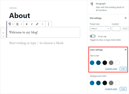
Picking a text color for the whole block in WordPress

Now, you can pick a new color for the text. The visual editor will show you some options based on your theme. You can simply click on one of these to change your text color.

Alternatively, if you have a specific color in mind, click the ‘Custom Color’ link. This will open up a color picker where you can manually select a color. You can also use this to type in a hex code.
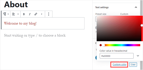
Picking a custom text color for your block

If you change your mind and want to go back to the default text color, just click the ‘Clear’ button below the color options:

Setting your block back to the default text color

Pro Tip: If you want to change the background color for a block, you can do that here too.

Changing the Text Color of a Word or Phrase

What if you only want to change the color of one or two words? That’s easy using the block editor as well.

First, you’ll need to highlight the word(s) that you want to change. Then, click the small downward arrow on the content editor toolbar.
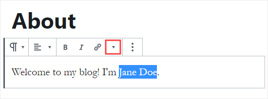
Highlight the words that you want to change the color of

Next, simply click on the ‘Text Color’ link at the bottom of the dropdown list:
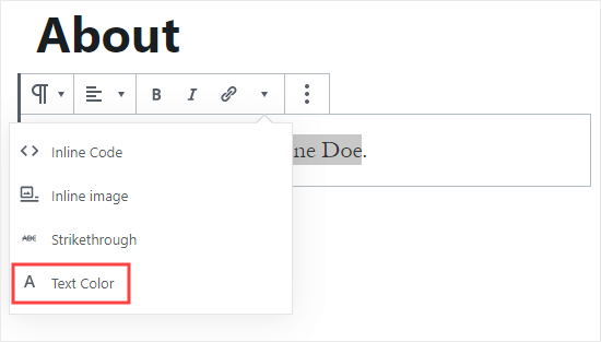
Click the 'Text Color' link at the bottom of the dropdown list

You’ll now see the same color options as for the whole block. Again, you can pick from one of the default options or use the ‘Custom color’ link to select any color you want.
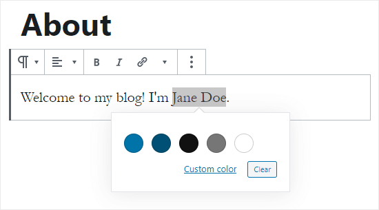
Choose the text color for your highlighted word(s)

The color options aren’t limited to paragraph blocks. You can also change the text color of heading blocks. As with paragraph blocks, you can set text color for the whole block in the block settings. Alternatively, you can highlight individual words and change their color.
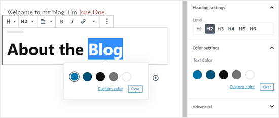
Changing the text color of a heading block in WordPress

Note: You cannot set a background color for heading blocks.

You can also change the text color in a list block, but only by highlighting the word(s) and using the toolbar. There’s no option in the block settings to change the text color for the whole of a list block.

Changing the Font Color Using the Classic Editor

If you’re still using the classic WordPress editor, then you can change the font color using the toolbar.

In the classic editor, click on the Toolbar Toggle on the far right. You’ll then see a second row of icons:
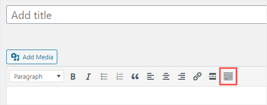
Click the Toolbar Toggle button to see the second row of icons

Now, you can select your text and change the font color using the font color dropdown.
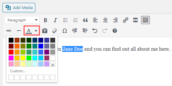
Use the text color button in the classic editor

Method 2. Changing the Text Color in the Theme Customizer

What if you want to change the text color across your whole website? Many of the best WordPress themes will allow you to do this using the theme customizer.

For this example, we’re using the OceanWP theme. It’s one of the top free themes available for WordPress.

In your WordPress dashboard, go to Appearance » Customize to open up the Theme Customizer.
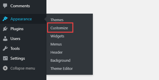
Go to Appearance then Customize in your WordPress dashboard

Next, you need to look for an option such as ‘Typography’. The available options, and what they’re called, will vary depending on your theme.
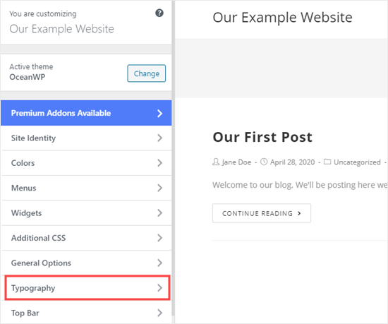
Select 'Typography' or a similar option in the theme customizer

Let’s go ahead and click on the Typography tab, or an equivalent option. Next, look for a setting where you can change the text of your posts and pages. In OceanWP, this is called the ‘Body’ text. You need to click on this, so you’ll can customize the font color and more.
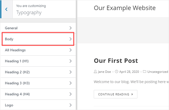
Select the Body text to modify in the customizer

When you click on the Font Color selector, you’ll see a color picker. Choose whatever color you want to use for your text. This will change the text color in all your posts and pages.
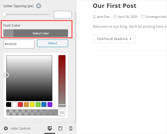
Picking the color for your body text using the theme customizer

You can also change your heading colors in a similar way, by using the options to change H1, H2, and so on.

Once you’re happy with your changes, click the ‘Publish’ button at the top of the screen.
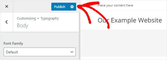
Publishing your changes to your website

Tip: Choosing black or dark gray text on a white or very light background is usually best for readability.

Method 3. Changing the Text Color Using CSS Code

What if your theme doesn’t have the option to change the text color?

You can still change font color across a whole site by using the theme customizer. Go to Appearance » Customizer in the WordPress dashboard.

At the bottom of the list of options, you’ll see a tab that reads ‘Additional CSS’.
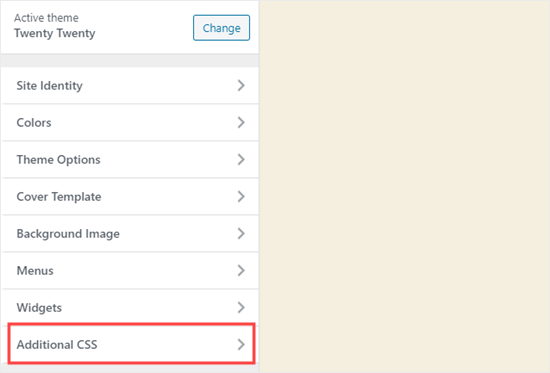
Open up the Additional CSS section of the theme customizer

Next, click on the Additional CSS tab, and you’ll see some instructions plus a box where you can enter CSS code.

For starters, you can copy this code into the box. After that, you can change the 6 numbers to the hex code of your chosen color.

p { color:#990000; }
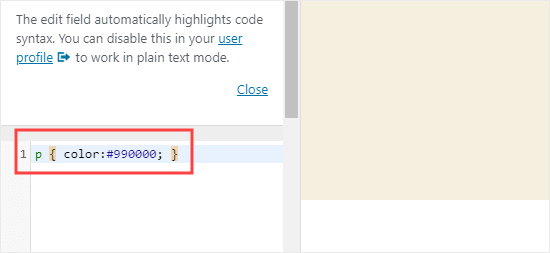
Enter the CSS for changing the paragraph color into the theme customizer

This will change the font color of the regular text in all your posts and pages to dark red (or whatever color you chose), like this:

Text color customized site-wide using CSS code

If you want to change the color of the headings within your post, you can add this code instead:

h2 { color:#990000; }

Again, change the hex code to whatever color you want.

If you’re not familiar with CSS or want a beginner-friendly CSS editor that lets you easily customize the entire styles of your website, then we recommend looking into CSS Hero. It’s a powerful visual editor that lets you customize the styles of your entire site.

CSS Hero plugin

We hope this tutorial helped you learn how to change the text color in WordPress. You might also like our tutorials on how to change the font size in WordPress, and how to add custom fonts in WordPress.

If you liked this article, then please subscribe to our YouTube Channel for WordPress video tutorials. You can also find us on Twitter and Facebook.

The post How to Change the Text Color in WordPress (3 Easy Methods) appeared first on WPBeginner.

10 Top APIs for SEO

Featured Imgs 23

Successfully marketing a website can be a tricky endeavor. That is why Search Engine Optimization (SEO) tools are available to give websites greater visibility. Search Engines use several avenues for populating search engine results pages (SERP), and website developers want to make sure they follow the optimization guidelines for the best page rank results.

How to Export and Import Gutenberg Blocks in WordPress

Category Image 091

How to Export and Import Gutenberg Blocks in WordPressAt first, WordPress users had a bittersweet relationship with the WordPress block based builder. Then as we discovered in our guide to Gutenberg, the new editor comes with amazing features that make creating beautiful content easy and fun. Now, some can’t get enough of the editor. Gutenberg offers you enough features to create remarkable pages […]

The post How to Export and Import Gutenberg Blocks in WordPress appeared first on WPExplorer.

Techdegree for Teams

Featured Imgs 03

Every company is a tech company. As we settle into a new holding pattern while the global community fights COVID-19, many teams now find themselves working remotely, and adapting to new roles with new responsibilities. This is an excellent time...

The post Techdegree for Teams appeared first on Treehouse Blog.