Dark website designs are where it’s at. Don’t believe me? They’ve become increasingly popular over the past year. Dark designs are thought to be easier on eye strain and make for a more pleasant viewing experience. They can also add atmosphere to your site.
As more and more websites have shifted to dark mode in 2020, we thought it imperative to highlight some designs that really capture the concept of dark designs well. What follows is a list of over 20 delightfully dark website designs you’ll definitely want to check out.
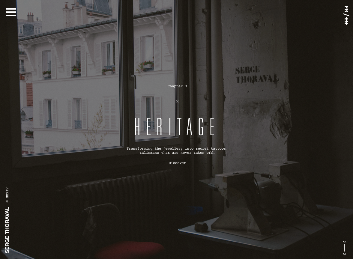
Serge Thoraval: Atelier
The Serge Thoraval: Atelier website doesn’t just offer a dark design — it also features some really interesting effects. From a mouse hover effect when the site is loading to transition effects when you scroll down the page, this site sets itself apart.
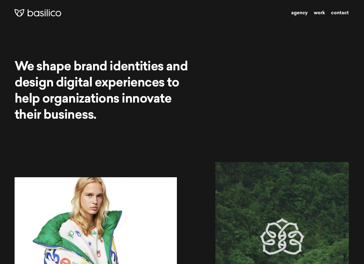
Basilico
This site offers a dark design that makes each portfolio piece really stand out. Plus, when you hover over each item, they color shift and descriptive text scrolls across it from right to left.
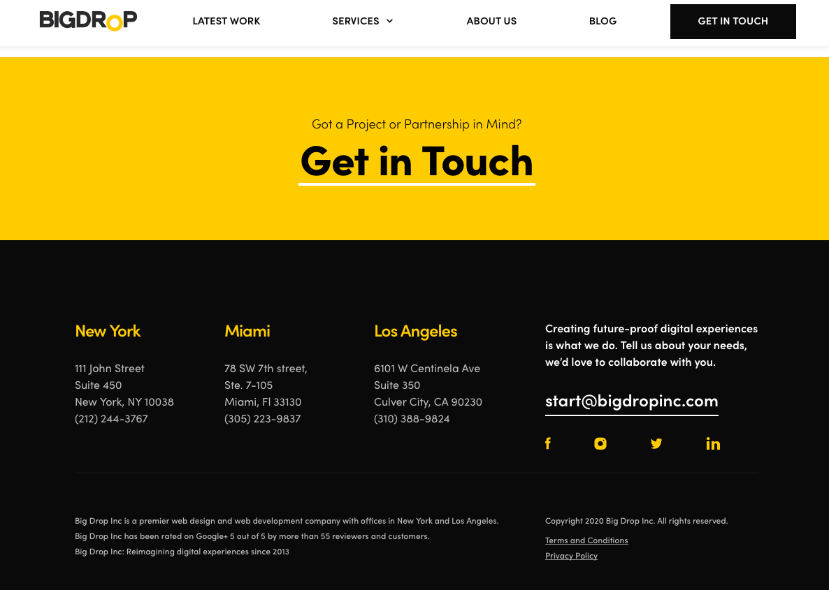
Big Drop Inc
Big Drop Inc has a combination of light and dark designs that are both appealing and effective.
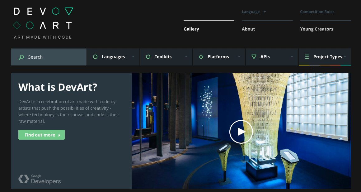
DevArt
DevArt is another site with a dark design that helps to make the artwork it features stand out. It’s also easier on the eyes than sites with brighter backgrounds.
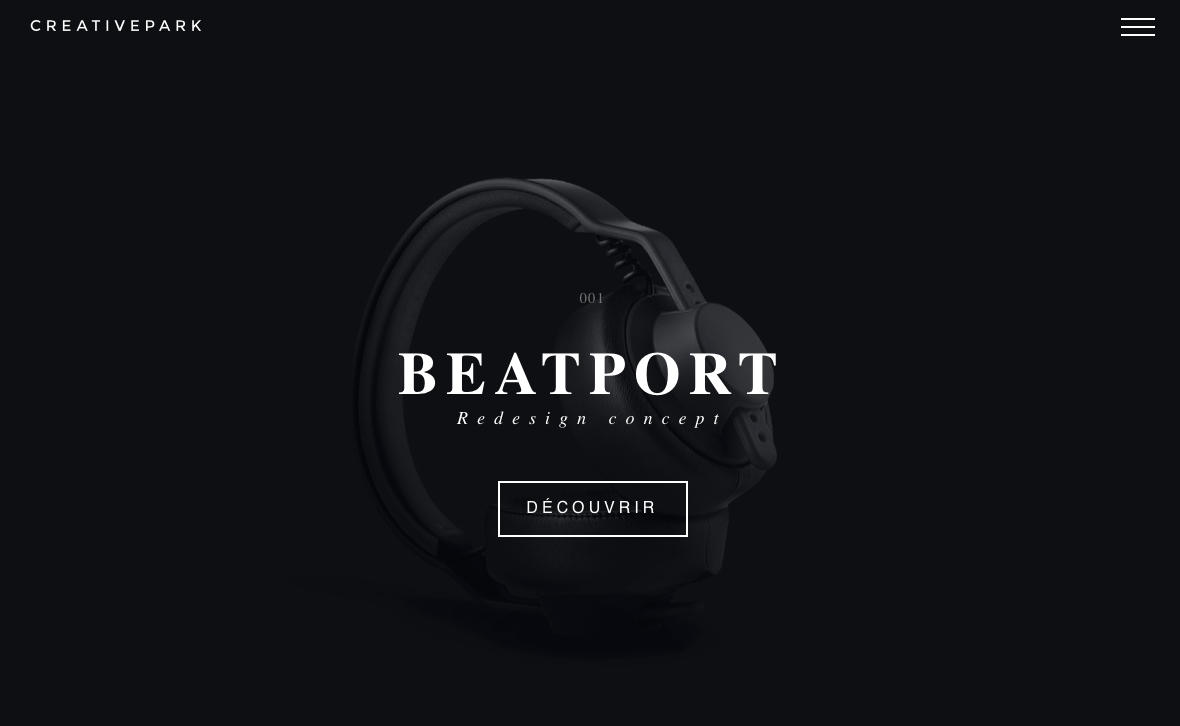
Creative Park
The Creative Park website offers up a delightfully dark design that allows the subject of photos to really stand out. It also has some really interesting transition effects for changing slides, clicking links, and opening menus.
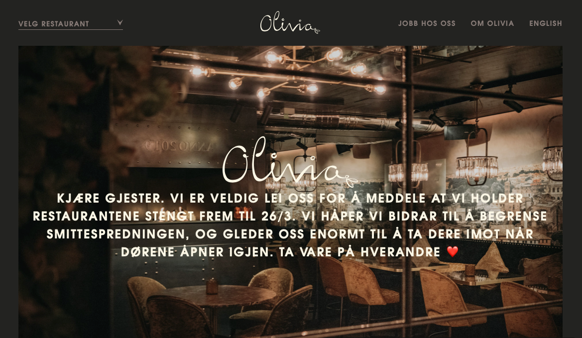
Olivia Restaurant
The Olivia Restaurant website mimics the mood inside of the restaurant itself — dark, cozy, and inviting.
3D Hubs
The 3D Hubs website leverages its dark design to make the components it features stand out. This also works well for displaying video and individual items the company offers.

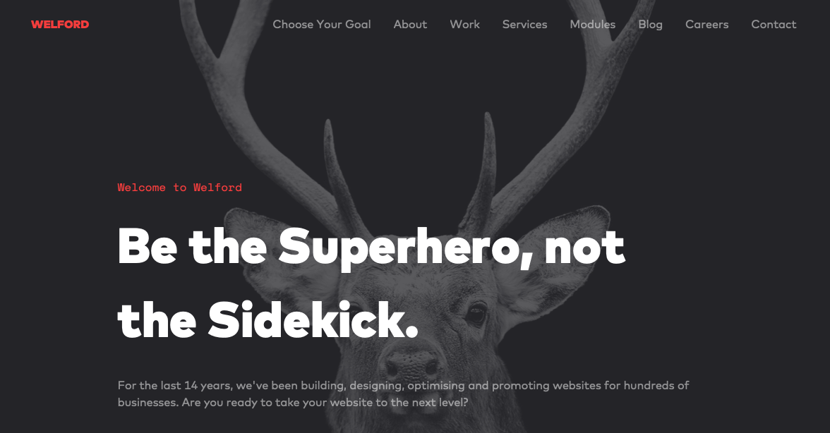
Welford Media
Welford Media is a web design firm that uses a dark design on its website to engage visitors. This design choice allows the company’s tagline stand out at a glance and builds immediate interest.
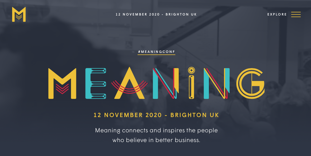
Meaning 2020
The website for the Meaning 2020 Conference has a dark design as well. The gray background allows the colorful logo to stand out and offers a subdued backdrop onto which videos and photos are placed.
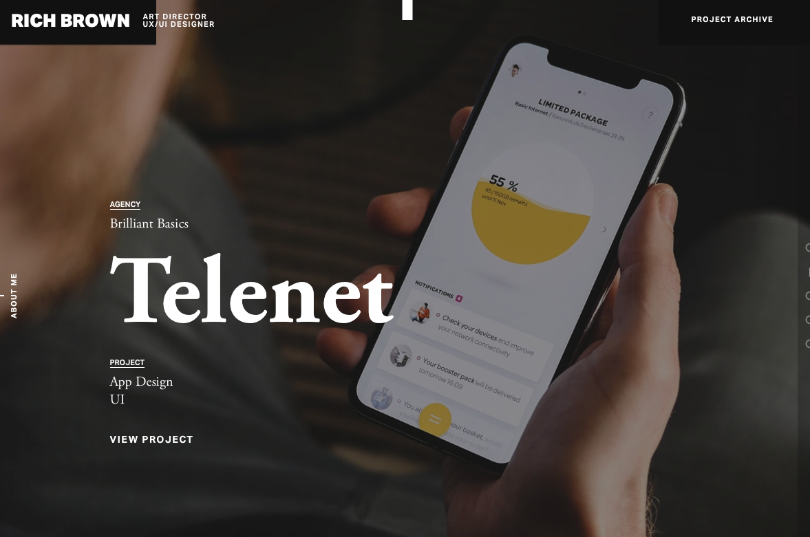
Rich Brown
This is a website dedicated to the work of Rich Brown, an art director and UX/UI designer. The site itself features a dark design onto which video backgrounds play seamlessly.
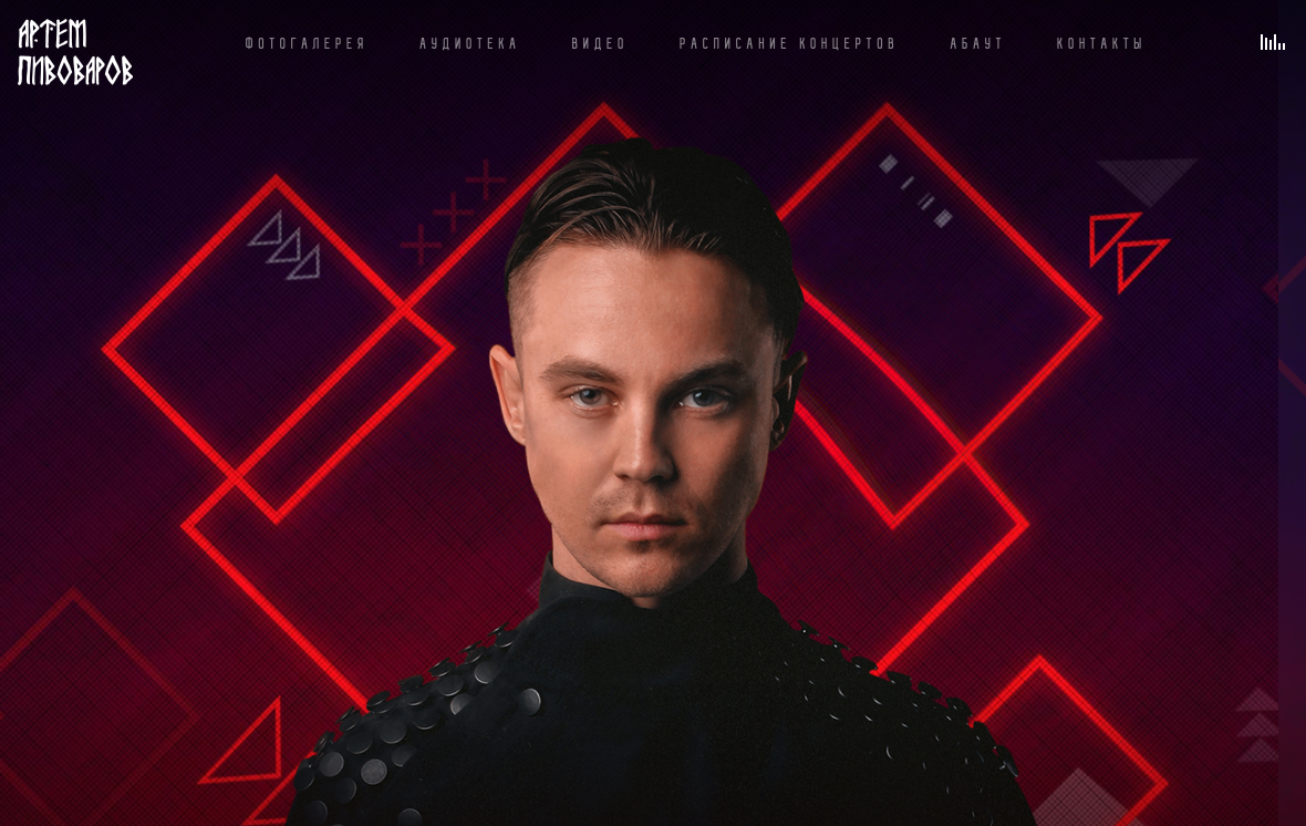
Artem Pivovarov
The design on this website is super interesting. Artem Pivovarov has a dark design with a prominent photo background. It also has interactive elements in this background that react on hover.
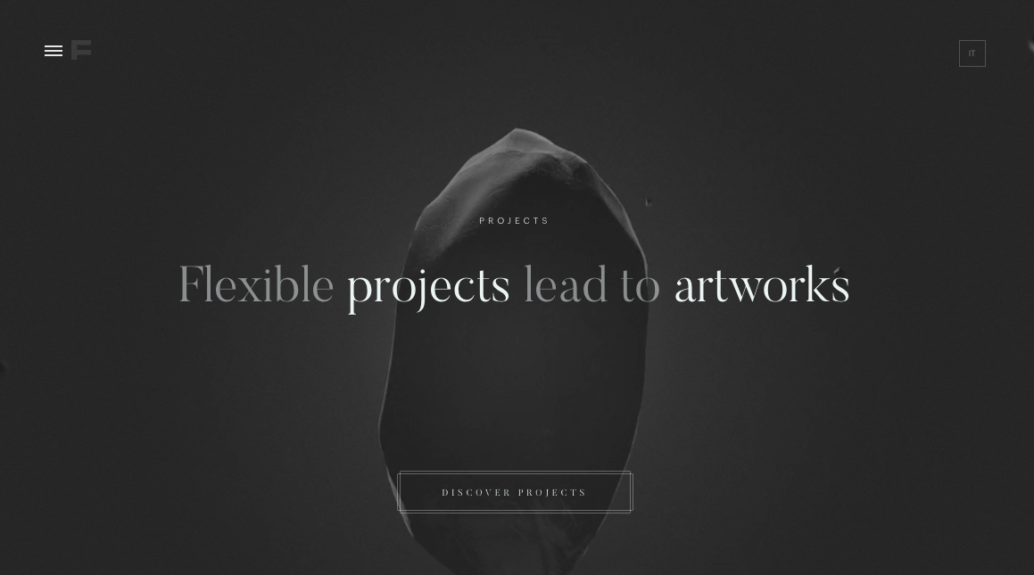
Formigari Srl
Formigari Srl is another site you should check out for dark design inspiration. It highlights videos and photos on a deep gray background that makes the entirety of the content feel immersive.
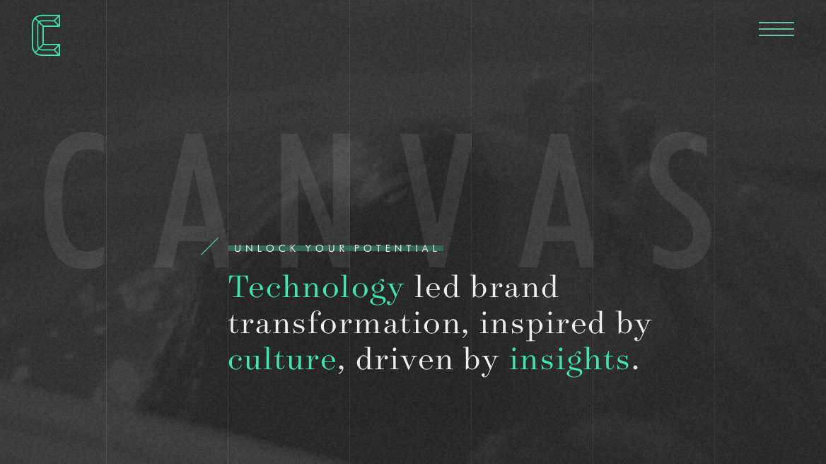
Canvas United
Still another site you should check out is Canvas United. This site is for a New York-based digital agency that provides some cool transition effects and an immersive experience.
The Kennedys
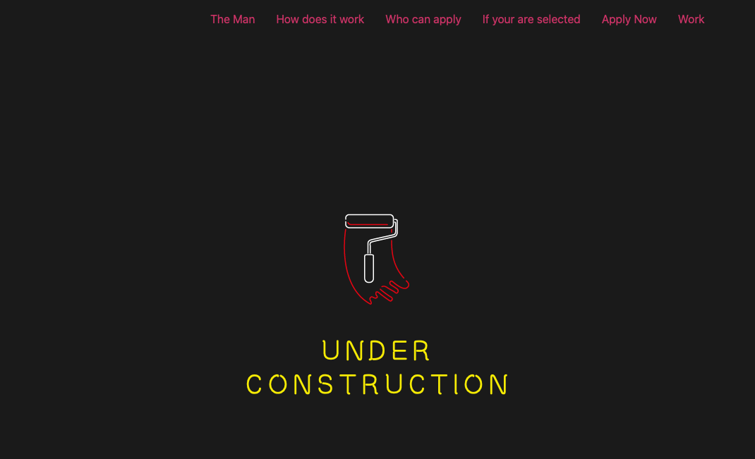
The Kennedys website currently features an under construction sign that’s set on a dark background.
Resoluut
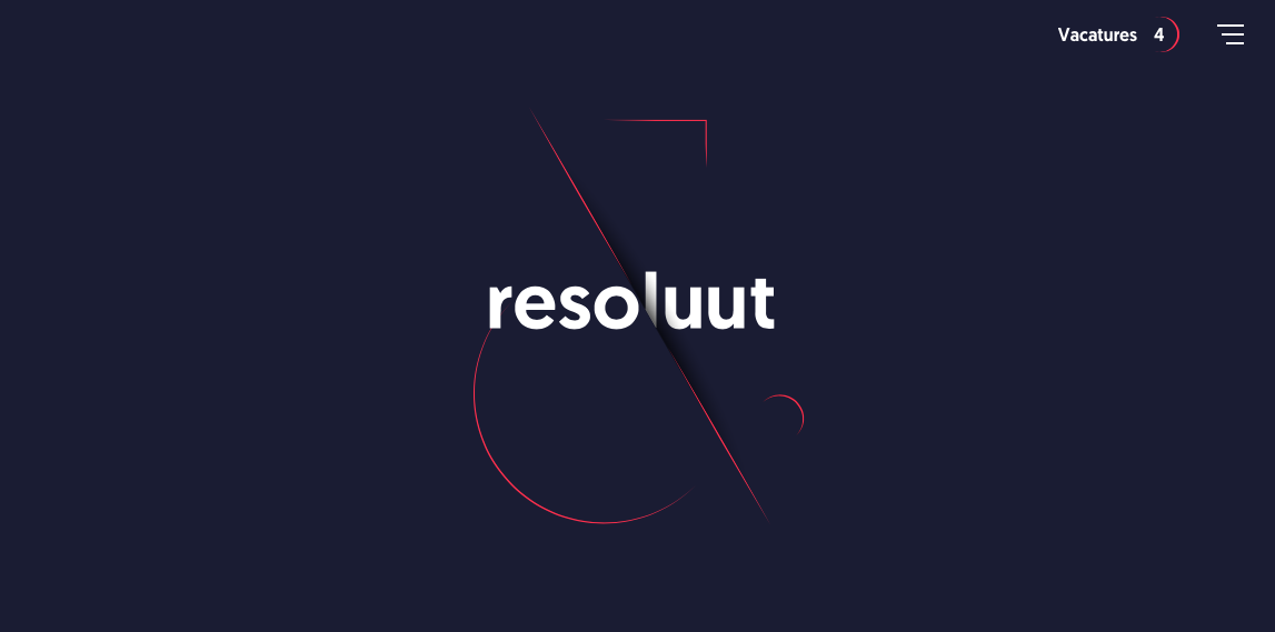
The Resoluut website offers a dark purple background with images that appear as though they’re hovering on top of it. There is a lot of play with depth of field here.
Fantassin
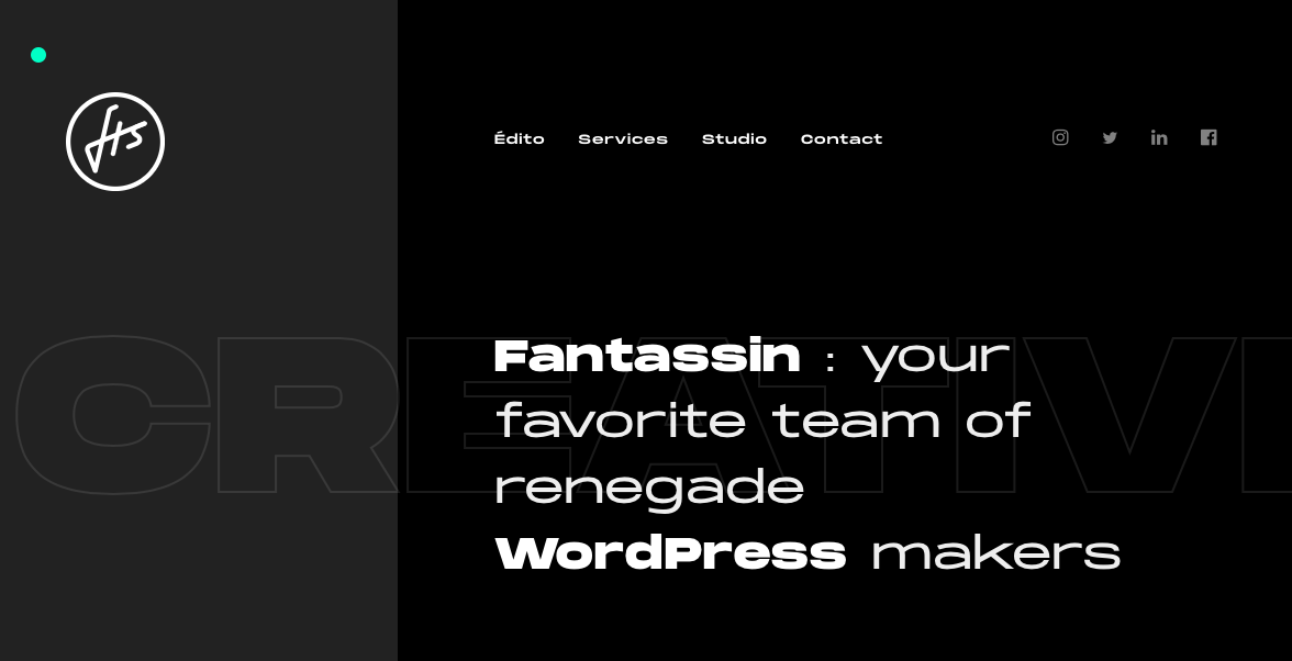
Still another option is the Fantassin website, which features a dark background and tons of cool scroll effects that draw the eye further down the page.
Cody Petts Studio
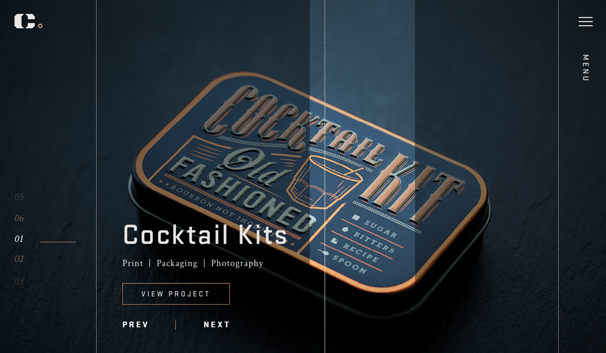
The Cody Petts Studio website highlights the work of Cody Petts, including print and packaging designs as well as photography. It’s dark, gritty, and extremely compelling.
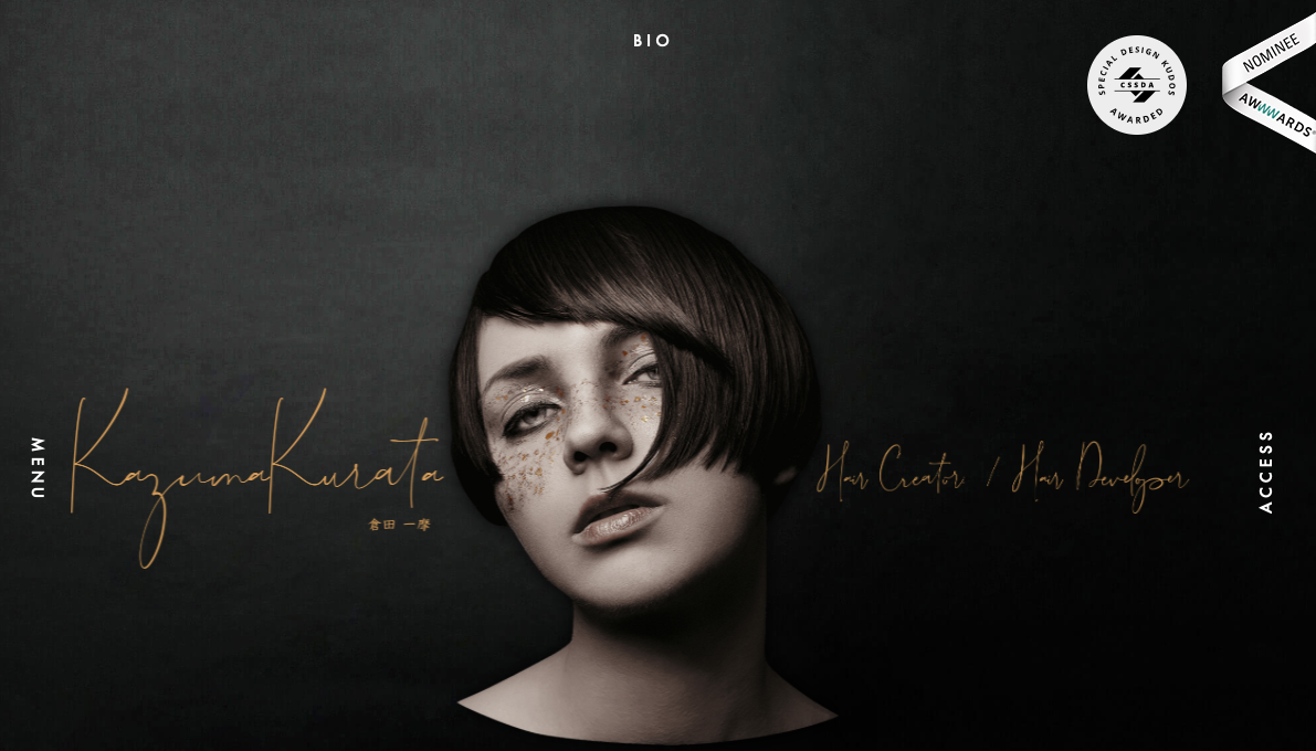
Kazuma Kurata
The design for the Kazuma Kurata website offers a dark background that’s intimately inviting. It makes the colorful Aspects of featured photos stand out even more. The design and function of the site make it clear why it’s deserving of its AWWWARDs Nominee status.
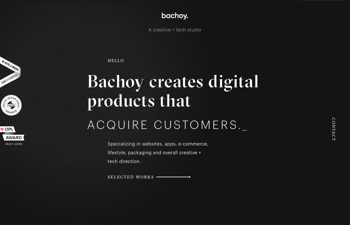
Bachoy
The Bachoy website highlights a creative and tech studio. The dark design featured here uses a cool spotlight hover effect and interesting interactions with photos as you scroll down the page.
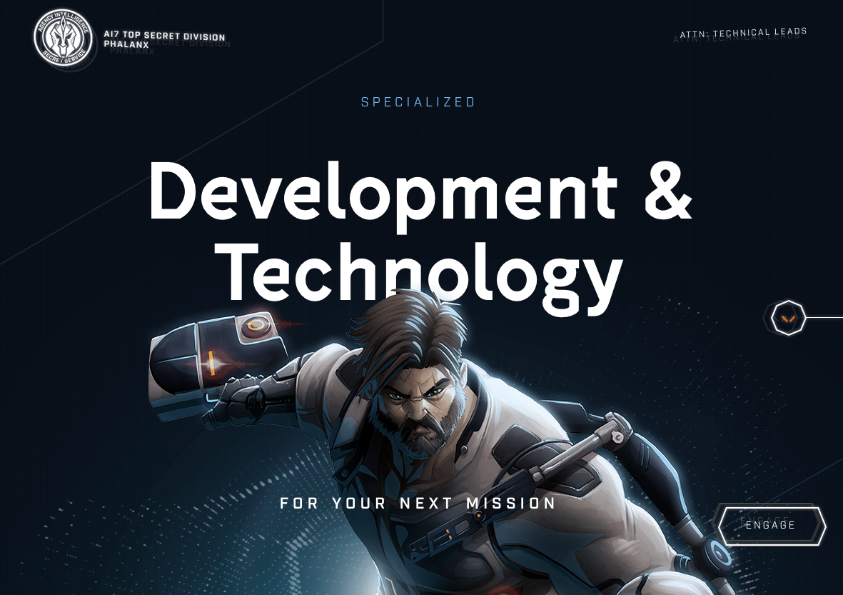
Agency Legend
The Agency Legend website has a truly appealing site that takes advantage of superhero motifs to increase engagement.
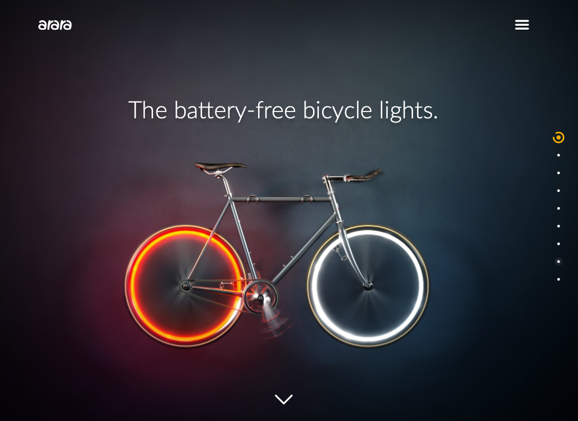
Arara
Last on our list is the website for Arara, which offers battery-free bicycle lights. This site is dark but not brooding, and instead uses the darker background to make the bright colors featured in images and videos “pop.”
Dark Website Designs Can Serve You Well
As you can see from the examples listed above, dark website designs can really take the overall look of your website to the next level — whatever that means for you. Whether you want to make colors look more vibrant, ease eye strain, or provide a mood, dark designs offer flexibility in both form and function. Have fun playing with them!


