James Kemp Acquires ReplyBox

Wp Plugins

James Kemp, a WooCommerce developer and founder of Iconic, has acquired ReplyBox, a privacy-focused comment system. Originally built by Ashley Rich and Lewis Warren and launched in 2018, ReplyBox has struggled to gain a strong foothold in the WordPress ecosystem as a commercial product with no free version, but it has continued growing at a slow rate.

“It’s a great SaaS but the previous owner had capacity issues and had left the app in limbo with no updates and no support,” Kemp said. “We saw a number of people talking about wanting to use it and having minor issues, so I approached Ash and offered to take it off his hands.

“I’ve personally used ReplyBox before for my own site (Iconic) and already knew it was a great privacy-focused alternative to Disqus (which riddled my site with ads unknowingly!). Ash had already been looking for a buyer, and as we’ve worked together before he knew I’d be a good fit as the new owner.”

ReplyBox is positioned as a Disqus alternative product that is faster, more lightweight, and focused on privacy. Kemp said users are often attracted to the design, the ability to use Markdown, social login, and webhooks.

The system can be embedded on any website, including static HTML pages to add dynamic commenting. It also integrates with WordPress through a connector plugin that is available on WordPress.org, which has more than 400 users. Kemp said the majority of ReplyBox users are using it with WordPress because that is the audience they are best at reaching due to the current and previous owners’ backgrounds.

The deal closed earlier this month and the ReplyBox team has been focusing on forging new partnerships.

“Since taking over, we’ve seen an uptick in users and have tested compatibility with Strattic – a static WordPress site generator – the perfect candidate for ReplyBox,” Kemp said. “Joost is using it on his personal blog. We’ll hopefully be setting up WPMayor with an account, too, for their site.

The team has a few preliminary ideas for the upcoming roadmap and is reviewing past and current requests. Potential features include the following:

  • Emoji reactions
  • Pin a comment
  • Review system
  • Upvote/downvote
  • Edit comments
  • User profile links

ReplyBox is currently working on rolling out some minor improvements and feature requests and the team is first planning on adding “review” functionality so it can integrate more deeply with WooCommerce and Shopify. For now, they plan to maintain ReplyBox as a commercial-only service. Kemp said they may consider adding a free version of the service in the future but “right now it’s not a priority.”

Munir Kamal Updates and Overhauls the Block Slider Plugin

Category Image 091

A couple of weeks ago, Munir Kamal updated his Block Slider plugin for WordPress. While not as popular as some of the other projects he has spearheaded, such as Editor Plus, he wanted to breathe some fresh life into it.

The original plugin allowed users to insert a slider block and create the slides directly from the post or page editor. The new approach is similar. However, end-users can only edit it from a new “Block Slider” post type.

WordPress block editor with an interface for inserting slides into a slider.
Creating a slide in the block slider.

Existing users should note that the new version breaks compatibility with their old galleries. It would be wise to make a backup to revert to if necessary.

Kamal listed several benefits to the updated approach:

  • A clean and wider slide editing/creation interface. Comparatively, the ‘block’ had less room to work with.
  • The fact we have a separate interface/post type, I took the opportunity to modify it a bit to make the slide creation easier for users.
  • This approach lets users create and manage sliders easily from one place (post type) compared to in-page block.
  • Using the slider to multiple pages/posts is easier with this approach.
  • The best part and the most important reason is that the slider can be used outside Gutenberg editor or anywhere with any page builder using the shortcode (or I could provide more ways to use it in the future).

Depending on the user, some of those can be advantages. However, for others, they are not. For example, not all websites would benefit from a dedicated slider management admin screen. Sometimes, a one-off slider is all that is wanted for something like the front page. The new approach creates more work and adds an unnecessary admin menu for those use cases. For users who add multiple sliders to their sites, it should simplify management.

Kamal touts using the block shortcode anywhere, but this feels like a step back from the earlier version of the plugin. It is now impossible to see what a slider looks like mixed with page content without previewing it on the front end. When laying out a full-page design via the editor, having the live preview can be vital to putting it all together.

“I am working on a block that lets you insert a slider (and maybe do a bit more),” Kamal said when I questioned him on the implementation. “It should be out in the next update soon.”

Overall, the user experience of creating and customizing sliders feels smooth. It is easy to attach new slides via the “Add Slide” button fixed to the bottom of the screen and navigate to others.

WordPress block editor with a Block Slider block that has multiple slides and buttons for navigating it at the bottom of the screen.
Adding multiple image slides.

Other than a minor spacing issue where the right navigation arrow butted against the side of the screen, I had no trouble using it. It worked well in the editor and on the front end.

Block Slider has a commercial version that begins at $29 per year. It includes updates and support for one site. There are also five-site and unlimited tiers for $49 and $99, respectively.

However, most users will likely not need the upgrade. Other than a handful of options, including a carousel view and a few customizations, most features are in the free version. And the plugin does not lack out-of-the-box options.

If anything, the number of settings is almost dizzying. Users who want ultimate customizability should enjoy tinkering with the design tools. Those who prefer a scaled-back interface can always leave the defaults in place. Otherwise, diving into them can be overwhelming.

Kamal shared an intro video to the plugin that barely scratches the surface of what the plugin can do:

I like where Kamal seems to be going with the plugin. His target audience focuses on users who love plenty of options and an easy way to manage their sliders. For one-off use cases, it is best to look elsewhere. Some bits still feel a little rough, like using a shortcode when placing the slider on a page, but that can always be addressed later.

WordPress Updates COVID-19 Guidelines for In-Person Events: Masks Strongly Recommended

Featured Imgs 23

In-person WordPress events are ramping up again, with in-person meetups happening all over the world and WordCamps back on the schedule. A sampling of the upcoming major events include the following:

  • WordCamp Vienna, Austria (April 23, 2022)
  • WordCamp Irun (May 21–22, 2022)
  • WordCamp Europe (June 2–4, 2022)
  • WordCamp Warsaw, Poland (June 11–12, 2022)
  • WordCamp Montclair, (June 25, 2022)
  • WordCamp Netherlands (September 15–16, 2022)

WordPress’ Community Team published an updated set of COVID-19 guidelines today ahead of a the five WordCamps that will be happening over the next few months. There are a few notable changes from the previous guidelines, which mandated that organizers select a venue with staff that can check temperatures and vaccination status and remind attendees to wear masks. This removed the enforcement burden from volunteers.

The updated guidelines require organizers follow local guidelines, provide masks and hand sanitizer, and provide a sticker to attendees that indicates if they prefer others to wear a mask when conversing in close proximity.

The Community Team strongly recommended the following for attendees:

  • We still recommend that you wear a mask while at in-person WordPress events.
  • If you see that someone is wearing a sticker requesting people wear a mask near them, please wear a mask while within 6 feet (2 meters) of them or keep your distance.
  • A request that you only attend in-person if you are vaccinated or have recently tested negative.
  • Please stay at home if you are sick or have recently come in contact with someone who is ill.

Ten days prior to publishing the updated guidelines, the Community Team requested feedback in a post that asked the question, “What is keeping you from either organizing or attending an in-person event?

WordCamp Birmingham organizer Ryan Marks responded, saying his team was restricted from organizing in-person events (under the previous guidelines).

“My location doesn’t allow for the checking of vaccination status,” Marks said. “So we must answer yes to all of the In-person safety checklist items. It hasn’t been possible to answer yes to the first two questions yet.” The checklist required the area’s average positive case rate to average under 4% for 28 days, and to have under 50 new cases reported per 100,000 people for 14 days, among other requirements. 

Marks and his team were forced to postpone WordCamp Birmingham in January after Omicron hit Alabama and local infections began rising. The camp had previously been criticized for its initial masking policy, which stated “Masks are required for entry and preferred throughout the event.” This set off heated discussions on social media, where concerned community members condemned the gathering as “irresponsible.” The camp revised its masking guidelines to require masks indoors but ultimately had to postpone due to local conditions.

The updated guidelines from WordPress’ Community Team bear a striking similarity to WordCamp Birmingham’s original masking policy – if the local authorities do not have requirements in place, masks are optional but recommended. It has been well-documented that indoor masking can significantly reduce transmission, so the Community Team must have witnessed a major change in pandemic conditions to amend the guidelines to make them optional. With the exception of a handful of flagship events, WordPress has ultimately decided to leave the requirements to local authorities.

“As flagship events are larger and draw an international crowd, both WordCamp Europe and WordCamp US organizers were asked to view these as minimum requirements and are expected to have a more comprehensive plan in place,” WordPress community organizer Angela Jin said in today’s announcement.

WordCamp Europe will require masks indoors and social distancing at the speakers dinner. They are creating self-service registration booths and trying to put more activities, like WP Cafe, outdoors.

WordCamp US will be following San Diego’s local guidelines in September.

“We will require all attendees to be vaccinated or have recently tested negative,” Jin said. “Additionally, due to the size and nature of this event, masks will be required to be worn over both the mouth and nose while indoors. Hand sanitizer and masks will also be available and some activities, such as lunch, will be outdoors.”

WordPress Performance Team Puts Controversial WebP by Default Proposal on Hold After Critical Feedback

Category Image 006

WordPress’ Performance team has put its WebP by Default proposal on hold after the community voiced critical feedback and significant technical concerns. The new feature would generate WebP images on upload by default for new JPEG uploads and would use WebP images by default for website content. WordPress’ Performance team proposed this update for the upcoming 6.0 release.

“The performance team has heard the feedback and takes the community’s concerns seriously,” Google-sponsored contributor Adam Silverstein said in an update on the status of the proposal. “With the help of the community, we will work on conducting additional data-driven research. Based on our findings, we will reassess our proposed approach to enabling WebP by default.”

Vocal opponents to the feature characterized it as “heavy handed” and pushed for it to be “opt-in” only or introduced with a more user-friendly way to disable it. One of the chief concerns is that the proposal has the potential to double the amount of disk space used for images, as it would generate WebP thumbnails in addition to the JPEG sub sizes.

Viktor Nagornyy summarized storage concerns in a comment on the proposal:

This is not just about image formats. You’re going to drastically increase disk space usage by generating more images. This will affect anyone hosting WordPress on managed hosts with storage limit, their own servers with limited storage, anyone offloading images to S3, etc. This is why there needs to be an option to disable this under Media options. Hidden images generated by WP because of plugins and themes already cause problems. I’ve seen a site generate 20 images for every uploaded image. Uploads directory was 20GB. Can you imagine adding webp images in addition to this? 

This directly affects hosting cost. You will cause a lot of billing issues.

The Performance Team said they are working closely with the hosting community but this change directly benefits hosts that sell plans with tiered storage space limits.

“There are also significant conflicts of interest,” WordPress agency owner Andrew Wilder said. “WebP is a format that Google Created — and it’s Google Engineers who are leading the Performance Team. WordPress agency owner Andrew Wilder said. “This proposal is designed to serve Google’s interests (making it easier and cheaper for them to crawl the web). And the increased cost for all the additional storage space needed will be borne by site owners, not by Google.”

Hosting companies may also experience complications as the result of enabling WebP by default that may not be worth the increased billing for customers who are forced to upgrade. Charles Smith, Managing Director at WordPress hosting company WPopt AB, articulated a litany of these concerns for hosts in a comment on the proposal, especially as it relates to support and backup costs:

Disk space – a vast majority of our users have very large image libraries. While they might not be hitting limits yet, effectively doubling the media library size is going to cause issues for many people. I can see that ending in one of several ways – either they’ll ask us to delete the webp files (so, more work for us, thanks!), or they’ll be forced to upgrade (so, higher fees for them), or they’ll get upset that we don’t offer more disk space for free, and then potentially leave us

Backups are already one of our major expenses. We invest in multiple solutions, and multiple storage locations. A decision like this will *directly* increase our costs. It will also make account restorations, account migrations and similar actions more time consuming.”

In the most recent update, Silverstein said the Performance Team’s primary objective in enabling WebP by default is to bring WordPress’ image processing to the level of its competitors.

“The main goal of this feature is to set the foundation for WordPress to be able to process and deliver more performant formats in the same way other CMS like DudaWix, and Shopify are already doing,” Silverstein said.

This reasoning is grossly disconnected from the concerns voiced by people who are in the trenches supporting and maintaining WordPress sites. The team’s initial approach at selling the benefits of WebP, without adequately addressing the disk space issue, has generated significant community pushback in a short amount of time.

As Performance Team representatives responded to concerns in the comments of the proposal, several participants in the discussion grew more irritated, saying they felt proponents of “WebP by default” do not fully grasp the real-world implications of the proposal for users. The timeline for bringing it into core also seemed rushed and premature, given that WordPress already has support for WebP images for those who choose to use them.

“Bottom line is pretty simple,” WordPress agency owner Sergio Scabuzzo said. “We are being asked to double the number of images for no good reason.

“There is a small bandwidth benefit in forcing all images to have a WebP version. But we will then have a crap show on our hands in the back end. How manageable are media libraries now? Cool, now double that with another media format. Oh, wait, let’s add AVIF later too…

“This is a problem looking for a solution, not a decision. This change is great only from a web crawler, search engine, supported device/medium. But for the WordPress ecosystem, it will create a huge headache in maintenance and hosting costs.”

The Performance Team is now reassessing its approach and seeking to bolster its case with more data and research. Silverstein referenced two GitHub issues where the team is tracking research on the impact of enabling WebP by default:

  1. Research: Impact of additional WebP images on upload [Issue #289]
  2. Research: WebP compatibility [Issue #290]

“Once we have completed our investigation and determined next steps on these two issues, we will work with the community to reassess two other concerns that were raised – having the feature on/off by default, and having a UI-based control to turn the feature on/off,” Silverstein said.

Phi Phan Launches Block Enhancements WordPress Plugin

Category Image 091

WordPress developer Phi Phan has been making small splashes lately, but in a sea of 1,000s of plugins, it is increasingly tough to make a wave. Over the weekend, he released the Block Enhancements plugin, the first pass on a project that he plans to iterate on with new ideas.

WordPress post editor with four different buttons in the content canvas.  The inspector panel shows a set of icon related options and the "fill" color is highlighted for an SVG icon.
Adding icons to buttons with Block Enhancements.

However, this is not his first block-related plugin. Last year, he launched Content Blocks Builder, a plugin that allows developers and users to create blocks from others, patterns, and variations. In February, he released Meta Field Block. He then followed it up with the launch of SVG Block and Block Enhancements last week.

I have quietly tested each as they strolled into the WordPress plugin directory, but they kept getting relegated to the back of the draft posts list. Most seemed like solid plugins at the time, and a reminder from two different people in the past week to check out Phan’s work lit a fire under me. It was time to share what he has been doing with WP Tavern readers.

The SVG Block plugin is a unique take compared to some existing solutions. Users can output the SVG as an image or implement it as a divider.

Phan is not short on ideas for new blocks and enhancements. He rattled off a hefty list of features that he plans to build when questioned.

“A simple separator with an icon,” he noted as an idea. “I’ve tried to support icons in the core/separator, but it requires changing the markup. So I may create a new tiny block just for it. Maybe a wavy divider designer block. I know there are already some on the plugin directory, but they are not fit for some use cases. I’m kind of obsessing with SVG stuff. A ‘toggle’ button block for showing modal, off-canvas, or collapse layout.”

BoldBlocks is his upcoming website, which he will eventually use to promote his plugins. He has yet to launch it—likely because he has been too busy developing new projects.

“[Content Blocks Builder] is my main business focus in the long term,” said Phan. “It’s a tool allowing users to create blocks from other blocks. It helps to create responsive ‘boring’ grid layouts or carousel layouts easily without touching code. I used to create layouts like those with the ACF repeater field, but I didn’t like that kind of workflow in the Gutenberg world anymore. That plugin has many more features than the description on the plugin page, but I’ve not finished rewriting the description and user guides.”

The Block Enhancements Plugin

Block Enhancements is not a block in and of itself. It takes a similar route as EditorsKit and Editor Plus, adding features on top of the system.

The first version of the plugin adds a single feature that allows end-users to stick icons into the core Button, Heading, and List blocks.

WordPress post editor with a Heading and List block in the content canvas. Both have custom icons selected with different fill colors. The inspector panel shows a list of icon-related options.
Inserting icons for the Heading and List blocks.

Maybe the plugin does not offer enough features to grab everyone’s attention, but it is off to a solid start. Phan does not go overboard with the UI, keeping it simple and following WordPress standards. The icons feature had just the right amount of customizability that I never felt like I needed anything more.

While not listed anywhere in the plugin description, the default library looks to be a mix of Ionicons, Bootstrap, and core WordPress icons. In total, there are over 3,500 options for users to choose from.

Popup overlay screen in the WordPress post editor that lists a library of icons in a grid.
Block Enhancements icon library overlay.

If the library does not offer enough choices, the block allows users to directly paste in SVG code.

This is the start of something new, and Phan has already created what looks to be an exciting to-do list for Block Enhancements’ future. Some potential features include:

  • Box-shadow builder.
  • Multi-border design options.
  • 2D transformations via translate, rotate, skew, and scale.
  • Fancy border-radius implementation a la 9elements’ project.
  • Responsive text alignment.
  • Animated reveal effects.
  • Copy/paste styles.
  • Child blocks selector.

If Phan continues iterating on Block Enhancements with these and other features, it will be a plugin to keep an eye on.

How To Build a Timeline Page With Blocks

Category Image 091

Up next in our Building with Blocks series is a quick tutorial on how to build a timeline page. Timelines give brands and organizations a visual way to introduce themselves and feature highlights from their histories. The block editor makes creating a timeline easier than it ever was with legacy plugins.

For this example, I selected the Timeline Block For Gutenberg by Cool Plugins, which is available on WordPress.org. It’s one of just a handful of plugins that offer timeline blocks. It makes it easy to create a responsive timeline that can be customized to match the organization’s brand, with live previews during the creation process.

I used the relatively new Blockpress theme from MotionBlocks, which supports full site editing so users can customize everything directly on the page. I found the theme easy to work with when creating my example website for this project. It also has compatibility with WooCommerce, if you’re selling something on your site. The Timeline Block for Gutenberg plugin will work with any theme that supports the block editor, but I wanted the chance to play around with Blockpress.

This video demonstrates how you can create a timeline in under five minutes.

The first step is to install the theme and plugin. Once both are activated, create a new page that will house the timeline. Click on the block inserter and select Timeline Block.

One convenient feature about the plugin is that it will insert some placeholders, so it’s easy to see how to add new timeline items (“stories”). The easiest thing to do is replace the text and images that are already there and add more stories at the end if you need a longer timeline.

The plugin lets you customize the story heading, description, and primary label colors, and even the line, icon color/background, and story border. This makes it possible to match the colors to a site’s branding. On the individual story settings, you can change the image size and customize the story icon by selecting from the Font Awesome icon collection. The stories can also link to other posts, so it’s flexible to be used for a variety of different purposes in addition to your standard corporate timeline.

The Archeo WordPress Theme Blends Mayan History With Magazine-Style Block Patterns

Category Image 091

The day has finally arrived when a block theme does something interesting with the featured image on single post views. One of my biggest pet peeves is when themers simply dump it at the top of the content and call it a day.

I nearly always bolt straight for the site editor to remove the single-post featured image upon installing block themes from some authors. However, after installing Archeo, Automattic’s latest, I simply let it be. At least in this instance, the implementation did not make me wonder if we were ever going to get this whole block-based theme venture right.

Single post title on a WordPress post page view.  The date and title are on the left.  The featured image is on the right.
Split-screen post title and featured image.

Perhaps the most impressive thing about the single-post header design is that it works with the limited toolset offered by the current Featured Image block.

If there is one knit-pick I have it is that the post and site titles do not align on the left side of the page, at least on wide-desktop views.

So, the single-post header is well-designed. How does the rest of the theme hold up? I am getting to that, but every now and again, something special about a design catches my eye. And, I cannot wait to let others know about it.

Automattic is the most prolific block theme creator to date. Its Theme Team has rolled out a dozen designs to the WordPress directory over the last year. Many of its initial outings had a familiar feel — tiny variations on a simple base. However, things have livened up recently. Livro, the dark theme that made me dislike dark themes a little less, and Skatepark, a unique experiment in its own right, represented a fresh start after the previous months began to feel stale.

Archeo continues that momentum. The theme is bold when it needs to be while making enough use of whitespace to not overwhelm readers.

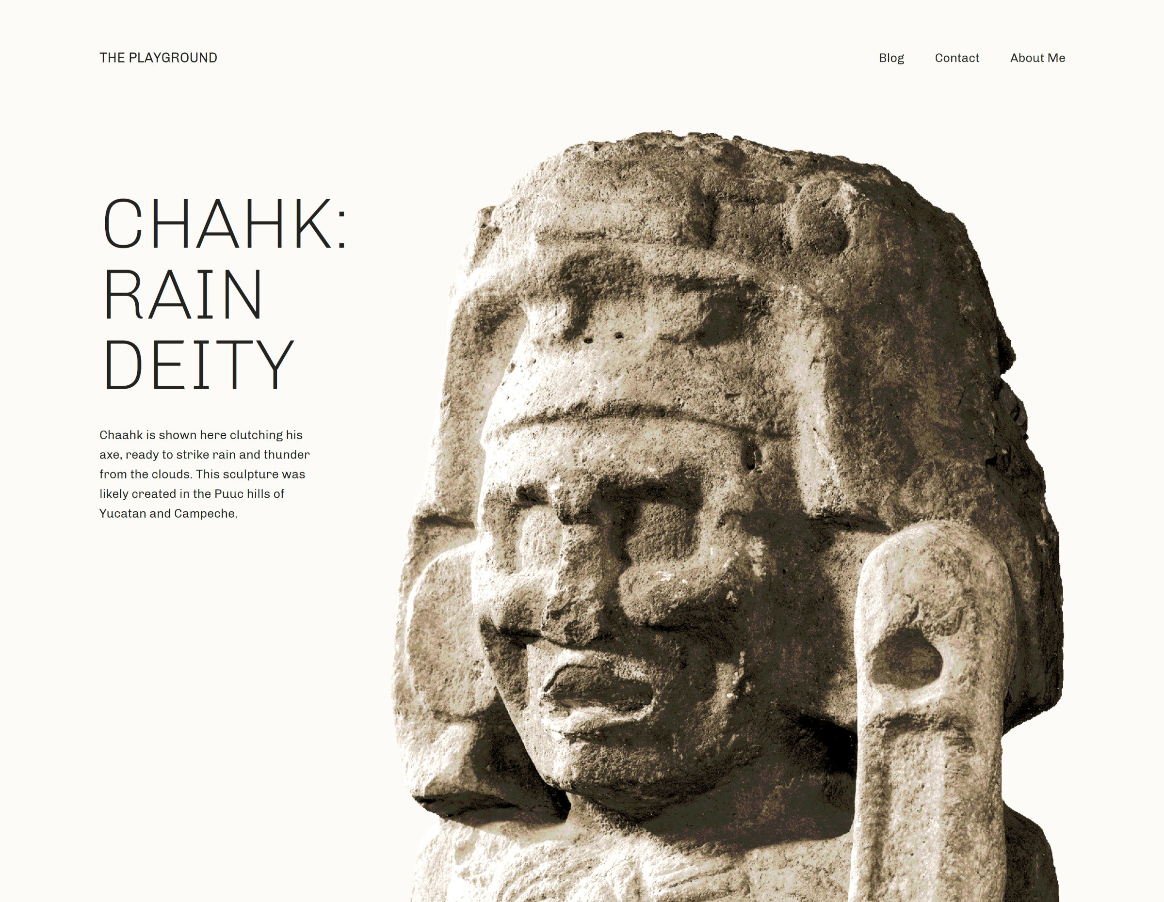
A sculpture of a deity from Mayan culture inside of a a two-column design with text on the left.
Intro section of Archeo’s homepage.

It is one of the few faithful representations of magazine designs that I have seen. No, I am not talking about the muddied term in some circles that confuses it with news design. It reminds me of those stunning feature layouts that would draw a reader into a story as they flipped through the latest gloss-covered print that arrived in the mail. I am a product of my generation and will always have a sense of nostalgia for the dying art form, and I love seeing web-based implementations of it when they work well.

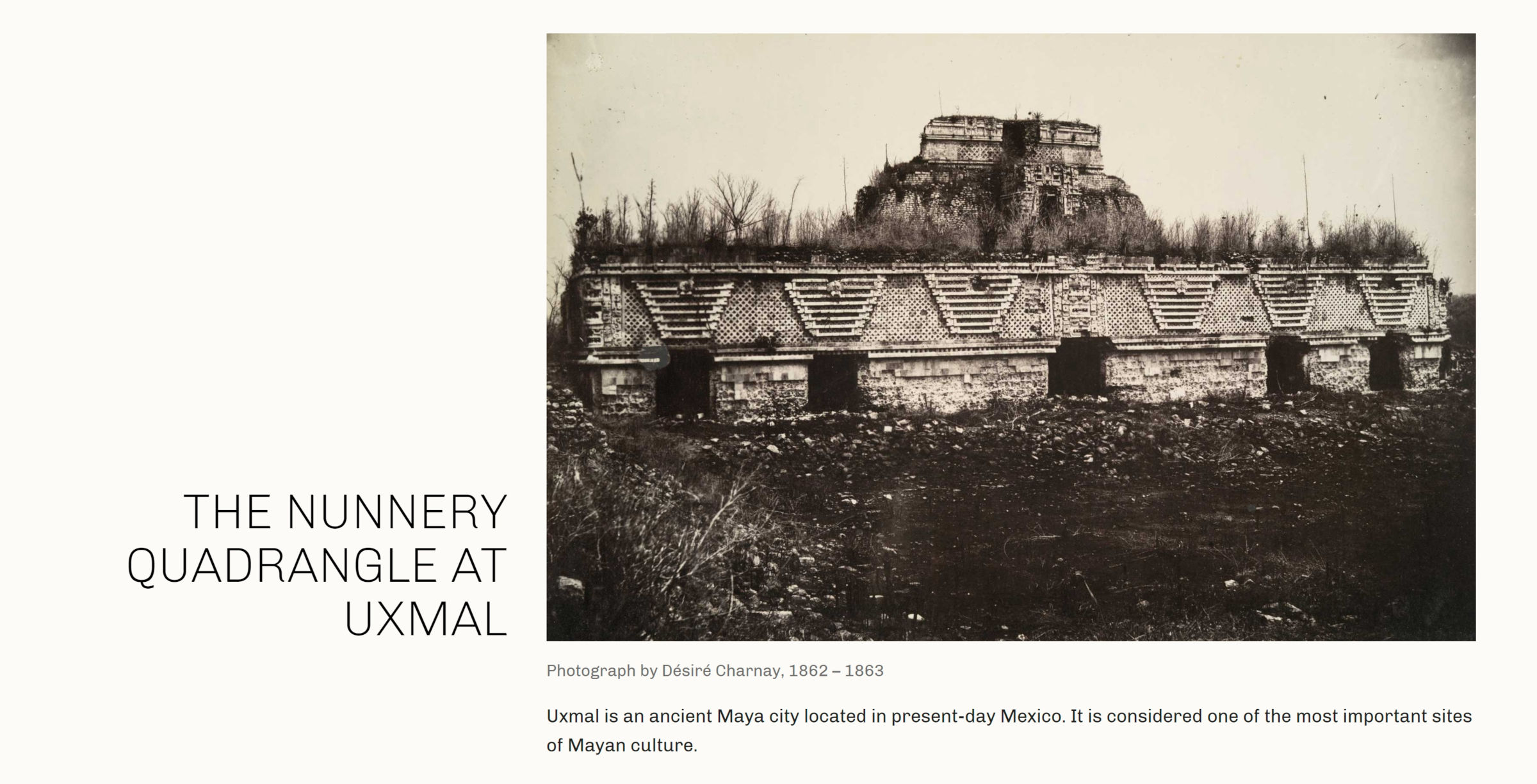
Nearly every one of Archeo’s image-categorized patterns captures that essence of a magazine featured article. The following is one of my favorites.

On the left of a two-column layout sits a large heading.  On the right is an image with a caption.  Underneath is a longer description.
Two-column image pattern with header on the left and additional text.

The theme is described as being inspired by Mayan history and culture. Archeo’s patterns are littered with tidbits of historical text and images that make me want to learn more about the subject. Great design can speak to us in ways that we were not expecting.

As an aside, I would love to see creators who describe their designs as “inspired by” something to provide more insight into the subject via a blog post. For those unfamiliar with whatever that subject may be, it would pull back the curtain a bit, giving us a glimpse into why it was important to the designer.

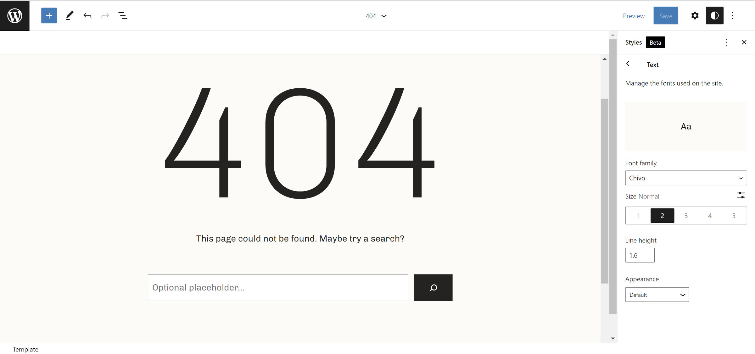
Archeo is the first theme that I have seen use the upcoming web fonts API expected to land in WordPress 6.0. Users with the Gutenberg plugin installed should see the theme’s only font, Chivo, gracing the front end and editor. Those without the plugin should see their system’s default sans-serif font.

The following screenshot is of the theme’s 404 template and shows the Chivo font:

WordPress site editor open to the 404 template.  In the content canvas is a huge "404" title.
404 page template in site editor.

It looks far better than the default, at least on Windows. I recommend running this theme alongside the Gutenberg plugin for the ideal result.

I am surprised the Theme Team did not include a backward-compatible method of handling web fonts for WordPress 5.9 users. It would not have taken much code: a single hook and a check for whether the wp_webfonts() function exists.

Archeo is now the 59th block theme to land in the WordPress.org directory. I am eager to see more from Automattic’s Theme Team, especially if this will be its minimum standard with future designs.

Newfold Digital Acquires YITH to Expand WooCommerce Expertise

Set Up Woocommerce

Newfold Digital, the parent company of Bluehost, Yoast, and Web.com, has acquired YITH, a WordPress plugin company with more than 100 WooCommerce extensions.

YITH’s has more than 2.3 million active installs across its suite of products. The company hosts 31 plugins on WordPress.org, many that are lite versions with commercial upgrades. YITH’s most popular product, the YITH WooCommerce Wishlist plugin, is active on more than 900,000 WooCommerce sites.

YITH founder and CEO Nando Pappalardo said he started this endeavor in 2011, in a small apartment in Southern Italy. The project later became YITH, a company that has grown to employ 46 people. All YITH employees, including its leadership team, will join Newfold Digital as part of the acquisition.

“The acquisitions of YITH and Yoast last year are a part of a long-term strategy to provide the best solutions to our WordPress customers and further our expertise,” Newfold Digital President Ed Jay said.

“As a company providing WordPress solutions, we’re always looking for opportunities to create better customer experiences to help our customers succeed. YITH will allow us to offer a world-class WooCommerce experience and make it easier for our 7 million small business customers to thrive online, similar to how Yoast helped with SEO.”

The YITH team currently maintains nearly 150 plugins, with a much smaller number available on WordPress.org. Jay said that Newfold Digital plans to work with YITH to “expand the plugins available in the directory to reach more online sellers.” 

Pappalardo confirmed that YITH will remain an independent brand, while improving its products and developing new e-commerce business solutions at Newfold Digital.

“The only difference is that now we will have the strength and drive of a partner that will allow us to break through,” Pappalardo said.

“We have hundreds more [plugins] on the idea board. Our solutions will still be available on our website and through WordPress.org. There are no plans to remove our free products from WordPress.org or change our current support for them. Existing customers will continue to be able to use YITH products as they do today. Additionally, our team will be exploring new solutions for our customers but also finding ways to introduce YITH products at the beginning of the website process.”

GiveWP Launches Standalone Donation Form Block for Stripe

Category Image 052

GiveWP quietly released its new plugin, Donation Form Block for Stripe, in the WordPress directory last week. It is a standalone block that allows users to accept donations almost instantly. No complicated setup. Just install, activate, connect to Stripe, and play.

I named the GiveWP plugin my favorite of 2019. The team behind the donation plugin has consistently produced top-tier plugins and extensions, and I have long been of fan of the company’s work. It did not take me long to install and activate its latest plugin.

Donation Form Block for Stripe is essentially a lite version of GiveWP. The primary product is far more powerful and has an entire ecosystem of extensions built around it. In general, it is geared more toward charities, non-profits, and other fundraising efforts where users might need more flexibility, reporting, and integration with third-party systems. It can be overkill for someone who merely needs a simple donation form.

The one-off donation form block is better-suited for those “buy me a coffee” scenarios than well-organized fundraisers. I am glad to see GiveWP tackling this side of the donation arena.

Inserting the block is as easy as adding any other. However, before using it, users should connect their Stripe account, and the plugin provides a handy button for doing so in the block sidebar:

Donation form in the WordPress editor in the middle of connecting it to Stripe.
Connecting to Stripe.

The Stripe connection persists, so it only needs to be configured once. From that point, everything is relatively straightforward. Plug in a few details and publish.

In a couple of minutes, I had created and published a fictional fundraiser for cleaning a local basketball court.

Fictional donation form for cleaning a local basketball court.  Has a header image, text, and buttons for donating various amounts.
Full donation form on the front end.

As much as I love the idea of this block, I was not entirely happy with the user experience. However, keeping in mind that this is version 1.0.x, it has a ton of potential.

GiveWP’s donation form managed to break nearly every one of my block-related cardinal sins while still managing to be an exceptional product.

Users must add an image, custom text, and donation field text via the block options sidebar. This means there is no Rich Text input, so users cannot even add simple bold and italic styles. It also feels unintuitive working from the sidebar instead of modifying the fields directly from the content canvas.

Form block in the content canvas of the WordPress editor but its fields are in the sidebar for editing.
Text editing in the sidebar instead of the block in the content canvas.

A more ideal approach would have used the “inner blocks” feature to put Heading, Paragraph, and Image/Cover blocks — locked in place — into the main donation form. It could have done the same with the buttons and other form elements via custom blocks.

Ultimately, most of the problems are related to control over the design. One of the worst things block plugins can do is overrule everything the theme styles on the front end.

Do not get me wrong; blocks should ensure quality control over their own output. Their functionality should be unencumbered, and their layout should work well regardless of the theme.

However, this donation block takes its duties a step too far, using JavaScript to inject CSS into the page and doubling up on the specificity with !important. Even if a theme wanted to integrate with the block, it is next to impossible to style the donation form elements. Is there really any reason that the inputs are required to have 2px, solid, rounded borders?

And, why are my theme and user-registered colors not even available for the single color option provided?

Colored buttons in the WordPress editor inside of a donation form.  The sidebar color option shows custom colors instead of theme/user-registered ones.
Theme colors not selectable.

That is what frustrates me the most — not just with this block. WordPress has built this standardized system that allows communication between the platform, plugins, themes, and end-users. It lets developers build output that should always be customizable. By no means does it cover every Aspect of design. However, the foundational components are in place. Colors and font sizes have been around for over three years. Extended typography and border controls are available now.

There is no way to make a wide or full-width form. The block does not support alignments, and even when wrapping a Group block, the plugin limits it to a maximum width of 650 pixels.

Some of these problems are similar to the issues I was writing about nearly two years ago with the release of GiveWP 2.7. I would have liked to have seen them addressed on an entirely new plugin release from the outset.

Despite my complaints, the plugin does the one thing it must do correctly, at least as good as anyone and better than most. It makes accepting donations as simple as inserting a block into a page, customizing a handful of fields, and hitting the publish button. If the dev team never added another enhancement, that would be all most of its users need.

Gutenberg Contributors Explore Expanding Background Image Block Support and Refining UI for Background Tools

Category Image 091

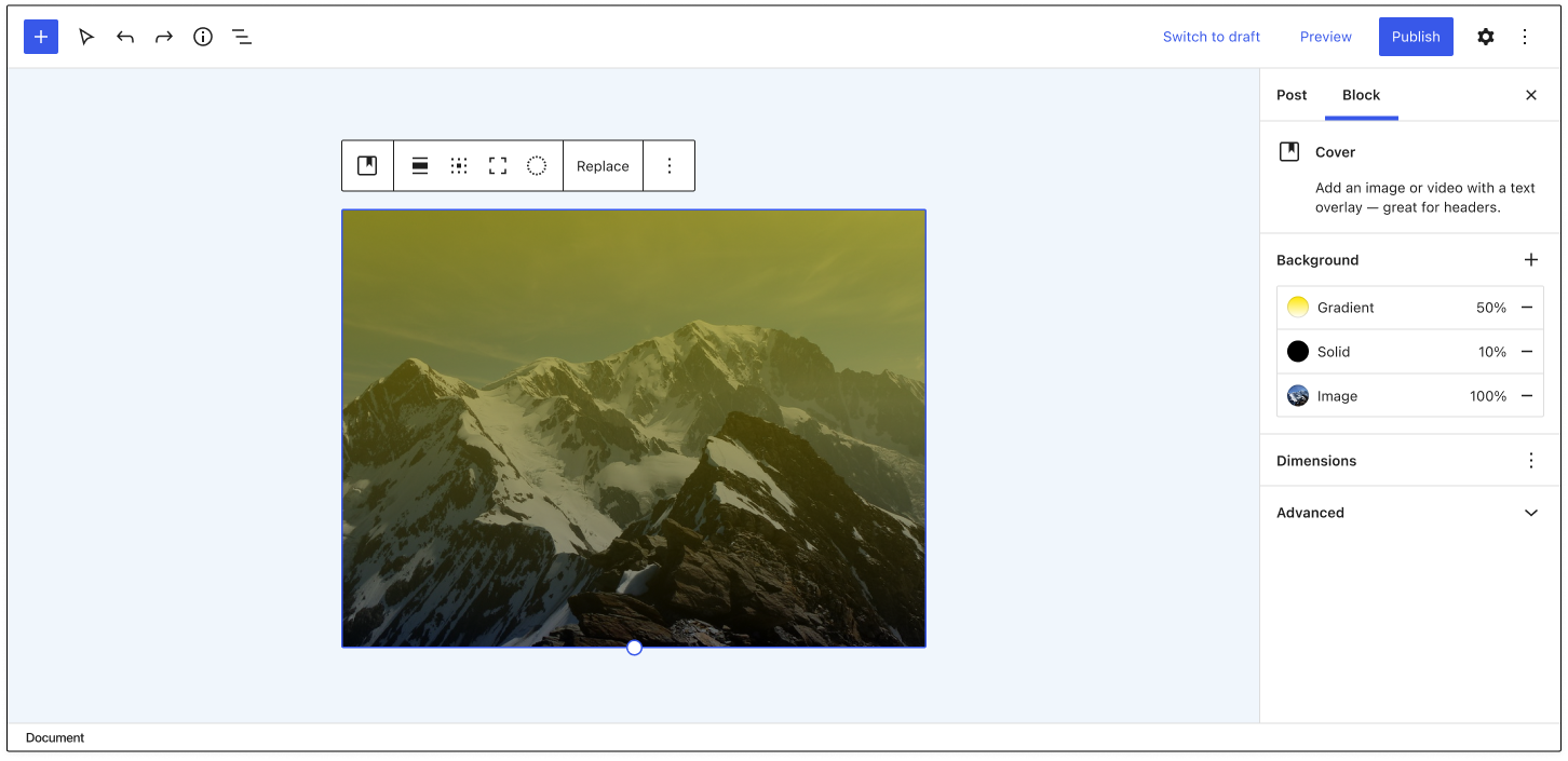
Background tools in Gutenberg are currently limited to the Cover block, but contributors are working on expanding support so that any block can opt into it. Discussions about the best way to do this have been happening for the past two years and now are gaining some momentum.

“Right now it’s possible to add video backgrounds, colored overlays, etc, to the Cover block alone,” Matias Ventura said in 2019 ticket on the UI for background tools. “It would make sense to extract this and extend to other container blocks (group and columns, for example) as well as expanding the features.”

Gutenberg contributor Andrew Serong has created a draft exploratory PR for adding opt-in, server-rendered background support for blocks, which would save background image values to the block’s style attribute in a backgroundImage key. Serong created the PR as a rough, experimental approach and published a few screenshots of how the inspector controls might fit in. However, Gutenberg designers are working on a more refined design for background support in the editor.

Today, Gutenberg designers Joen Asmussen and Javier Arce published a GitHub issue with their vision for a complete reorganization of background controls that includes layer management, layer reordering, and support for filters/blend modes.

“The core idea is to group all the layers (both overlays and media layer) inside a single sidebar section called Background, abstracting the organization of the Cover Block layers on the canvas and simplifying the block sidebar,” Arce said.

These new designs intersect with the goal of expanding background support for use in other blocks beyond the Cover block. There are many other considerations that splinter out of adding background image support to blocks, which contributors have noted in the discussions. These include features like the ability to add a body background image to block themes, specify a color palette to be used for background colors, and the ability to add multiple background images.

Expanding background image support and refining the UI for background controls is still a little ways off, but the project is starting to make significant steps forward. This will be an exciting addition that will markedly expand users’ ability to customize blocks.

WordPress Community Designers Create the Museum of Block Art

Category Image 091

Anne McCarthy announced the launch of the Museum of Block Art earlier today via the Gutenberg Times blog. The site’s goal is to showcase creative uses of blocks and inspire the WordPress community to push the limits of what is possible with the block editor.

The site showcases 22 pieces of block art from 11 people in the WordPress space. Ann McCarthy, Tammie Lister, Beatriz Fialho, Allan Cole, Rich Tabor, Nick Hamze, Brian Gardner, Javier Arce, Mel Choyce-Dwan, Channing Ritter, and Francisco Vera all contributed to this first outing.

A 6-column grid showcasing various art designs created via the WordPress block editor.
Multiple block art styles.

The concept builds upon an earlier project by Lister. In October 2021, she announced Patternspiration, a site where she created and released a new block pattern every day for the entire month.

“She was showing me those, sharing problems she was running into, the intent around ‘how quickly can I create a pattern/what can I create in 30 minutes per day,’ etc.,” said McCarthy. “I brought it up on a hallway hangout, and the idea just hit me as we were chatting (that’s the moment in the video). I found her approach to be so beyond creative and beautiful compared to some of the necessarily practical items in the block pattern directory.”

The pattern directory on WordPress.org must take a lot of factors into consideration to ensure patterns work across themes for millions of users. This limits what designers can do. However, such limitations are unnecessary on third-party sites.

“I wanted to take it a step further because it felt so compelling to look at something and not have an ‘I bet that was made with WordPress’ feeling that many of us have had,” said McCarthy.

Because the Museum of Block Art allows for more artistry in its showcase, it can also create inconsistent results if end-users blindly copy/paste the code. For example, one of my favorite patterns is the It’s Me (Super Mario) design by Hamze, which brings back at least a decade of childhood memories:

Super Mario "pixelated" image made out of Button blocks in the WordPress editor.
Super Mario block art.

However, it relies on color names that are not likely to exist in every theme. Copying the pattern code and pasting it into the editor should create the correct layout, but the colors might be off.

Other patterns require users to download the correct images and add them to their posts. Abstractions Study No.8 by Cole relies on custom CSS, which is provided via a downloadable Blockbase child theme.

Image of multiple abstract shapes created via WordPress blocks.
Abstract block art.

This sort of hodge-podge of methods is OK for a project like this. The goal is to inspire, not necessarily to make downloadable patterns. When designers experiment and push the boundaries, it can also help evolve the block system’s tools as they report limitations upstream.

Aside from Lister’s Patternspiration work, I had caught Ritter’s blog post in January sharing how she had created block art. At the time, I was unaware that it would be a part of the then-unknown Museum of Block Art project.

WordPress block art made from a gallery of various city images.
City Textures block art.

McCarthy added that she encouraged Ritter to publish the post, noting that it helps to “demystify” how it was done.

“I started pinging people who I thought would be interested in doing it,” said McCarthy of the block art included on the site. “It was all very grassroots and sometimes would just randomly come up in conversation. I tried to keep the ask very small since so much is going in with WordPress and the world. Probably less than half of the people I contacted actually submitted art pieces.”

The initial plan was to launch the site alongside the WordPress 5.9 release. However, it was pushed back as contributors needed more time.

There is no submission form for third-party contributions to the museum. However, McCarthy encourages designers to use the #WPBlockArt hashtag across social media to share their work. It could get picked up for inclusion on the site.

“I’m mainly looking for pieces via the hashtag, but if I see a big demand for folks wanting to submit, I’d be game to open up something more official,” said McCarthy. “This has been a side project on top of 5.9, the FSE Outreach program, etc., so I wanted to be mindful about the opportunity cost of sinking more time into an off-the-wall idea.”

WordPress 6.0 to Introduce Performance Improvements for Custom Pages

Featured Imgs 23

WordPress core committer Jonny Harris merged a patch into WordPress core for a 12-year-old ticket that he says has the potential to bring “a massive effect on performance for custom pages.” The change, which will be included in the upcoming 6.0 release, stops unnecessary queries when developers are using the do_parse_request filter, thanks to a refreshed patch from contributor Paul Bearne.

Harris summarized the problem and how the change improves performance in the commit message:

Developers of plugins and themes can use the do_parse_request filter to hot-wire requests and hook in early to render custom pages. However, even through these request may not need post queries and 404 lookups to be run, they run anyway. This can results in unnecessary SQL queries running on these requests. By adding a return value to the parse_request method of the WP class, these queries can now be skipped.

WordPress core contributor Konstantin Kovshenin detailed the need for this change in a Twitter thread he published in 2021, when soliciting help for the ticket:

Harris performed a quick review of plugins that use the filter and said he does not anticipate breakages. The search found 133 plugins using the filter. Some of the most popular ones include Google’s Site Kit plugin (1M+ installs), The Events Calendar (800K installs), and AMP (500K installs). Harris suggested the change requires a dev note, as it may have unanticipated side effects. The dev note is likely to be published closer to the time of release. WordPress 6.0 is currently scheduled for release on May 24, 2022.