Earlier this week, the WordPress Biratnagar Facebook group announced a WordCamp scholarship in honor of Ujwal Thapa. The goal is to honor the legacy left behind by one of Nepal’s leaders both inside and outside of the WordPress community.
Thapa passed away a month ago at age 44 from complications with COVID-19. He was a political activist, founding the Bibeksheel Nepali party, originally a peaceful movement against corruption and social injustice. He was the co-founder of WordPress Nepal, a group that has grown to 8,000 members. He was also a close friend and mentor to many in the community and helped many more launch careers in the IT industry.
“After the untimely death of WordPress contributor and co-founder of WordPress Nepal Ujwal Thapa in 2021, due to COVID-19, the WordPress Biratnagar community decided on this scholarship,” wrote the WordPress Biratnagar team. “Ujwal was a dedicated patron to the WordPress community in Nepal, and the WordPress Biratnagar decided to pay applause to his memory in this way.”
Nepal is still struggling with getting COVID-19 cases under control at the moment. The CDC lists the country as “very high” risk and recommends avoiding travel. There is no date set for a physical conference, and a WordCamp Biratnagar 2021 event is unlikely. The organizing team may not be able to grant a scholarship until next year at the earliest.
WordCamp Biratnagar lead organizer Ganga Kafle said they are just waiting for the situation to return to normal but cannot be sure when that will happen. While there is no date for the next WordCamp, they are still holding regular meetups.
The group is still discussing the details of the scholarship. Currently, they plan to consult with other community groups within Nepal and the global community. Any help creating and maintaining such a scholarship system would be welcome.
The WordPress Biratnagar team did agree to some guidelines. Once submissions open, applicants must be Nepalese. “We believe that empowering community members is an excellent way to honor his memory and carry on his legacy,” wrote the team in its announcement.
Group leaders mostly agreed to award the scholarship to those meeting the following criteria:
People with disabilities.
People from lower-income families.
Women interested in WordPress.
The group said the selection process would be completely transparent, and the awarded scholarship would be at the discretion of the current WordCamp Biratnagar organizers.
Kafle said the scholarship would also be annual. The team plans to keep this going in honor of Thapa and paying respect to the man who helped jump-start many of their careers and involvement with WordPress.
The name zero-width space is antithetical, but it’s not without uses. In text, maybe you’d use it around slashes because you want to be sure the words are treated individually but not have any physical space around the slash:
That’s an image. WordPress was being weird about it and not escaping it even when in a code block.
That’s pretty theoretical though—I’ve never once needed to do that. It might be useful in a long word to suggest that it can be broken there… but that’s also rare as we have the soft-hyphen (­) which is designed for that and leaves a typically appropriate hyphen at the break.
What I have needed to do is exactly the opposite: trick a system into thinking a single word is two words. Like on Twitter, if I @username or #hashtag in the text of a tweet, those will be linked up respectively. But I don’t always want that. On CSS Twitter, I might want to refer to a @media query or show an #id-selector. Toss a zero-width space between the symbols and the text and I’m all set.
Get a zero-width space on your clipboard
Here’s a Pen I created ages ago that will help you do that:
There is also a quick trick for doing it from the browser console:
copy('u{200B}')
via:
Twitter tip: To prevent usernames and URLs from being converted to links, interrupt them with a zero-width space.
And for yet another way that may appeal to you, a bookmarklet!
Copy & Paste concern
The danger with the zero-width space is, well, you can’t see it. If someone were to, for example, copy your @media query using the zero-width space trick from a tweet, it won’t work in their code editor (because it will invalidate the rule) and it might be extremely confusing. For that reason, it’s probably good to avoid using it in anything that might be copied as a code example, but probably fine when explicitly trying to not autolink something.
The marketing for Core Web Vitals (CWV) has been a massive success. I guess that’s what happens when the world’s dominant search engine tells people that something’s going to be an SEO factor. Ya know what language can play a huge role in those CWV scores? I’ll wait five minutes for you to think of it. Just kidding, it’s CSS.
Absolutely positioning things takes them out of flow and prevents layout shifting (but please don’t read that as we should absolute position everything).
Don’t load images you don’t have to (e.g. use a CSS gradient instead), which lends a bit of credibility to this.
There are a bunch more practical ideas in the article and they’re all good ideas (because good performance is good for lots of reasons), even if the SEO angle isn’t compelling to you.
I got this exact question in an email the other day, and I thought it would make a nice blog post because of how wonderfully satisfying this is to do in CSS these days. Plus we can sprinkle in polish to it as we go.
HTML-wise, I’m thinking image, text, image, text, etc.
<img src="..." alt="..." height="" width="" />
<p>Text text text...</p>

<img src="..." alt="..." height="" width="" />
<p>Text text text...</p>

<img src="..." alt="..." height="" width="" />
<p>Text text text...</p>
If that was our entire body in an HTML document, the answer to the question in the blog post title is literally two lines of CSS:
body {
  display: grid;
  grid-template-columns: min-content 1fr;
}
It’s going to look something like this…
Not pretty but we got the job done very quickly.
So cool. Thanks CSS. But let’s clean it up. Let’s make sure there is a gap, set the default type, and reign in the layout.
Shopify is currently hosting its Unite conference and has announced the release of version 2.0 of the company’s online store. With this update, Shopify has unlocked new opportunities for developers to build platform experiences and themes. The company has also provided guidance for upgrading themes to 2.0 standards.
Rich Tabor, the Senior Product Manager of WordPress Experience at GoDaddy, tweeted that he had an idea for a new block at the end of last week. Shortly after, the Markdown Comment Block plugin appeared on WordPress.org.
The plugin is a one-off block. It allows users to enter notes directly into the post editor that will not appear on the front end of the site. Tabor said he came up with the idea when working on an article for building single-block plugins.
There are few things I love more than simple plugins with a tight focus, performing a single function. Markdown Comment Block lands in this category.
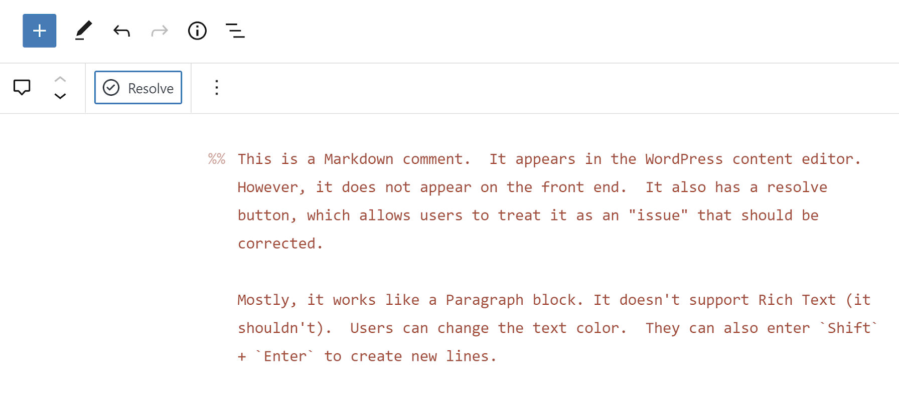
The plugin creates a new block that works nearly the same as a typical Paragraph block:
Adding inline comments to a post.
Users can change the text color, but they will not have access to the typical Rich Text controls. Those should be unnecessary anyway.
As someone who does long-form writing almost exclusively in Markdown, the block’s use of the double percent-sign syntax for comments intrigued me. Technically, the Markdown spec does not support any sort of special characters for them. It handles HTML comments. However, those appear in the source code on the front end when the document is rendered. I have only seen the %% mark to denote comments in the Inspire Writer app for Windows. Tabor said he had seen the same in Ulysses. The feature also exists in the Iceberg editor for WordPress, which Tabor created alongside Jeffrey Carandang.
The plugin also introduces the %% keyboard shortcut. Typing it directly in the editor will create a new Markdown Comment block.
My primary use case for the plugin would be leaving notes for my later self. However, it could also be handy in users’ publishing flows. The block adds a “Resolve” button to the toolbar. Clicking it deletes the comment.
Clicking the “Resolve” button will delete the block.
The block itself will not likely offer a robust enough feature set for complex workflows. However, pairing it with a plugin like Post Descriptions could round out the experience for larger teams of writers and copyeditors.
The Post Descriptions plugin allows users to add notes on the post level. These notes appear on the post-management screen, letting other team members know when to check an article. However, it may be hard to provide the full context of what issues need to be resolved before publishing. Markdown Comment Block adds an inline comments system, letting team members pass in-text notes.
Theme developers should appreciate that the block uses CSS custom properties too, which makes it easy to overwrite its default style rules. In moments, I was able to make it match my theme:
Custom color, font, and line-height styles.
The --markdown-comment-font-size, --markdown-comment-line-height, and --markdown-comment-color variables are available for theme developers who want to add in support.
The one complaint I had about the block is its title: “Comment.” It is easy to confuse it with the six other comment-related blocks already in the WordPress block list. And, there will only be more in upcoming versions. Giving it a title of “Markdown Comment” would better distinguish it from others.
Did you search for your WordPress website on Google and found a bizarre pharma title appended to it in the search results? Yes? Then your WordPress website is a victim of the WordPress Pharma Hack! Over 40% of all sites available on the Internet run on WordPress CMS. Its popularity has attracted many hackers and […]
I use this line, or one like it, in a lot of quick demos. Not that it’s not a production-worthy line of code—I just tend to be a bit more explicit on bigger projects.
html {
  font: 110%/1.4 system-ui;
}
Someone wrote in confused by it, and I could see how a line like that is a bit bewildering at first.
The first thing to know is that it is called shorthand. The font property in CSS gives you the opportunity to set a bunch of font-* properties all at once. In this case, we’re setting:
html {
  font-family: system-ui;
  font-size: 110%;
  line-height: 1.4;
}
There are a few more little specific things to know. For example, the order matters.
/* invalid */
html {
  font: system-ui 100%/1.4;
}
You also can’t set the line-height without also setting the font-size. If you’re going to set line-height, you have to set both. Be extra careful there because something like 20px is both a valid line-height and font-size, and if you only set one, it’ll be the font-size. If you go for a unitless number, which is a great idea for line-height, and try to set it alone, it’ll just fail.
To expand your customer base, it is pertinent to launch an organic search engine optimization campaign.
Avail these highly beneficial local SEO Tactics
At first claim Google My Business Listing
Google hosts 75% of the Global Search Engine market. Get benefit from Free listing at Google My Business. Make your company easily approachable. Make an account on these sites.
MerchantCircle
Thumbtack
Facebook
Whitepages
Prioritize your Customer Reviews
Approximately, 90% customers value the reviews on your website. Also consider the star rating.
Localized Your Website Content
Always add your name, address, and phone number easily scrollable on your website, make a header or footer of this information.
Always Avoid Keyword Stuffing, otherwise, Google Search Engine would detect your content as spammy.
If you’ve used Embedded Pens before, you might notice the UI for helping you get the code from them has been updated:
All the same functionality there, it’s just everything works better. I’m a particular fan of how clear the choice is now on which tabs to display by default (that was a bit wonky before, sorry!). Plus, as you resize the height now, you’ll get a height readout in case you’re aiming for a very particular value. We’ll also remember all of your settings, so for example, if you always tend to select the same theme, that’ll be pre-selected when you open it back up.
Always feels good for us to bring areas of the site like this in-line with our latest-and-greatest design patterns, not only ensuring it looks and works good now, but will continue to take advantage of our pattern work.


 Did you search for your WordPress website on Google and found a bizarre pharma title appended to it in the search results? Yes? Then your WordPress website is a victim of the WordPress Pharma Hack! Over 40% of all sites available on the Internet run on WordPress CMS. Its popularity has attracted many hackers and […]